

Fall Rose Garden Invitation Suite
Moody | Roses | Fall Greens | Velvet | Romantic
an invitation suite for a wedding at:
The Mount, Lenox, Massachusetts


We wanted to create a romantic garden invitation suite without feeling dainty or pale. Our lovely bride, Nicole, wanted a bit of deeper colors and drama in with her more traditional roses. It was a pleasure to help create unexpected moments throughout her suite, including the blind press details and little brass bee apliques for her garden wedding at The Mount in Lenox, Massachusetts
We began our design process with the idea of roses and bees. Once I had a good idea of what artwork I had in mind, I went into devising adorable little additions to her design. We designed her reception cards to be a simple design (to balance out the other artwork heavy pieces) and then added an overall bee impression pattern to bring texture and visual interest to the dark green cards.
Our reply cards were also fairly simple with a couple fall leaves and little bees pressed into the pale purple papers.


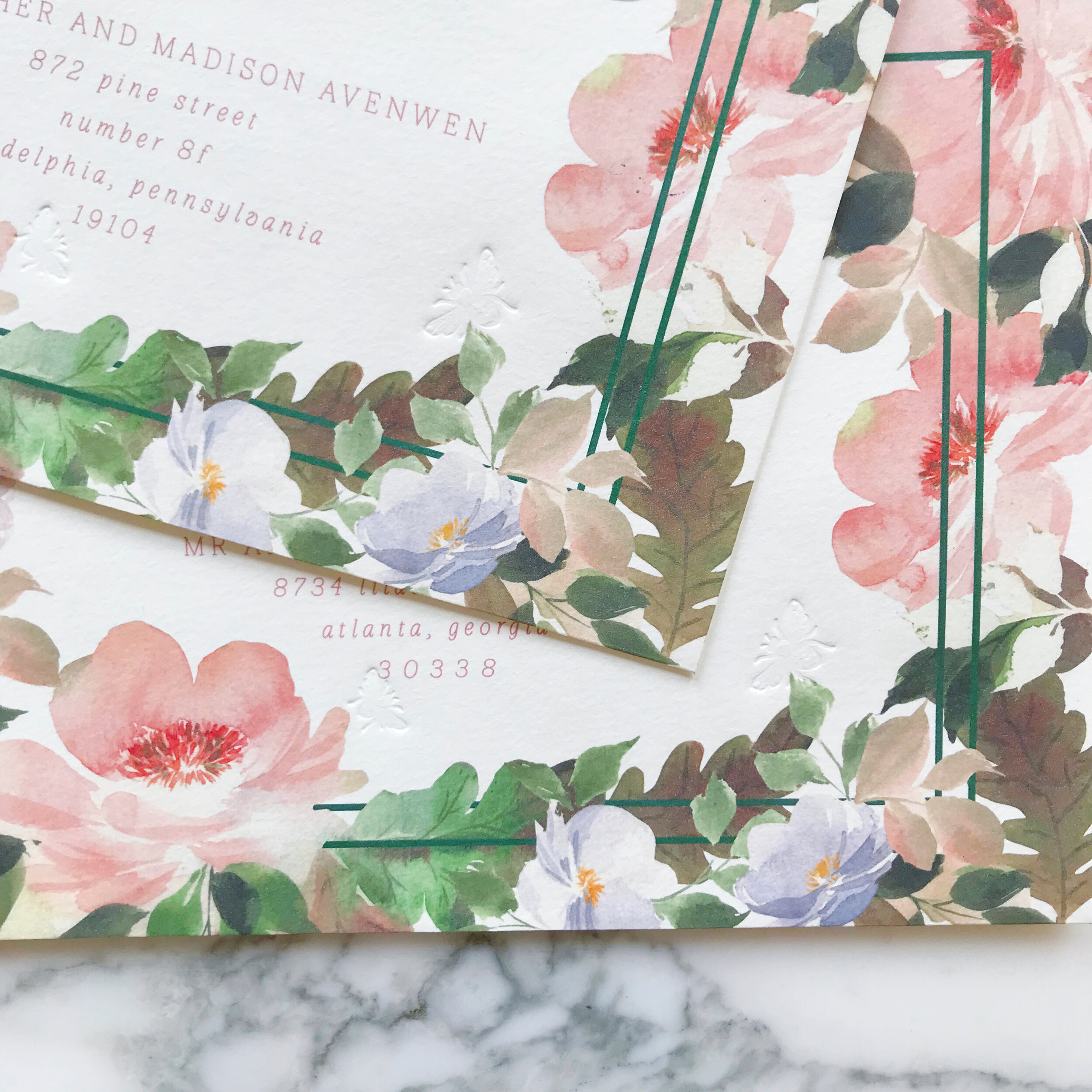
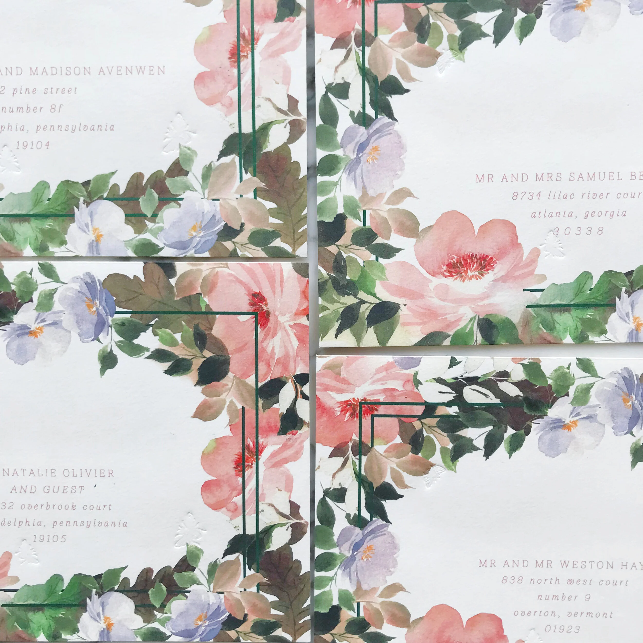
Let’s talk about these envelopes. It’s no secret that envelopes are one of my favorite thing to design. They’re difficult to print, require precision and imagination. I also think they are a wildly under-designed space in wedding invitations. Think how naked this overall suite would feel if the only artwork-heavy piece we had was the invitation! I love being able to use simple pieces like the reception card and reply card to keep a balance in the overall suite.
Our envelopes were printed front over to the back flap, creating an entire piece when they opened, while not feeling incomplete when closed. We also pressed a few little bees into the corners for added detail and texture.
For postage, we went with our usual mix of current issue and vintage.


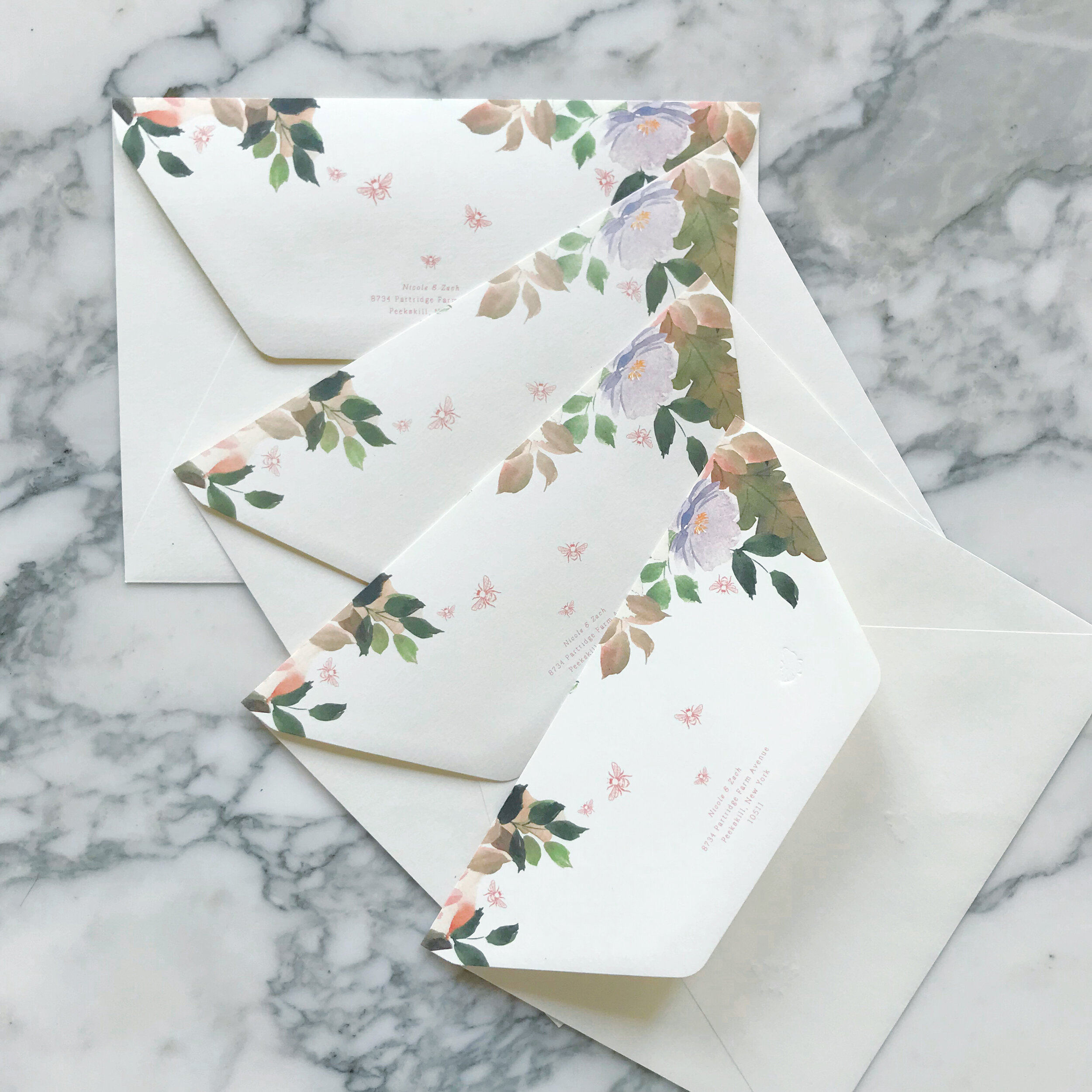

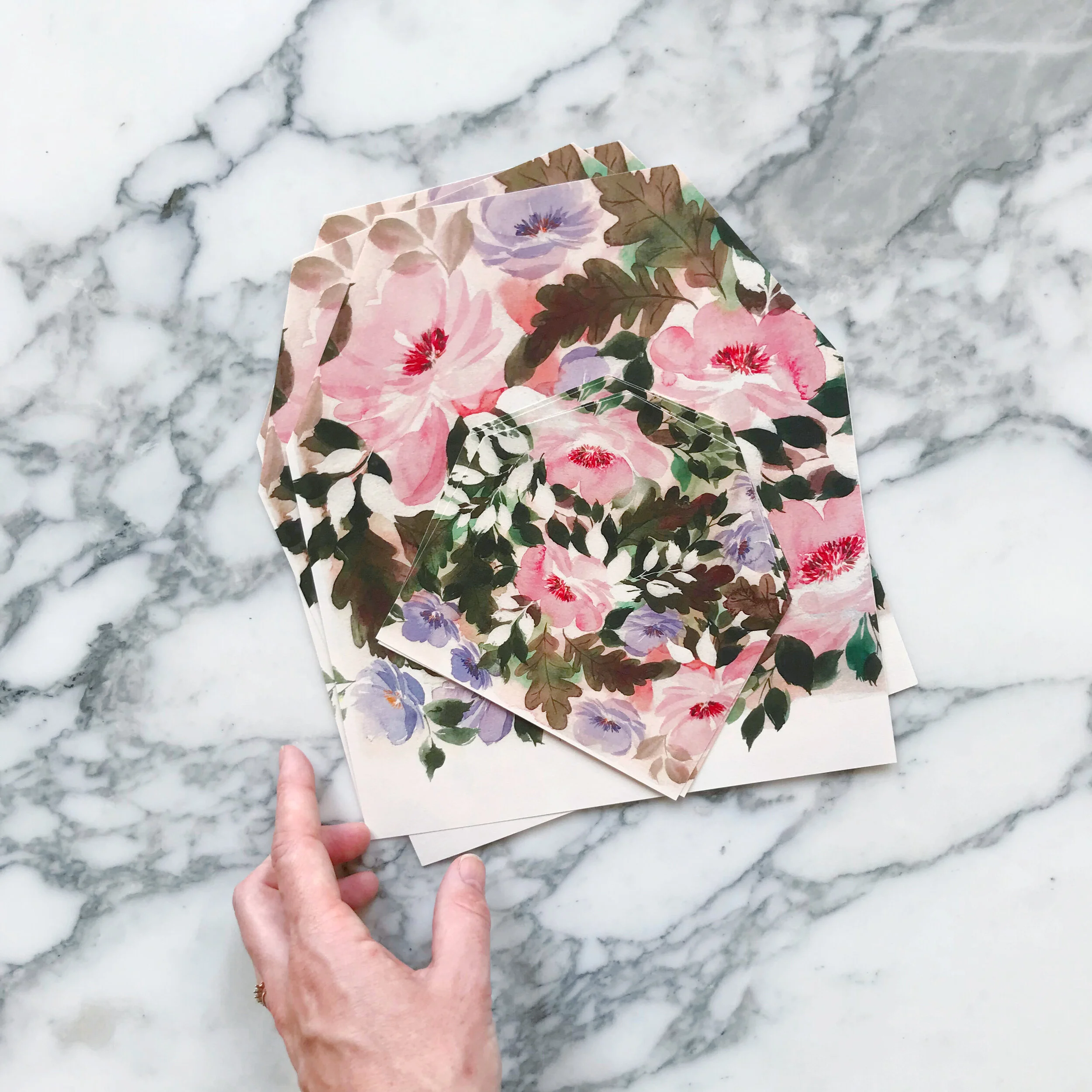
Also in our usual fashion, both our mailing envelopes and reply card envelopes were lined in matching artwork.


Last, but certainly not least, lets talk about the invitation itself.
Printed on pale blush paper, the invitation was designed to be a punch of moody artwork. I wanted layers of design elements, so we started with 300lb paper, printed deep florals, blind pressed little bees, and then added our brass bee appliques amongst the flowers.


We added a few finishing details, including the vellum wrap around our insert cards, the tiny little wax dots with brass bees, and deep green velvet ribbon.