

Bespoke Invitation ... sage & rosemary
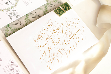
I loved working on this suite...hand drawn rosemary and sage, with touches of gold. The suite was designed around the wedding's venue, hosted at the Carneros Inn in Napa, California. We wanted to incorporate the feeling of the countryside and farm-to-table without leaning too far into the "winery" look and feel of things.
I always choose a group of descriptors for a design, whether its a wedding, invitation, or a home. For this suite, we choose: organic, rustic, elegant, easy, airy, herbal, farm to table, calligraphic,


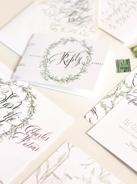
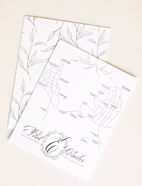
I created a laurel from sketched and painted rosemary to incorporate through several pieces in the suite as well as their monogram. We then used it on the invitation, backer, velum wrap, save the date, front of the reply card, table numbers and the monogram on their hand drawn map. The other darling little design element of this suite that I really loved was the idea of taping herbs to a page and jotting their names on the tape...I really haven't any clue where the idea came from, I just thought it was a creative way of using the pieces. The "taped herbs" were used as backers for several of the pieces and also along the bottom of the reception card.
after the suite was printed, we had each piece run with gold foil to add little bits of gold sparkle into the watercolor elements. We decided against doing gold for the letter as we liked the look of the heavy black contrast. Naturally, all the envelopes were addressed in gold calligraphy ink.


...in process - rosemary & sage invitations
Whenever I begin a new design, there are a few very important steps. First, determining the look and feel of the event and making sure the lines of communication are open between the designer and the client. That may seem like a given, but seeing how much time we spend on artwork, its nice to only have to do it once!
For this suite, we started with our descriptors - organic, farm to table, green, airy, light, elegant, formal. We knew we wanted to incorporate rosemary, sage, a hand drawn map, bits of gold, and very formal cursive. The next step I take is to sketch out the entire suite. I do this for a few reasons - one, it really helps me determine what art piece I'll need, what spot calligraphy will be needed where, what pieces we're actually going to be working on and it also helps the client see the overall look and feel and how the artwork will flow from one piece to another (which can be difficult to communicate otherwise). These sketches are exactly what I show to a client as we work through the process - they aren't very clean or pretty, but the communicate the general idea.

After the sketch is done, I begin working on sketching out the artwork. Depending on the overall look and feel, sometimes I go straight to watercolor or whatever our chosen color medium is. In this case, I purposely chose to ink everything first to bring in an element of black.


