

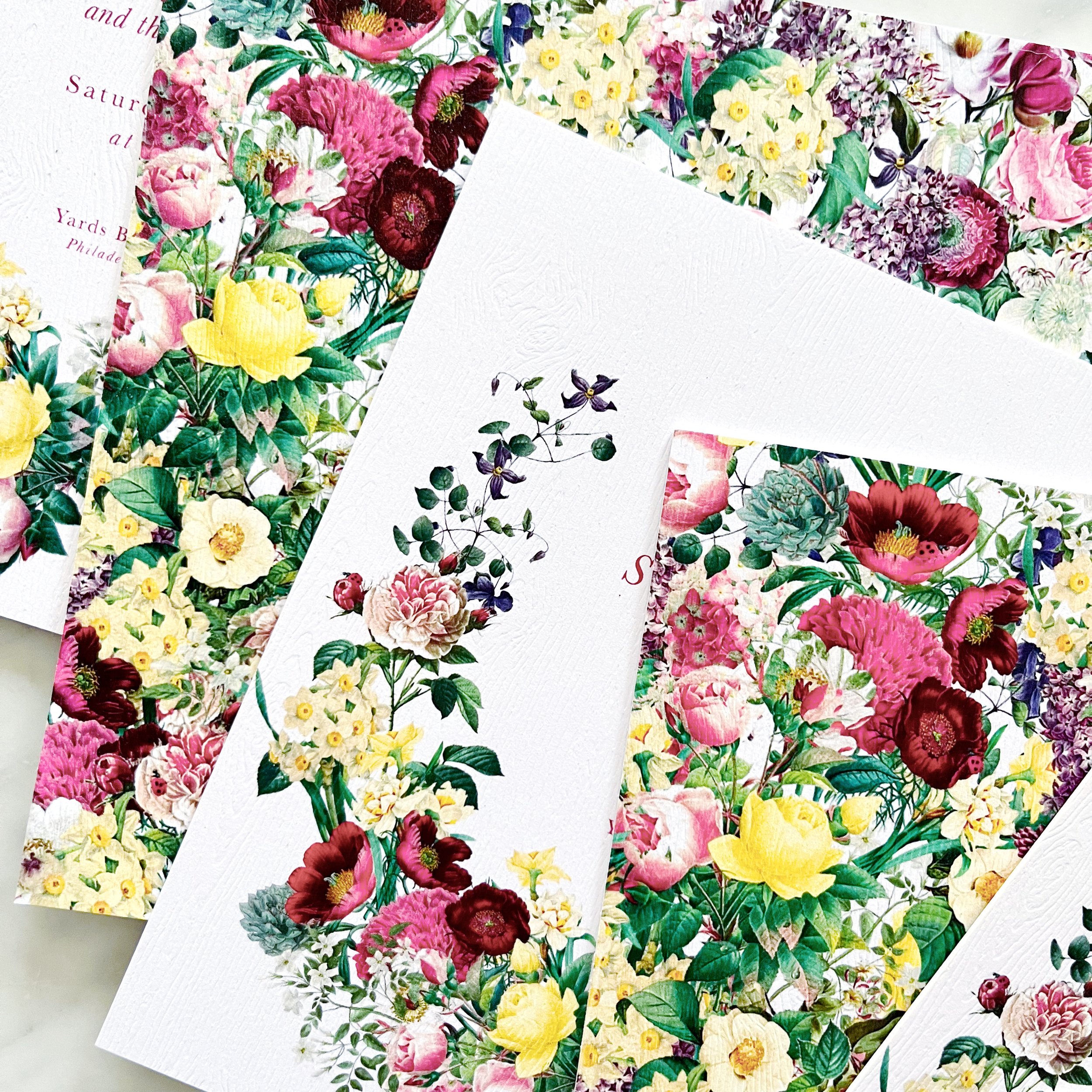
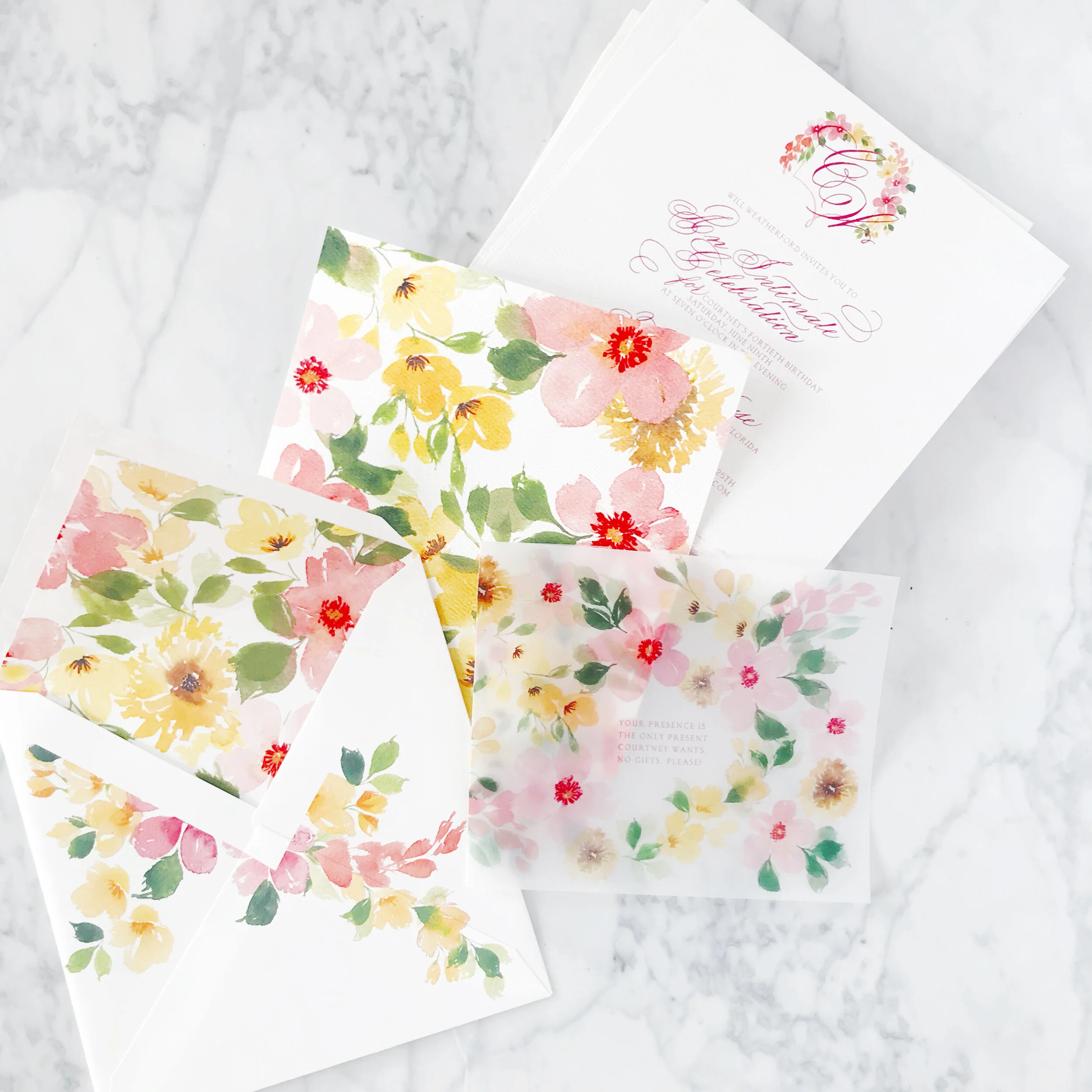
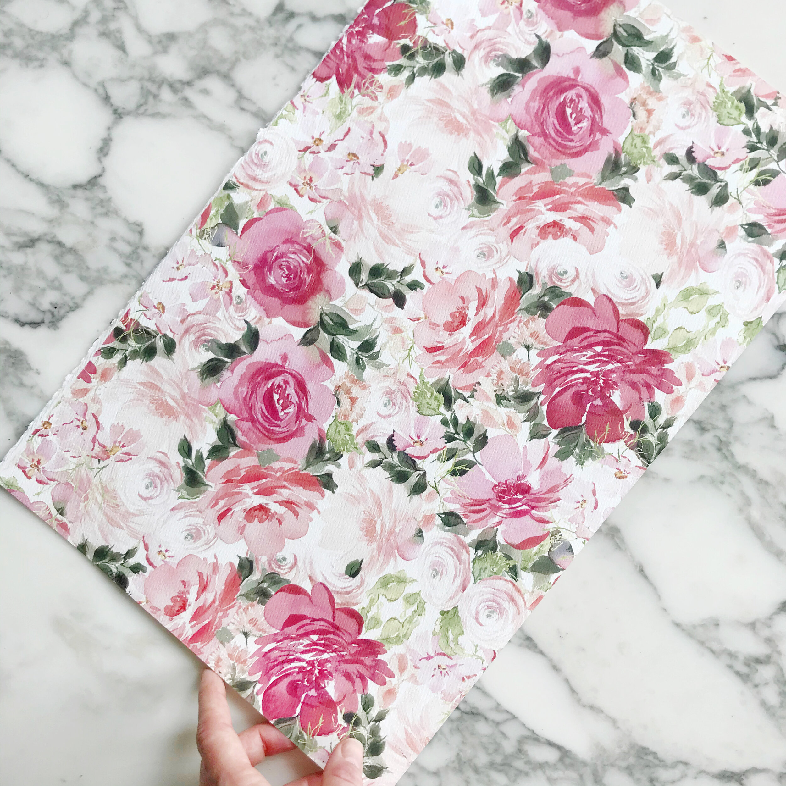
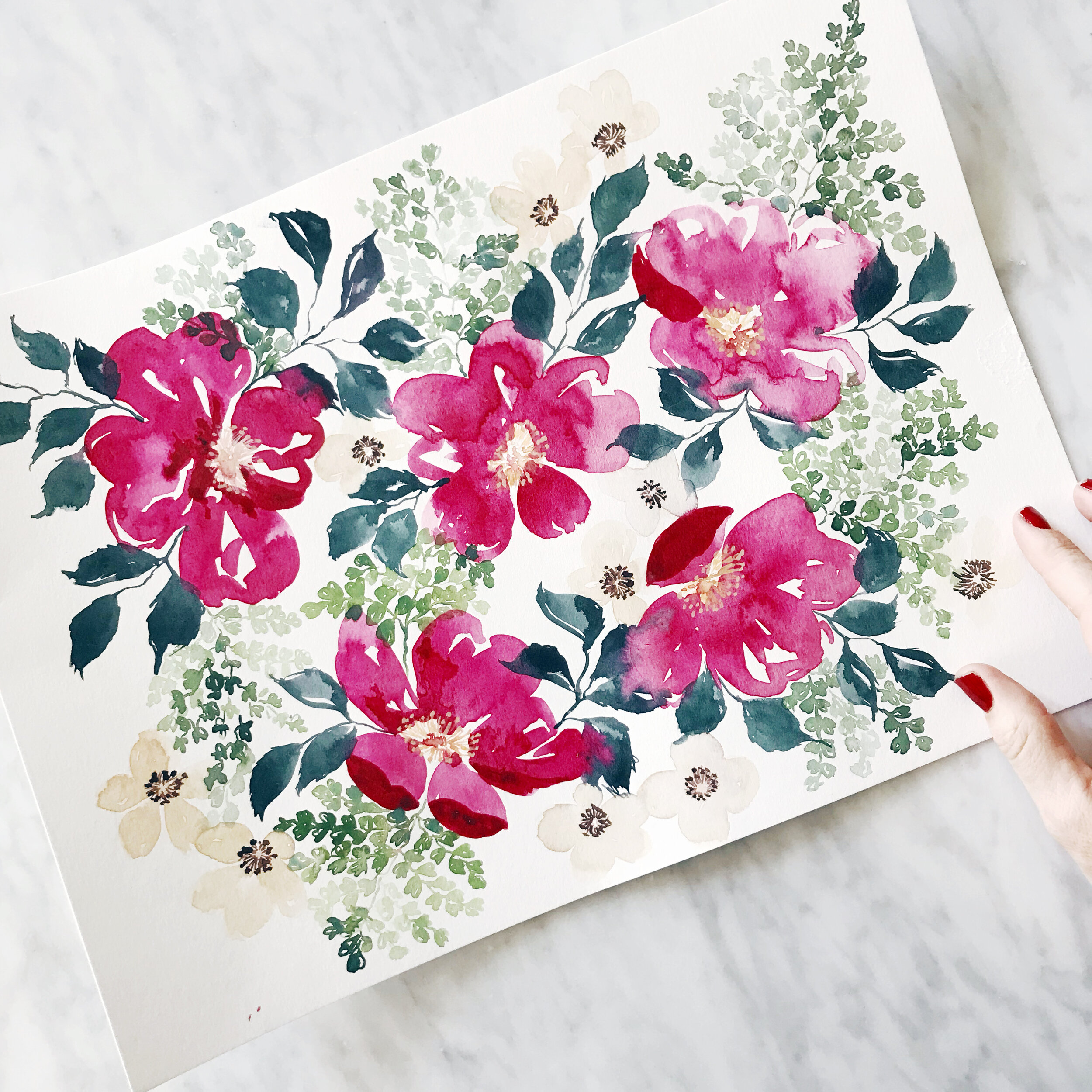
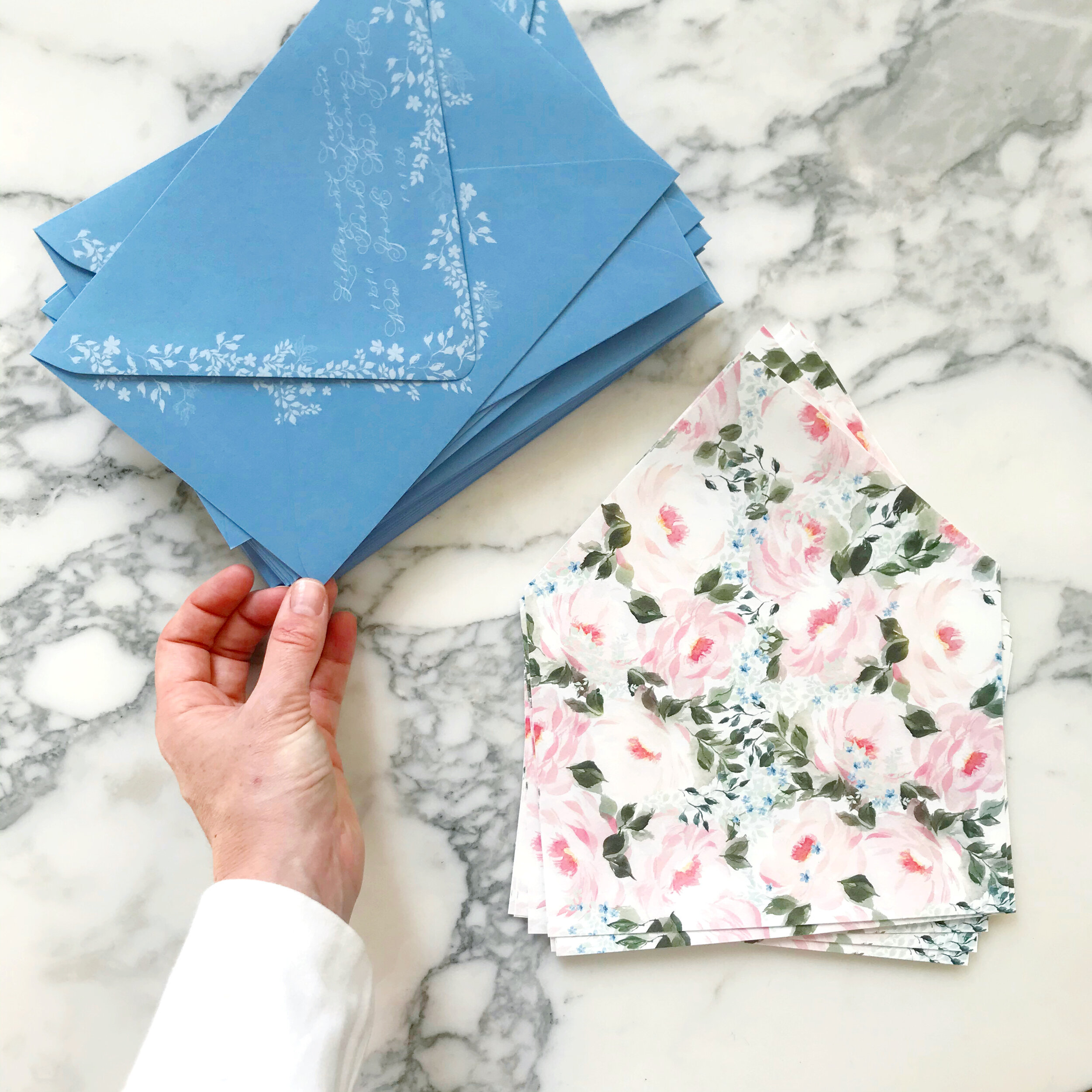
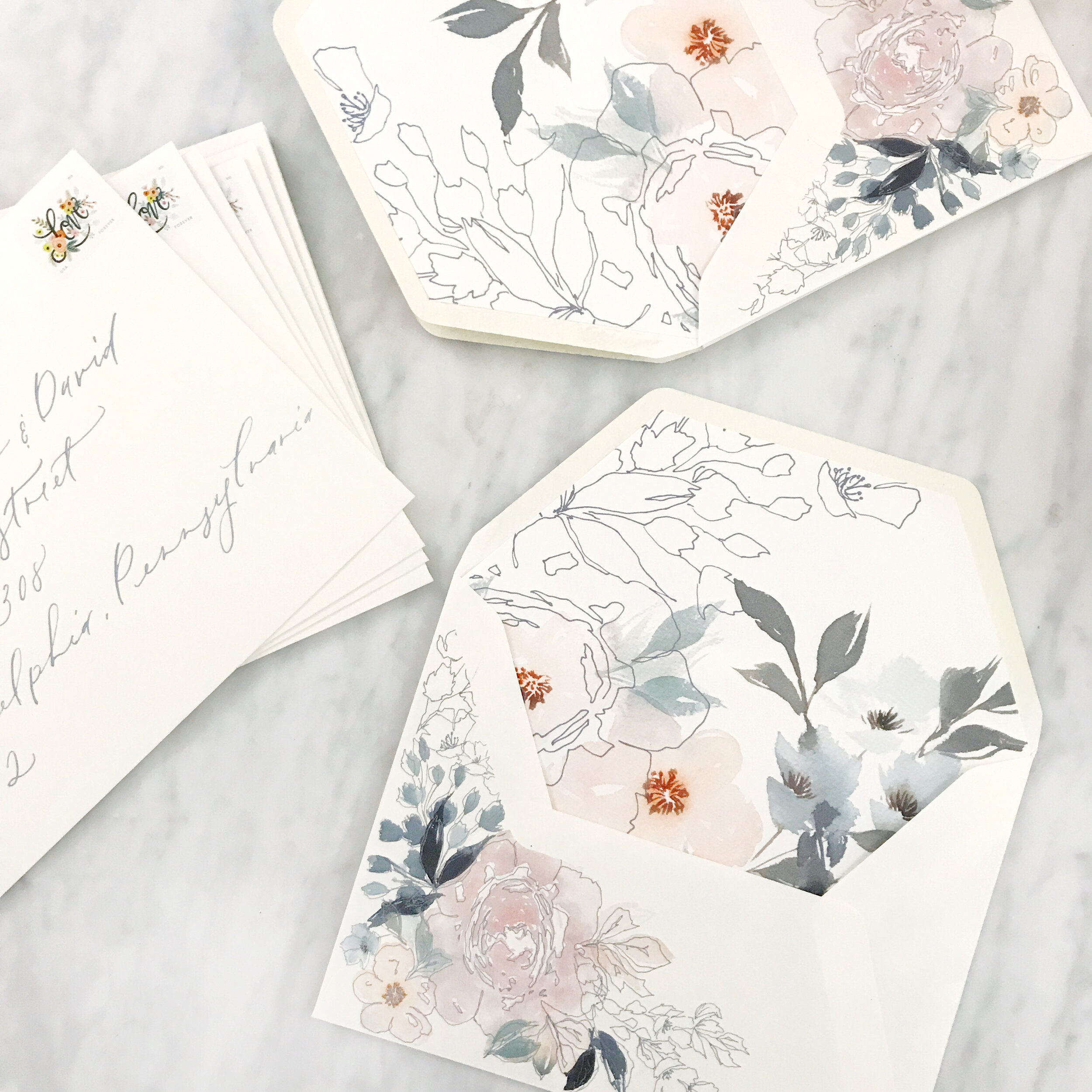
Bright and Summery Bridal Shower Invitations
So vibrant and colorful! This custom bridal shower invitation is perfect for a summer garden party!
I can’t wait to show you the details!

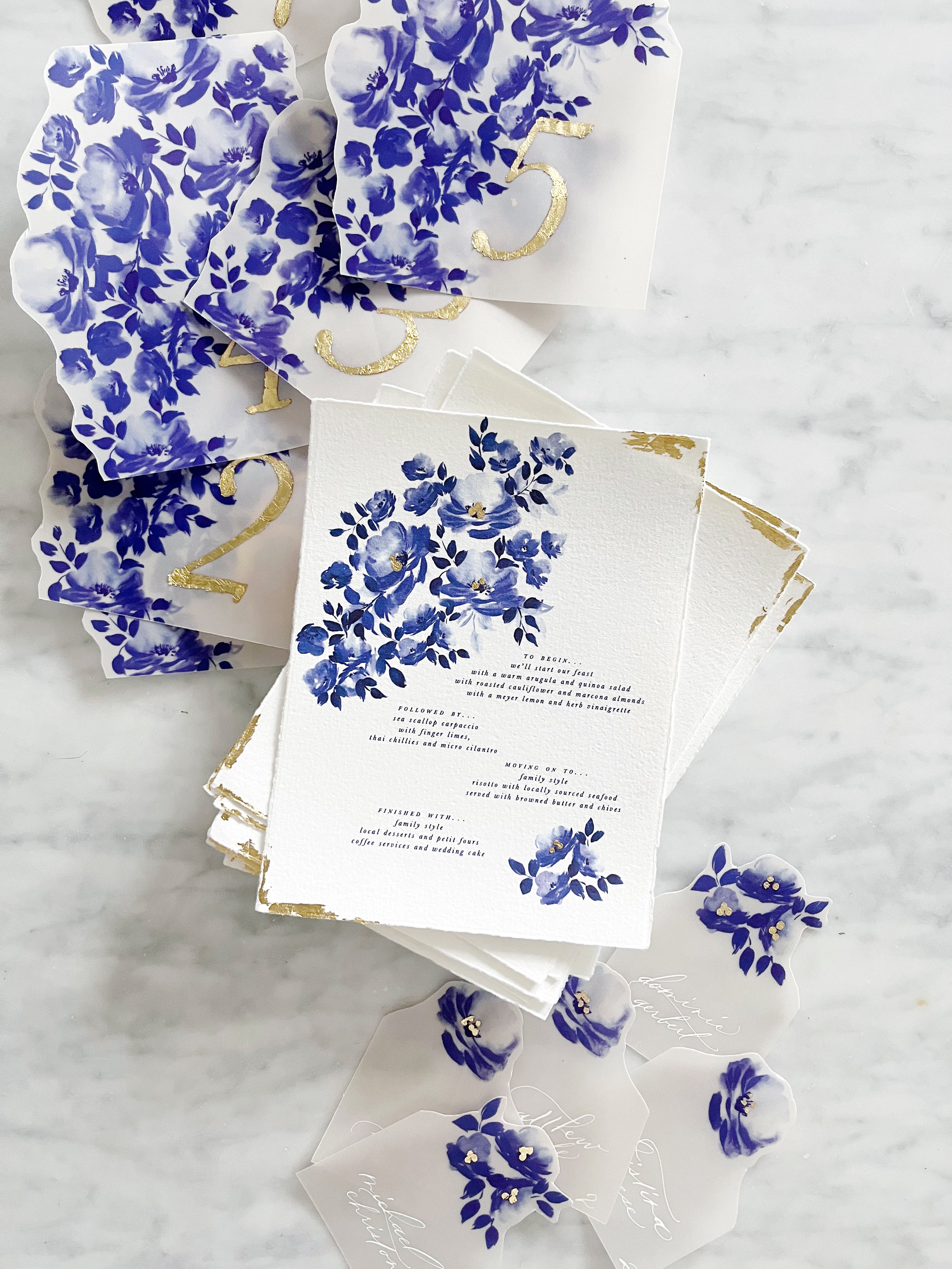
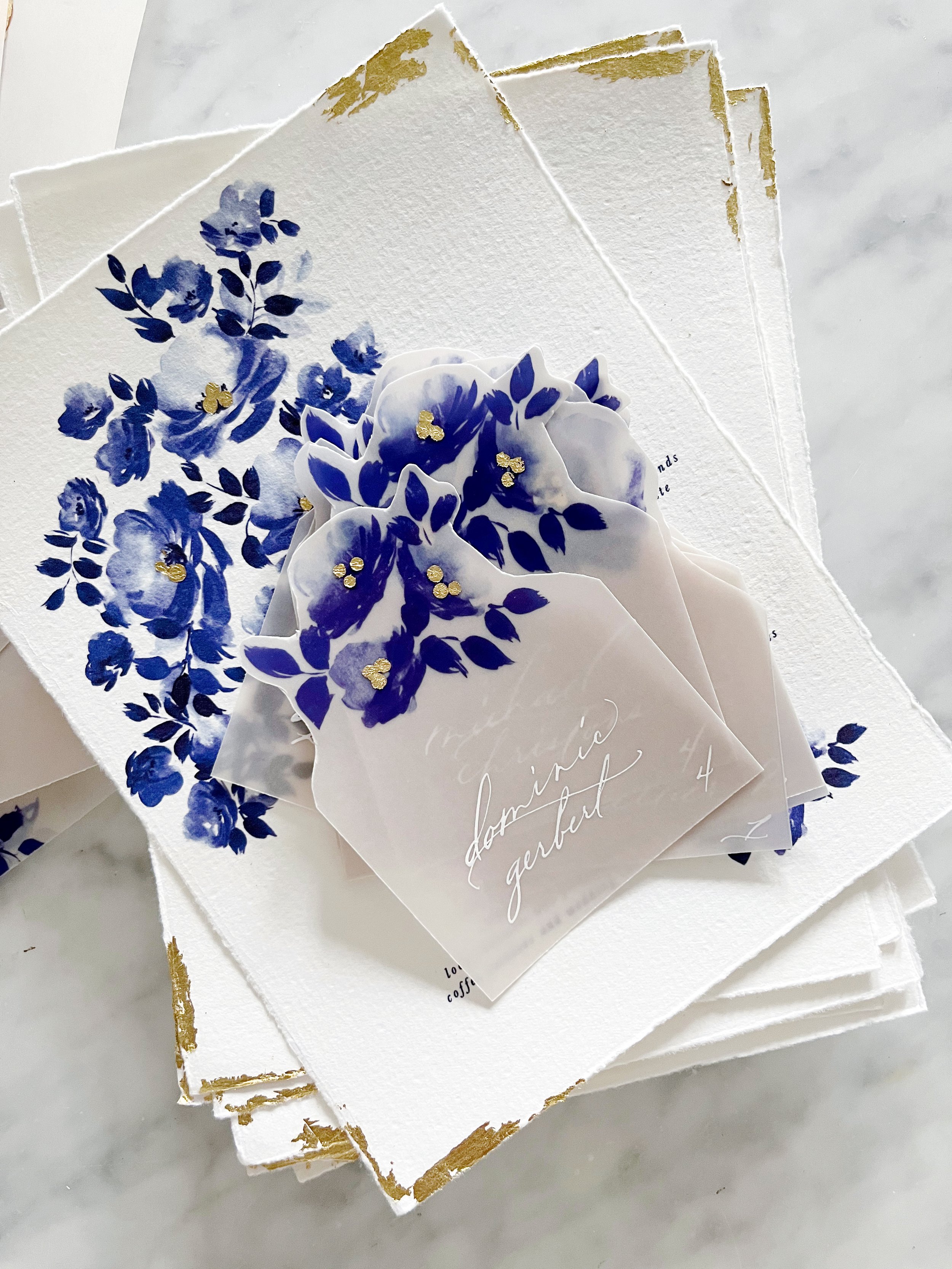
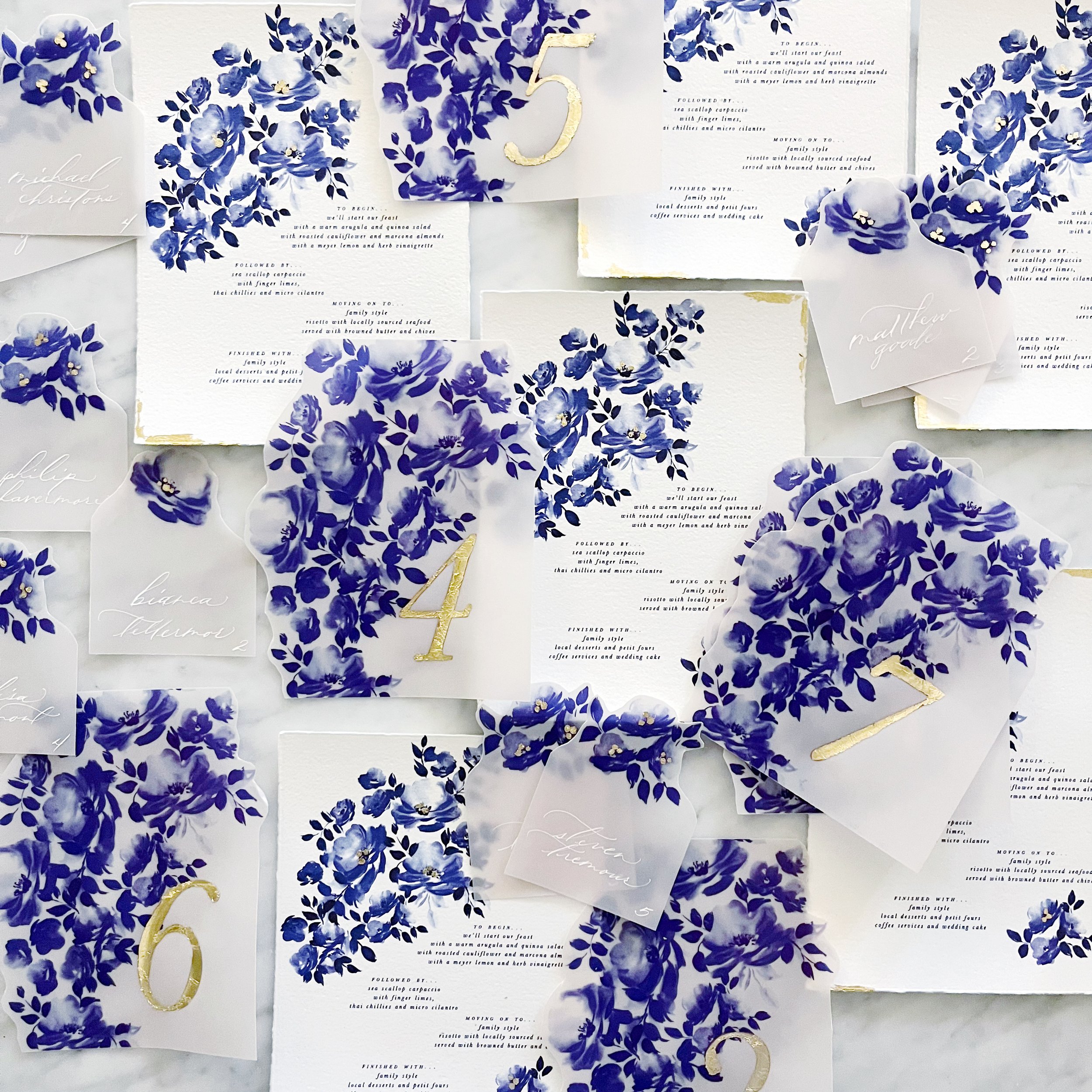
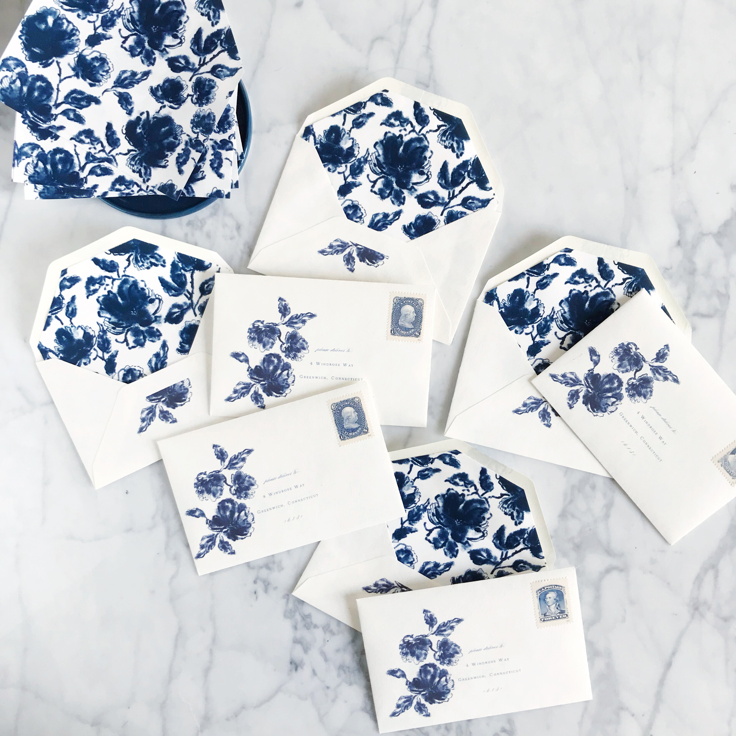
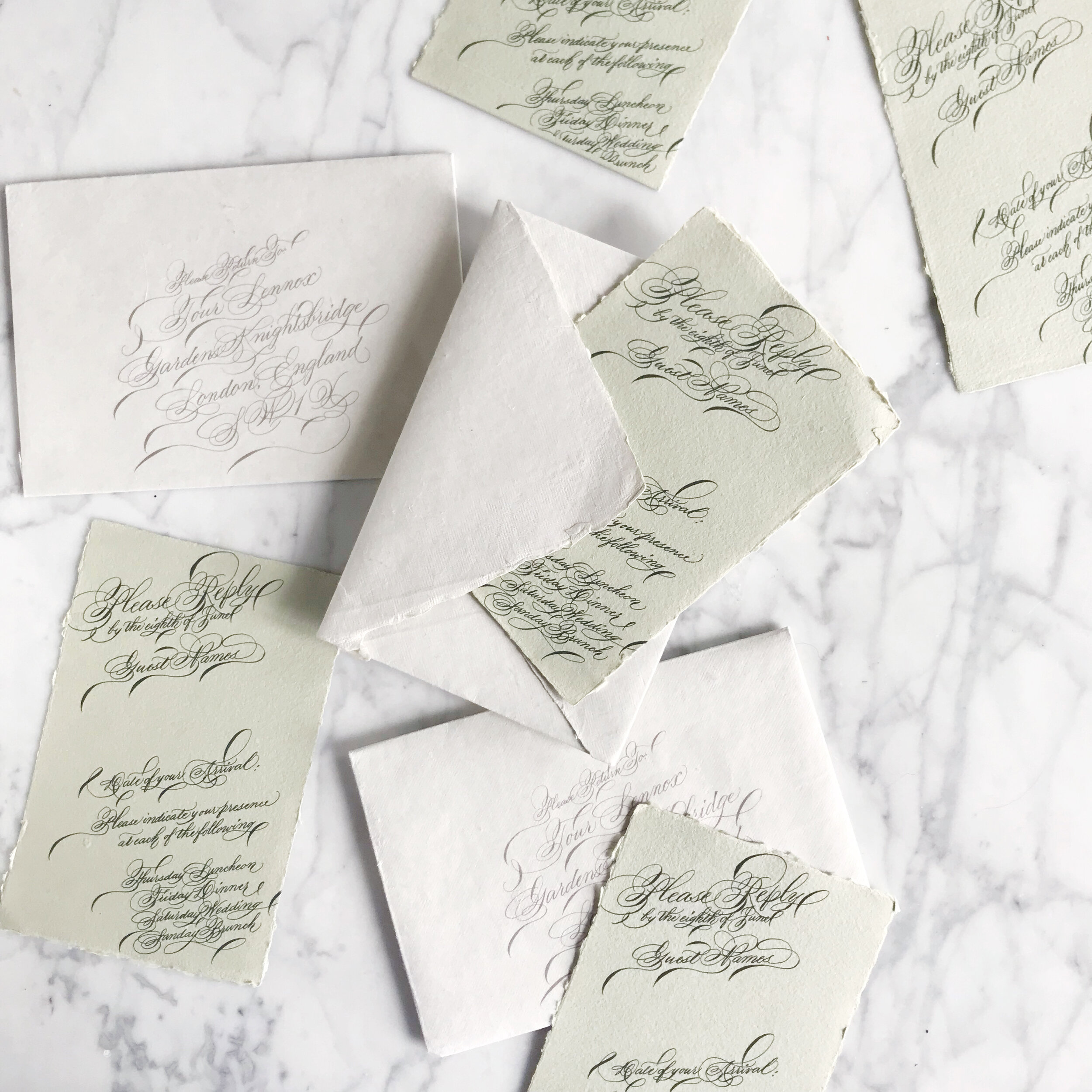
Chinoiserie Blue Reception Pieces
Newport | Rhode Island

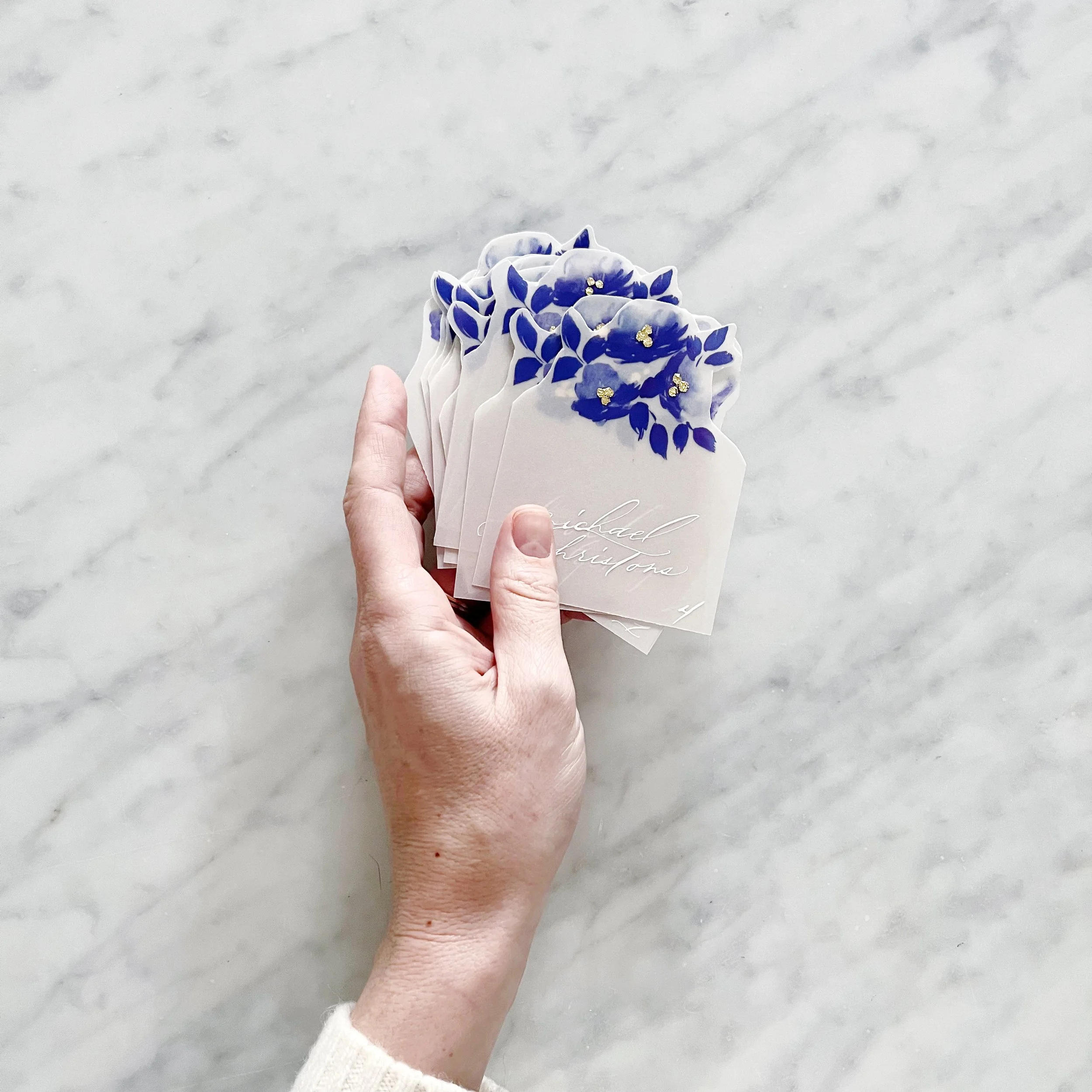
We have some lovely details for the custom designs we’re finishing up for a beautiful wedding in Newport.
We created two different designs for the escort cards to use as meal indicators, and each card had a cluster of gold gilding at the centers of their blooms.

We continued the gilding on the table numbers, which were all gilded by hand.


Likewise, our menus had gilded details in the flower clusters and along the edges of the white handmade paper that coordinated with the invitation suite design.


Sneak Peak: Botanical Baby Shower Invitations
It’s always so much fun to work on a project locally and get to present paper types and proofs in person, and that’s just what I got to do with our momma-to-be here in Philadelphia. I can’t wait to show you the rest of this gorgeous botanical baby shower invitation!
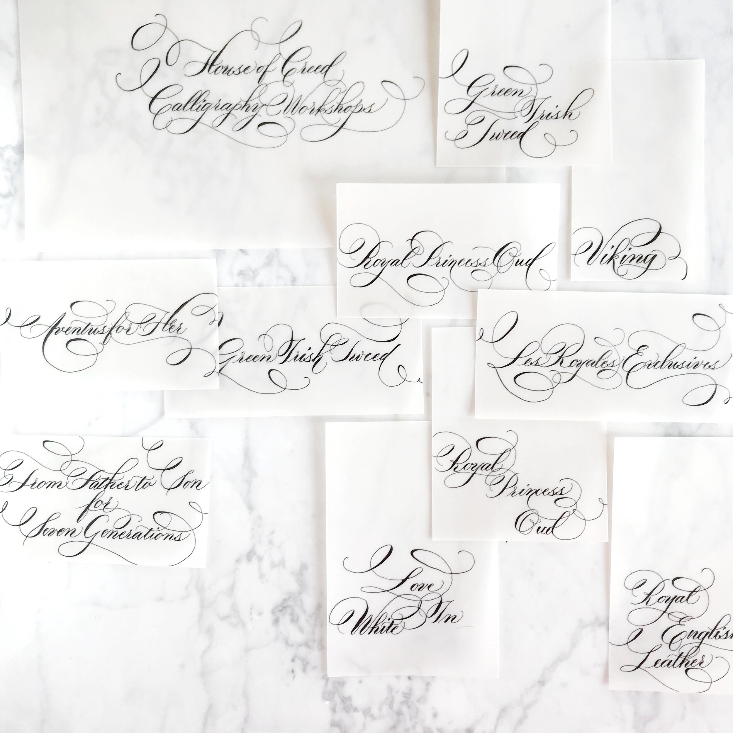
Personalized Perfume Bottles
This past month has held a few perfume bottle projects, which just warms my heart! They’re such an interesting and unique gift!
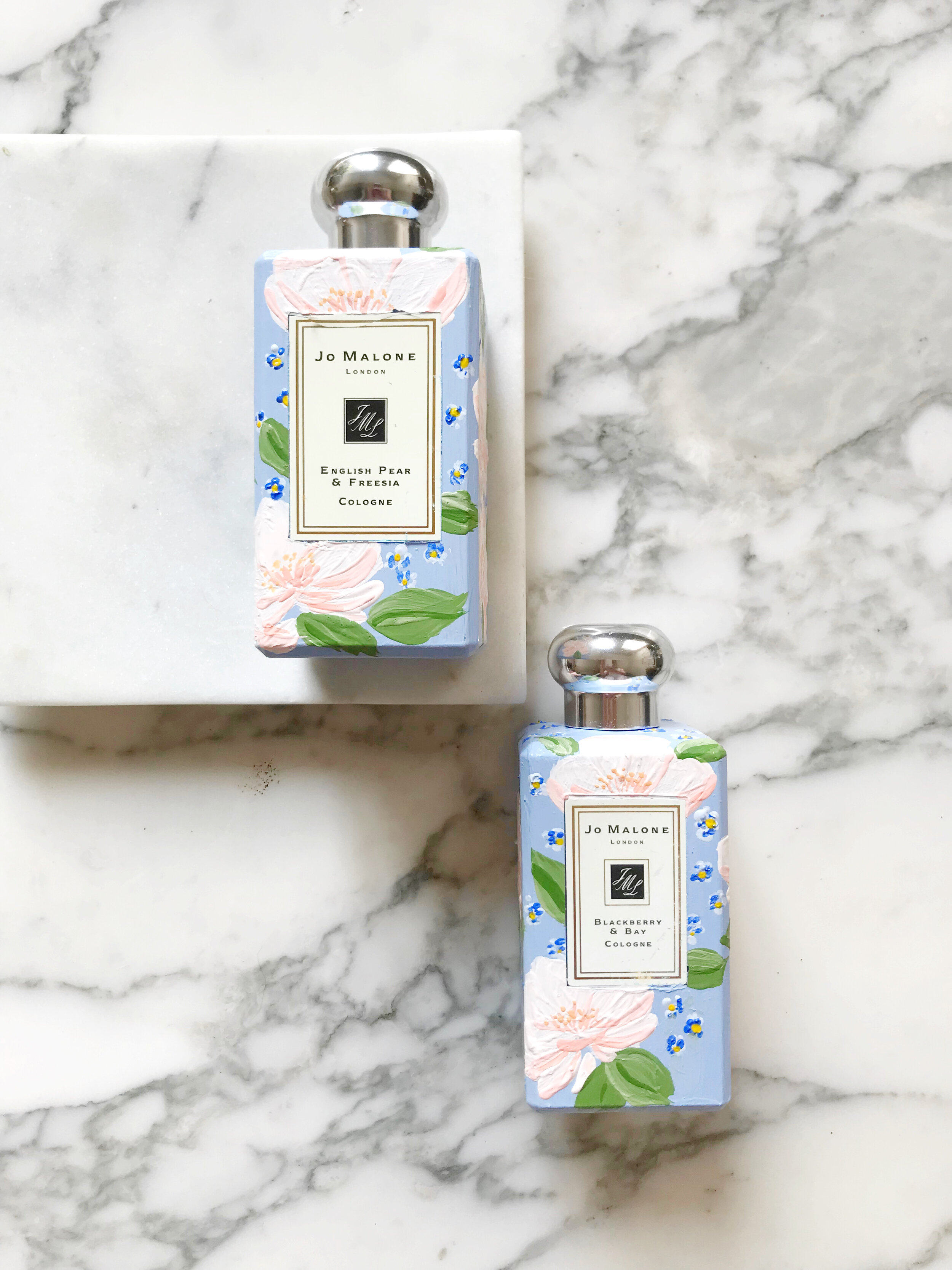
This particular set was designed to match the bride’s wedding invitations and was a gift from the mother of the bride to her daughter on her wedding day. (If you don’t know, Jo Malone is designed to layer and pair scents, so these two are the two the bride selected to wear on her special day!)


The bride’s invitations may look familiar to you, we posted the pictures a while back. Her perfume bottles pair beautifully with her blush and blue invitation suite.


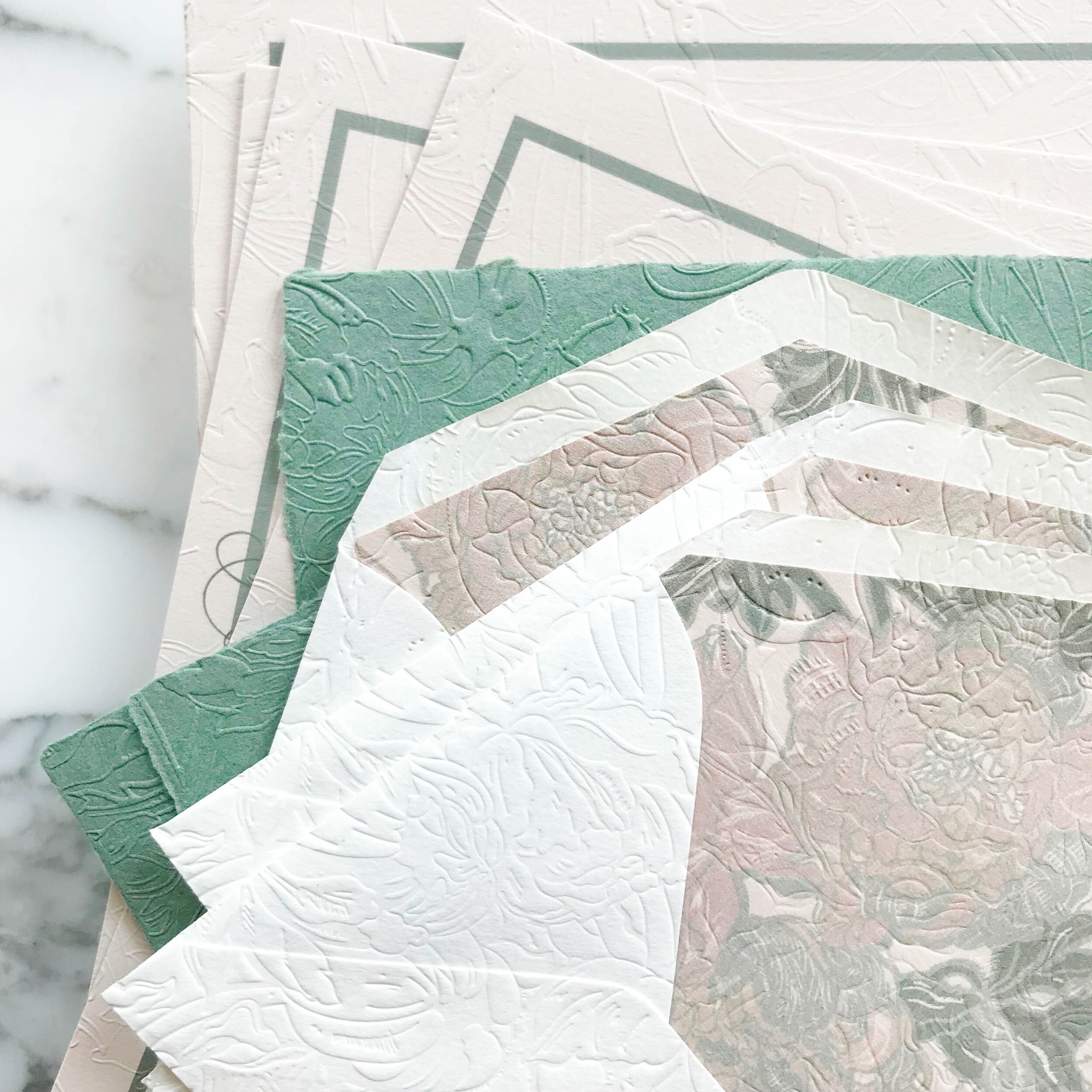
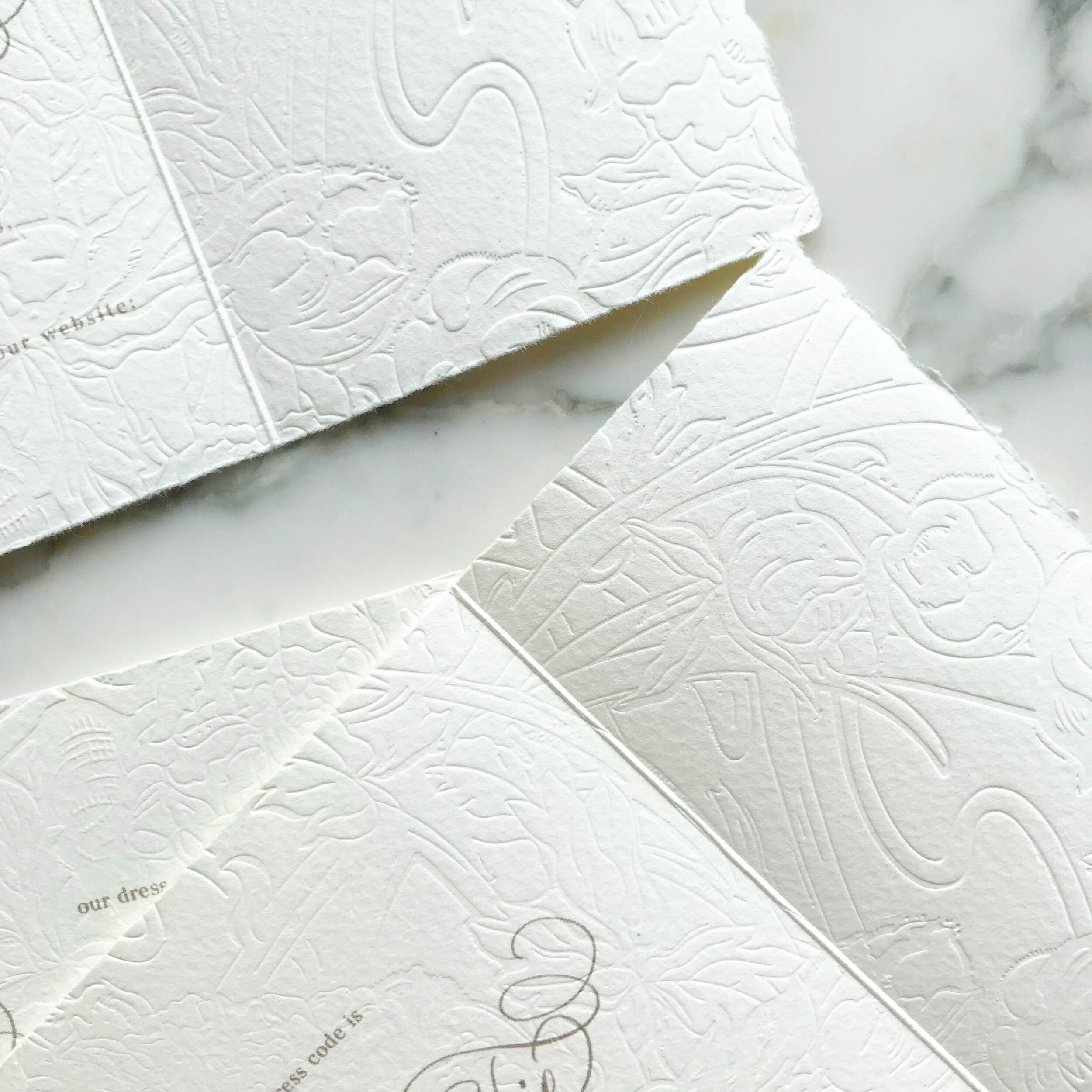
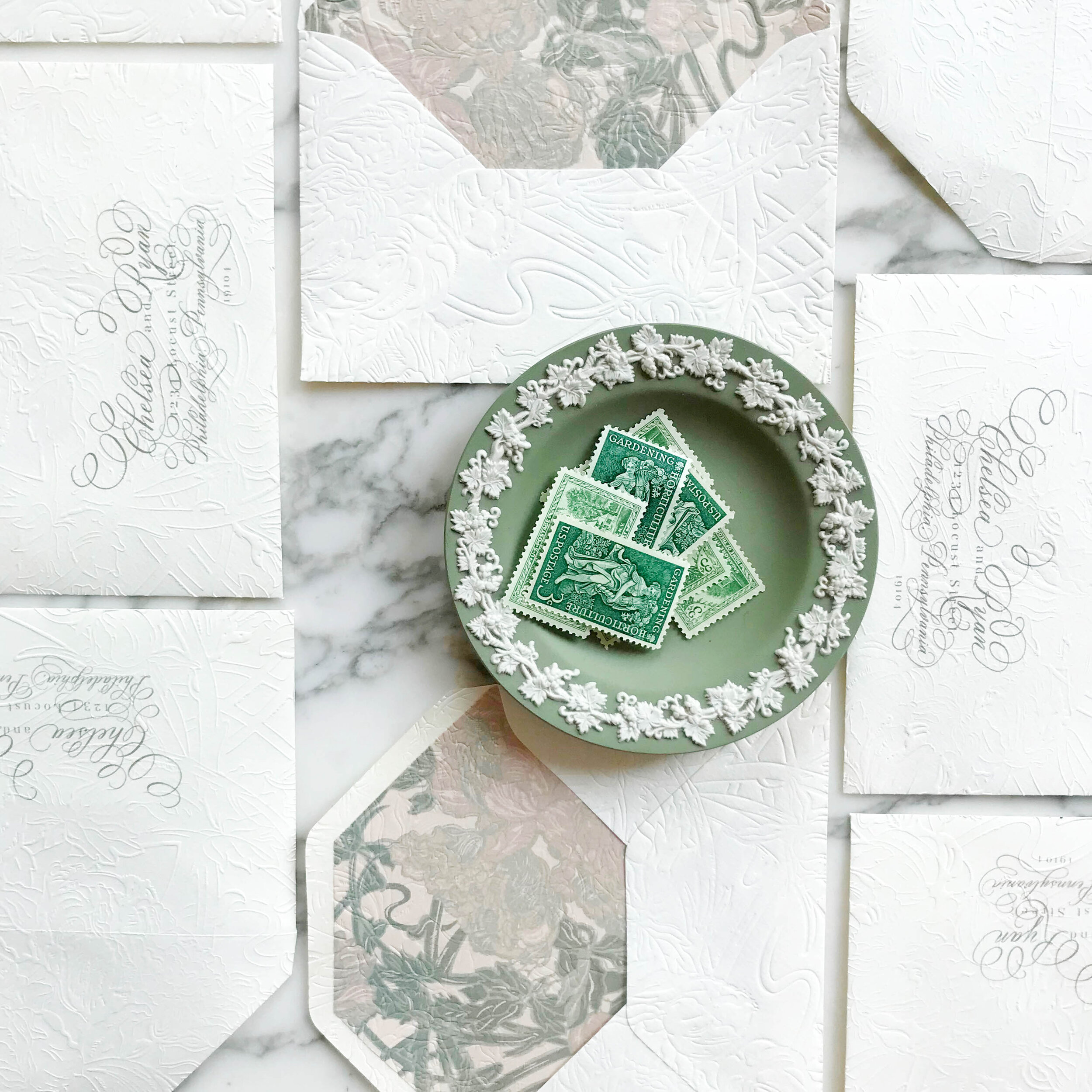
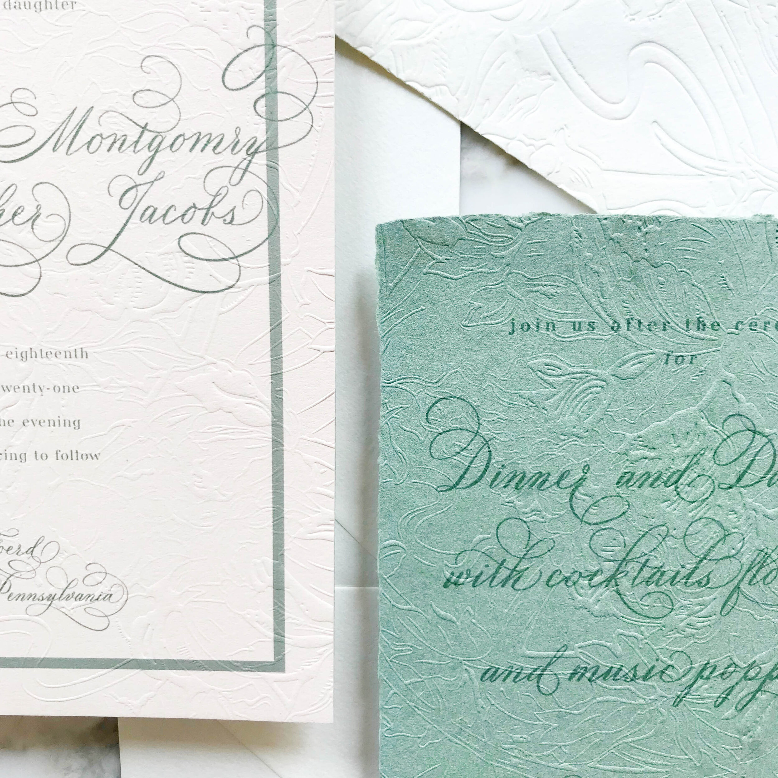
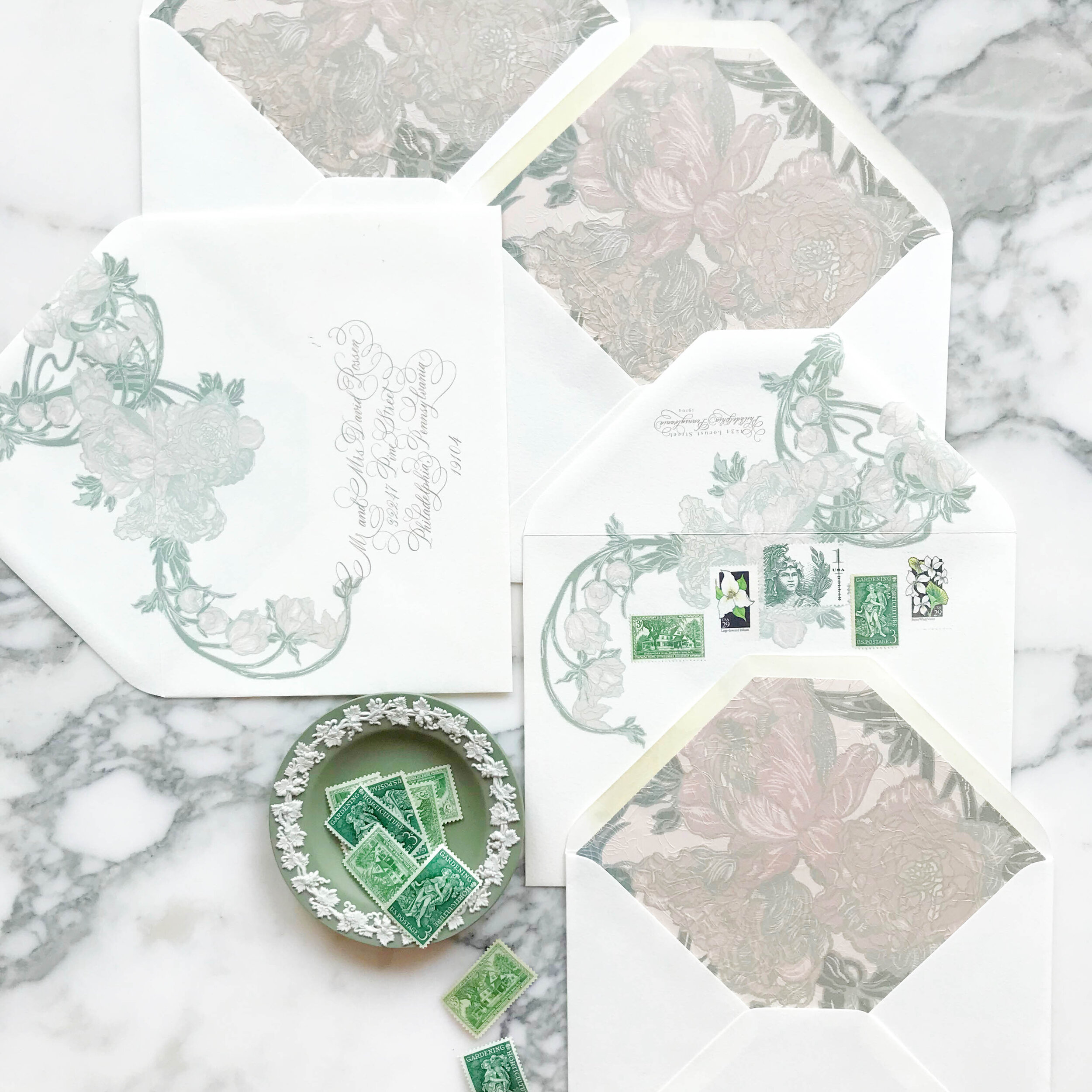
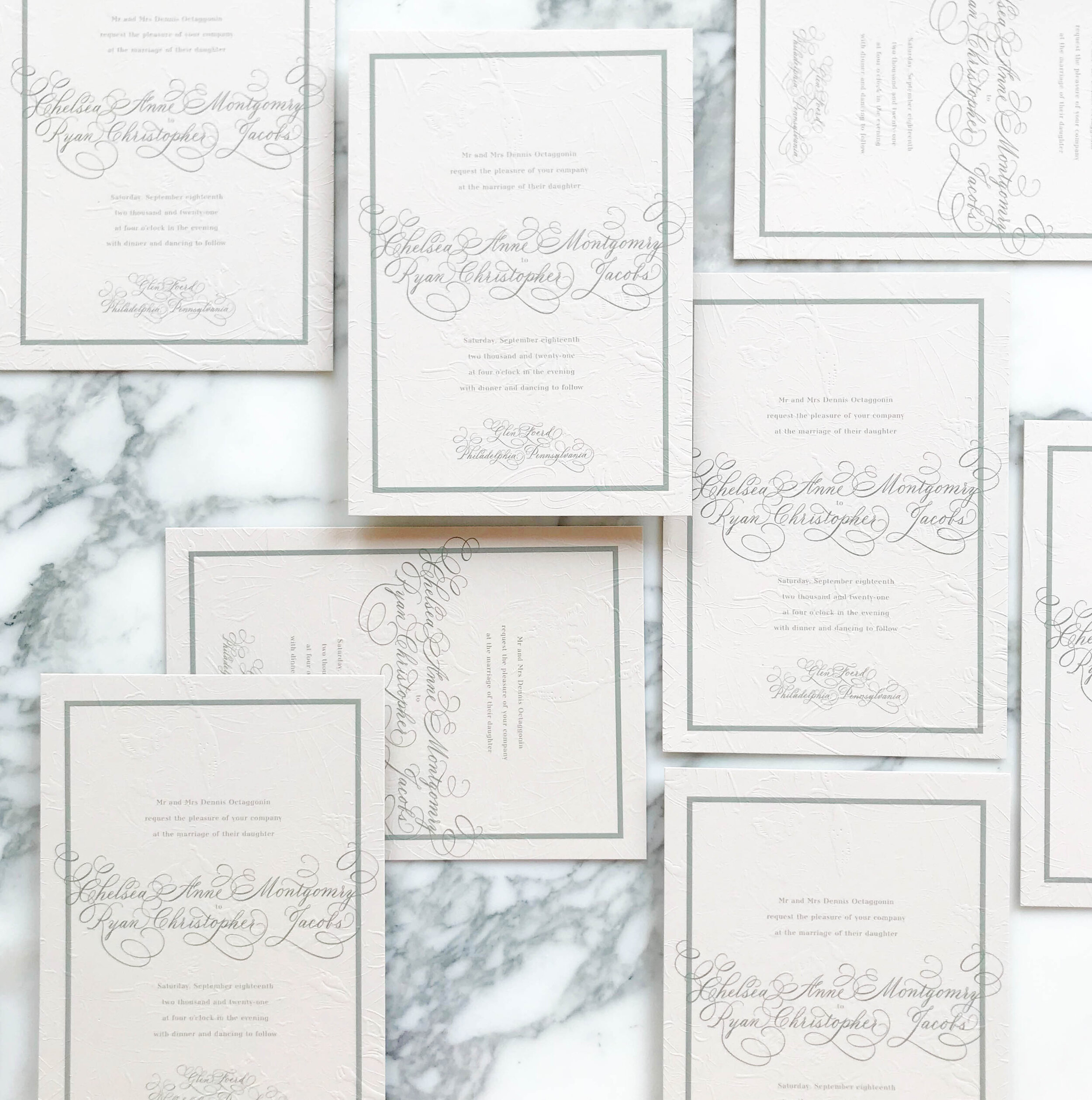
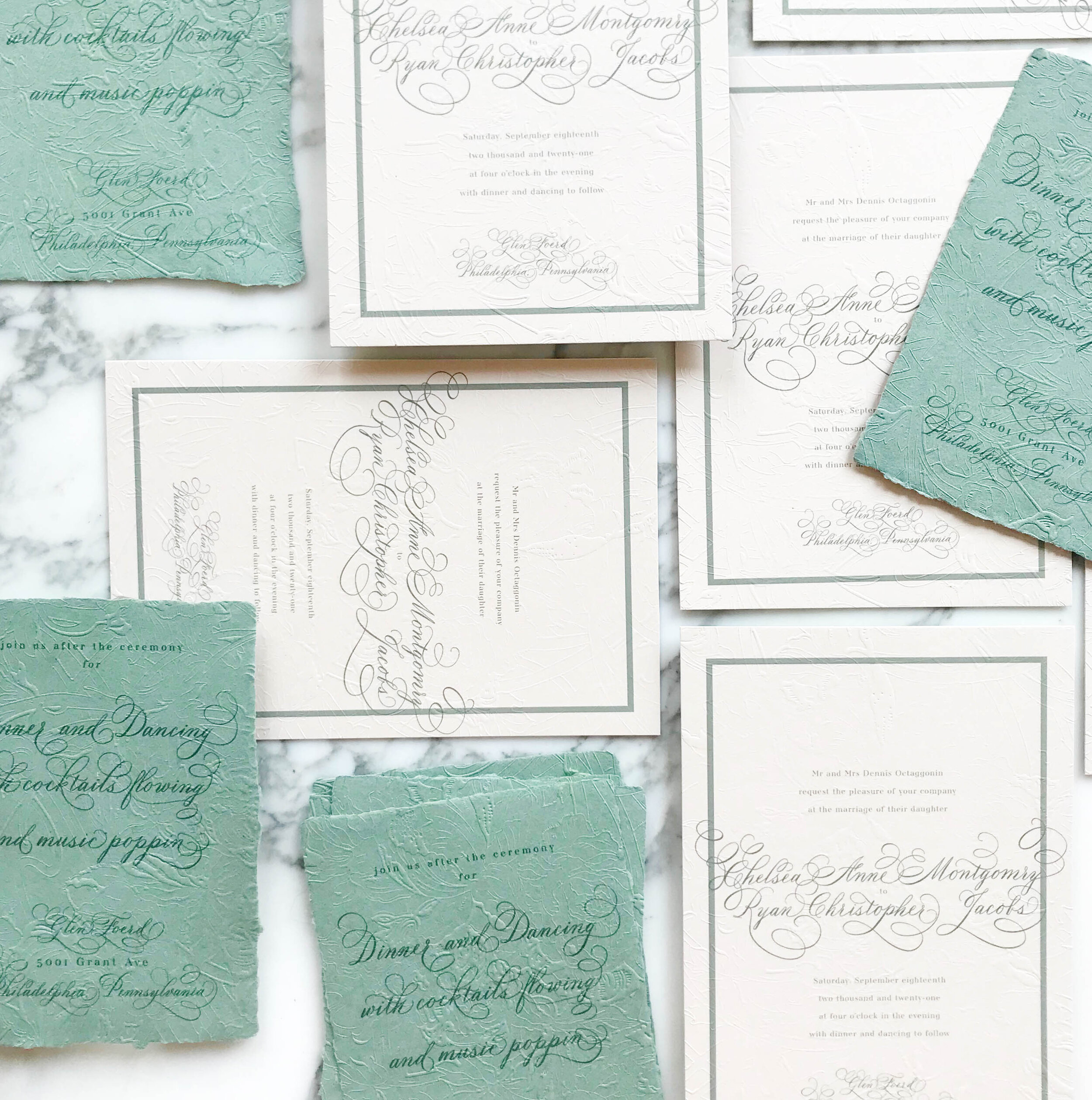
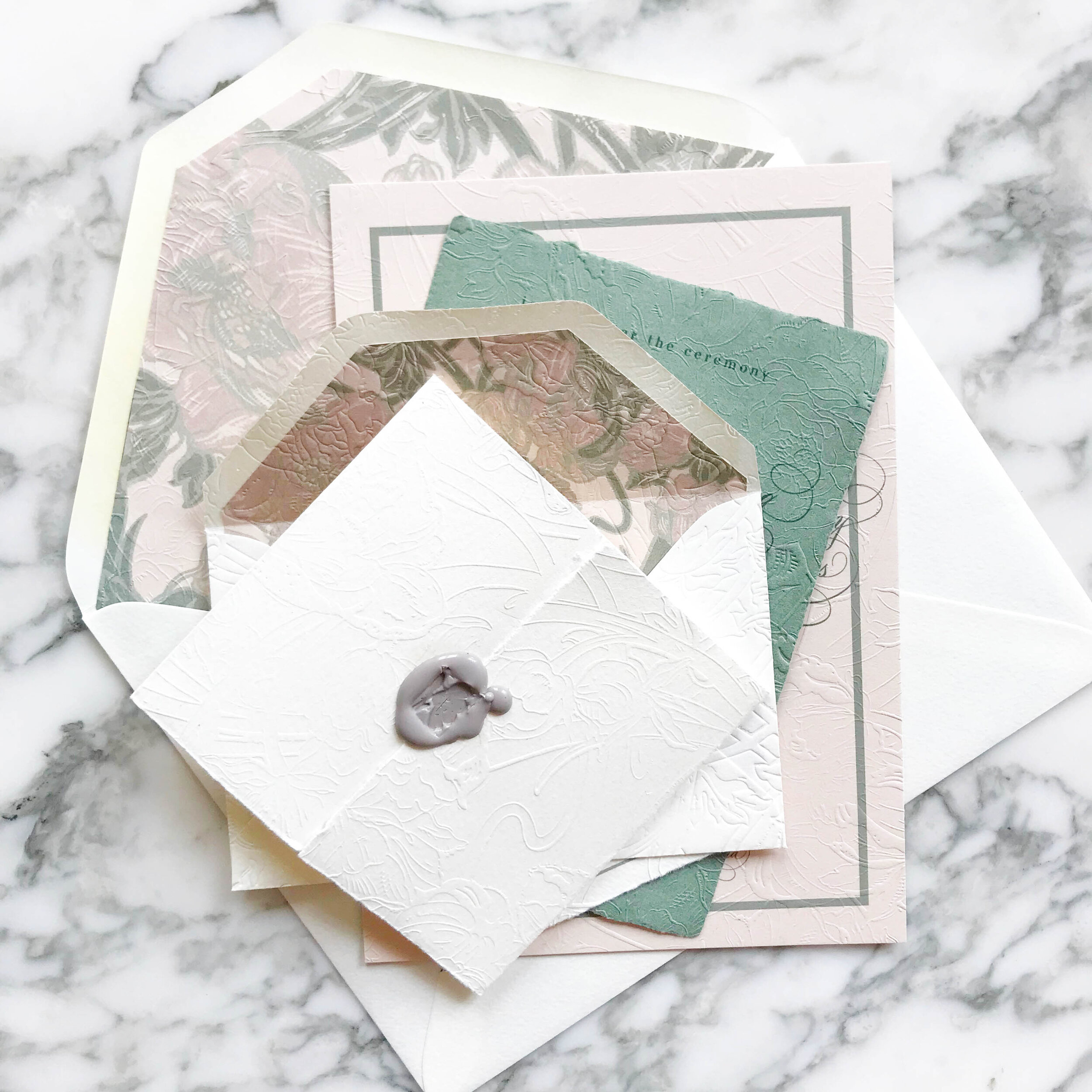
Art Nouveau Wedding Invitations
art nouveau, pale greens and nudes, elegant, overall texture, soft, unexpected, soothing, formal
Glen Foerd Mansion | Philadelphia, Pennsylvania
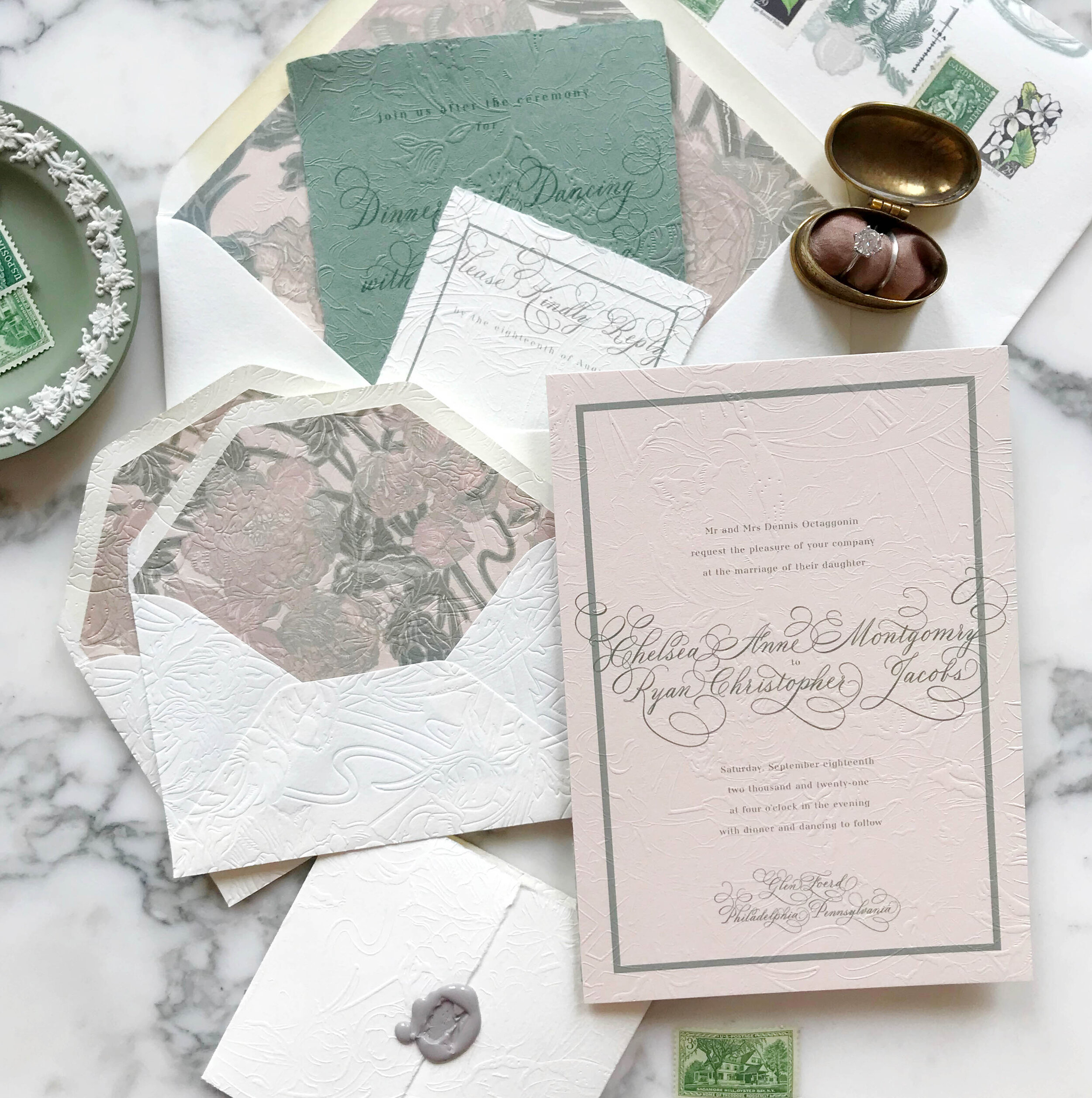
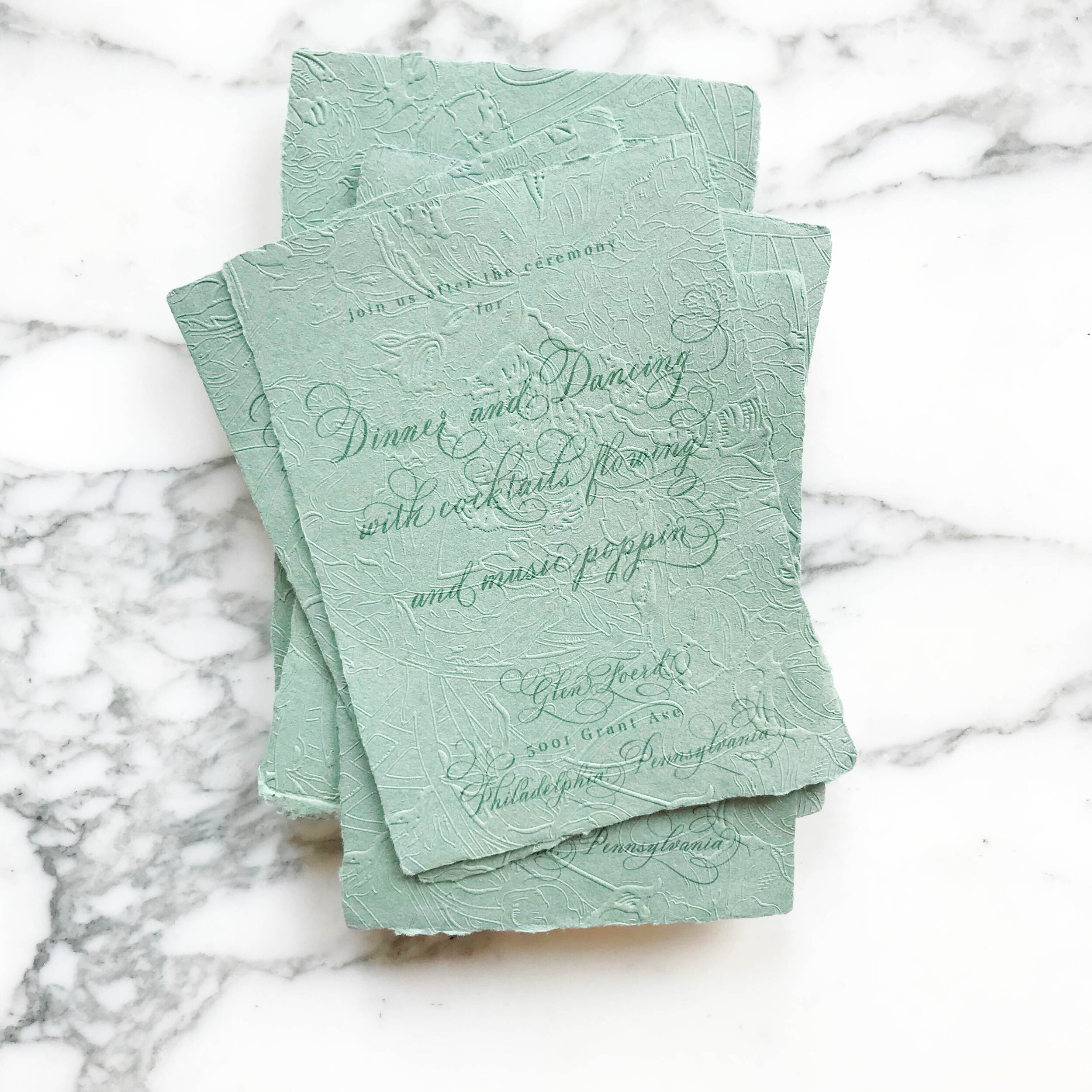
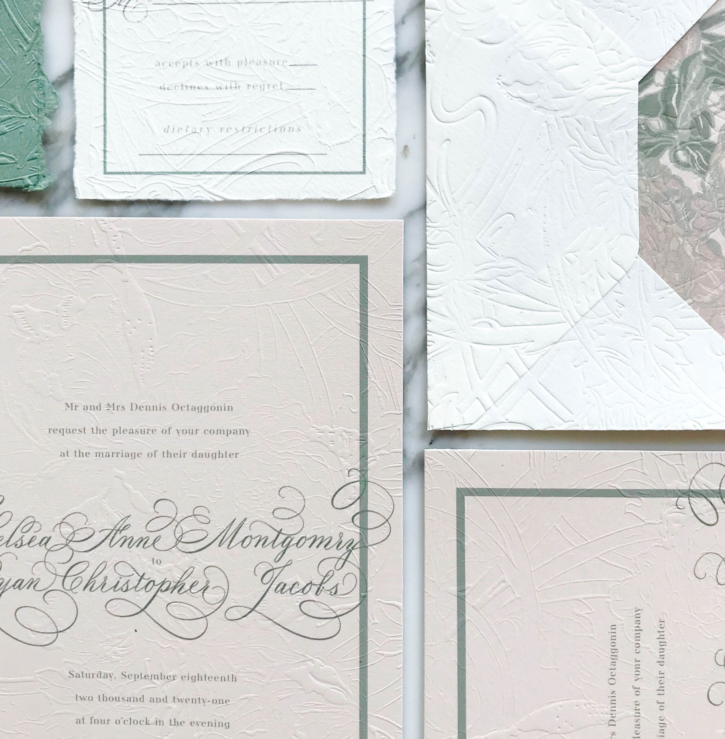
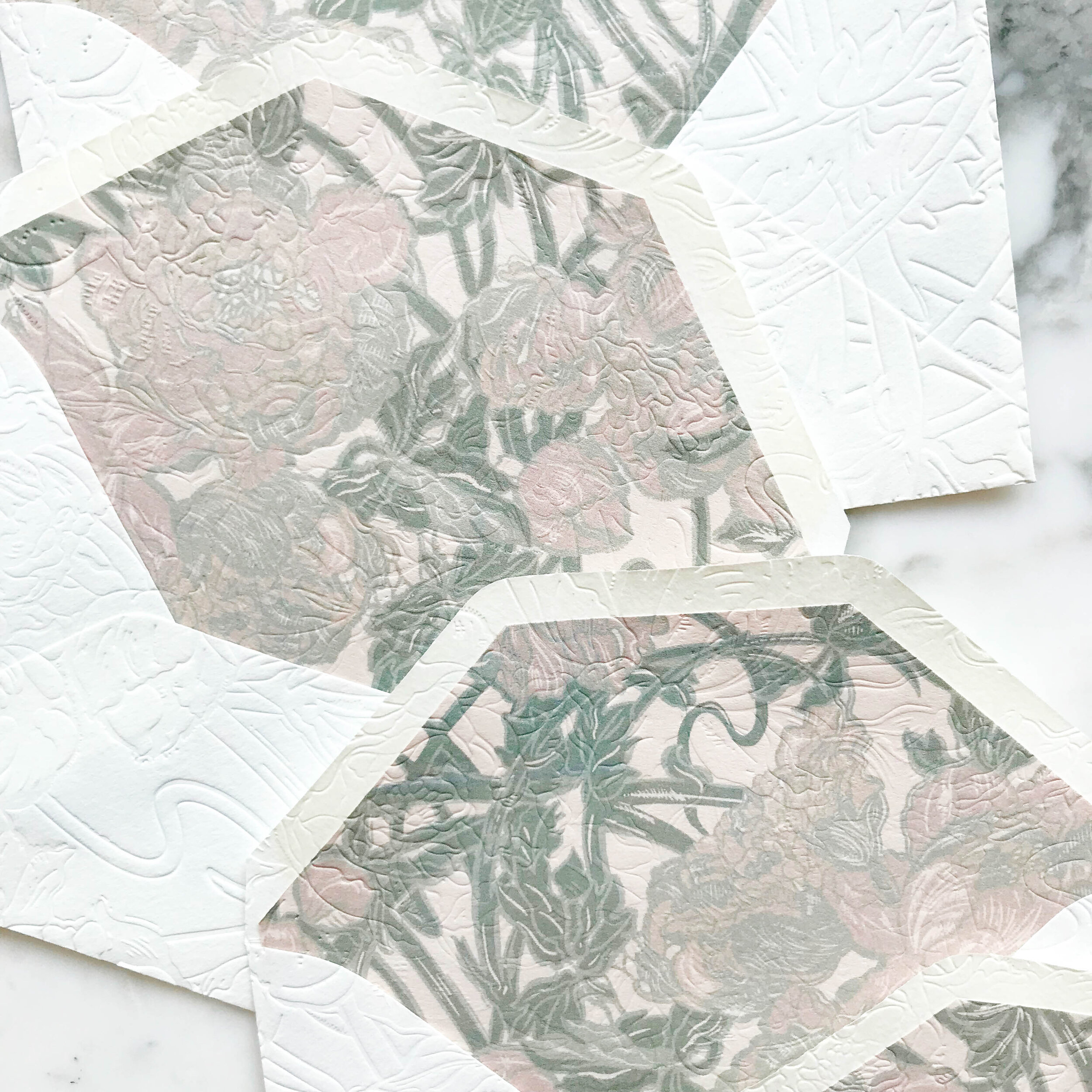
We wanted to bring in the graceful and soothing vibes of the Art Nouveau era with pale neutrals, smooth greens, and impressive overall texture. We selected artwork inspired by antique wall paper to start our design work. Working with the artwork and palette of nudes and greens, we developed our overall look and feel, a perfect fit for the gorgeous Philadelphia mansion of Glen Foerd.

The most striking element of the design is the texture. Each piece was embossed with a glorious overall texture for a pillowy and tactile feel.
My personal favorite piece of the suite are the reply envelopes. We embossed the envelopes after they were lined, so the liners as well as the fronts and back of the envelopes all had a contiguous embossed pattern.
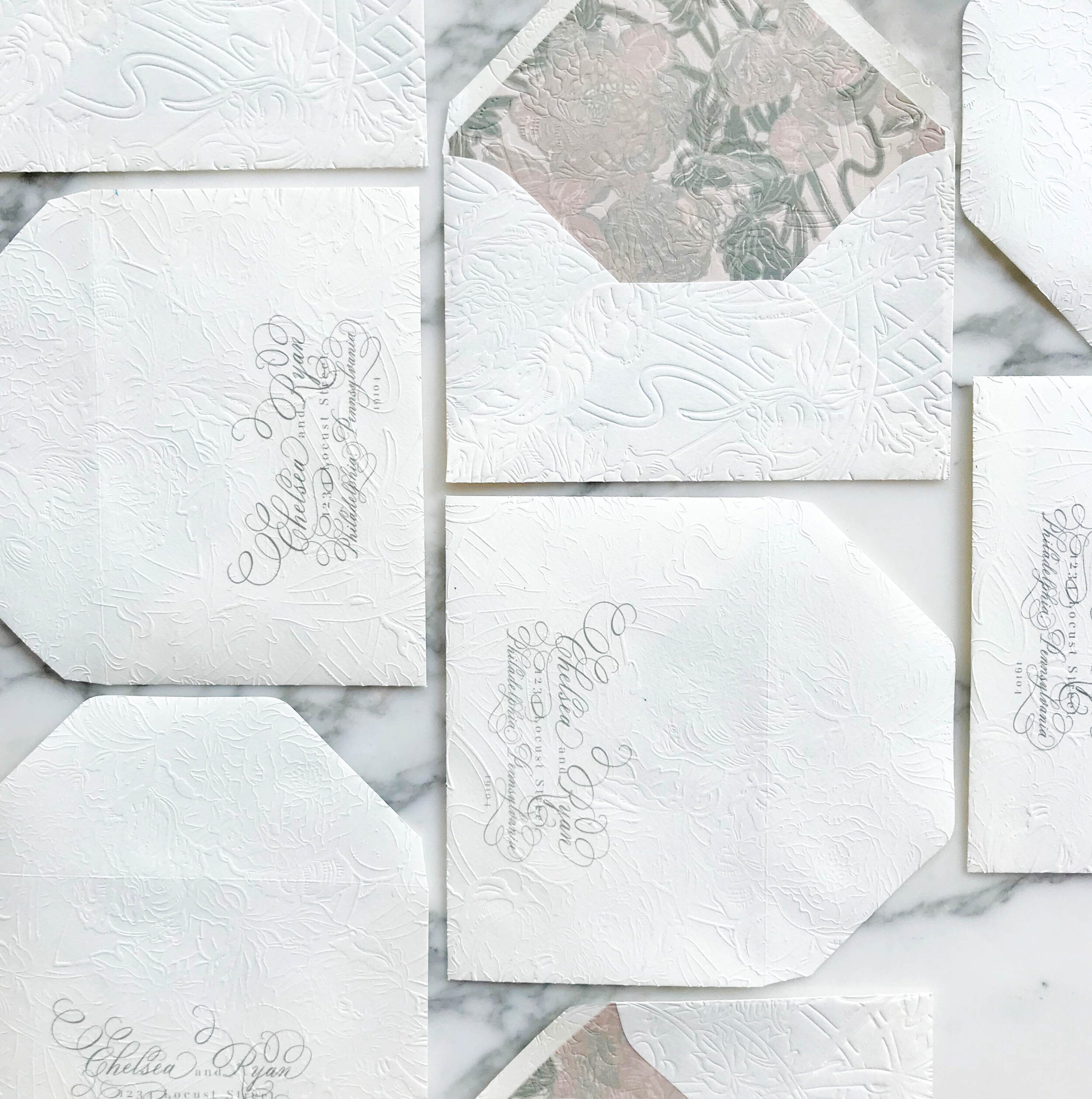
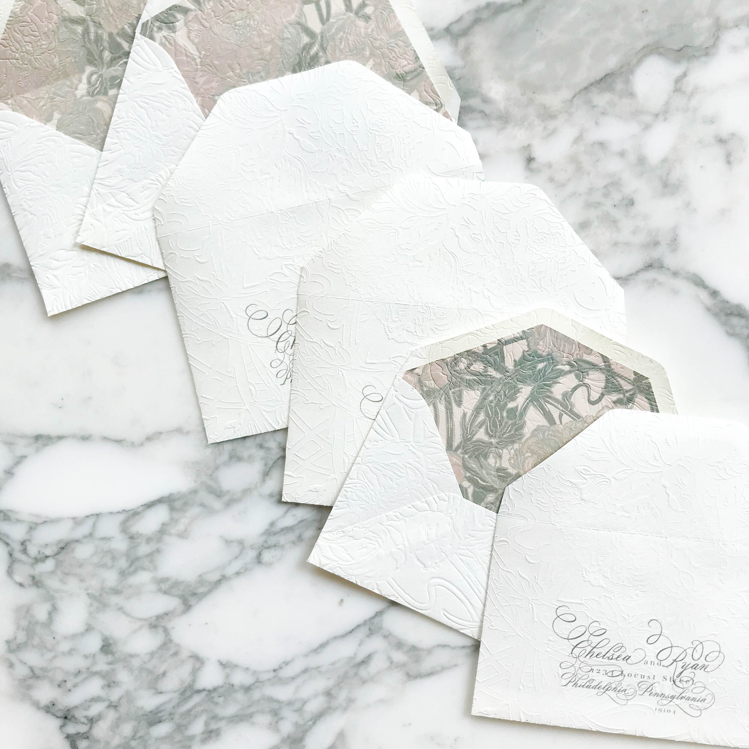

Like most of our projects, we combined several different paper types to come to our finished design. For this particular suite, we ended up with six different types of papers, including both machined and handmade.
The art nouveau design includes three handmade papers for the green reception card, reply card, and dress code tri-fold. The invitation consisted of two different machined papers, the first in a nude, then backed with a pale green. Our envelopes were both a gorgeous cream, and our envelopes liners were on the same rich nude as the invitations.
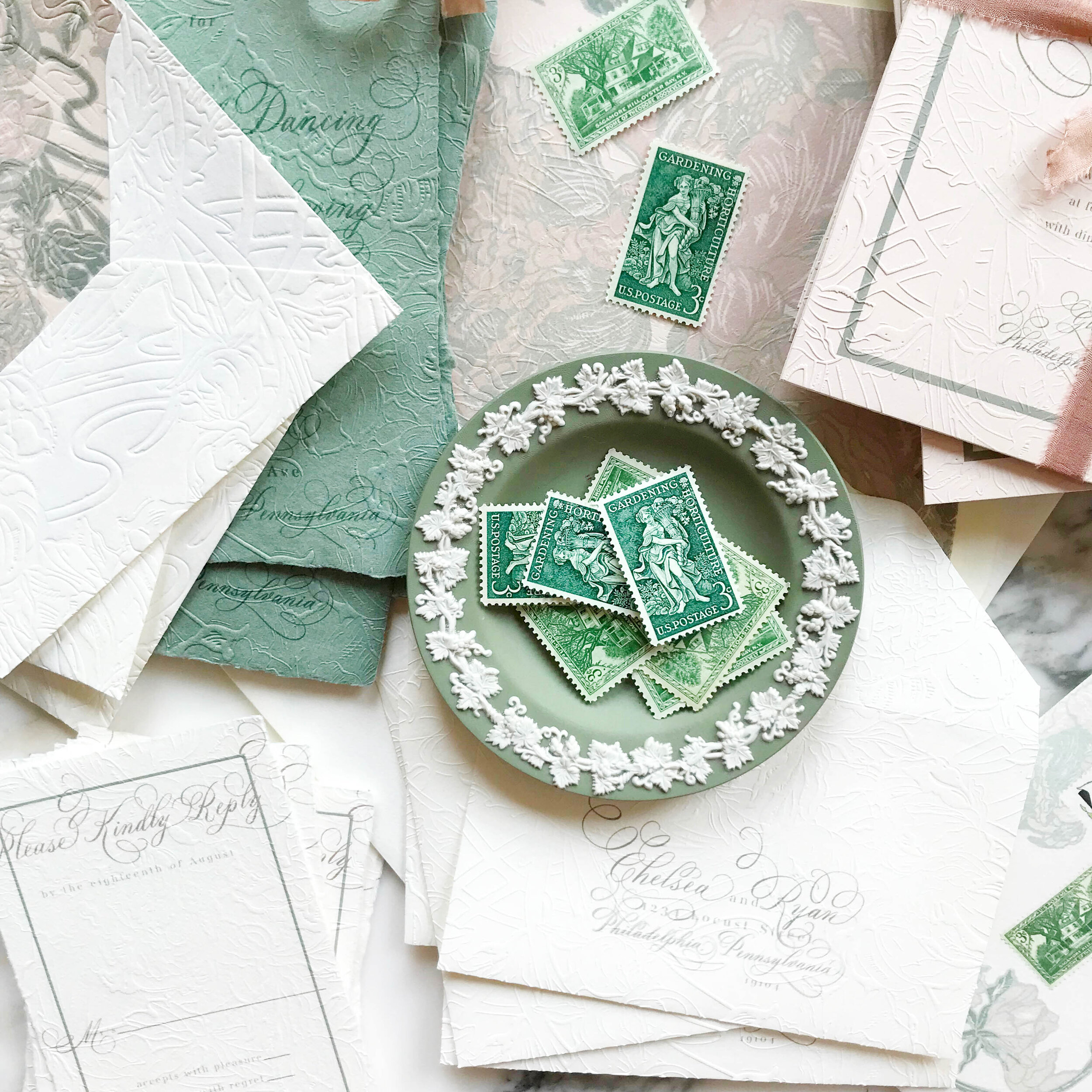
Our darling little tri-folded cards of handmade paper were sealed closed with a tiny wax seal in a taupe grey and embossed with the pattern showing on both sides.


How to Combine Classic & Modern
How do you combine two totally opposing design ideas? We’ll show you…

classic | elegant | gold | clean lines | monochromatic | bold
an invitation suite for a wedding at:
New York Public Library | New York, New York
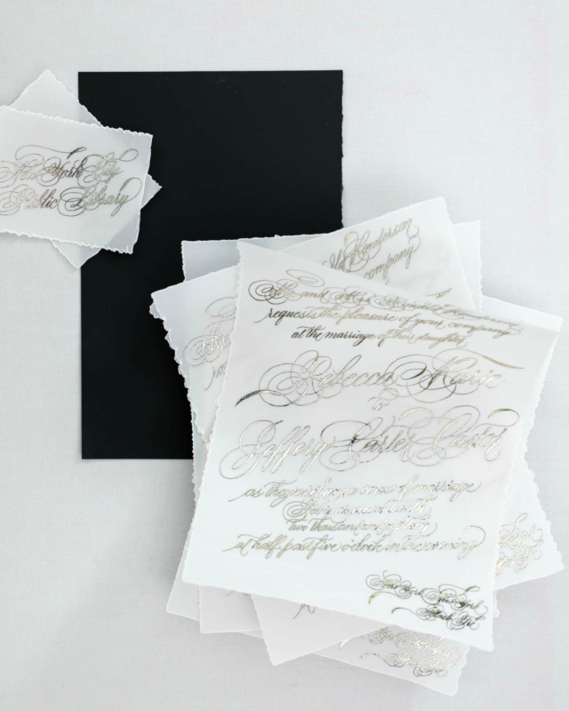
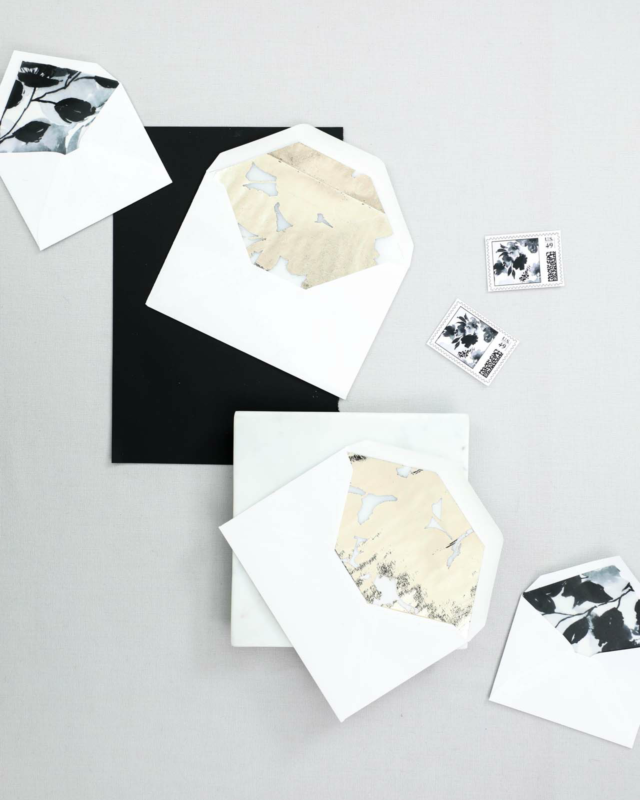
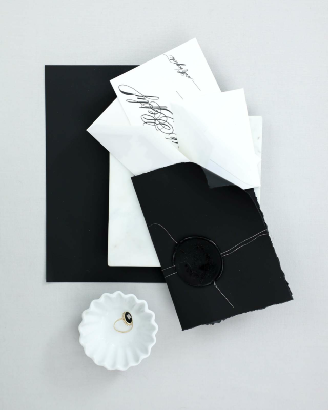
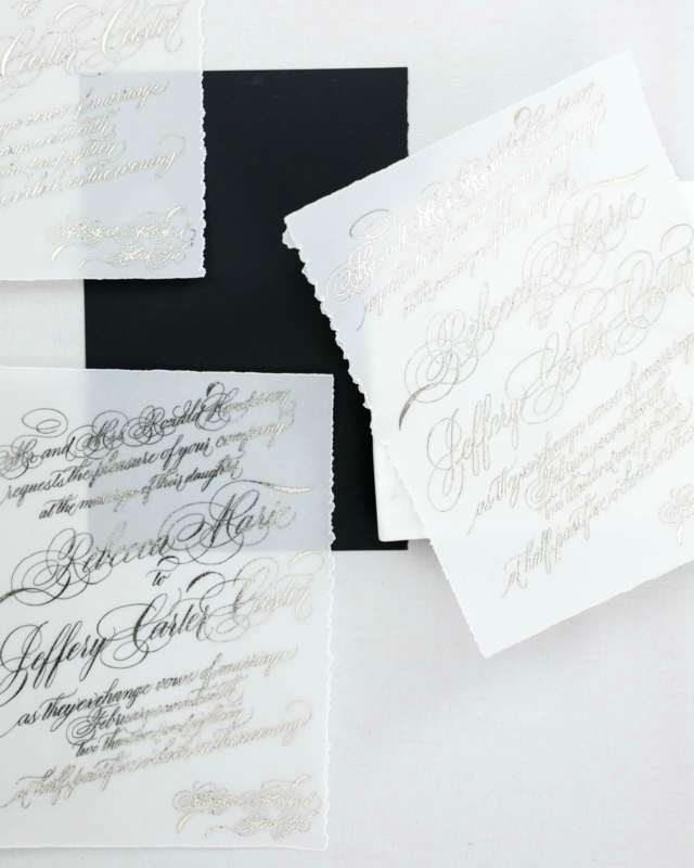
For a wedding at the New York Public Library, our bride wanted to figure out how to combine super traditional, flourished calligraphy (her favorite!) but with more modern lines and a bit of gold.


We started with our paper selection.
We went with a bold, bright white cotton, a silky smooth black, and thick vellum with deckled edges. The bold white gave us a modern feel while balancing out the over-the-top calligraphy.
We also selected an oversized wax seal in black, again, aiming to combine the traditional and modern.
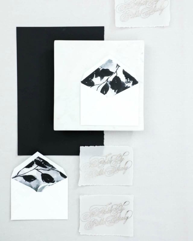
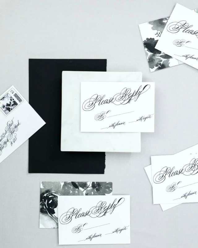
We used a combination of printing methods, including digital printing for our bold monochromatic patterns, and foil for the invitation, reply card envelope liners, and mini insert cards.
We placed the bold black and white floral pattern on both the backs of our insert cards as well as the envelope liners on our mini bright white envelopes.
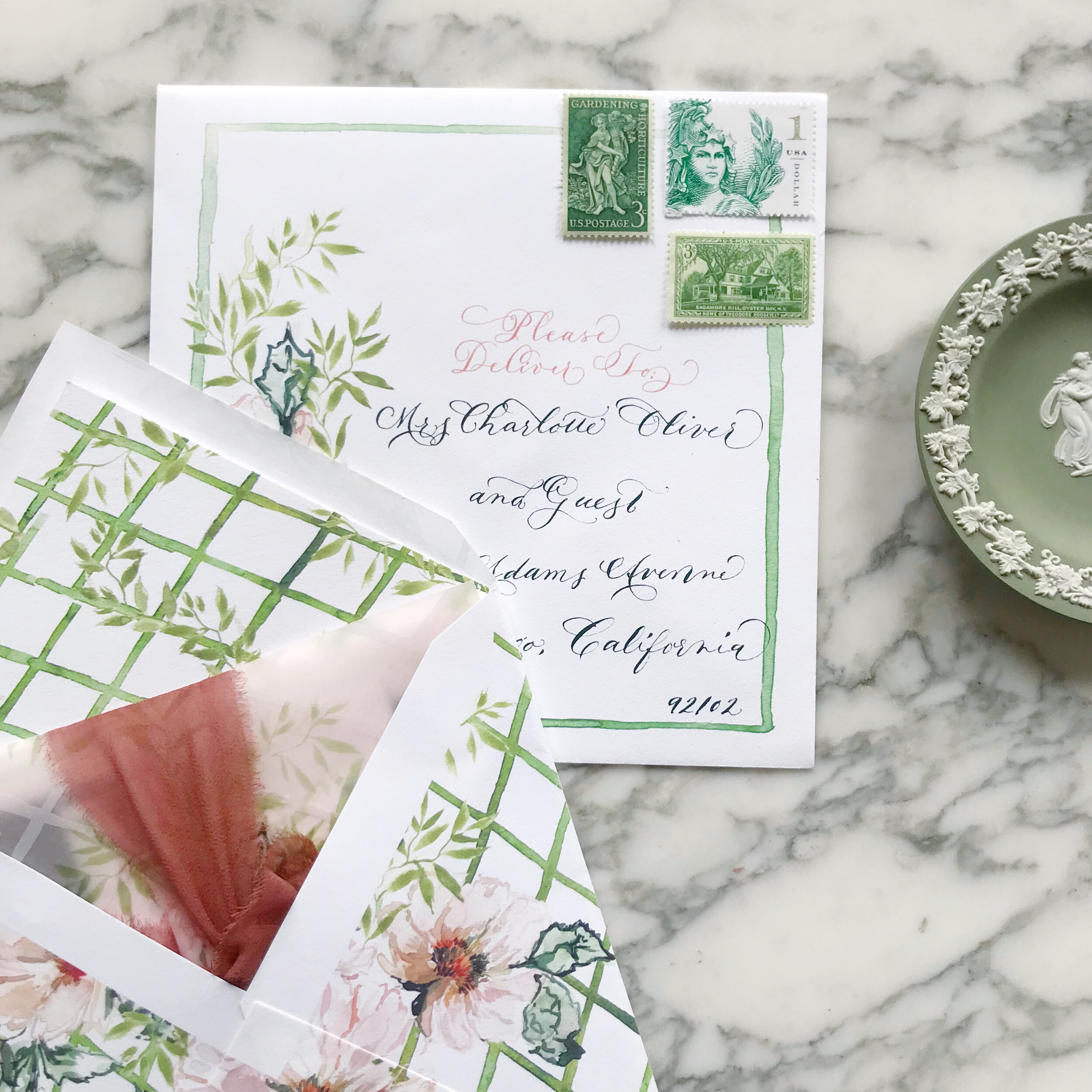
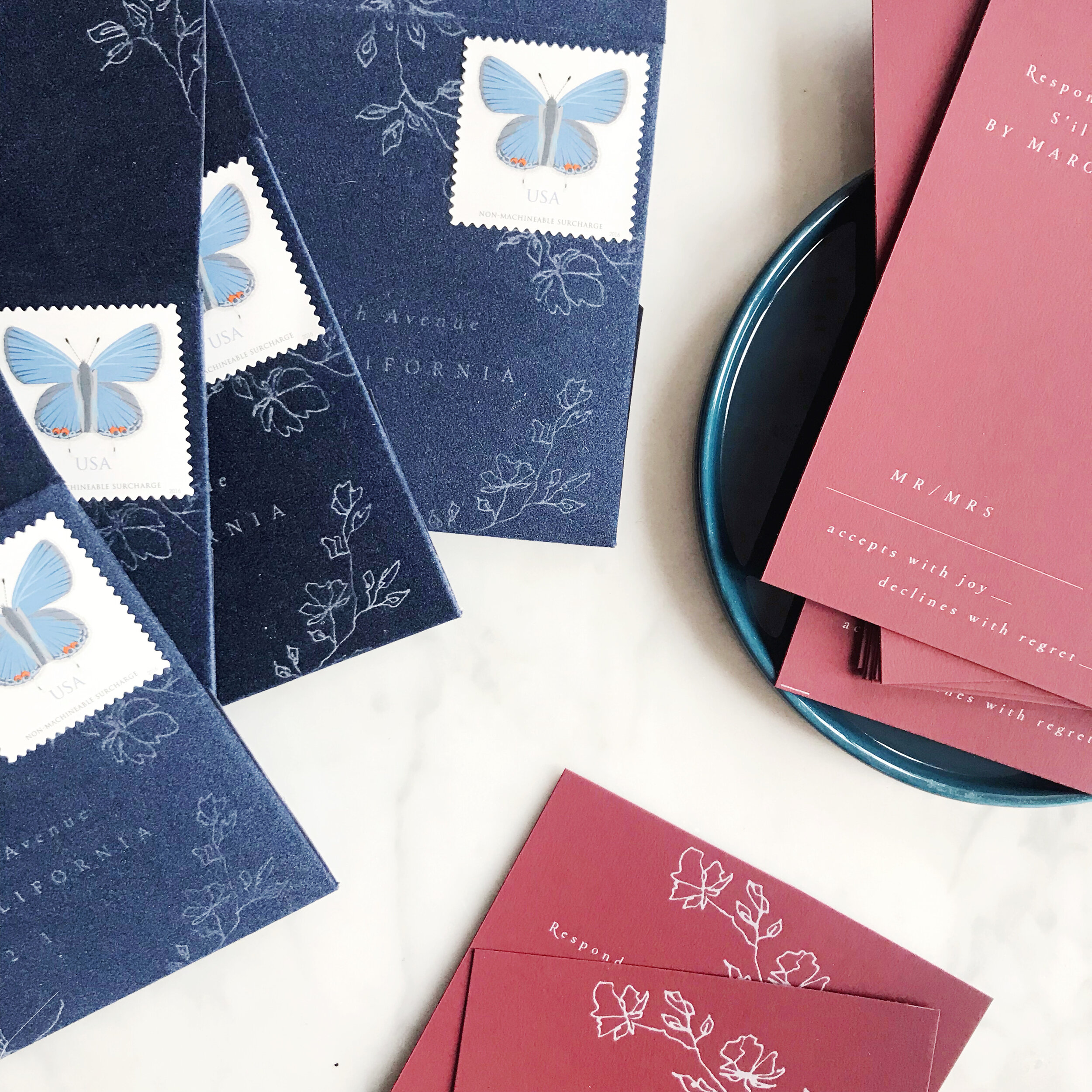
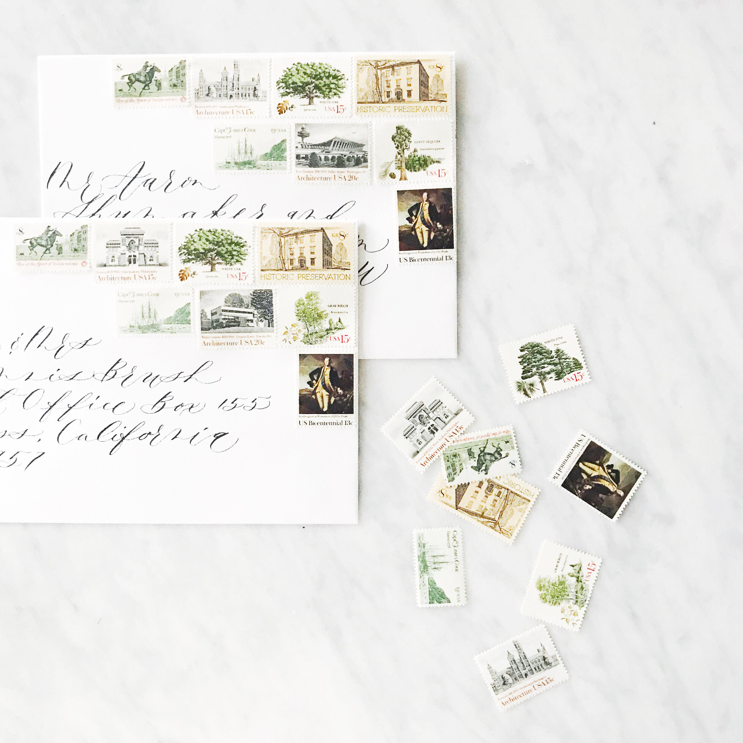
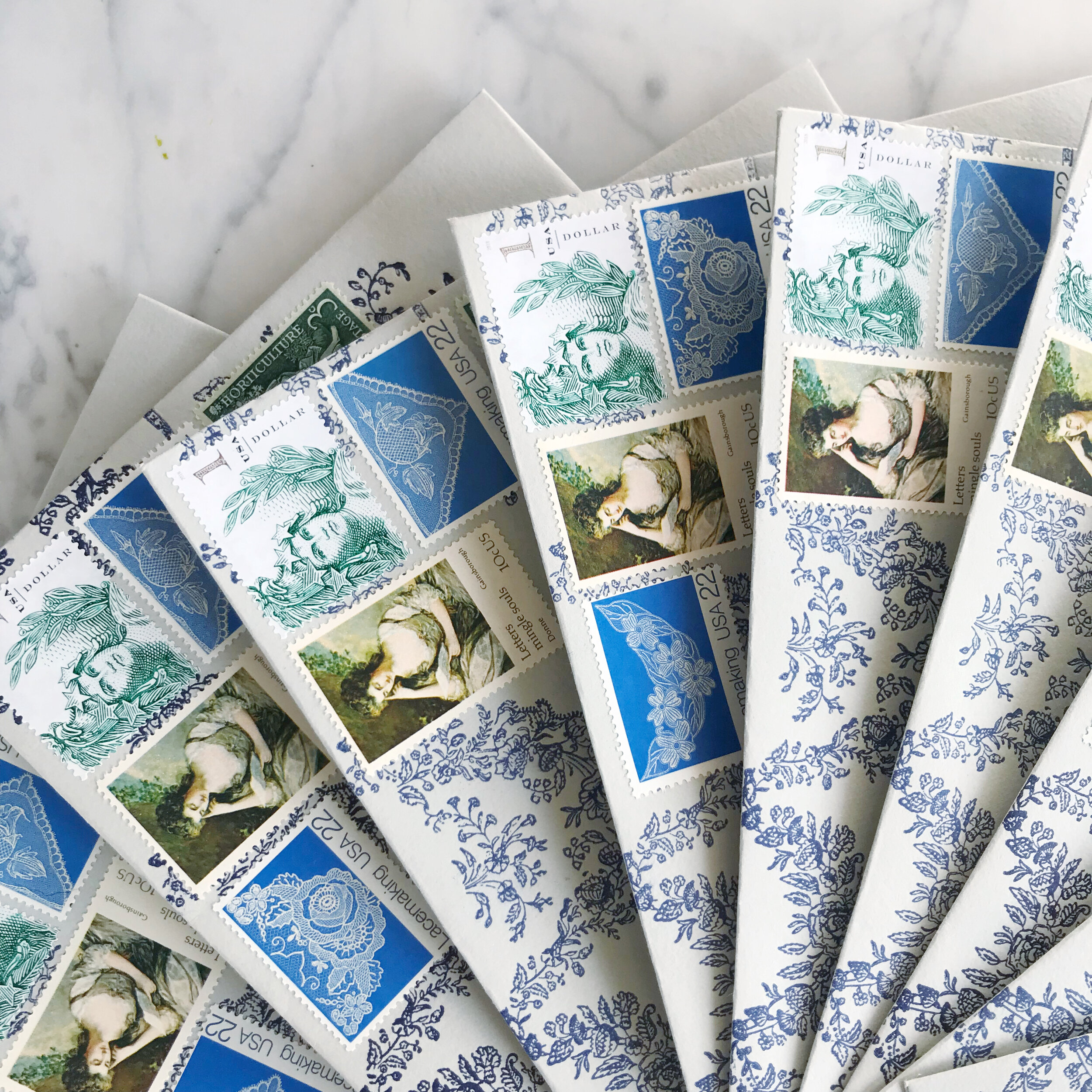
Postage - Curating with Current USPS Issued Postage
When we think of curated postage, we typically think of a collection of vintage stamps, but I’d like to challenge that idea.
While I love working with vintage postage, I actually have found that I prefer mixing current issue and vintage together. It’s a great way of ensuring that you’ll have enough postage to get your invitations to your guests without requiring a ton of stamps.

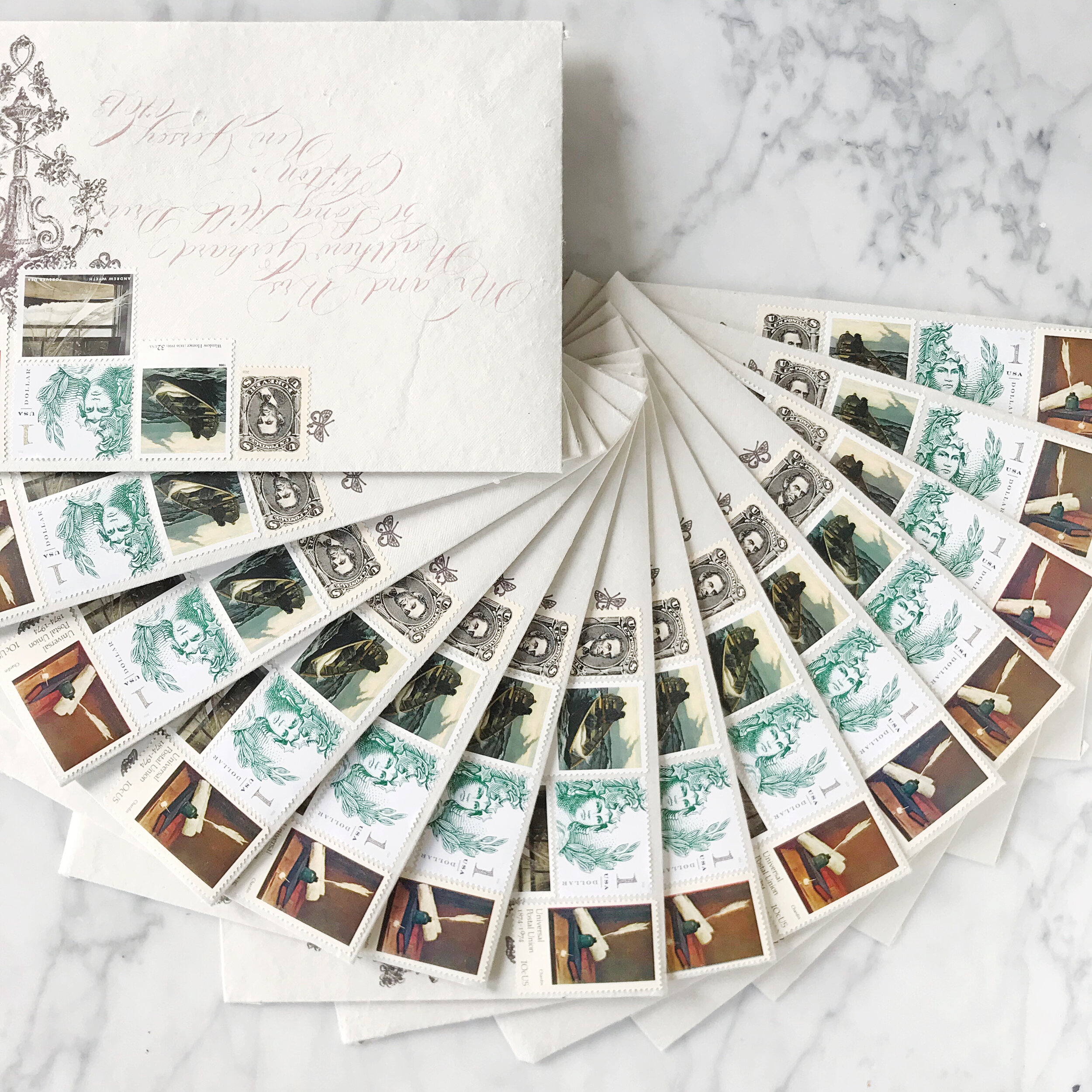
By selecting current issue with discretion, we’re able to select stamps that blend in seamlessly with a collection of vintage stamps. I love this option to bring up our denomination while still maintaining the overall look and feel of vintage.
Can you spot which stamps are vintage and which are current issue?


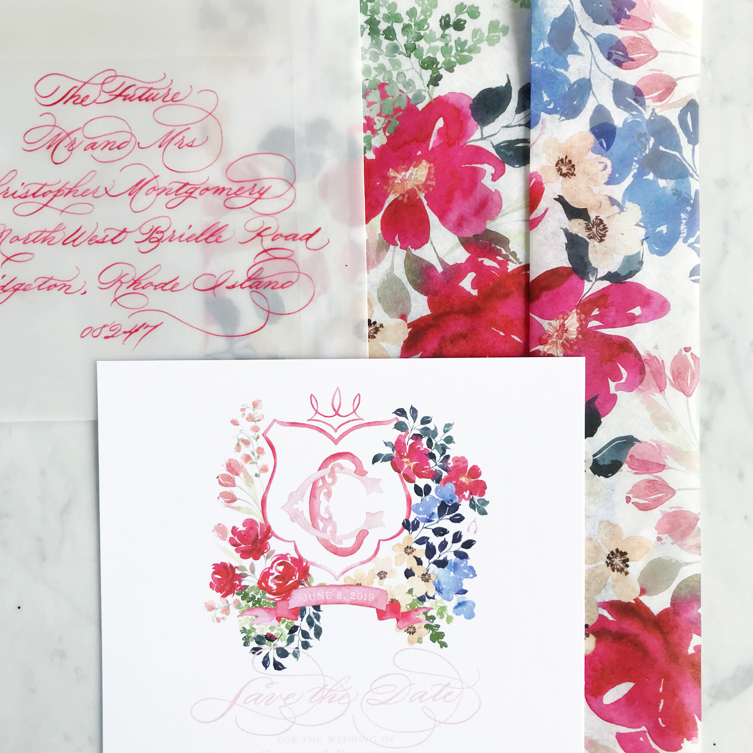
Spring Rose Garden Invitation Suite Reveal
See our spring rose garden wedding invitation suite in action as we unveil it on our YouTube Channel!
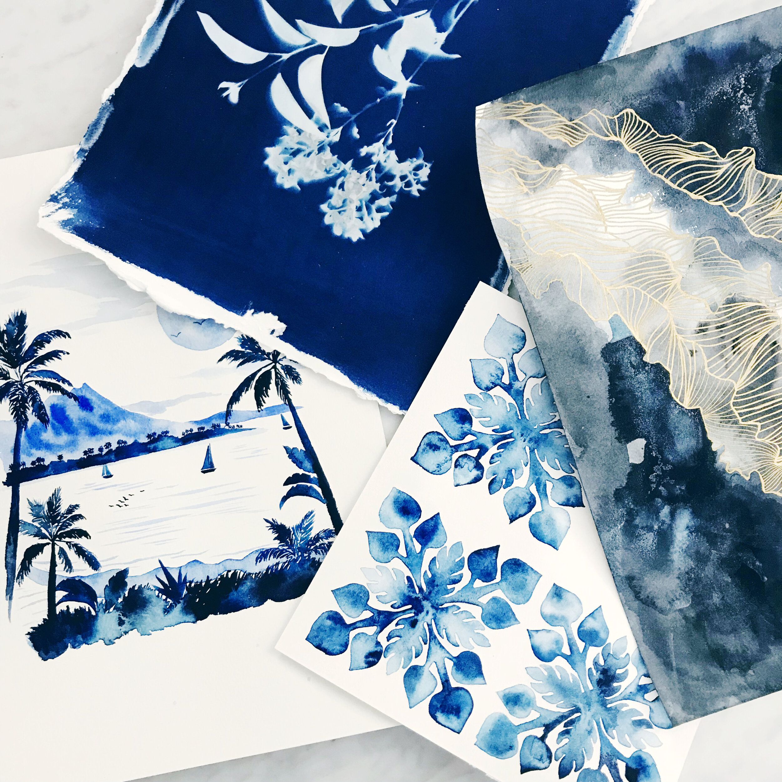
Roses and forget-me-nots were the focal point for this spring wedding invitation suite. I loved the pairing of white ink on blue pops of some more modern interest.

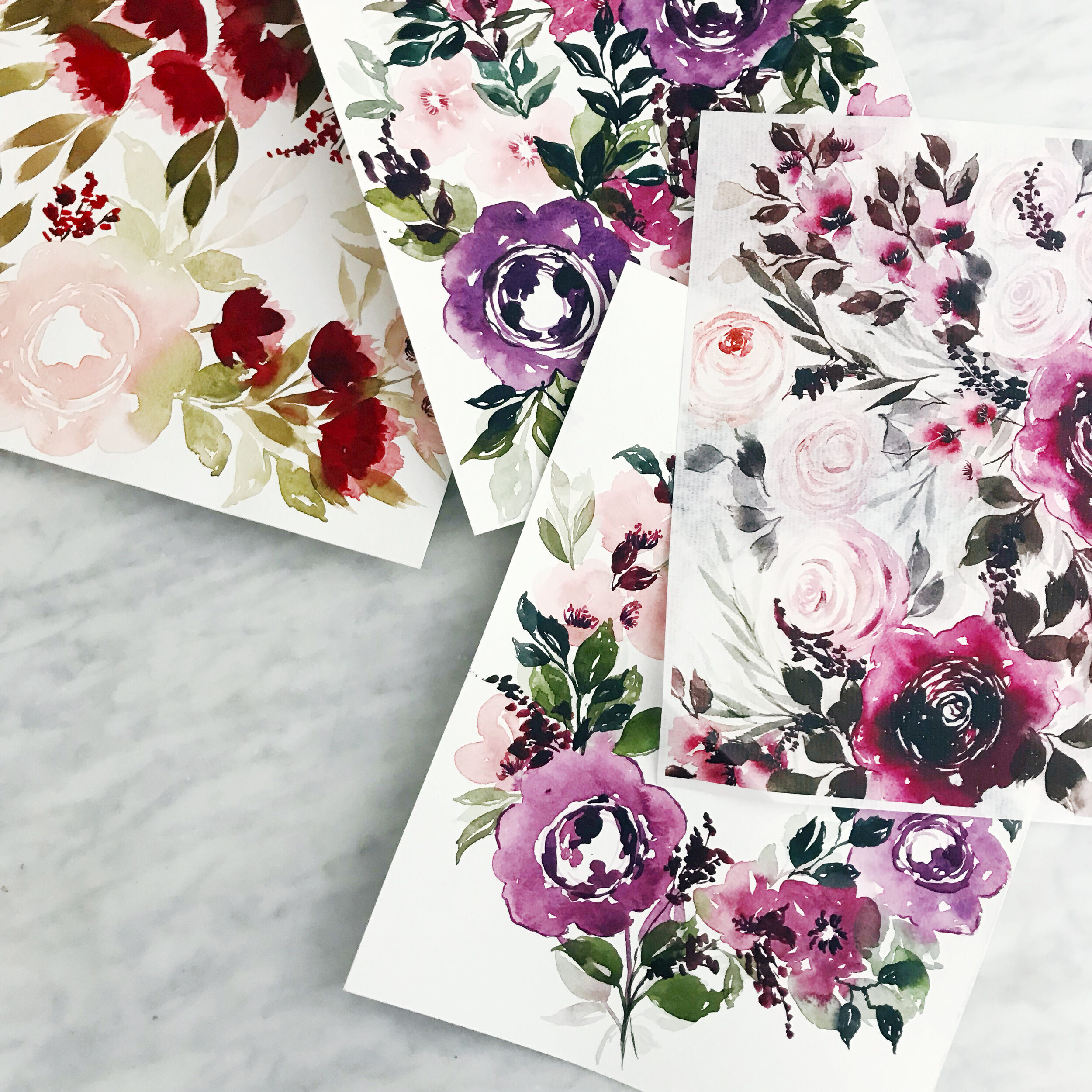
Moody Velvet Fall Watercolor Wedding Invitations
Moody Fall at Filoli Gardens
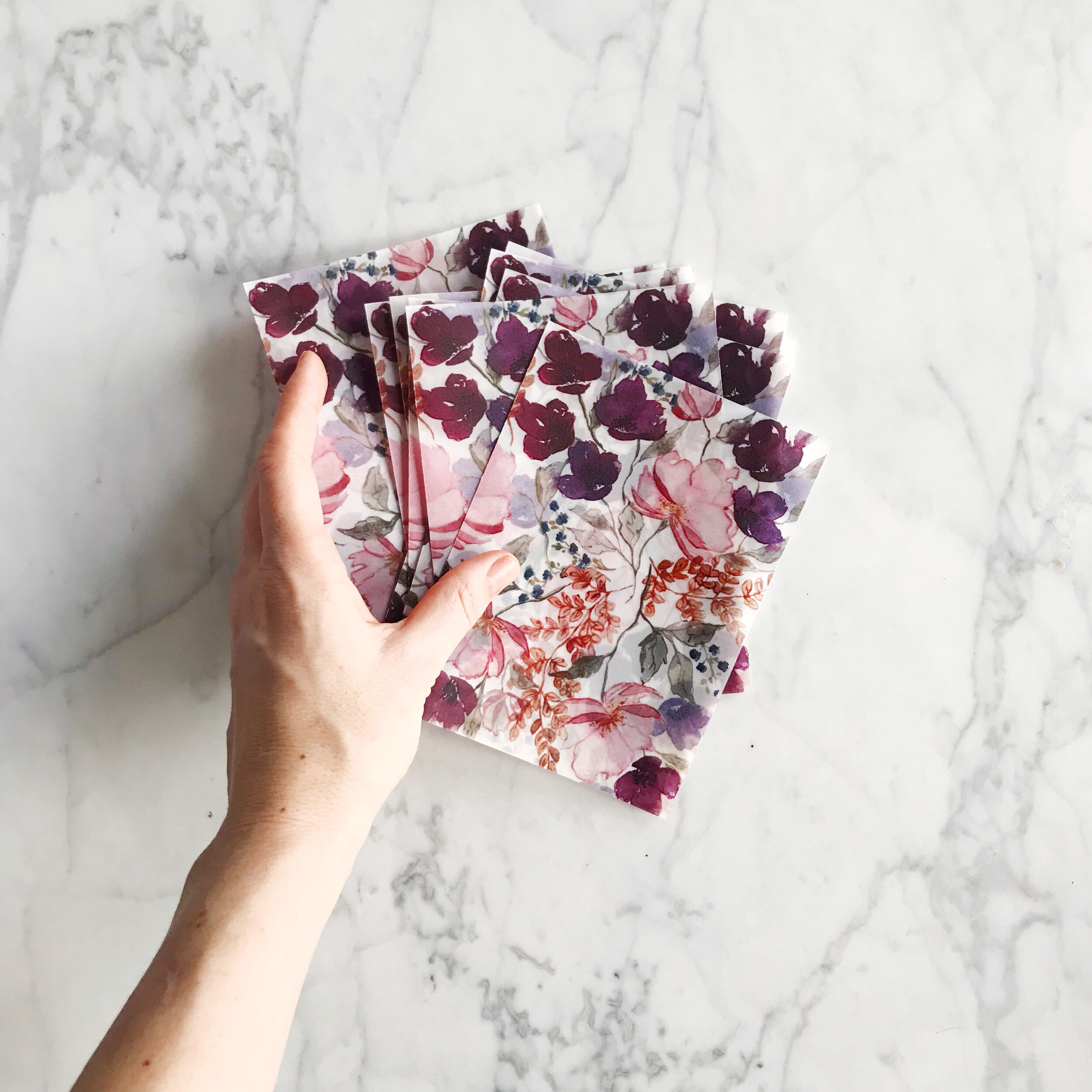
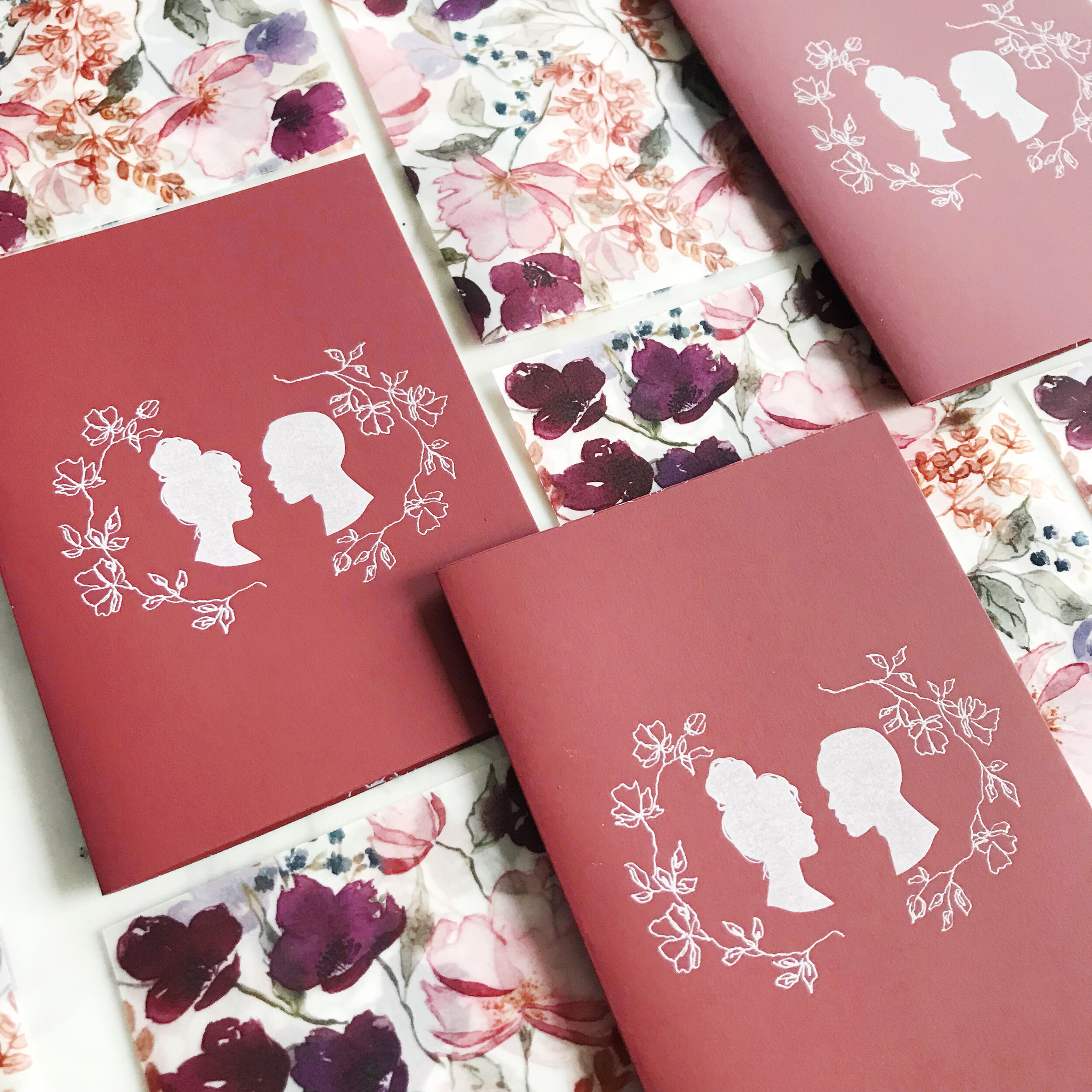
A color palette focusing on rich tones of burgundies, golds, deep blues, and ochres started us on our design path with Natalie and Ammar’s suite. The truly remarkable venue with a historic brick mansion, tulip fields, apple orchards, and rose gardens was the perfect setting for a modern take on an old-world wedding.

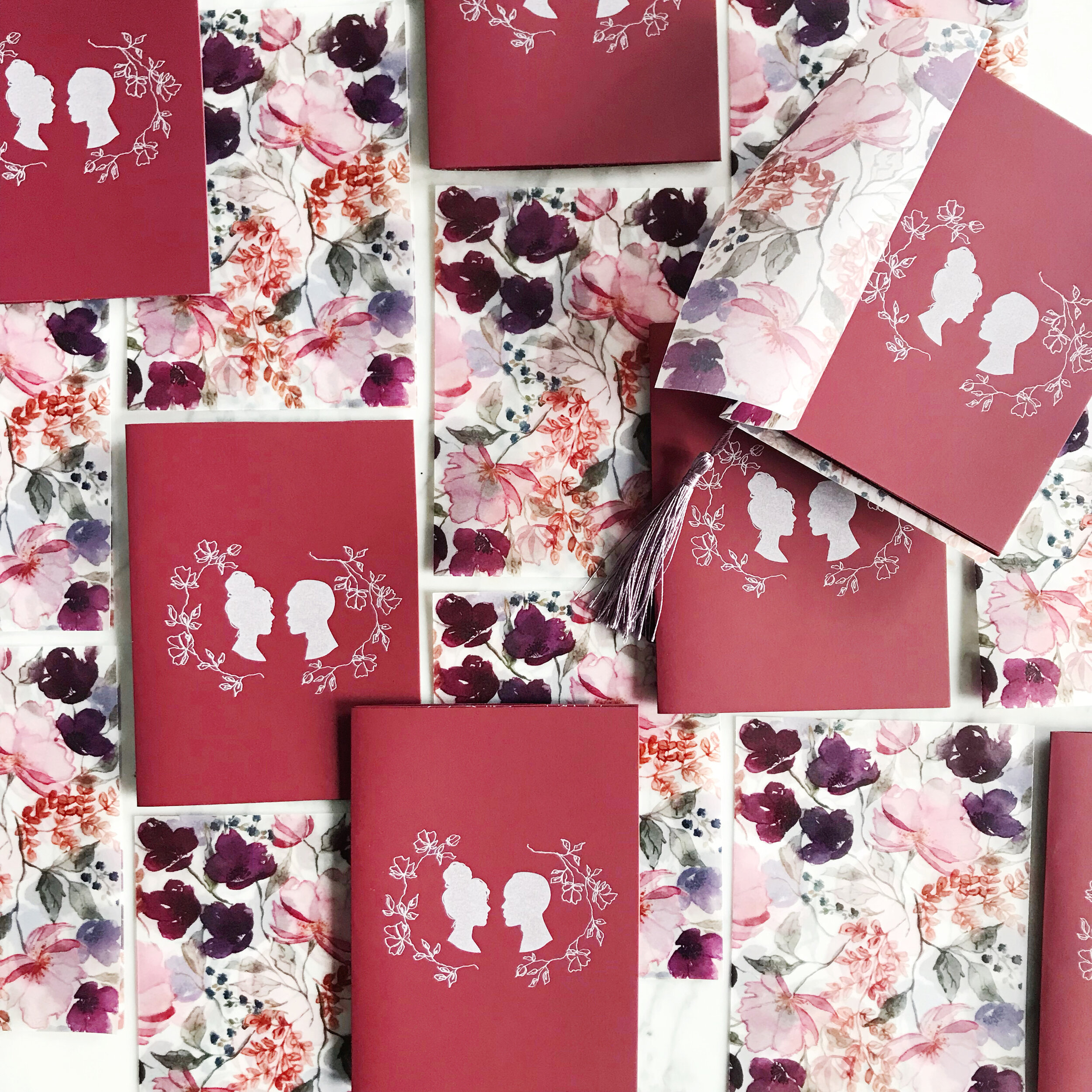
Bold and deep colors, mixed in with pale roses and deep-hued papers bright this suite together. We began with a moody watercolor pattern, incorporated a simpler line botanical, and mixed in the bride and groom’s silhouettes.
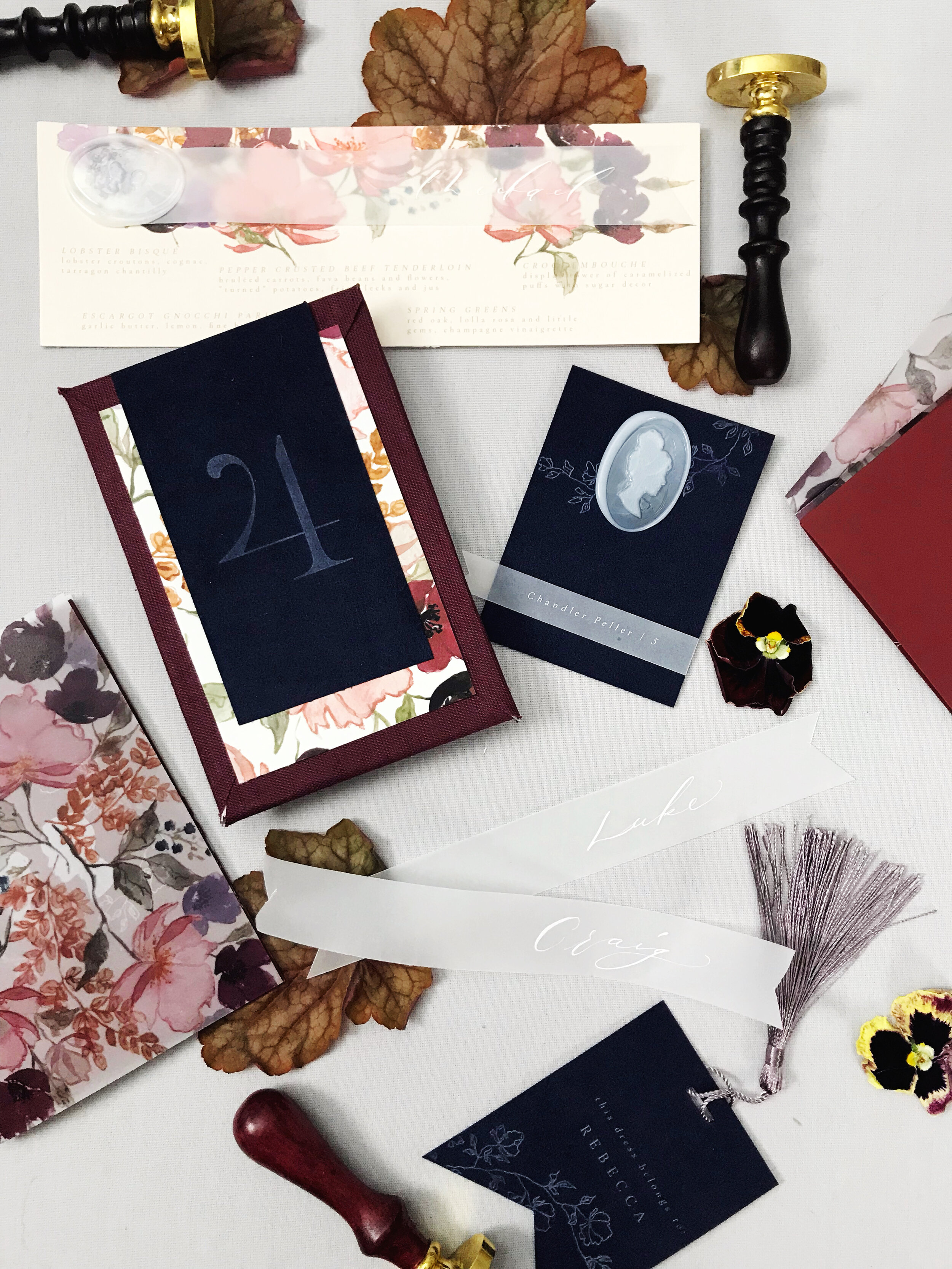
The bride wanted her suite to feel like guests were opening a book into their love story, which was the perfect jumping-off point for a bound invitation suite.

Each guest received a custom made burgundy linen-bound book with the couple’s silhouette on the cover in a custom wax seal. The inside of each linen-bound book was lined in the pattern we created for them and held their invitations with brass corner mounts. The invitation itself was printed on leather paper with a glorious texture. We also incorporated individual wax seals of each of the bride and groom’s silhouettes into the invitation design.
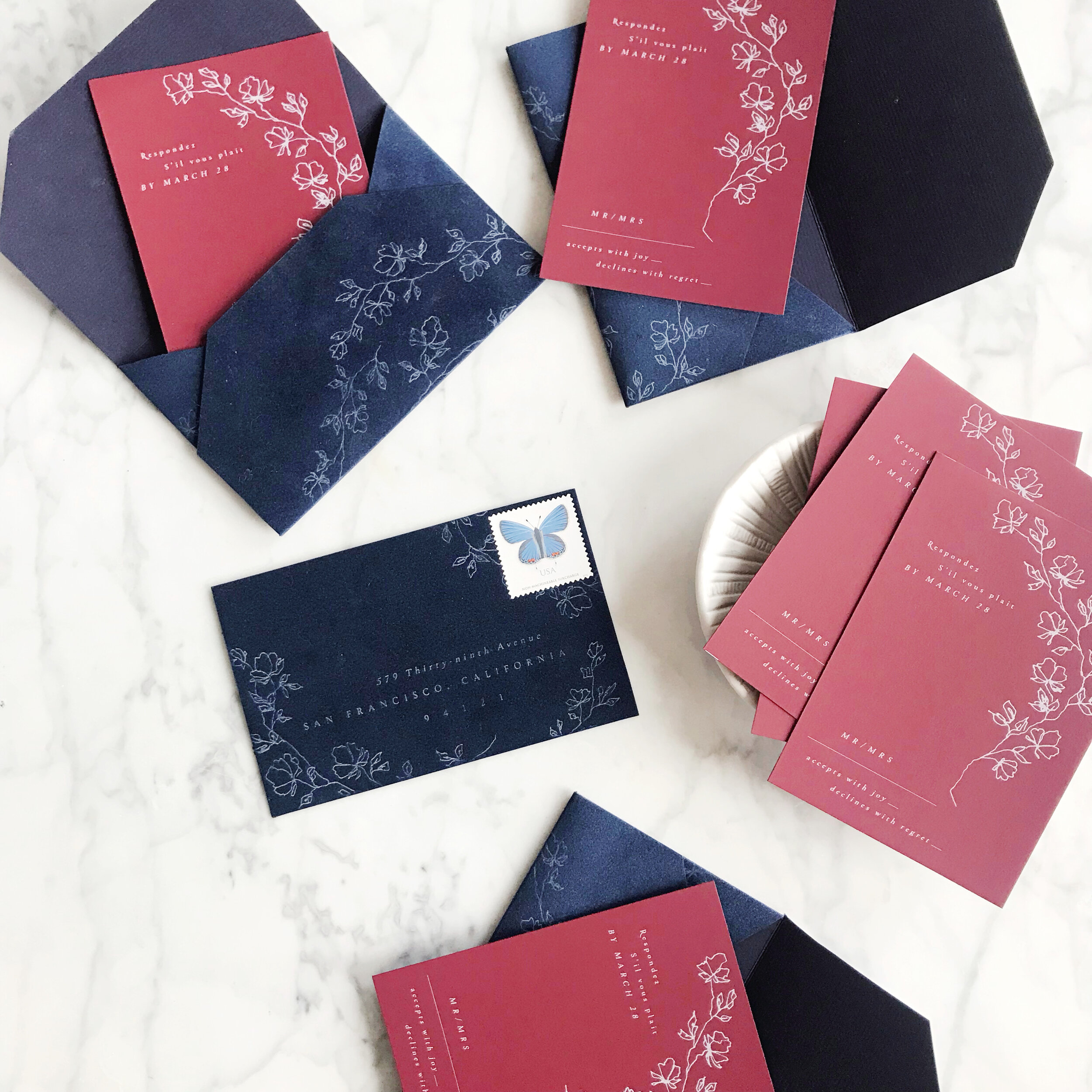
Our custom made reply envelopes of deep blue velvet had the climbing rose line botanicals tumbling off the velvet. We went with bold white printing on burgundy paper for the reply cards.


Our additional insert cards, including a hotel information card, reception card, and brunch card, were printed on pale blush, rust, and blue velvet reflecting the artwork and florals used throughout the suite.

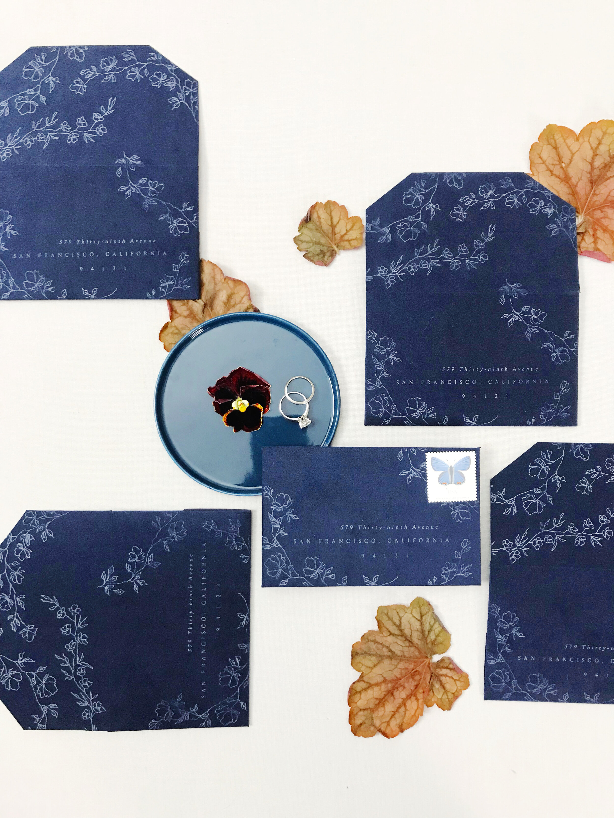
Let’s talk envelopes! Since the linen bound folio we created was fairly thick, we had custom made envelopes printed to accomodate the size we needed.
Each envelope was printed on the inside with the same artwork we used throughout the suite, with additional artwork details on the front and wrapping around the edges of the envelope.

Moody Velvet Fall Watercolor Wedding - Reception Pieces
Moody Fall at Filoli Gardens
We brought the same moody fall colors through to the reception pieces, including deep burgundies, blue velvet, patterned vellum, and gracefully watercolor florals.

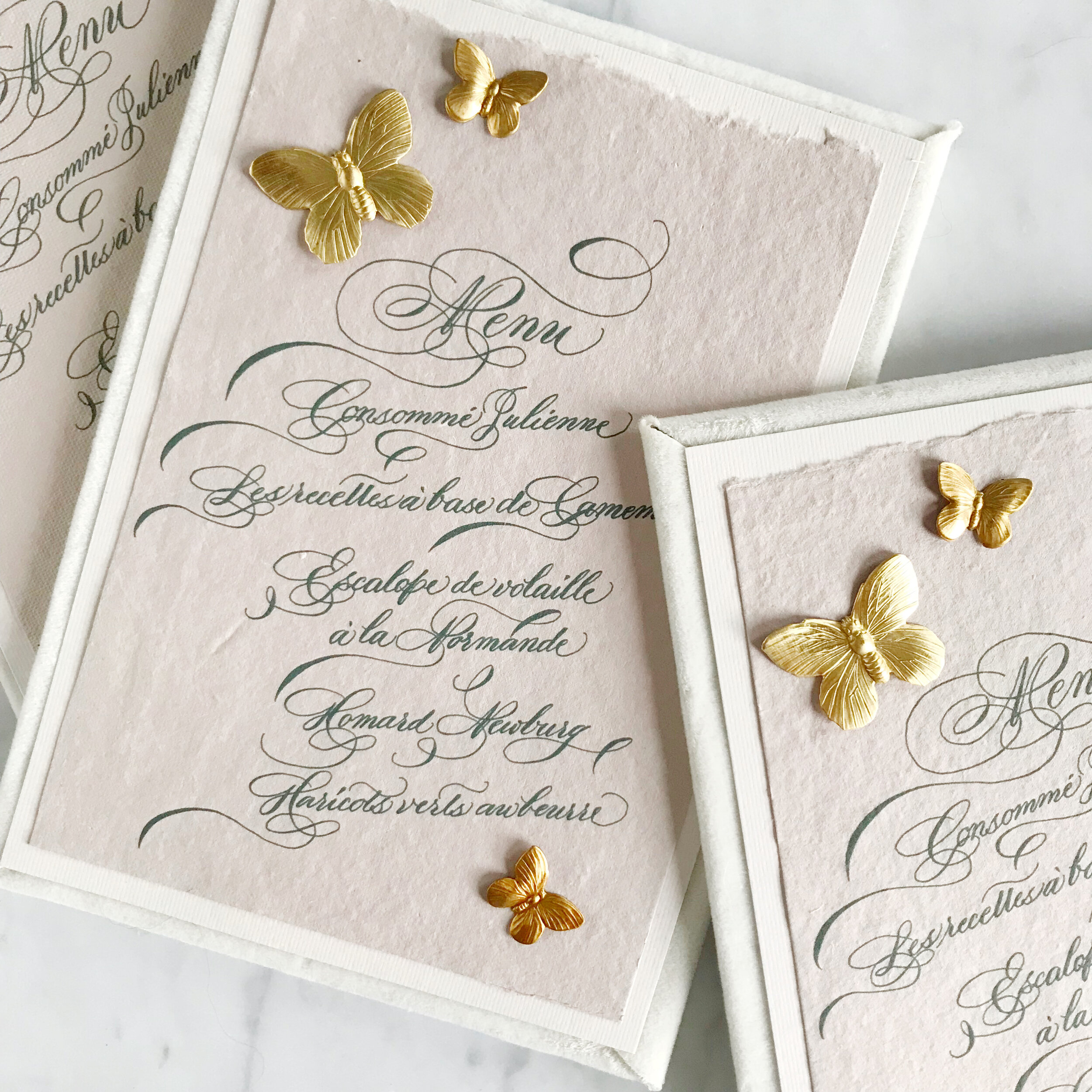
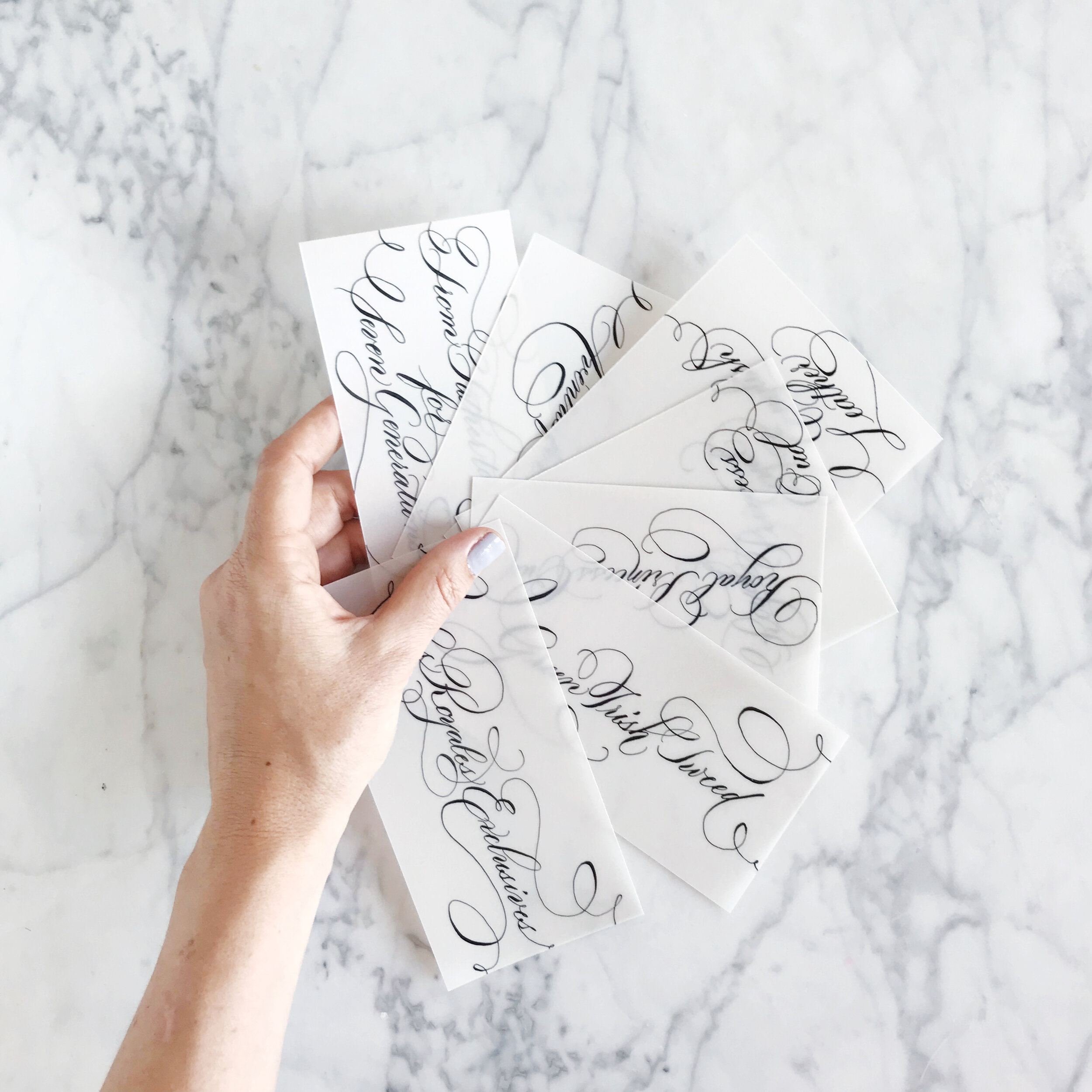
We continued the use of the bride and groom’s silhouette wax seals for the escort cards and menus, layering vellum over blue velvet and printed artwork.
Our table numbers featured a pressed and white printed number on blue velvet, layered with artwork from the invitation suite and mounted on the same burgundy linen used in the invitation booklet.

Each of the blue velvet escort cards were printed with white climbing rose vines in varying positions with the wax seal details. Each guest’s name was printed in white on vellum and fixed to the bottom of each card.
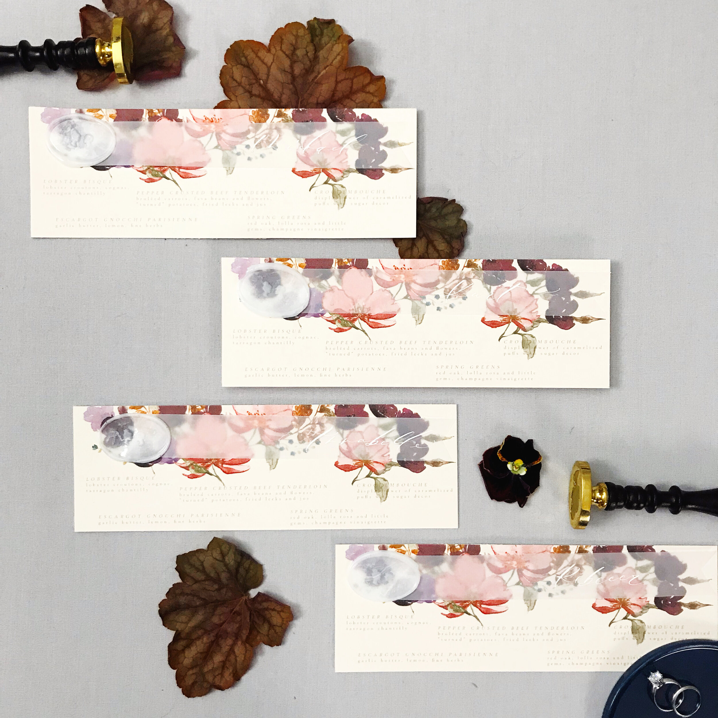
Our menus layered pale pink papers and vellum layers personalized with each guest’s name and affixed with a wax seal.

Our ceremony programs layered vellum artwork covers with burgundy inside pages and were bound with a pale purple tassel.
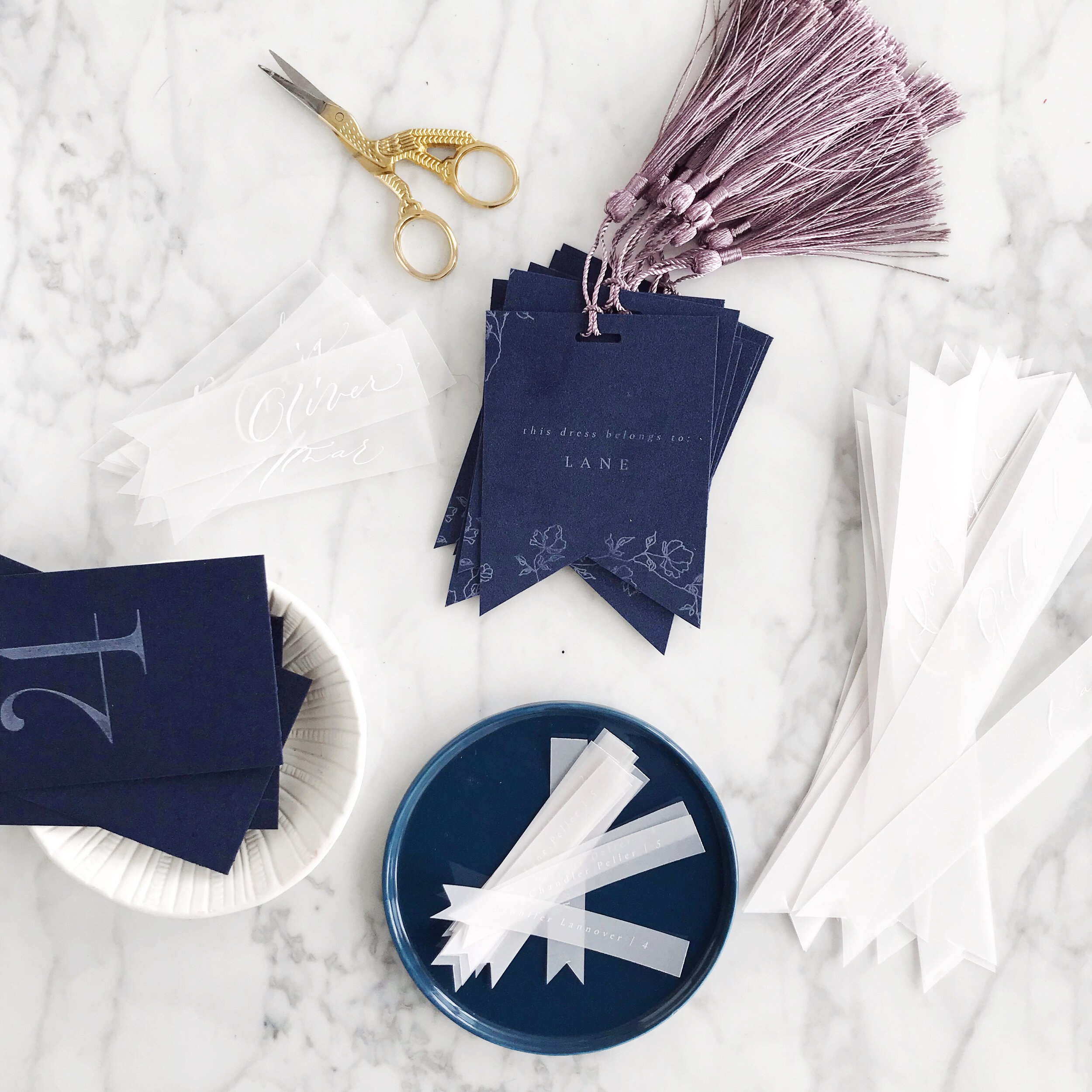

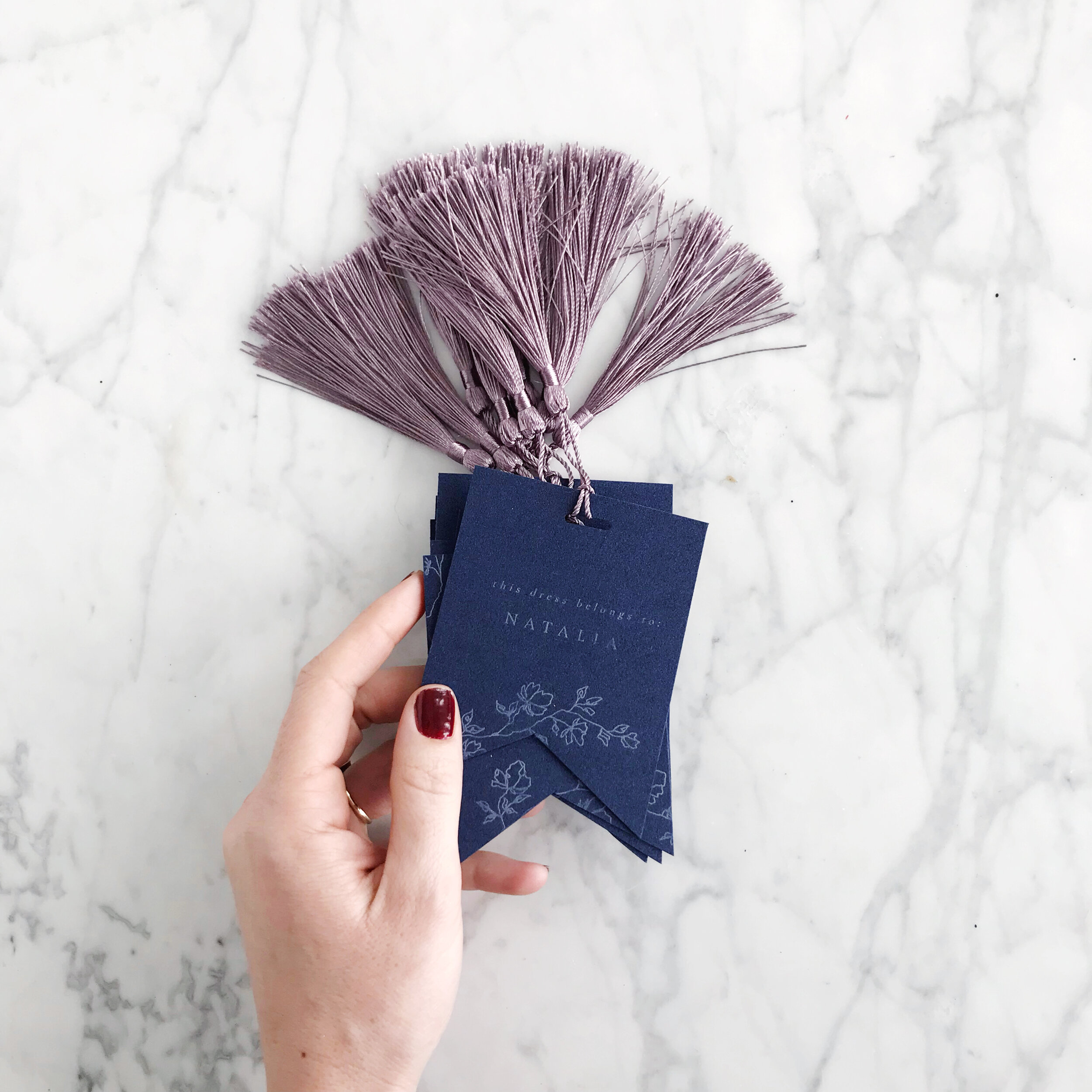
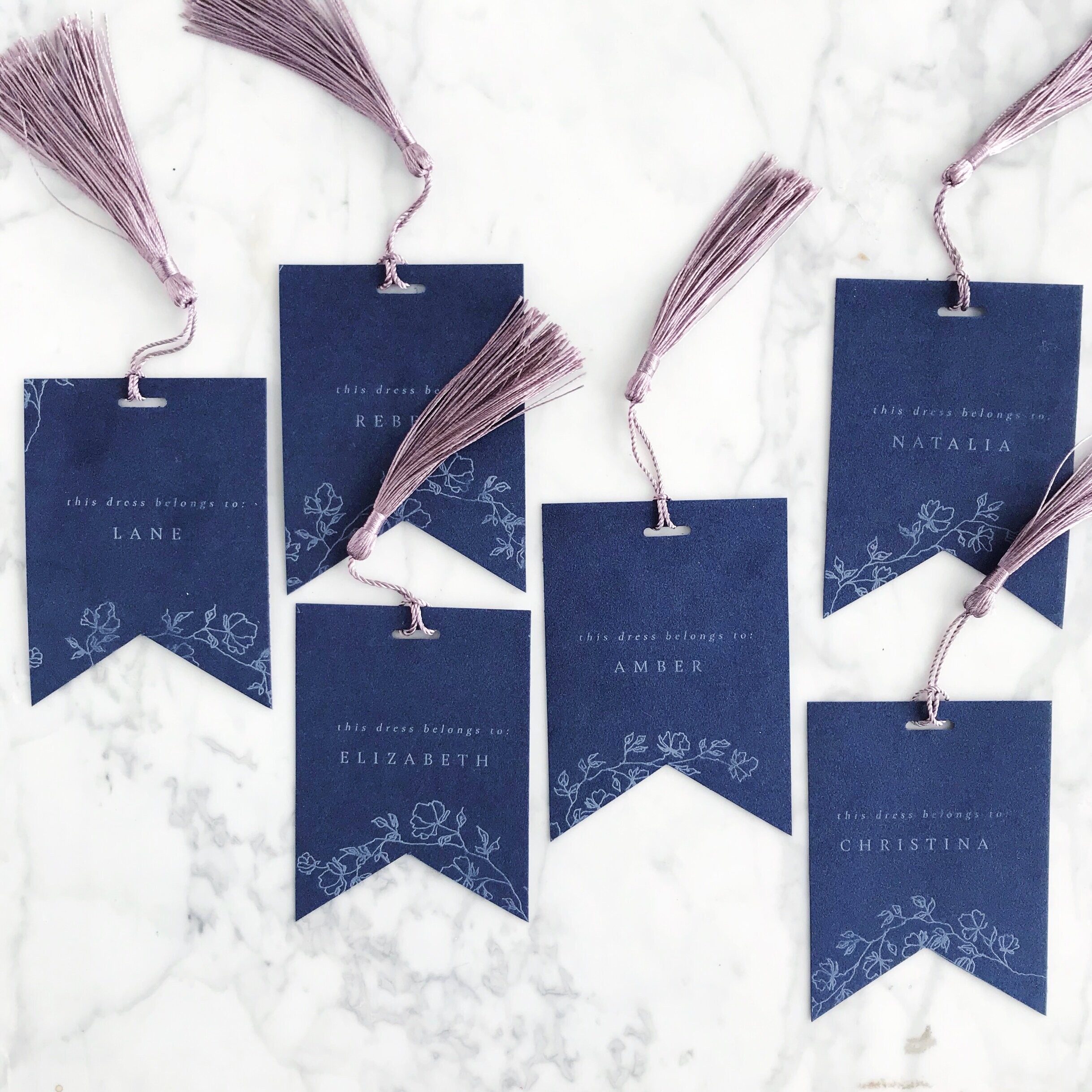
Another small detail that we love to add are dress tags and boutonniere tags for the bridal party. Each of these tags hung on the hangers of each bridesmaids dress noting which dress belonged to which girl and were a lovely little keepsake from the day.
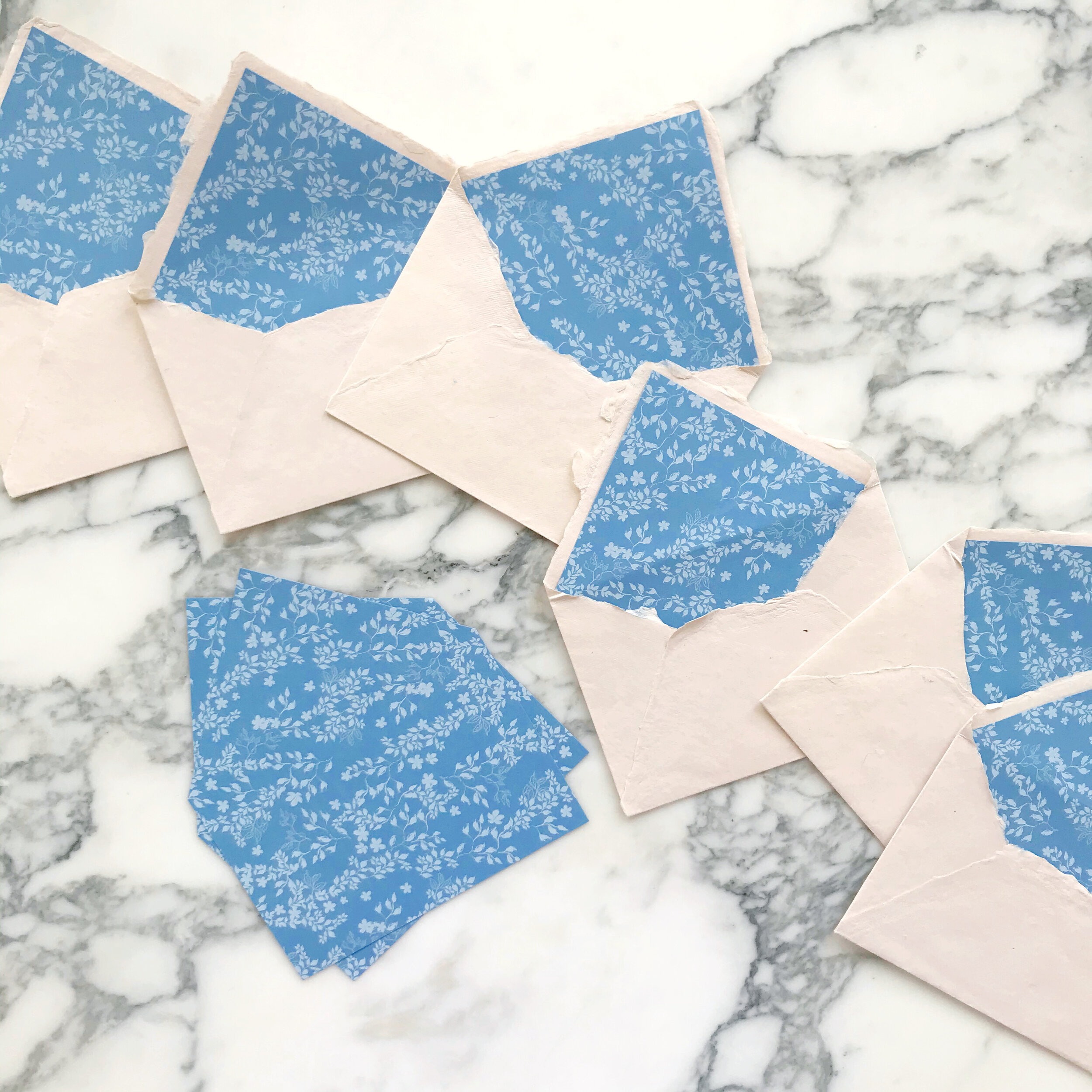
Custom Envelope Liners
Envelope liners are a gorgeous way to add more details to your wedding invitation suite! I personally love using the liners and a vellum overlay to bring in a pattern for a bold statement of your overall aesthetic.
Envelope liners are essentially just one more place you can customize your wedding invitations. I love an unexpected punch of color or pattern, and envelopes just feel terribly naked to me without them.
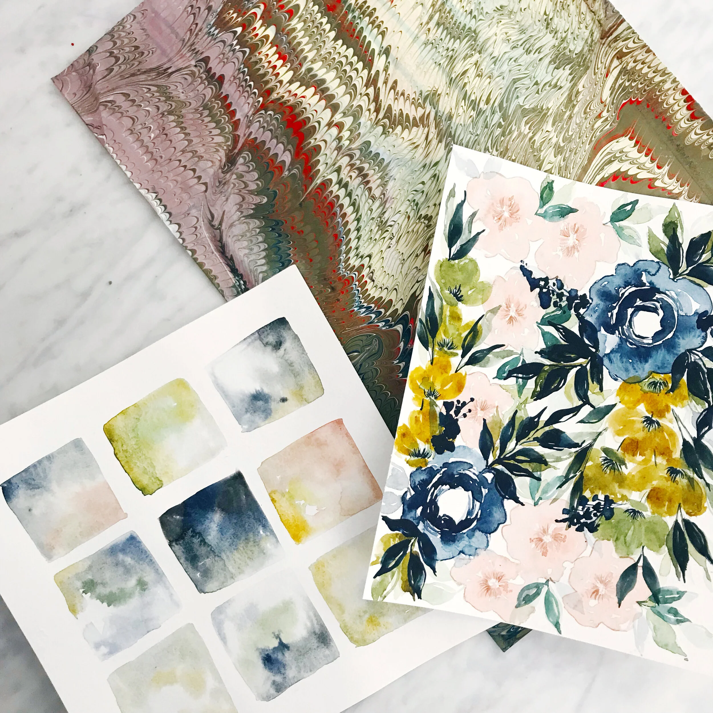
The three liners shown above include a pattern based on Delft blue vases, with watery deep indigo blue artwork throughout the suite. The bright summer vibes of pinks and yellows tumble down the envelope and custom watercolor envelope liner of the center invitation suite, while modern lines flex and compress against watercolor and a bright white envelope for a wedding in Bilbao, Spain.
Spring Garden Floral Wedding Invitations - Papers
romantic | vellum | handmade paper | french blue | rose garden
an invitation suite for a wedding at the
Brooklyn botanic gardens | New york, new york
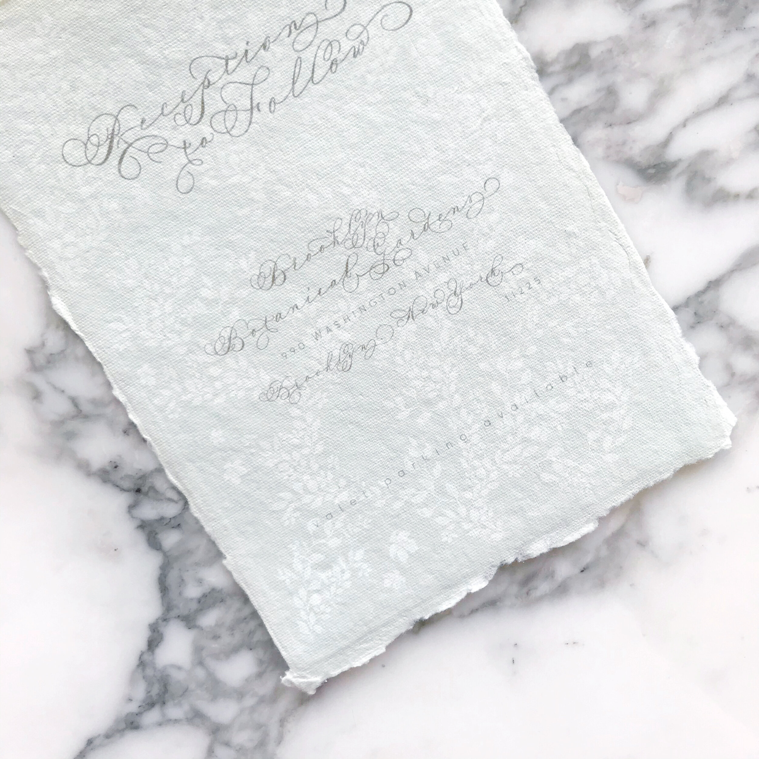
Let’s talk paper! We have warm white machined paper, subtle stripe taupe, vellum, handmade paper in green, handmade paper envelope in blush, and machined French blue in this suite.
I really love combining different paper types. It can absolutely present a special breed of problems when printing sometimes, but the final look is definitely worth it. This is certainly not a look that is easy to curate, and not something you can usually find without a decent designer to help guild your selections.


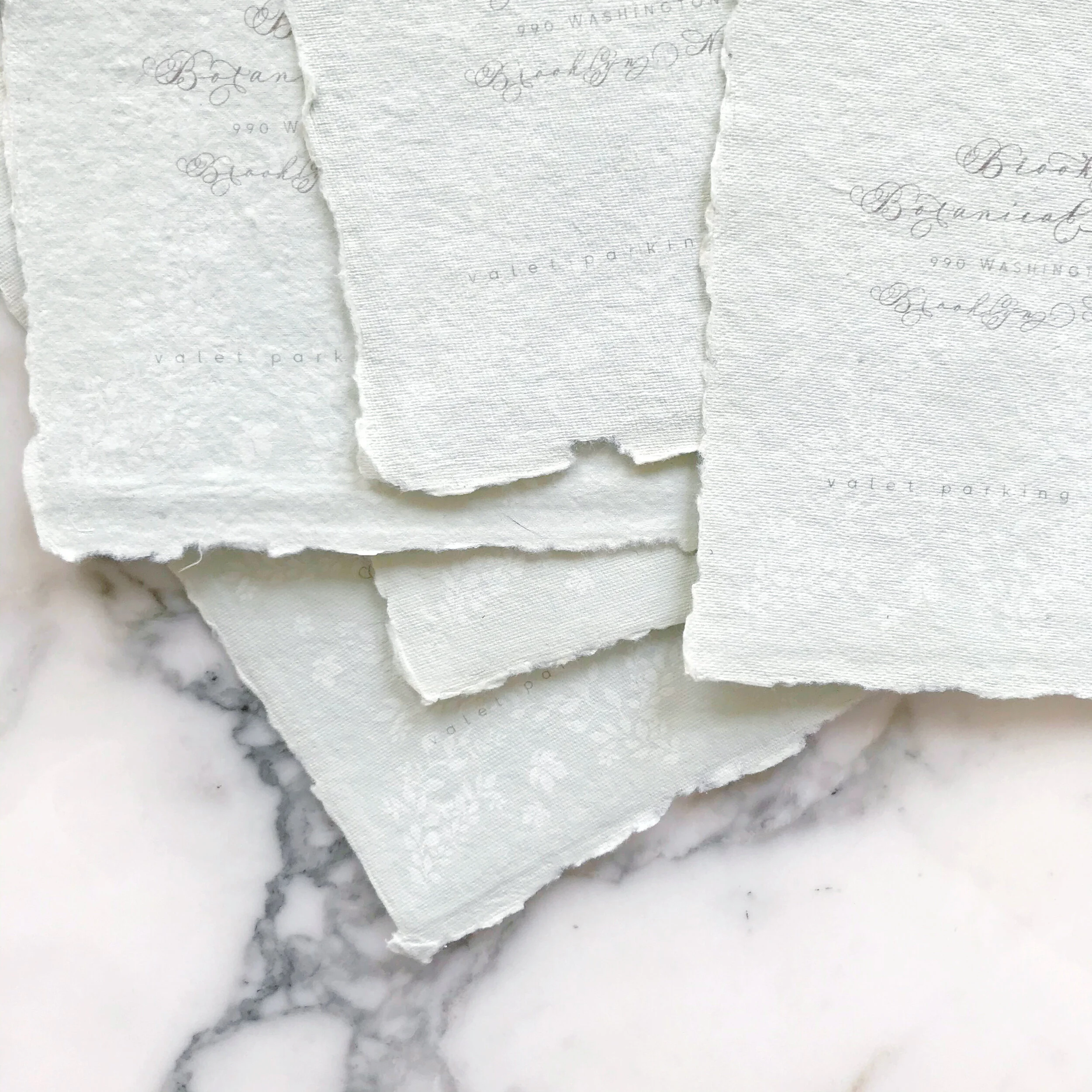
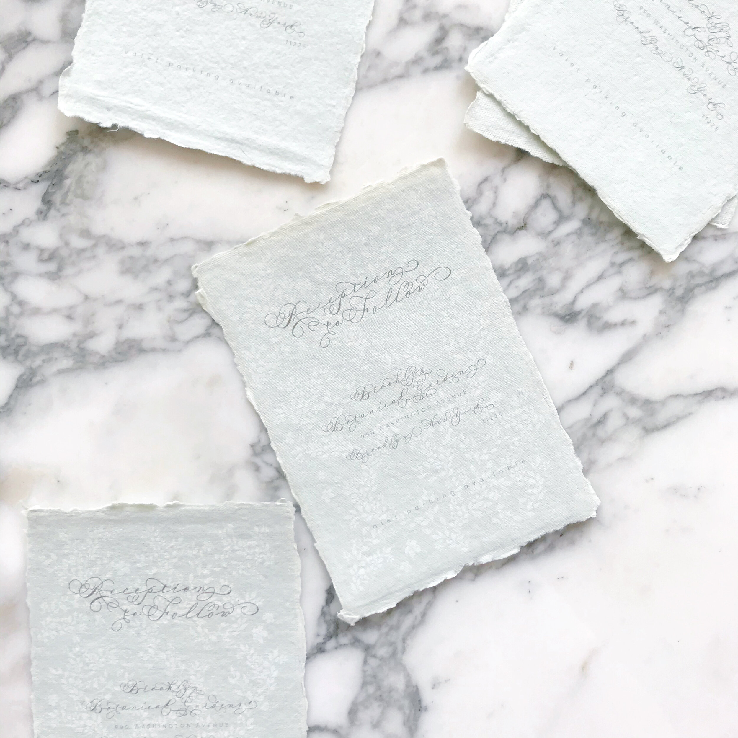
I love this pale green handmade paper that we selected for our reception cards. When it comes to selecting product, I usually only present paper types to our brides once I’ve selected everything I’d like to use and checked inventory to make sure I can actually get it. I want my brides to see the vision in my head as a complete idea, and presenting them with the entire suite’s paper helps them visualize.


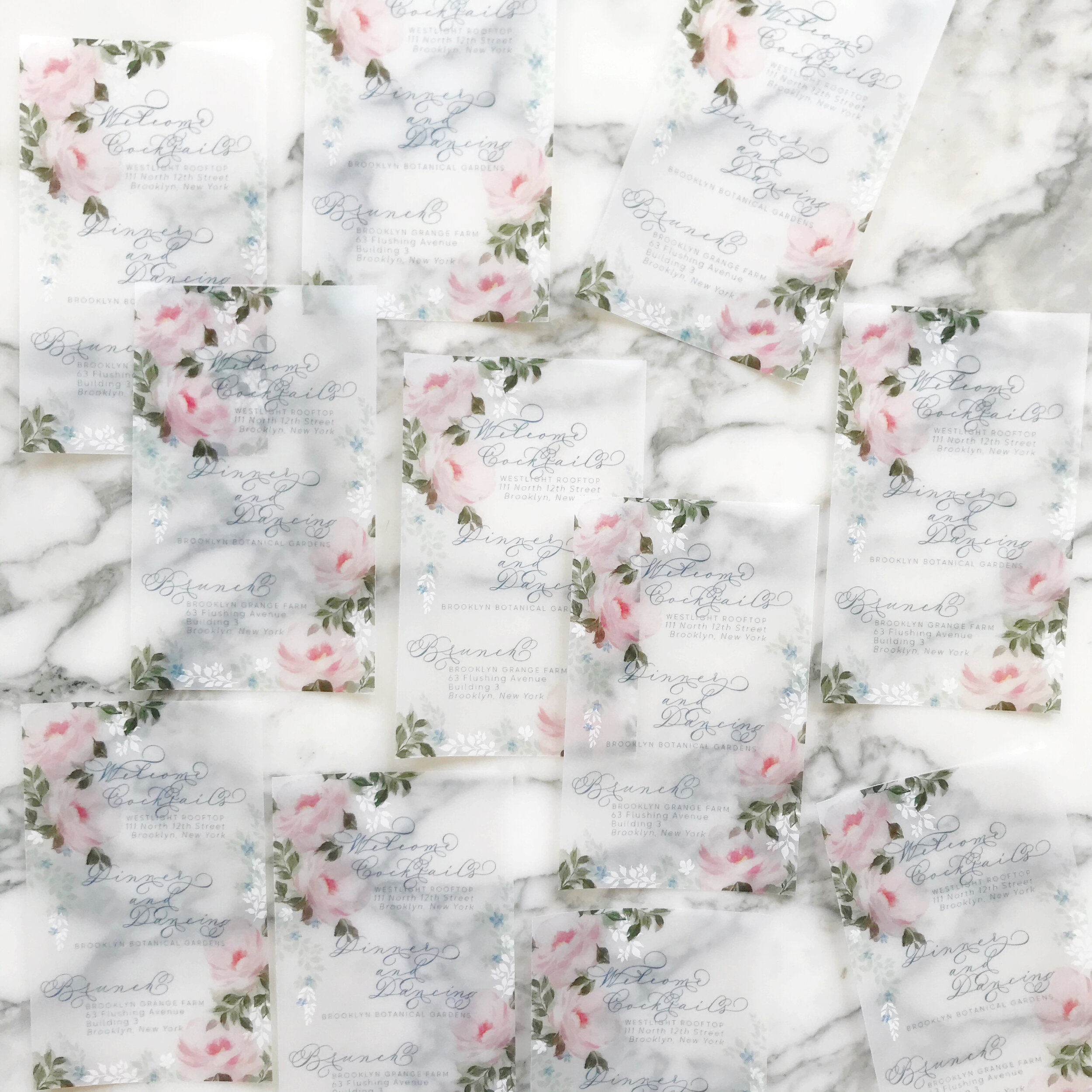
We also used vellum in this suite - one of my favorite papers to print on. I love how luminous the colors look! We did dual printing on both vellum pieces, overlaying white and color.


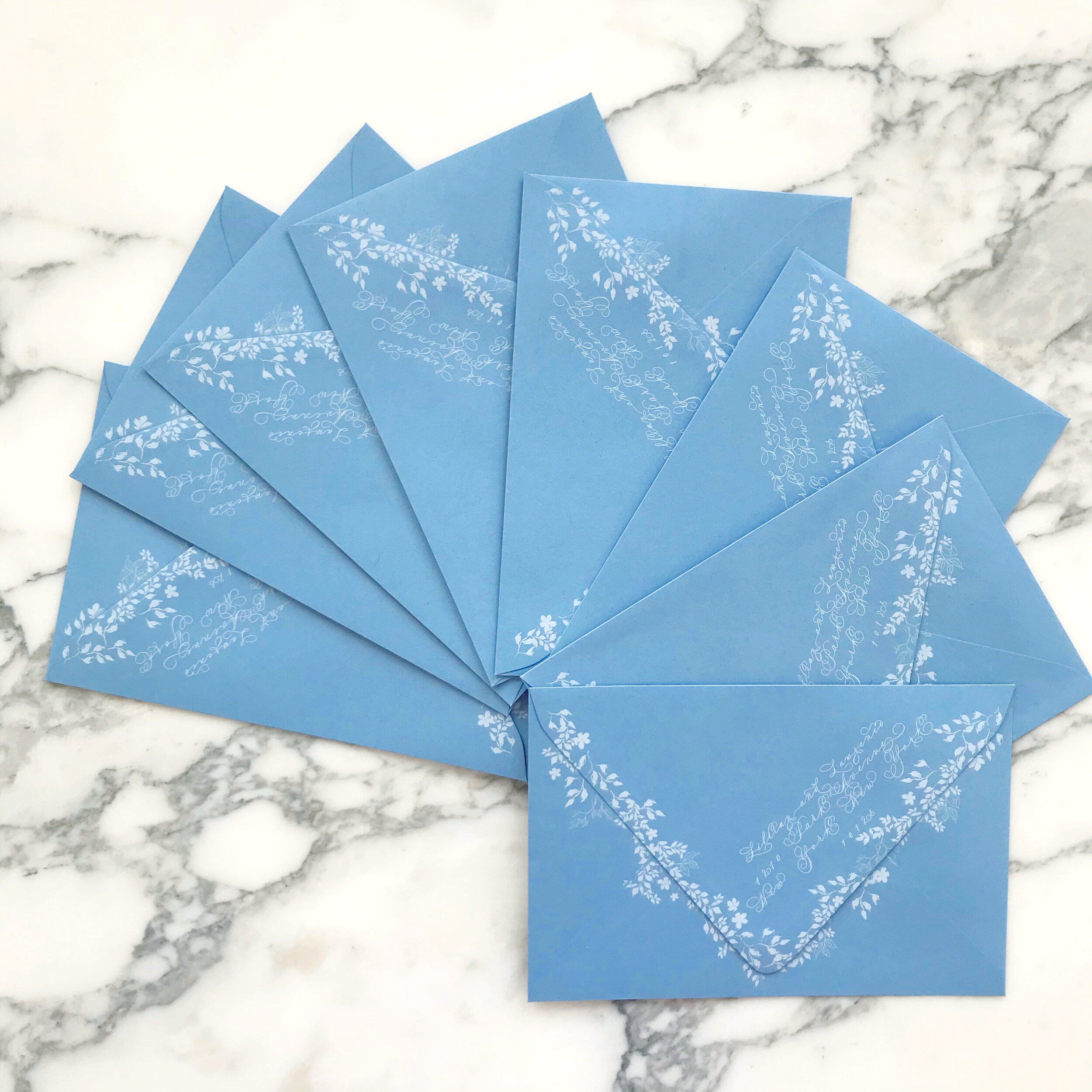
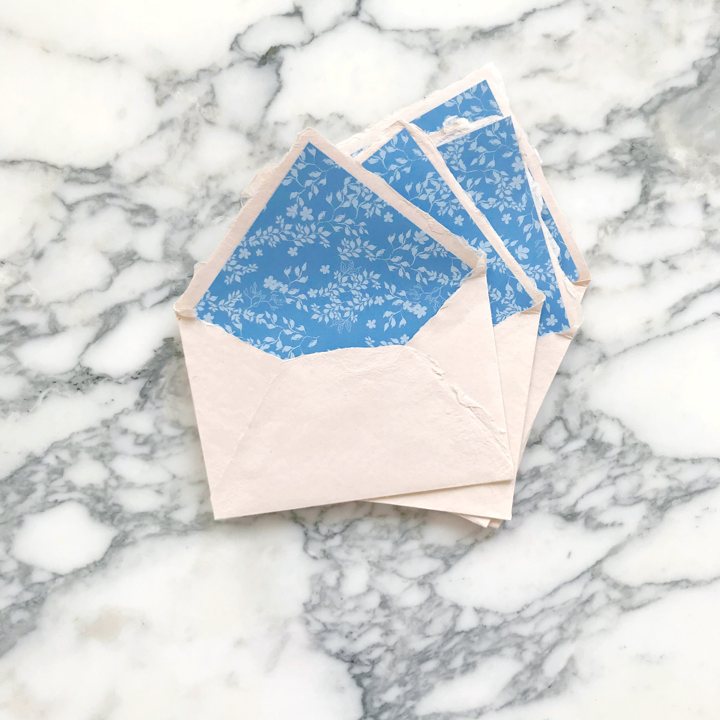
We went with a blush handmade envelope with french blue envelope liners printing in tumbling vines for the reply envelopes. The front of each envelope was printed with matching artwork and calligraphy (of course).
Our French blue mailing envelopes have the most gorgeous white vines tumbling down the back with the return address in matching calligraphy. Our mailing envelopes were lined in matching rose artwork.
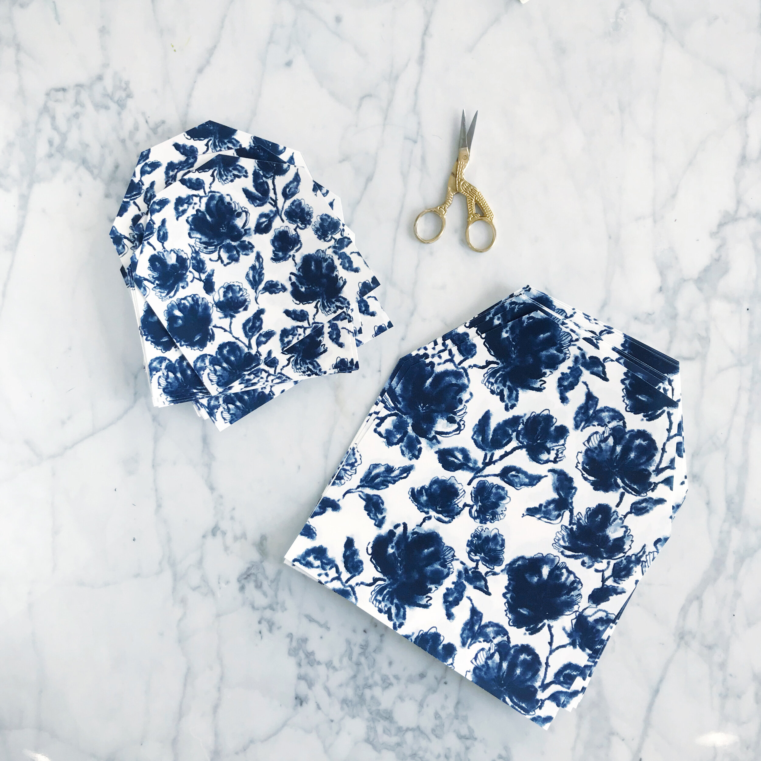
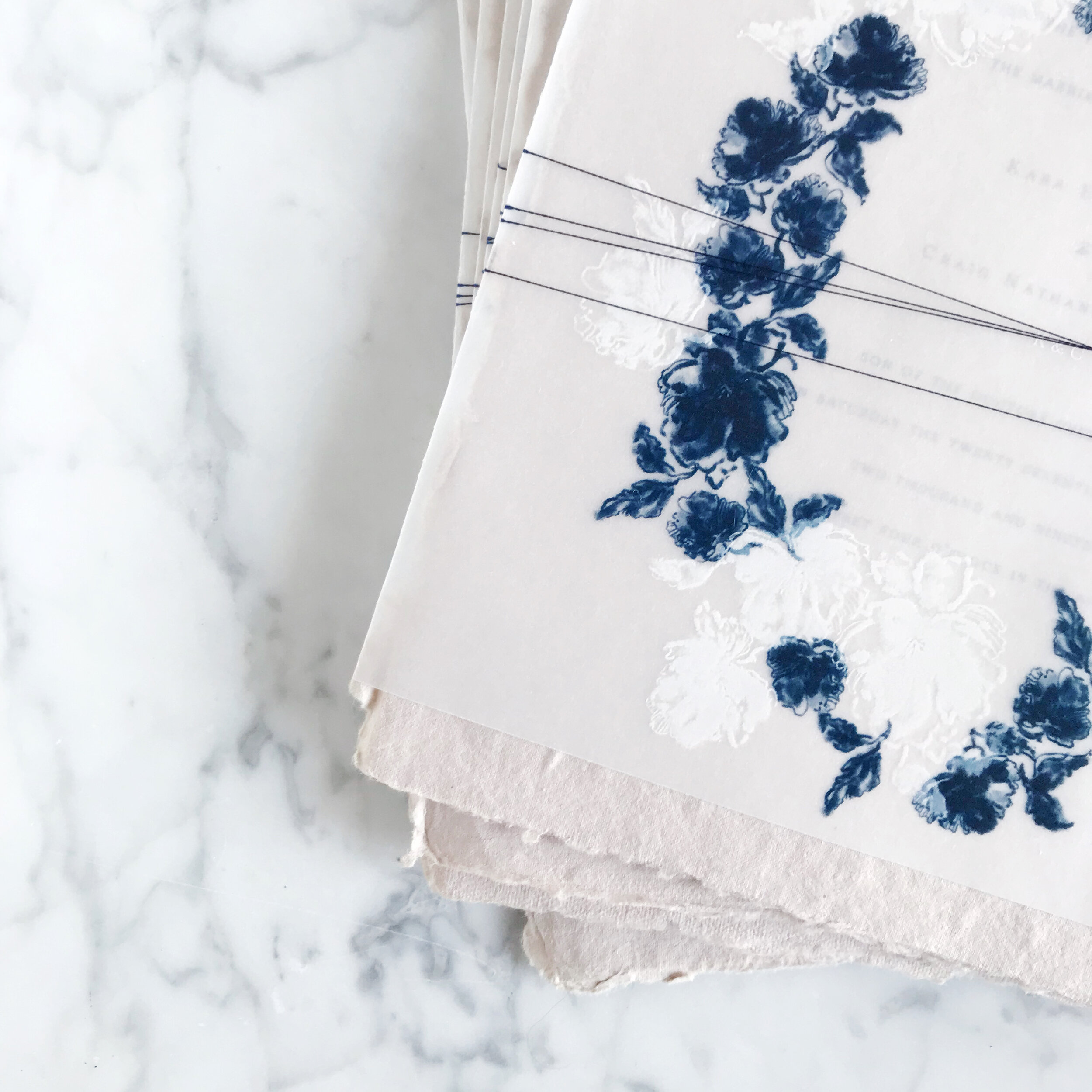
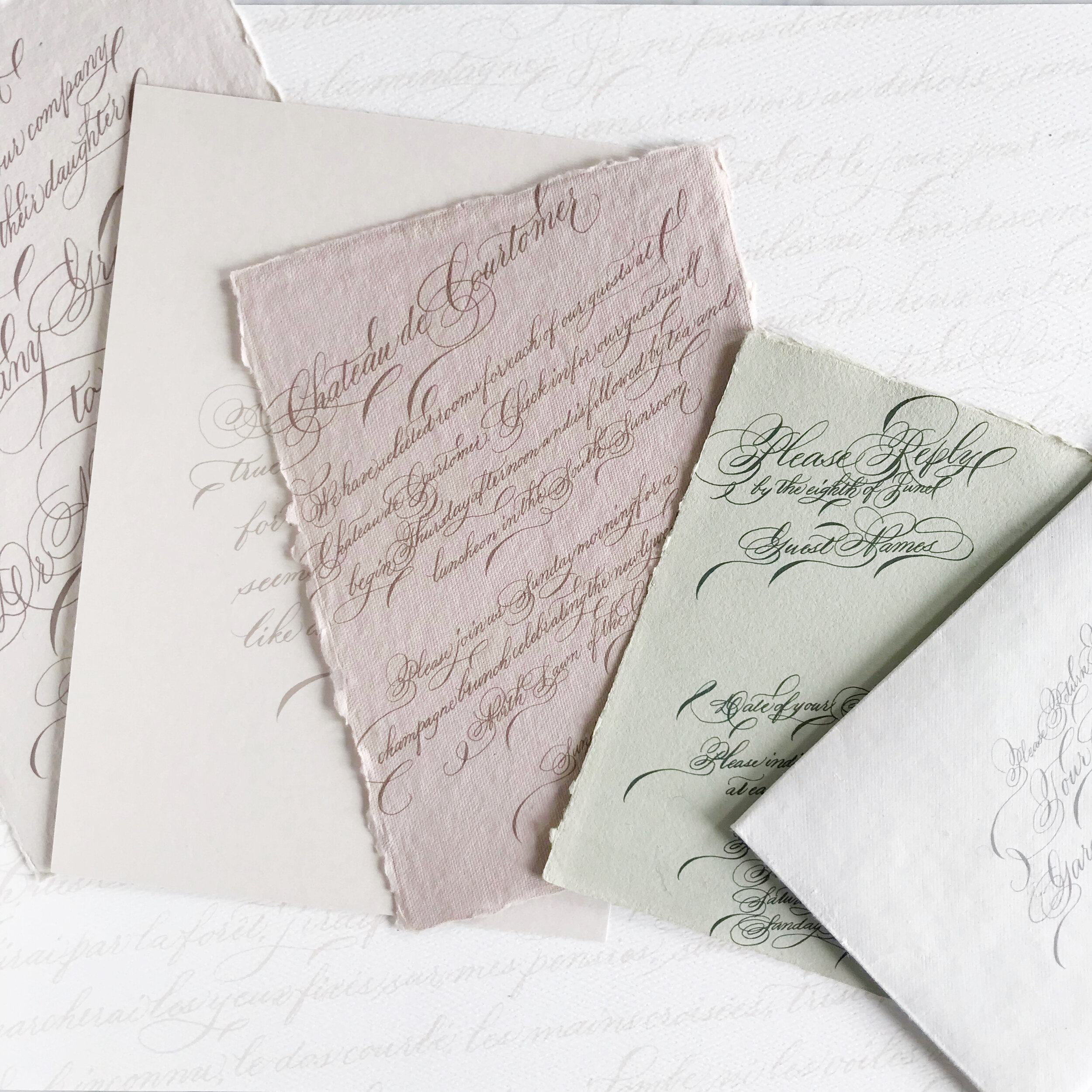
Delft Blue Wedding Invitations
Delft Blue Inspired Wedding Invitations
A classic inspired pattern for a wedding in an old English country estate.

The Inspiration
The bride’s mother, grandmother, and great-grandmother are all avid collectors of the famous Netherlands Delft blue. Long since immigrated to the United States, her family still has strong familial ties to family back home in the Netherlands, where Delft Blue china originated.
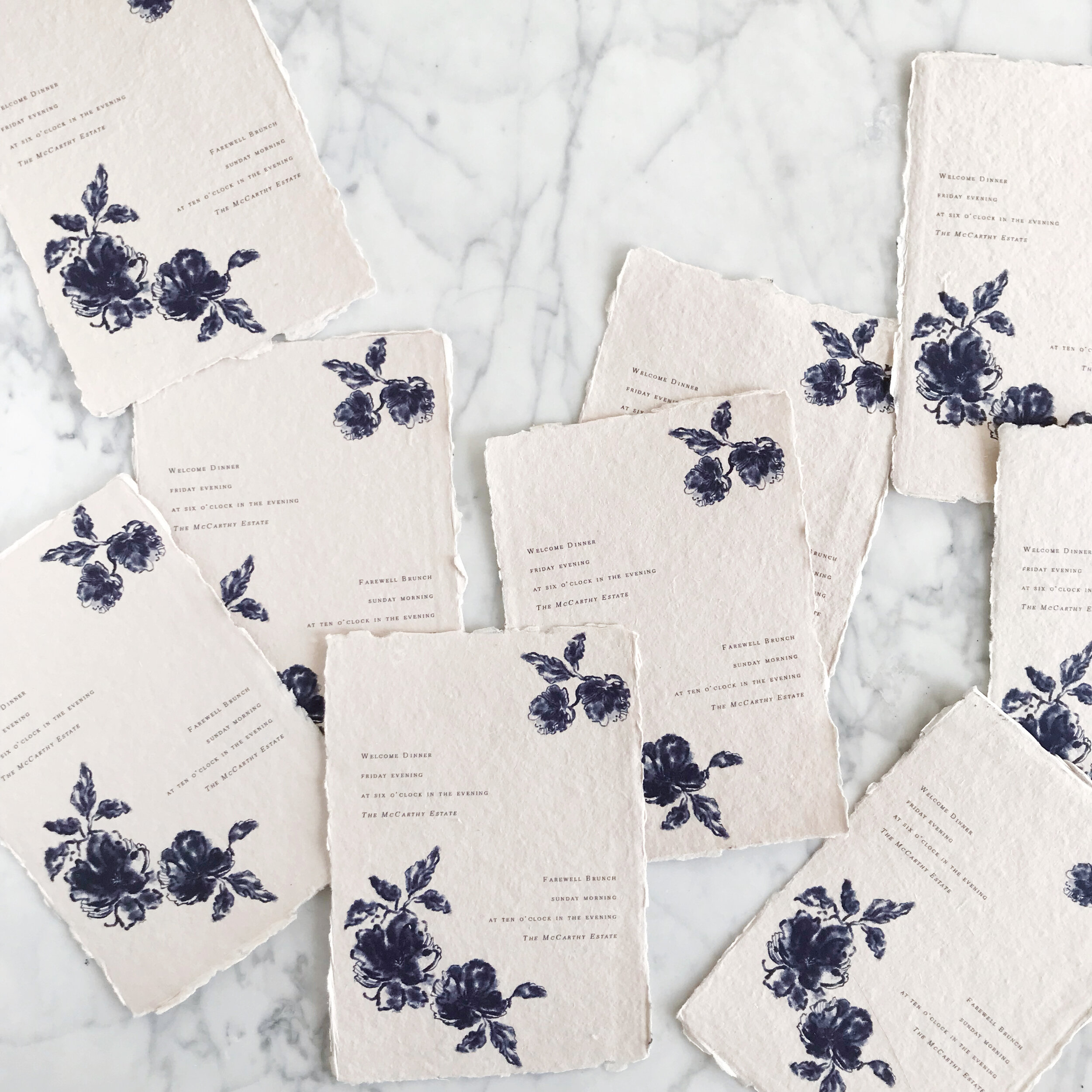

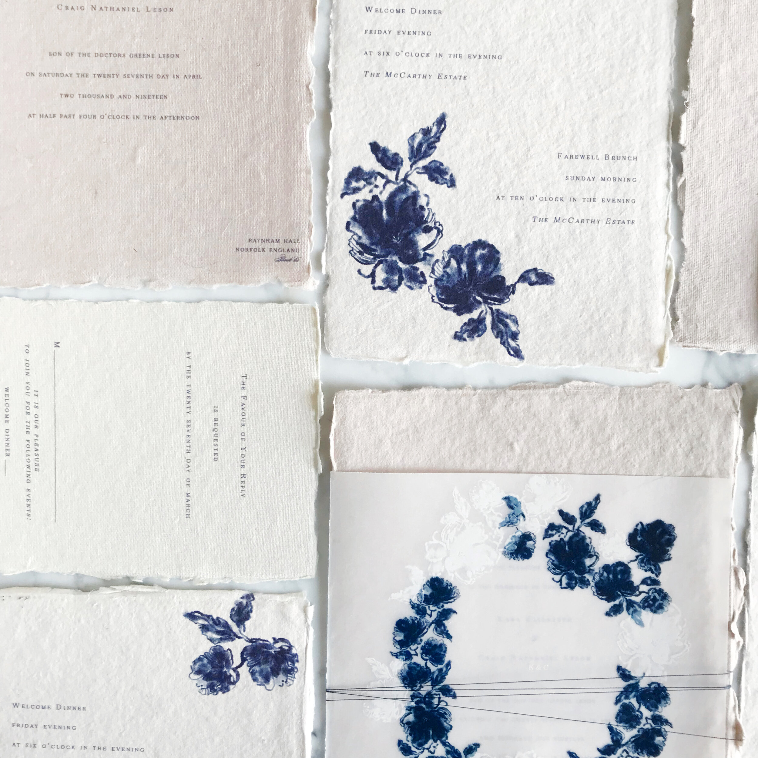
The bride asked for deep indigo blues that reminded her of Delft without being on the nose about it. She wanted to bring in a bit more of a modern take rather than having her wedding feeling dusty and outdated.
When it came to the artwork, we also minimized the pattern itself, sticking to florals only rather than the overall pattern-work of Delft.
We selected handmade paper in earthy tones of bone and taupe to tone down the blue a bit, as well as a vellum wrap tied delicately with thread.
We also kept the typography simple and very minimal, leaving lots of negative space.
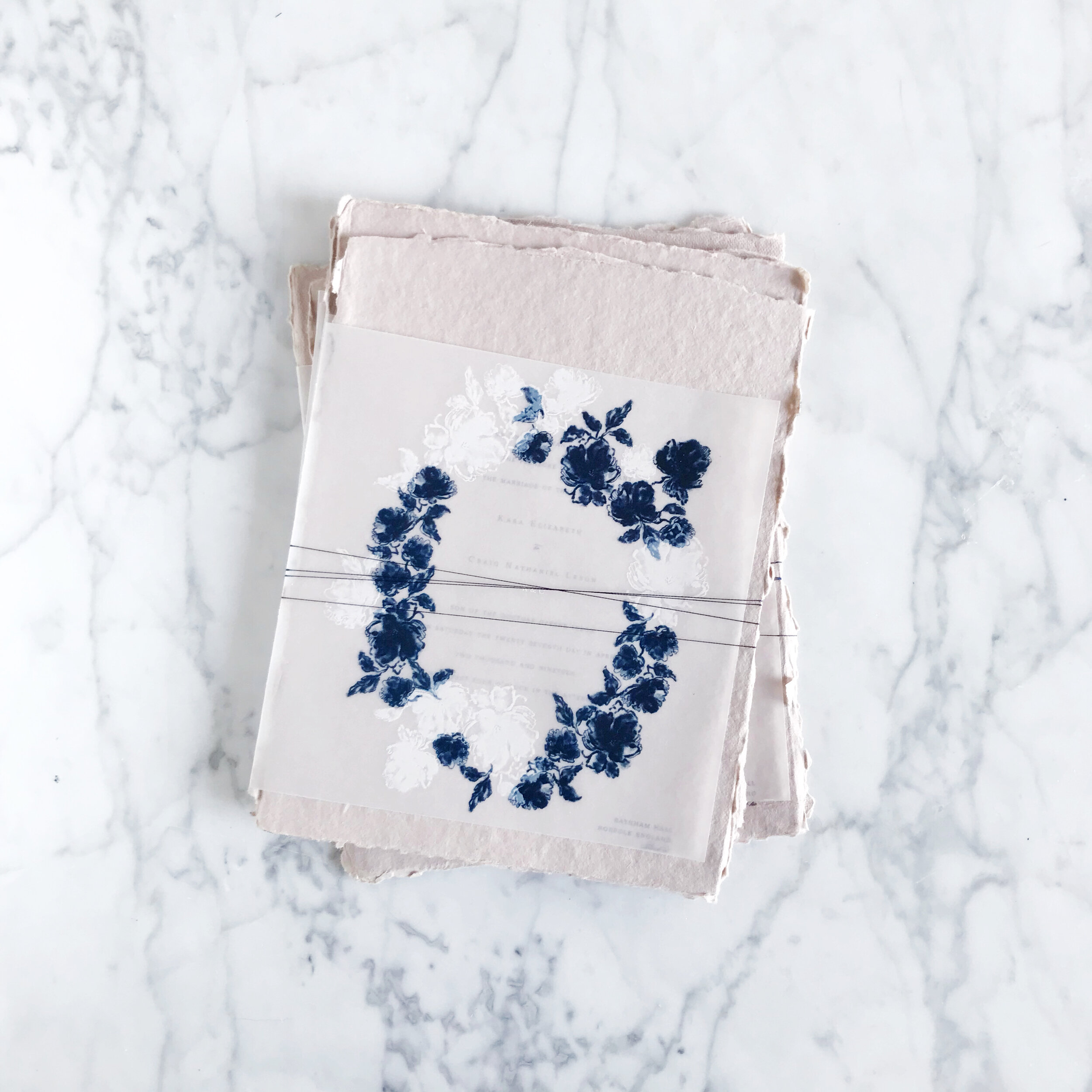
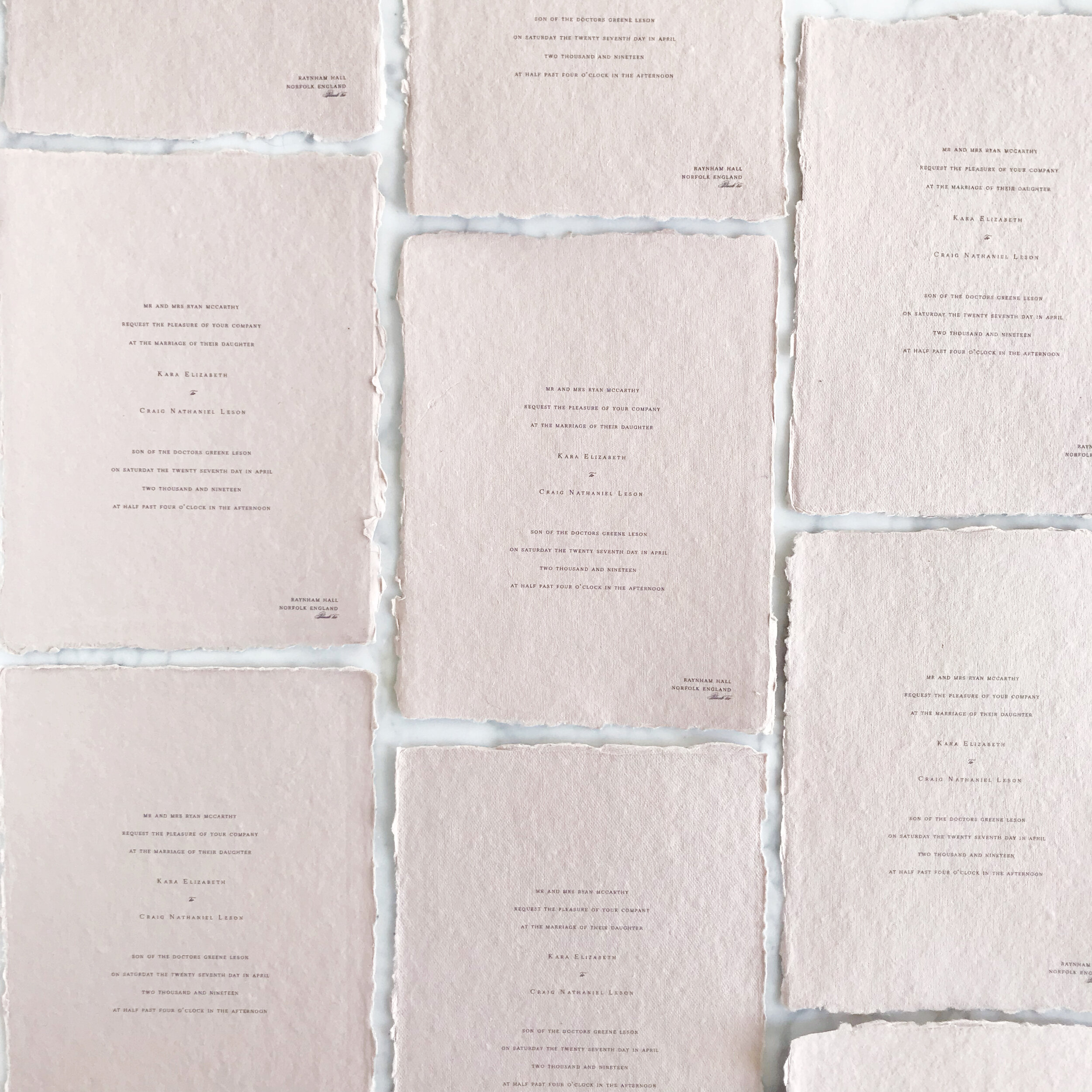
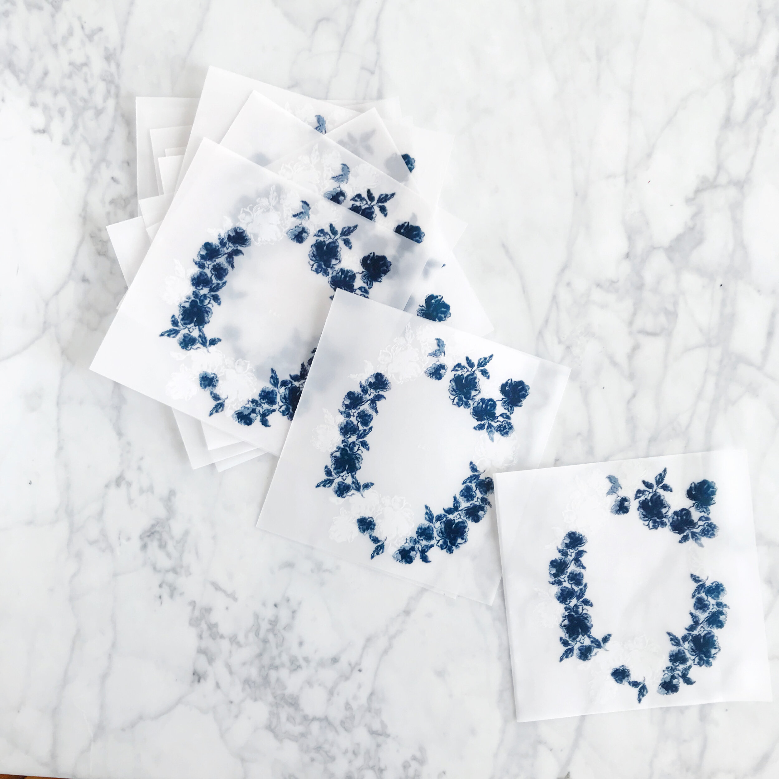


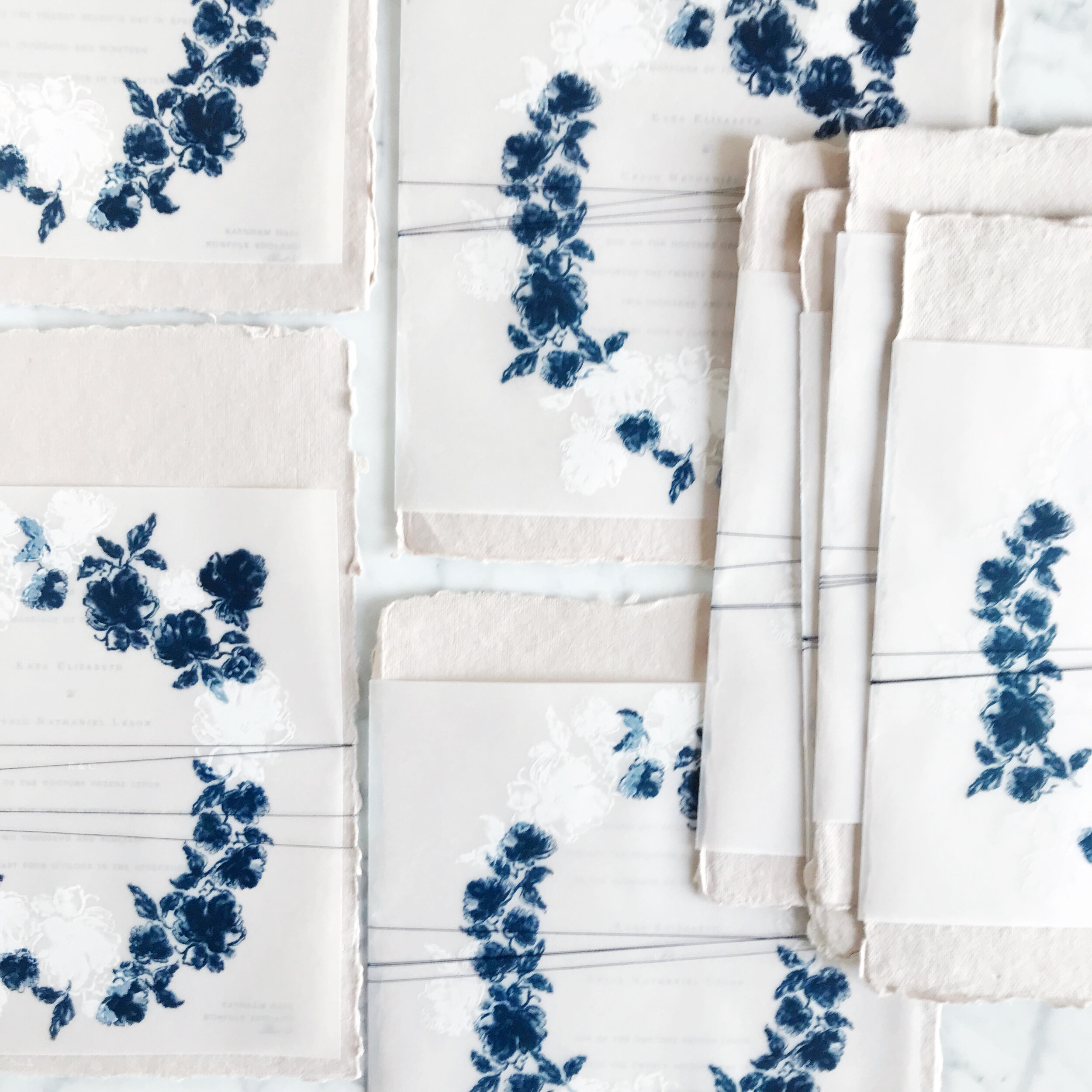
We paired white printing with the blue on the overlays, to bring in interest and depth and to soften and dilute the intensity of the overall Delft feel.
a suite with these details at 120 suites starts at $6,500 with full assembly
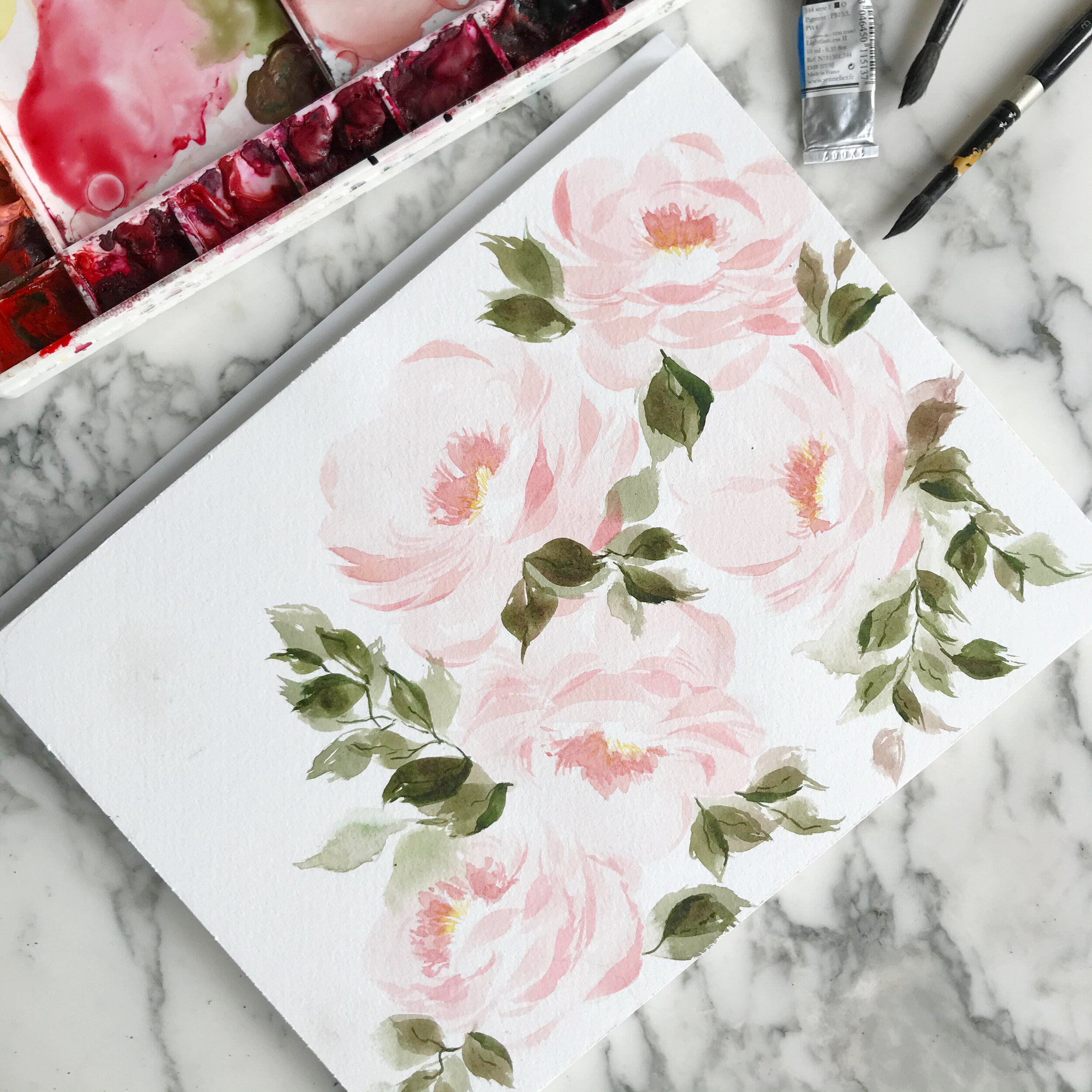
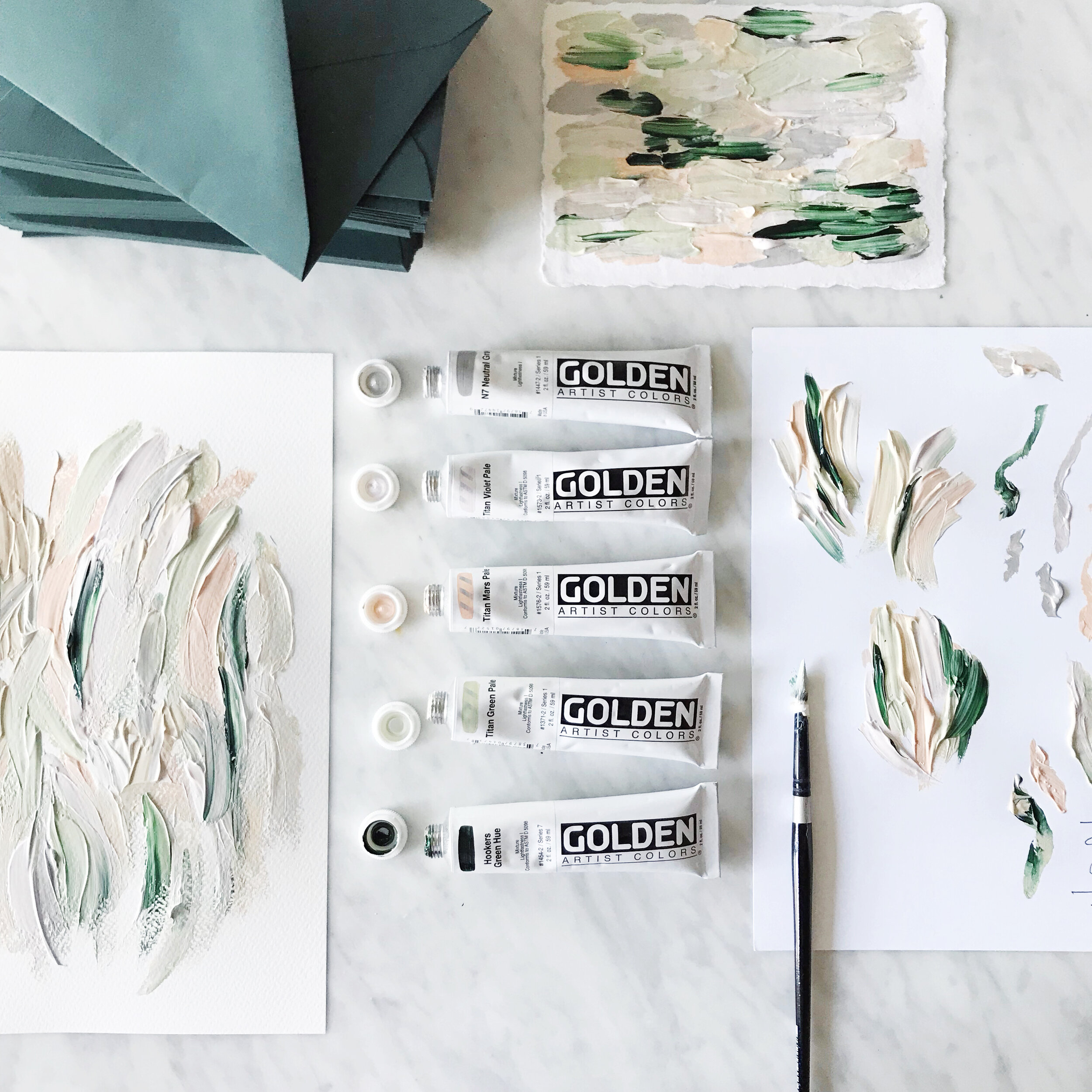
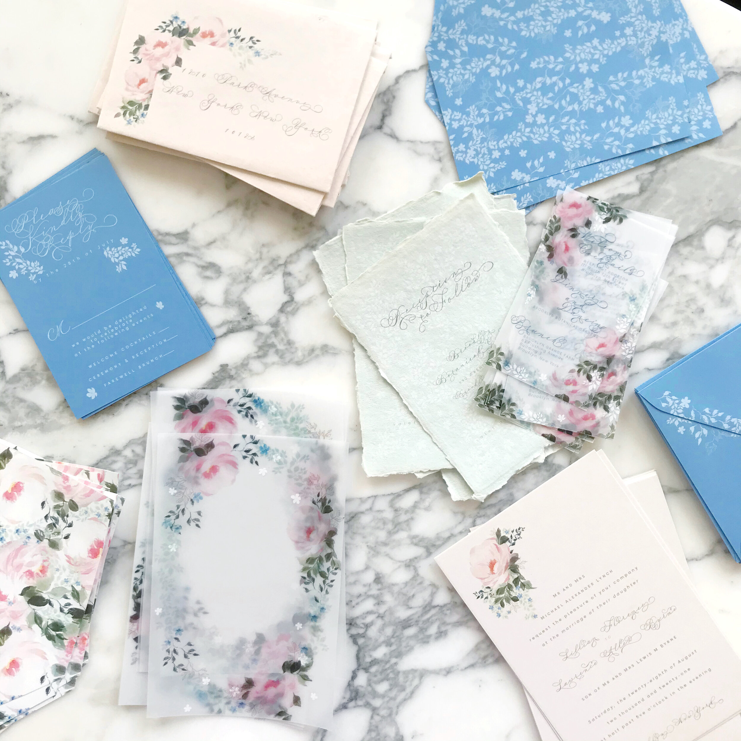
Watercolor White Peonies

We have a new painting up on our YouTube this week! Watercolor and white flowers are always a challenge, so I’ve been practicing with this perfect specimen of a white tree peony. Who wants a gorgeous white peony invitation suite??
Invitations Featuring Custom Artwork
There are several different routes you can go aesthetically when it comes to your wedding invitations. Around here, we typically lean towards the artwork heavy side of things, specifically watercolor.

Watercolor wedding invitations still seem to be in the forefront and limelight of design these days, and I’m loving it! From simple watercolor washes to colorful florals and patterns, we love it all - granted, around here, we tend to lean towards the more complex side and avoid the simple washes (I personally find them a little dull).
Watercolors are perfect for all seasons and aesthetics, from spring pastels to deep jewel tones of fall and winter.

Each suite of artwork is unique to each client, reflecting their personal style and wedding locale. I love bringing in bits of the season and venue, tying all of their details together.
My best advice when working with an artist for your wedding invitations:
Find an artist whose entire portfolio you love. If you start with a designer that you hope can capture the look you’re going for, it’s like cramming a square peg into a round hole. This also requires you as the bride to be able to perfectly articulate what you’re looking for, which sometimes is not all that easy. You know the vibe you’re going for, and can point to pictures you love, but when it comes down to it, you will be in charge of driving the creative direction of your wedding invitations and having the vocabulary to communicate that to your stationer. This leads to frustration on both sides, with the designer not understanding what about their work just doesn’t feel right to you, and you not having the vocabulary to communicate why it doesn’t feel like what you’re looking for.
In contrast, if you find a designer whose entire vibe you dig, you can trust them to create something for you that naturally fits within the aesthetic you’re looking for without requiring you to be in the driver’s seat. A good designer has a distinctive look and feel, which takes so much of the design burden and stress off of you, allowing you to enjoy the process rather than wanting to pull your hair out.
A good stationer isn’t just a designer - they’ll also have knowledge and experience with resources, materials, printing methods, and assembly tricks that we would never expect you to know. Find someone whose work you love, and trust them to guide you through a process you can then enjoy!

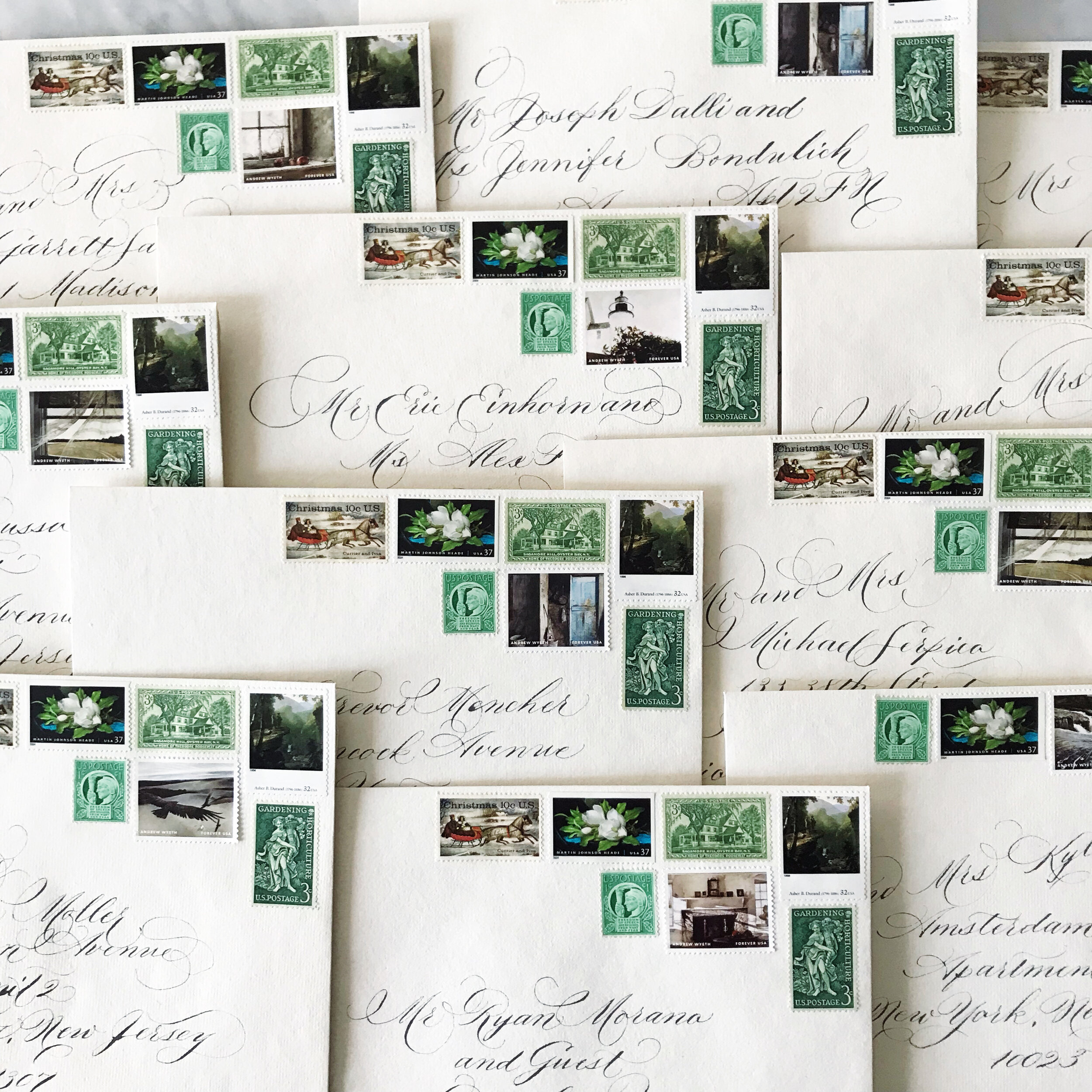
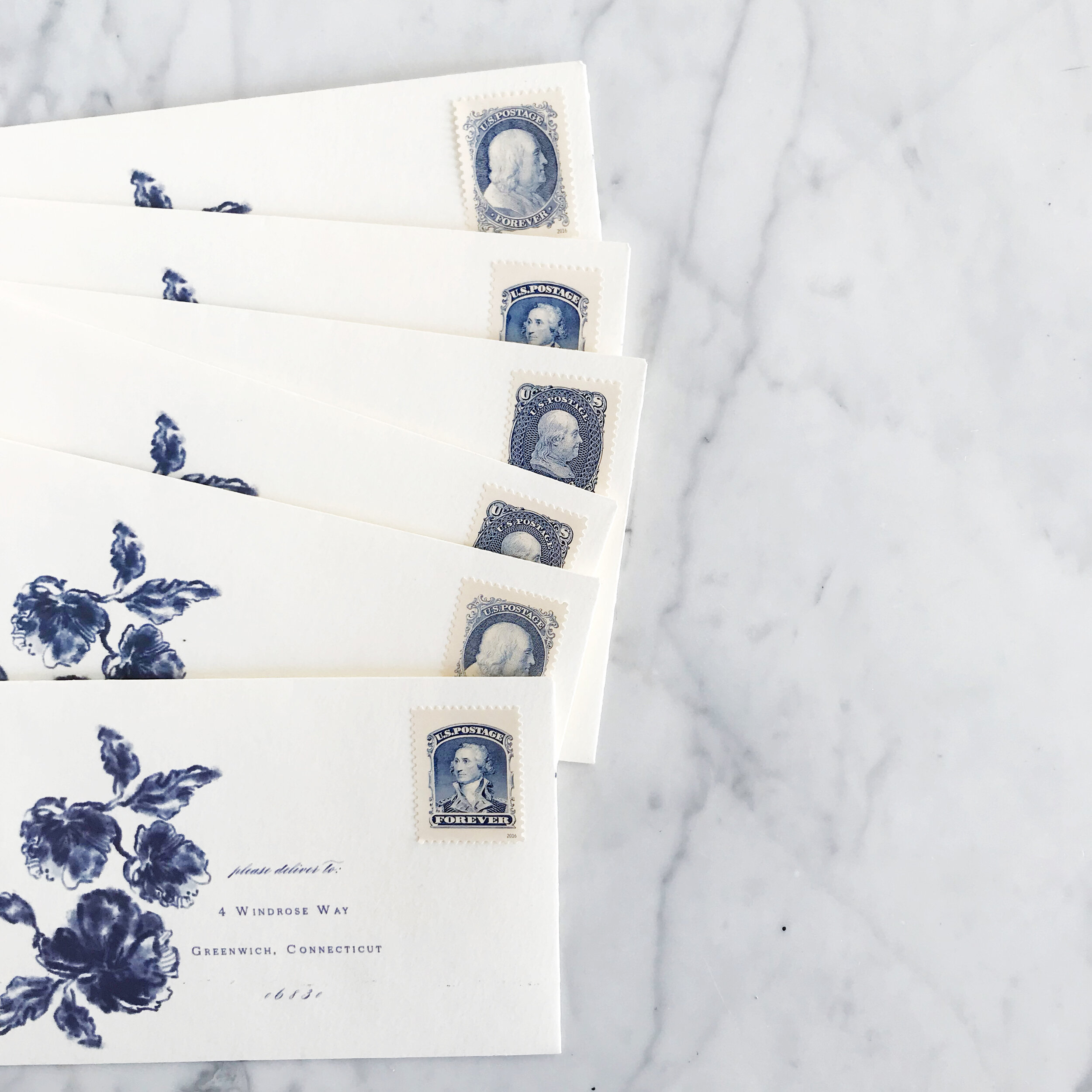
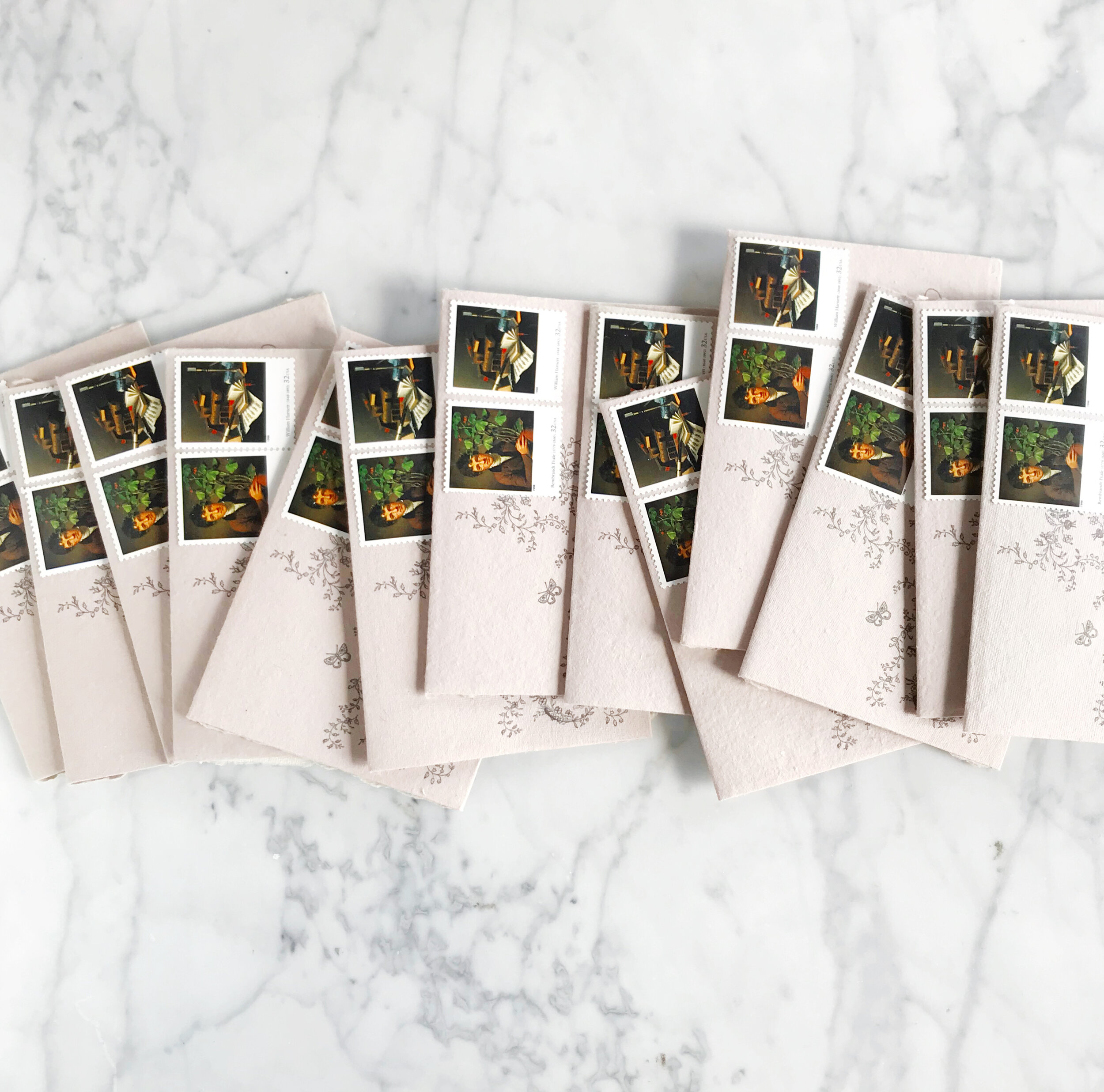
Vintage Postage on Wedding Invitations
I love curated postage on wedding invitations! It’s like a miniature gallery of art in support of your overall aesthetic.

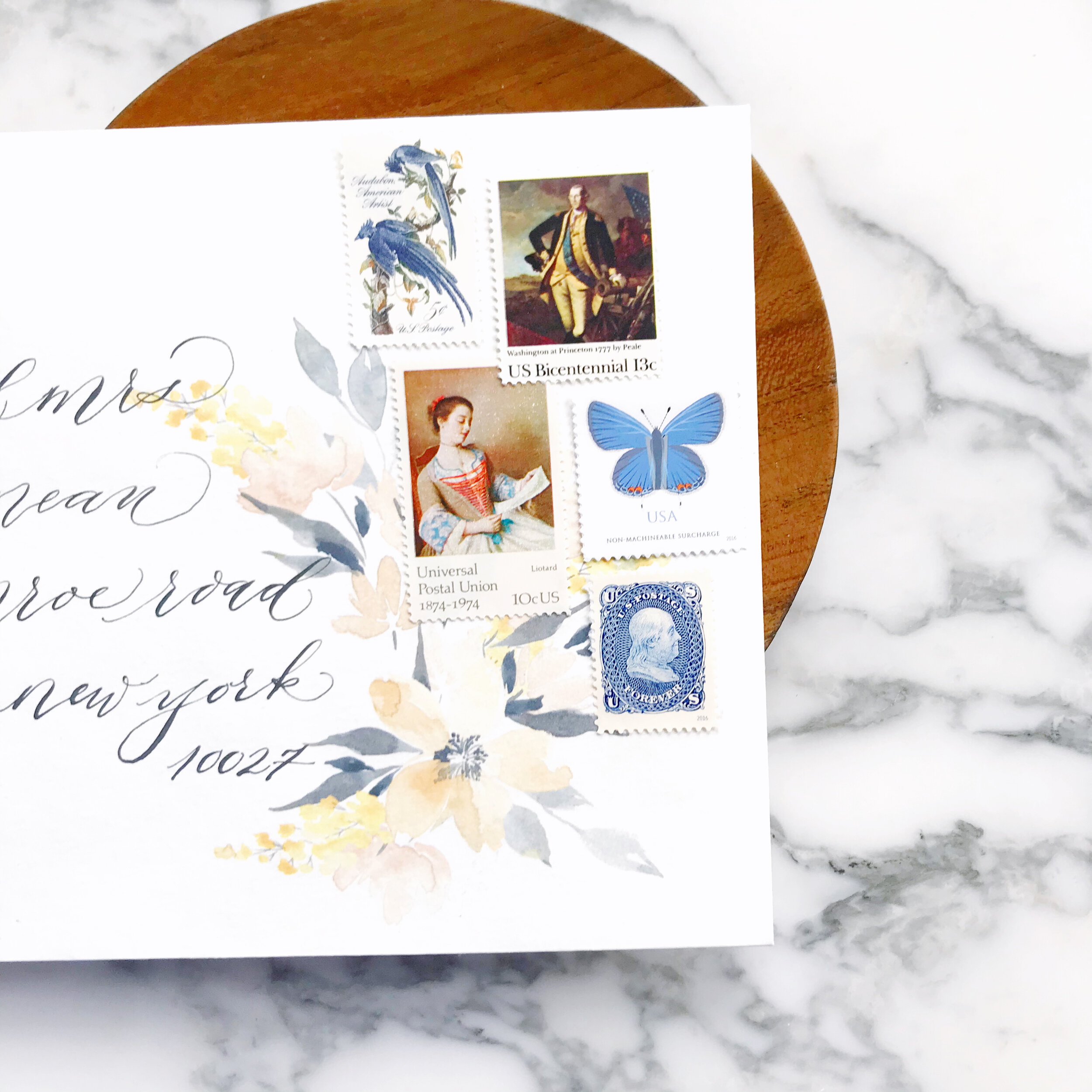
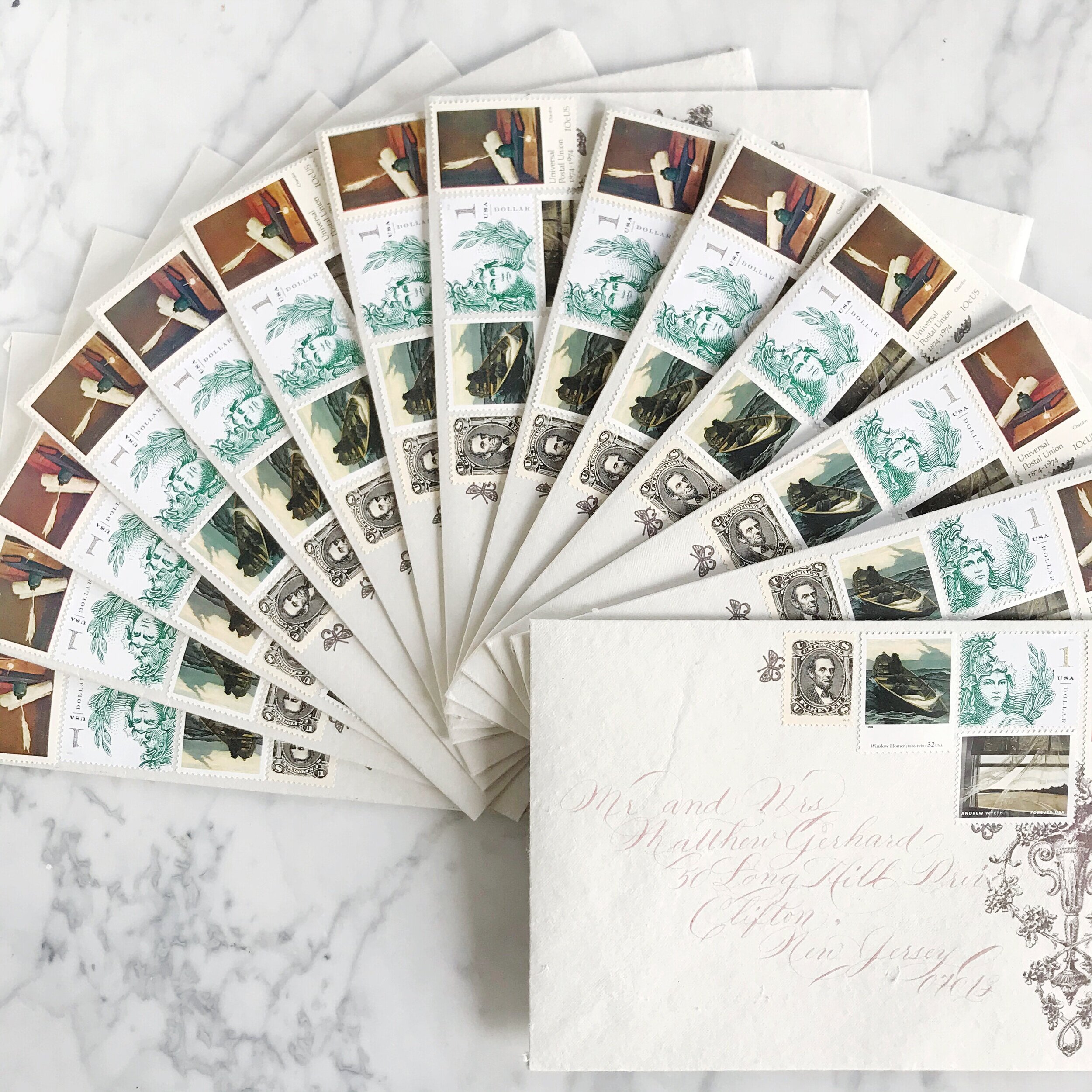

As a designer, vintage postage has its pros and cons. The pro is obviously how gorgeous and unique it is, bringing in supporting aesthetics to your suite (especially if you’re going for an old-world or vintage vibe!). Sourcing vintage postage can be challenging when wedding invitation suites require 100+ stamps. Inventory also tends to change quickly, so stamps you found three weeks ago and included in your pricing and proof may no longer be available at the same price.
I personally l love the challenge of finding the perfect collection of stamps for our clients. I have several tried and true suppliers who always have great selections and will help me find any postage that we need.


Tips for including vintage postage for your wedding invitations
Some designers will offer this service and don’t be surprised when they have an additional fee attached to it (we don’t, it’s a service we include in our pricing). Sourcing the right quantities and prices for vintage postage can be time-consuming, but not nearly as time-consuming as applying them to your envelopes!
If you’re applying the postage yourself, give yourself lots of time, it takes much longer than you think!
Use glue, don’t rely on being able to lick the old stamps as the adhesive ages at different rates, depending on how old the postage is. You certainly don’t want any falling off in transit!
Be prepared to pay about 3x the rate of current issue postage when shopping for vintage postage for your wedding invitations
Spring Garden Floral Wedding Invitations - Overview
Pale blush, taupes, pastel spring greens, and French blues for a botanical garden wedding.

Spring Florals & Handmade Papers
French blue garden wedding invitations with tumbling vines and blooming roses
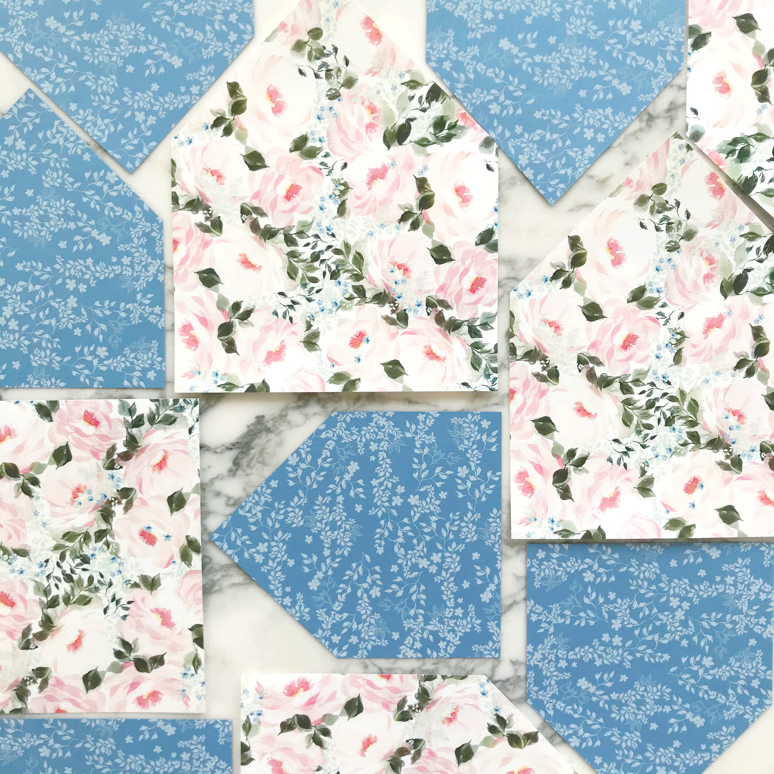
So much spring happening here! Like most of the wedding invitation suites we design, we have lots of mixed media paper types here.
We began the overall design with the blue - we knew we wanted a medium French blue…not too grey, but on the spring side. Once I had the blue sourced, I was able to collect all the other papers we used.
Roses and forget-me-nots play with each other in the artwork for this suite, incorporating spring green, blue, and blush into the watercolor that was designed and created specifically for this client.


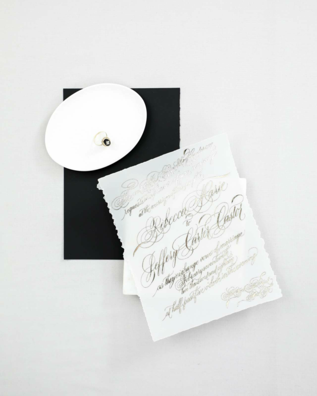
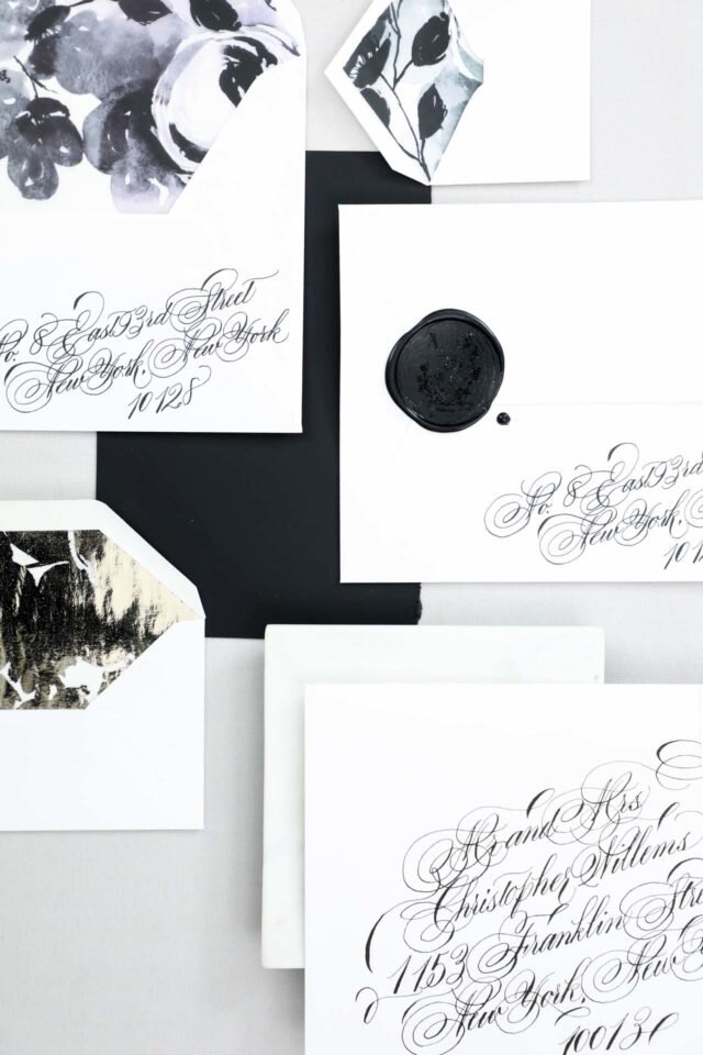
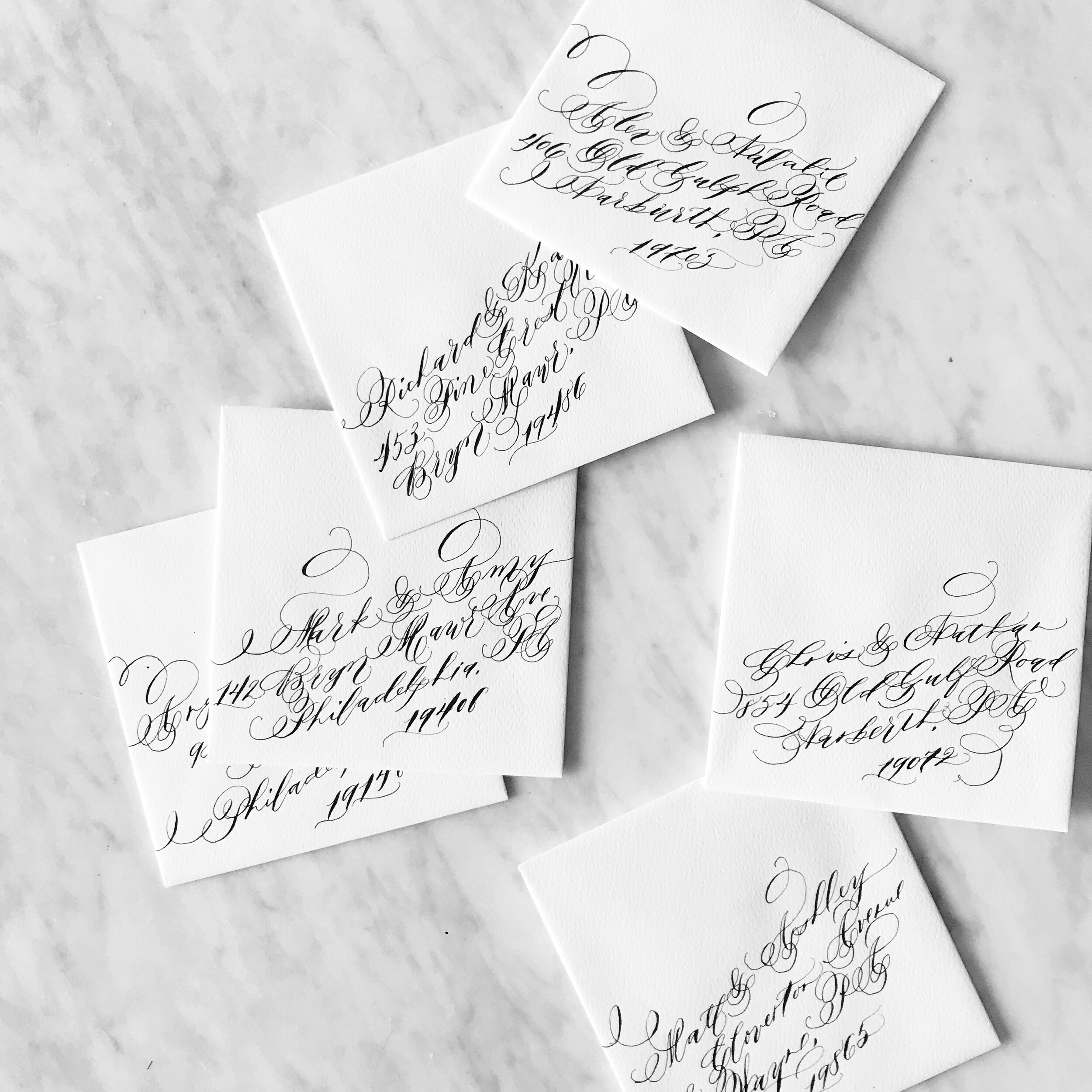
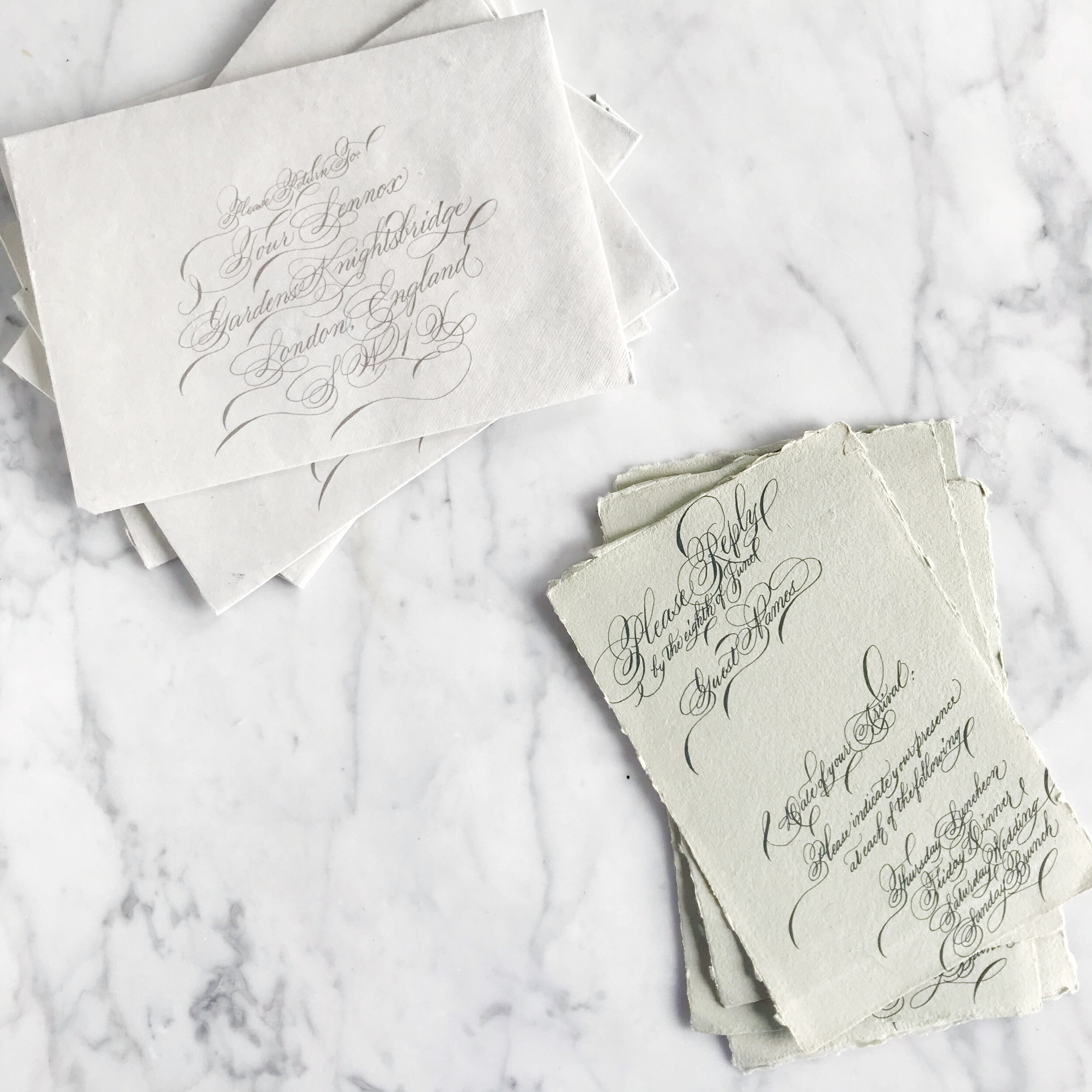
Formal Calligraphy
Formal calligraphy is the epitome of formality and tradition. it’s elegant style and grace lends itself perfectly for a formal wedding or a black tie evening.
There really is no such thing as “perfect etiquette” when it comes to weddings anymore. Nowadays, weddings are all about the merging of two people and everything those two individuals encompass.
However, formal will always be formal, and what better way to introduce your guests to your formal affair than with gorgeous formal calligraphy?
Wedding calligraphy comes in so many styles, from brush calligraphy to modern, flourished to drawn out and simplistic. Today we’re looking at the formal end of the calligraphy pool, which also happens to be my favorite end to swim in.
Like all calligraphy, formal wedding calligraphy can be used as spot calligraphy (titles and names) or the whole invitation entirely in calligraphy.
Things to keep in mind when selecting a calligrapher and calligraphy style:
Make sure the style you like is legible, especially if you love the look of the entire suite in calligraphy! Your guests need to be able to read what it says!
Not all calligraphers are created equal. Some have years and years of experience, and some are new to the scene. Like with most professions, you may find that more seasoned veterans have a more streamlined process and are able to help you select a style with ease. Typically, formal styles take longer to develop and learn, so you’re more likely to come across someone with a bit more experience under their belts when looking for a formal calligrapher.
Although some of these invitations are written entirely in calligraphy, they are not written individually in calligraphy. Formal calligraphy is a graceful and time-consuming art that takes time. Is it possible to have each one handwritten? Certainly, but be prepared to pay for it! Each invitation suite written entirely and individually by hand can take anywhere between an hour to several hours, so be prepared to see pricing north of $150 per suite (for example, I would charge $350+ for each suite). However, there’s good news! Most calligraphers have a much simpler and cost-friendly alternative! We handwrite each suite once, scanning the calligraphy into an editing software (I use Photoshop) to make any alterations and corrections and get the calligraphy into the invitation design. We then print each suite, rather than writing each one individually. I have seen many a bride asking for each suite handwritten not knowing the difference, so hopefully, this clears it up!
When shopping for calligraphy invitations, you can either pair up with a designer who then hires a calligrapher with/for you, or you can select a designer that also does calligraphy (like me!). When working with more than one artist on a project, look for a seasoned designer who can take the helm in finding a calligapher/printer/suppliers that fit your aesthetic and budget to make your invitation process smooth and stress-free!
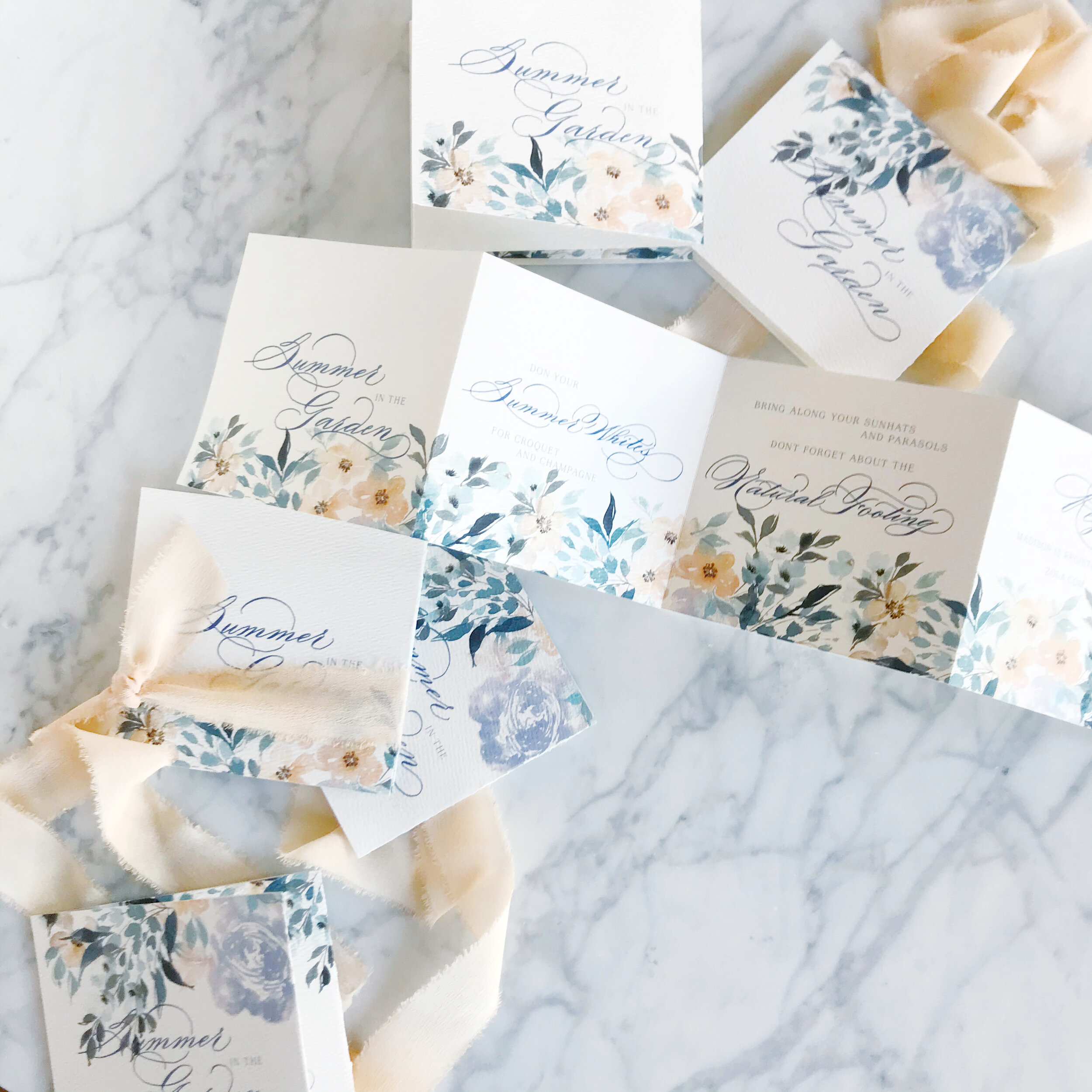
Summer Wedding Invitation Inspiration
Summer weddings are all about those bold colors, full of sunshine and exuberance. I love everything from the seaside blues to sunflower yellows!


Cheerful yellows, bright oranges, leafy greens, and summer sky blues are all over this time of year! I love outdoor weddings, and the summer season is all about parasols and the bright hues of the season.
So let’s talk about summer invitations, and we’ll start with the summer invitation inspiration in this post!
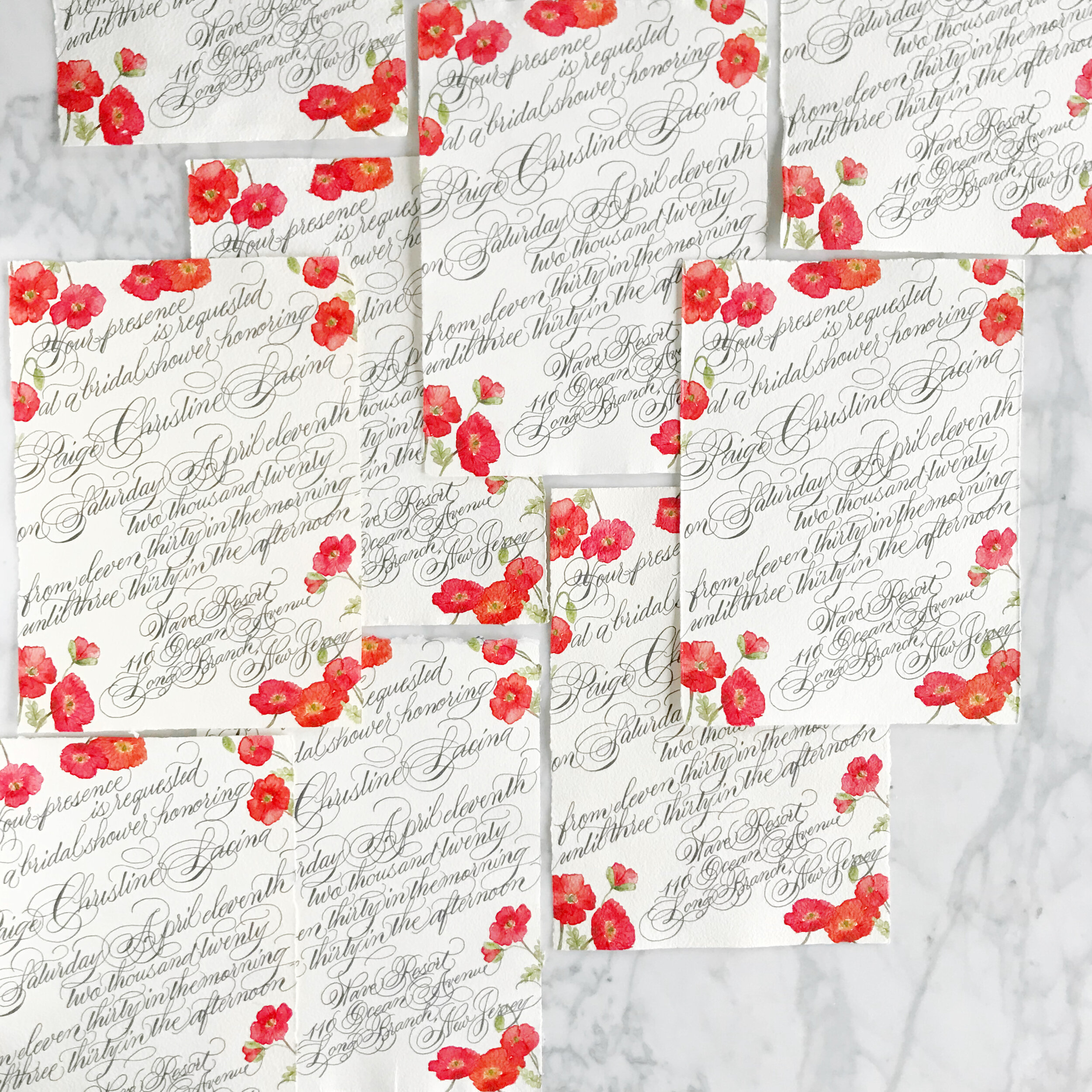
Poppies are such a summer staple, and the Icelandic poppies for these bridal shower invitations are no exception! Printed on handmade paper and covered edge to edge in gorgeous formal calligraphy, these bridal shower invites take your shower game to the next level! We went way over the top with the calligraphy for this suite, pouring the flourishes over the deckled edges.
The simple save the dates, layered with Japanese cane paper and handmade paper, for a Bermuda destination wedding are pale and understated. I love the idea of going off the beaten path, so taking on the tropical vibe while foregoing blues and bright colors is definitely my type of project. The amazing tactile texture of the cane paper was exactly what our bride was looking for. We paired it with a sage green handmade paper with a deckled edge to add in even more texture.
Can we say holy cow envelope game? I loved this project! The bride got married at her parent’s property in Sun Valley, Utah, surrounded by tall grasses and wildflowers. We spent some time researching the varietals that would be blooming at the time of her wedding and built her entire suite around those, bringing in bright yellows, shades of oranges and blues, leaf greens, and pale pinks and peaches (I shocked myself with how many colors I was able to build into this suite!) Bits of line botanicals peak out from the corners, creating some interesting negative space. At some point, we’ll also look at the suite of woodland creatures we also created for this suite (owls, foxes, and bears, oh my!).
These summer invitation suites have such different looks and feel to their aesthetic. I love the directions each of these brides went to reflect their personal style in their wedding!
Spring Wedding Invitation Inspiration
The spring season is all about the emergence from winter, flowers blooming, and the world exploding into color. A spring wedding, regardless of venue and locale, can feel the same way!

Pastel florals, delicate blooms, pale pinks and peaches, all exude the feeling of the season.
So let’s talk about spring invitations, and we’ll start with the spring invitation inspiration in this post!
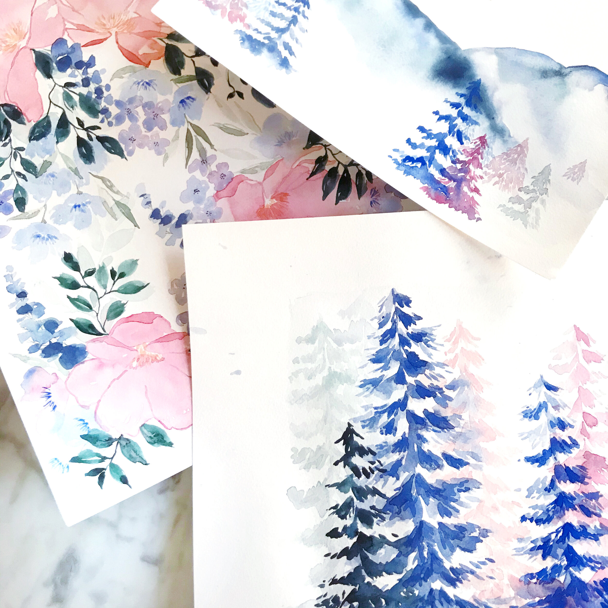
The first image on the left above features pastel pinks and blushes, pale blues, muted olive greens, and dark blues. We balanced the watercolor florals with the negative space created by line botanicals on both the custom printed artwork on a warm white envelope as well as the envelope liner. The envelopes were addressed in a pale blue modern calligraphy style that was designed for the client’s suite.
The center image above is one of my personal favorites. It has a different feel than the watercolor artwork suites that have become our signature, but I love the variety of textures that we achieved in mixing papers together. This suite features more traditional artwork, printed in deep rust, rose pink, olive green, and dark and light blues. The paper featured in this suite features warm whites, deep rose, pumpkin orange, pastel blush, and light blue, all handmade paper. The invitation was blind pressed for an overall texture on paper created in India by a female-owned, operated, and staffed company that pays a living wage to all their employees (this is important to us!). The additional paper selections were hand-produced here in the U.S. Handmade paper is such a gorgeous product to work with, but can be a nasty beast to print on (but totally worth it, IMO). Both envelopes were lined in custom envelope liners featuring artwork from the suite, and a pastel blush vellum overall completed the suite.
Last but not least in today’s spring invitation inspiration round-up is an accordion-folded save the date on a gorgeous warm white paper with a subtle overall texture. The florals for this suite are built around peach, lavender, pale blues, and muted olive greens. We went with traditional calligraphy with lots of flourishes for this suite. We easily could have brought in a more modern style to create a more playful overall look and feel, but selected the formal to reflect the level of formality of the overall event. The peach spring save the date was tied together with a gorgeous peach silk chiffon ribbon.
It amazes me that these suites are basically all featuring the same color palette (which I only realized as I was typing this and noticed that I had typed the same colors in all three projects!). It shows how different each bride is in how they see their day and how we work with them to develop a design unique to them!