

A Custom Toile Pattern for a Historic DC Wedding
A reception for the ages….and rare that I get to help set up in person!


Pro Pics (which these are not!) are from Jen Fariello, Florals by Springvale Floral, Coordination by Cheers, Darling.
A Custom Toile Pattern - Reception
The reception was held a the GORGEOUS DAR in DC, with so many historic details and the most stunning and dramatic columns.
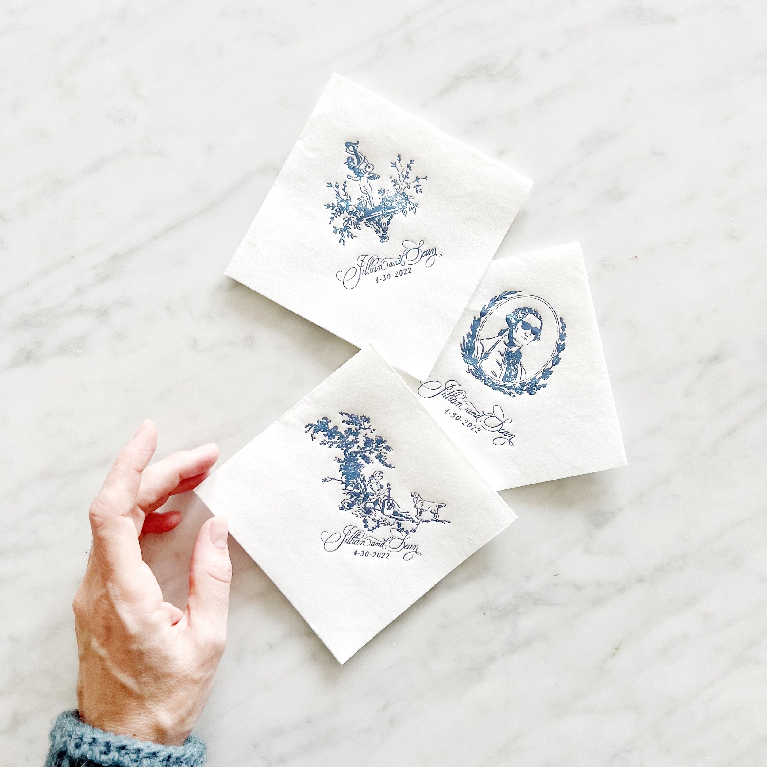
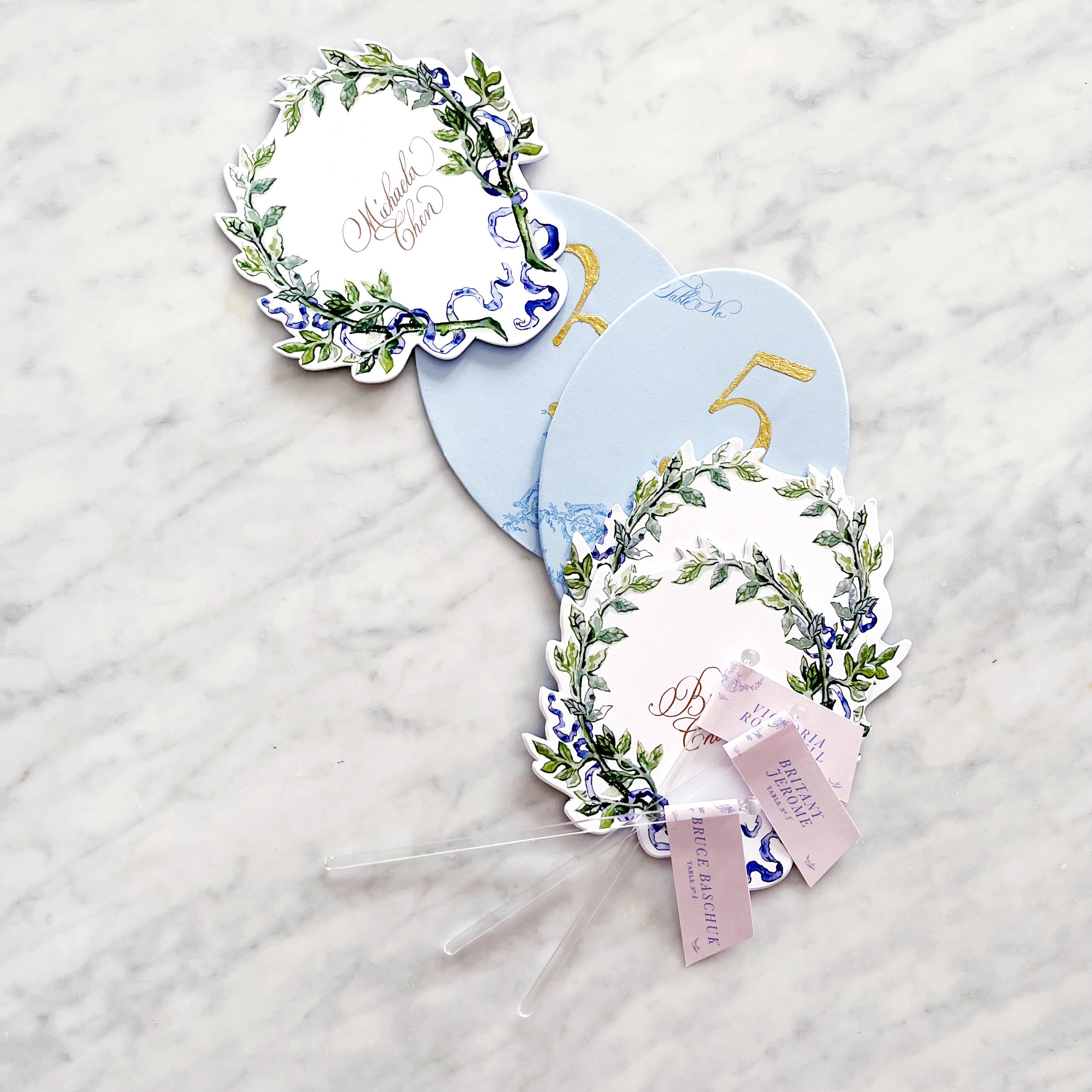
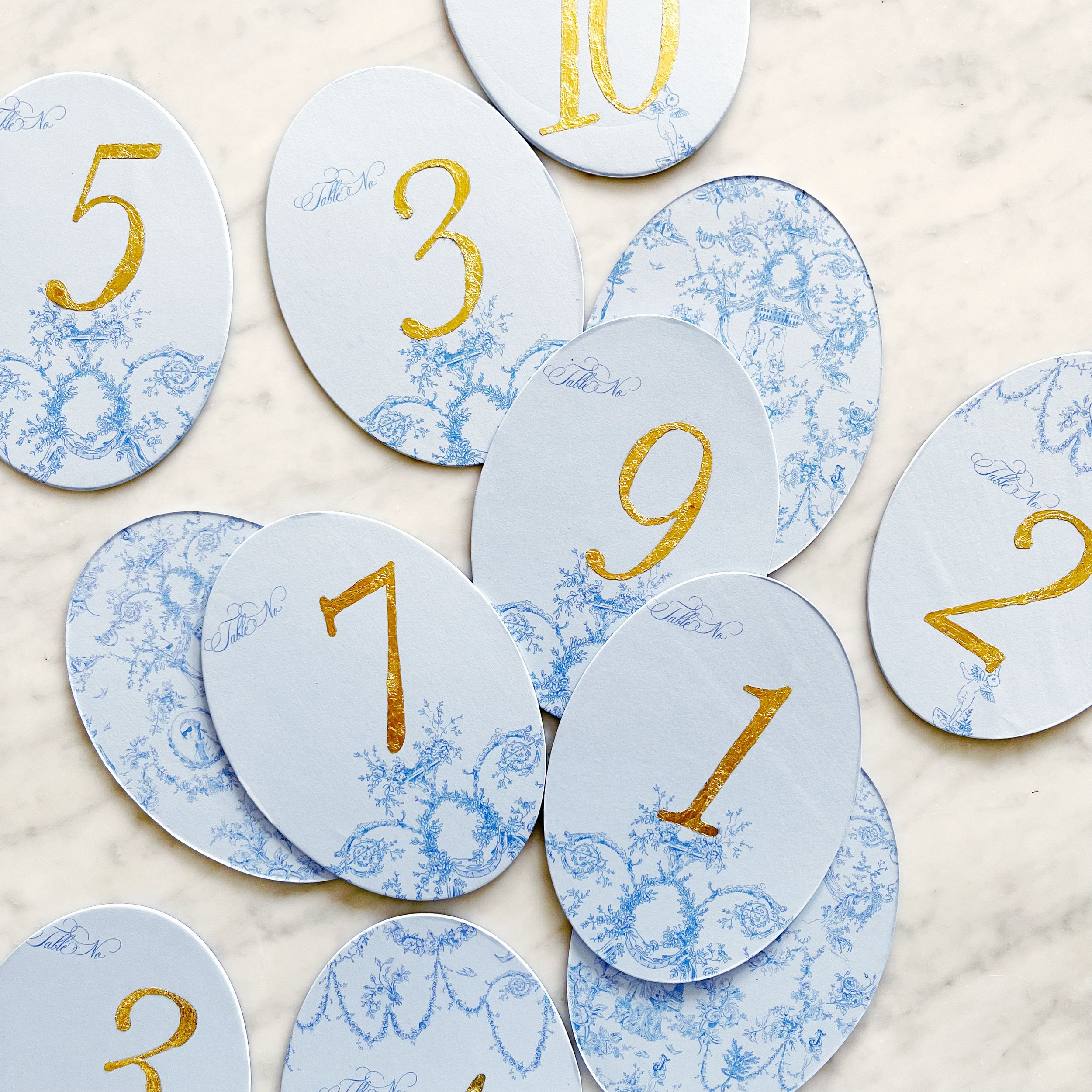
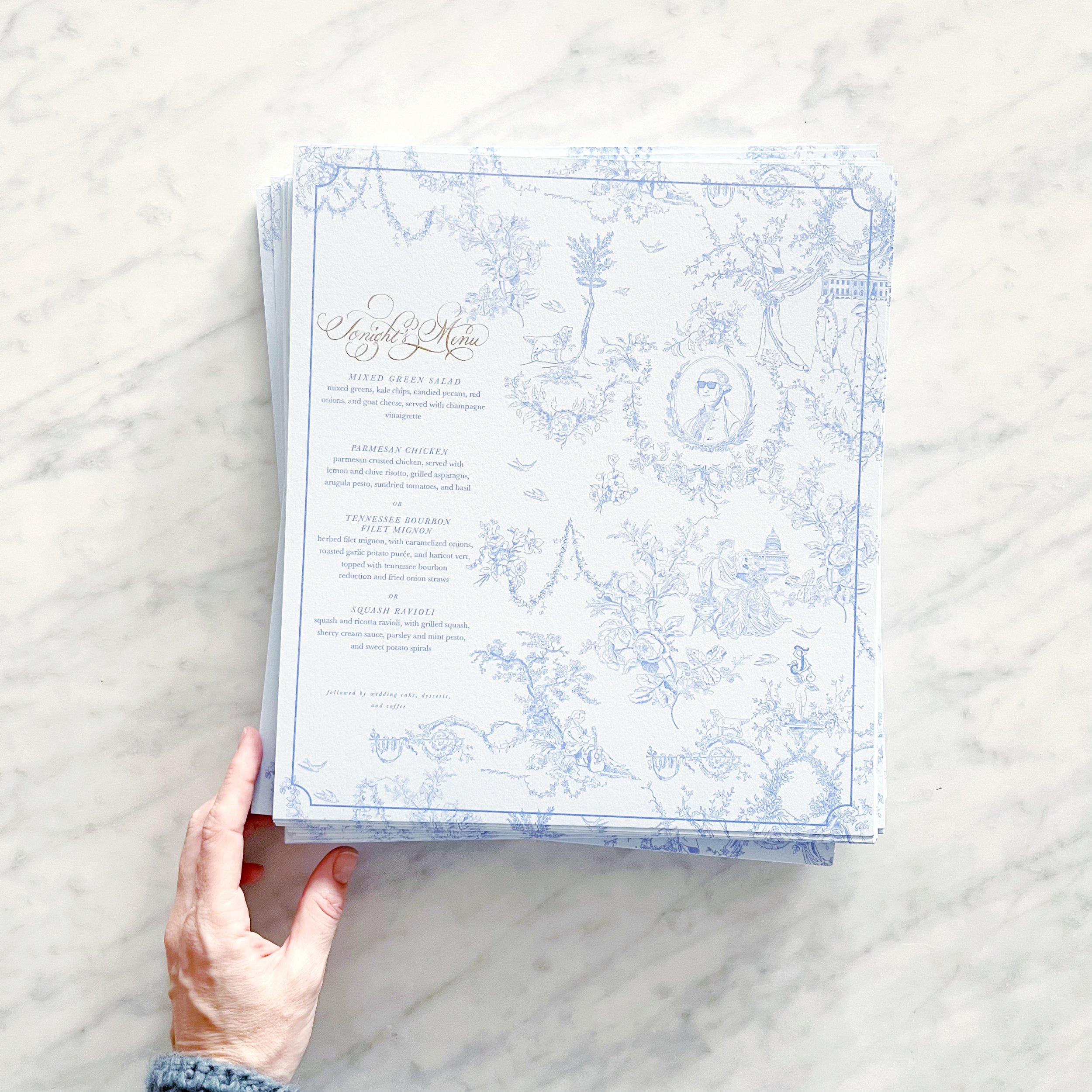
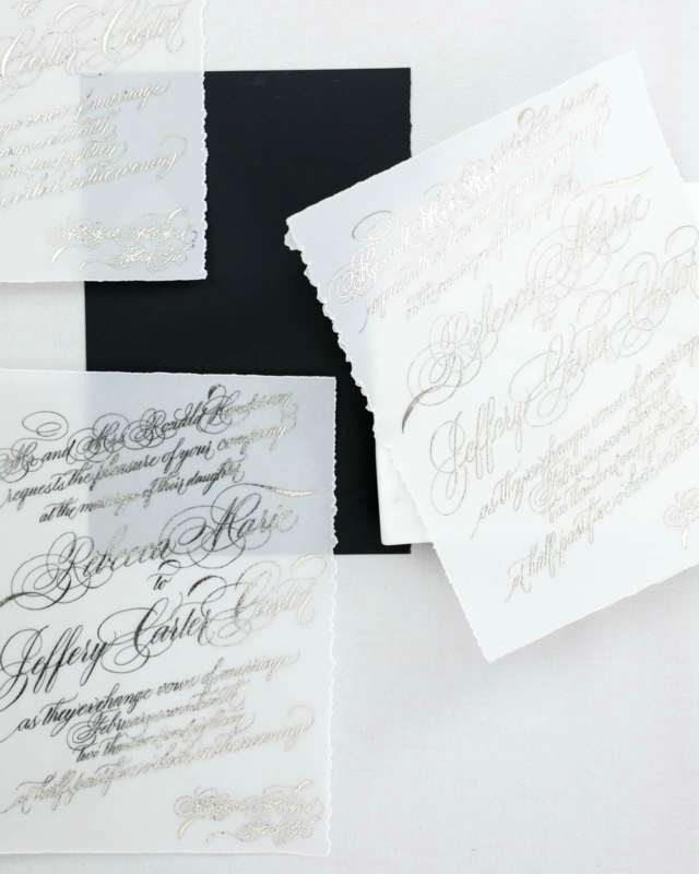
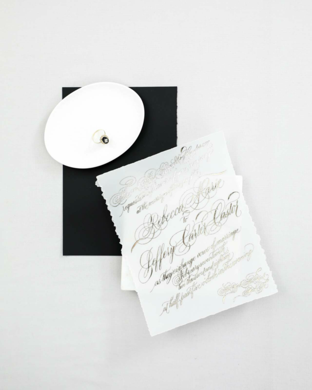
For her reception details, we added a few touches of gold here and there. We started with gold gilded table numbers, then went to gold calligraphy for the place card calligraphy, and gold calligraphy detail on the menus.
The menus were unusually large and designed to sit under the plates at each place setting with the napkins and placecards on top.


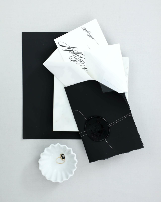
A Custom Toile Pattern for a DC Wedding - Assembly Details
Between the shortages throughout the industry and the very distinctive shade of blue I was looking for, we ended up going with a custom-dyed silk ribbon to hold all our pieces together. We paired it with a pale pink custom wax seal and vintage styled postage.


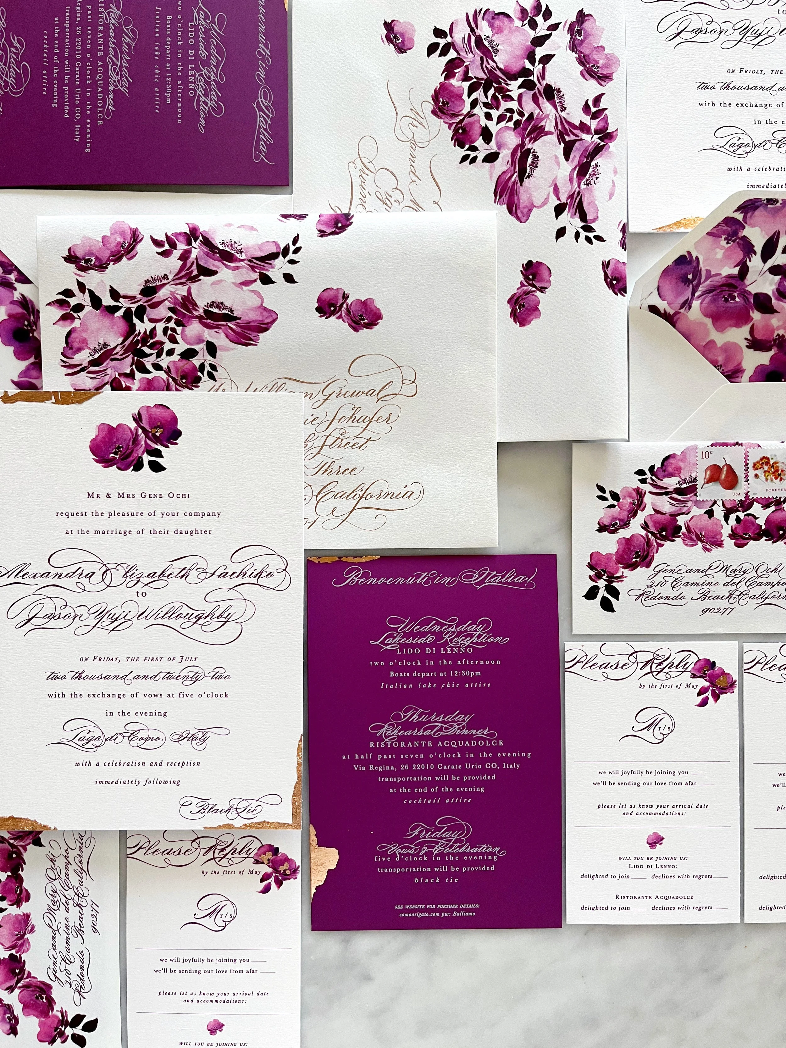
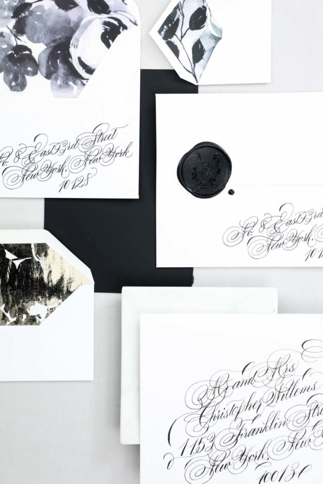
A Suite in Raspberry
Lake Como, Italy
Vintage, saturated, floral, elegant
Our amazing bride, Alexandra, requested two things….a bold, saturated, monochromatic color palette, and florals. We were all over that. I also added touches of rose gold foil and calligraphy throughout the suite to elevate the overall formality of her Black Tie wedding in Italy.
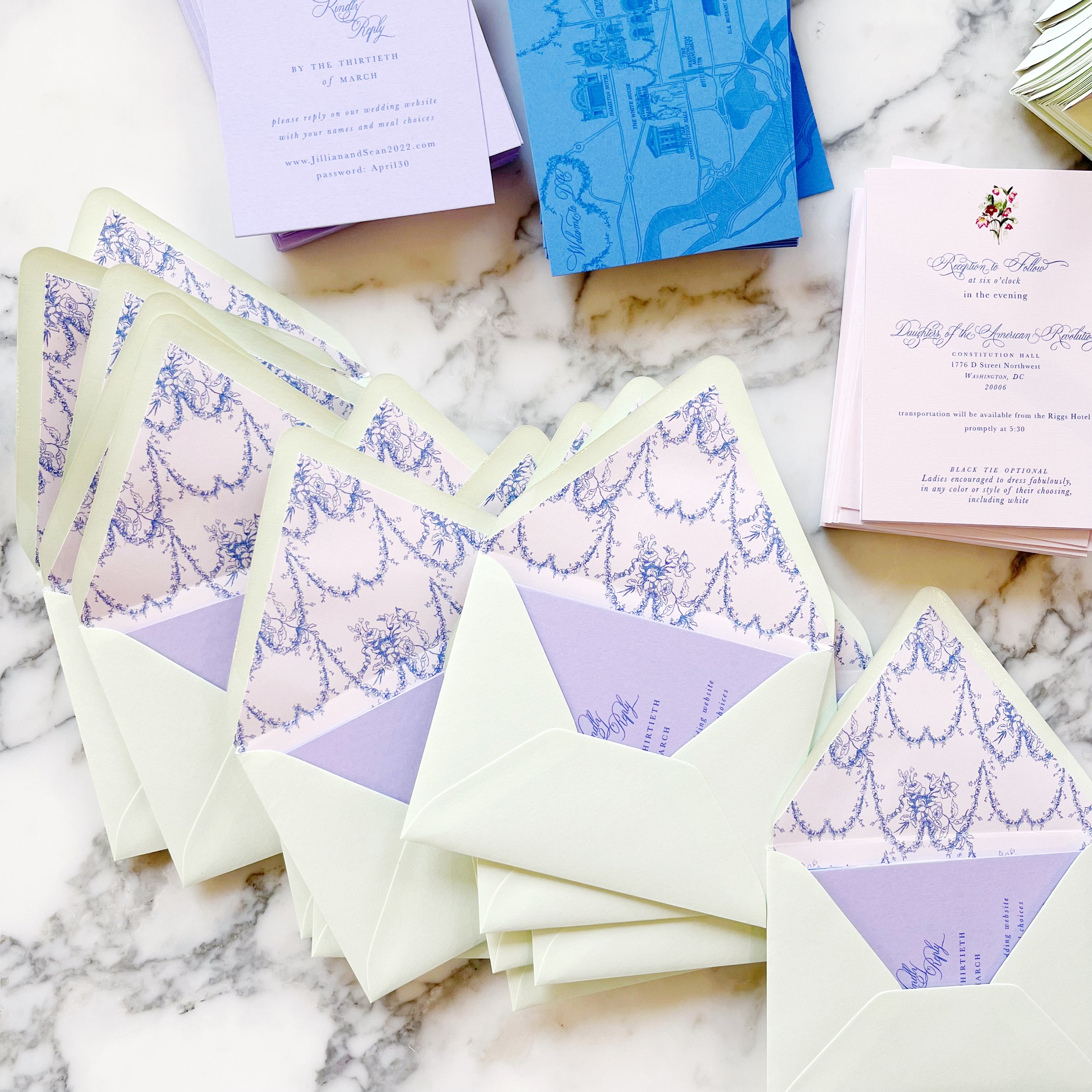
A Custom Toile Pattern for a DC Wedding - Colors
I love getting a project where I get to work with a ton of colors! Granted, the shortages we’re seeing throughout the paper industry right now didn’t make it easy, but I was up for the challenge.
We wanted to go with spring pastels without feeling too much like an Easter church service. I selected very specific shades, including a cool pink, medium rosy purple, spring green, pale blue, and a distinctive shade of cornflower blue.


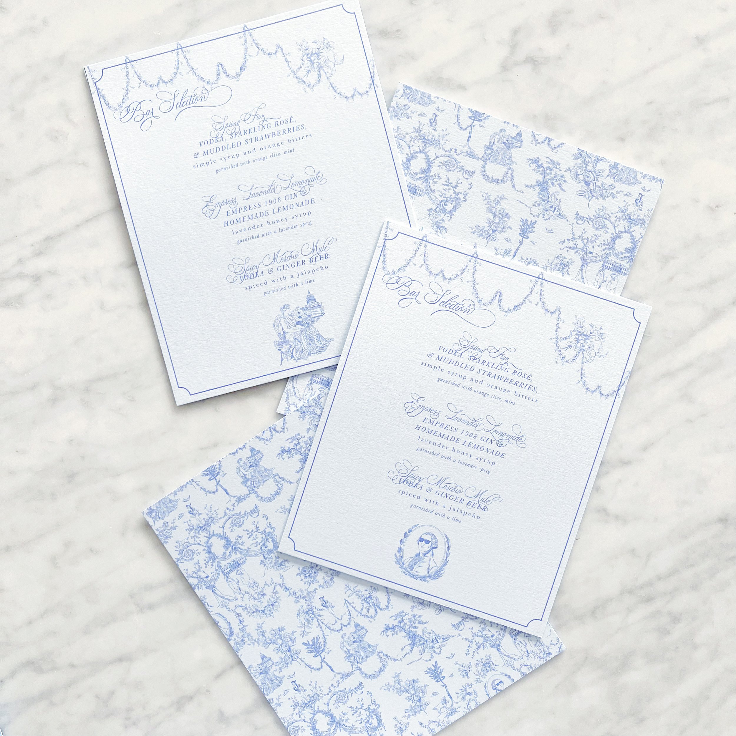
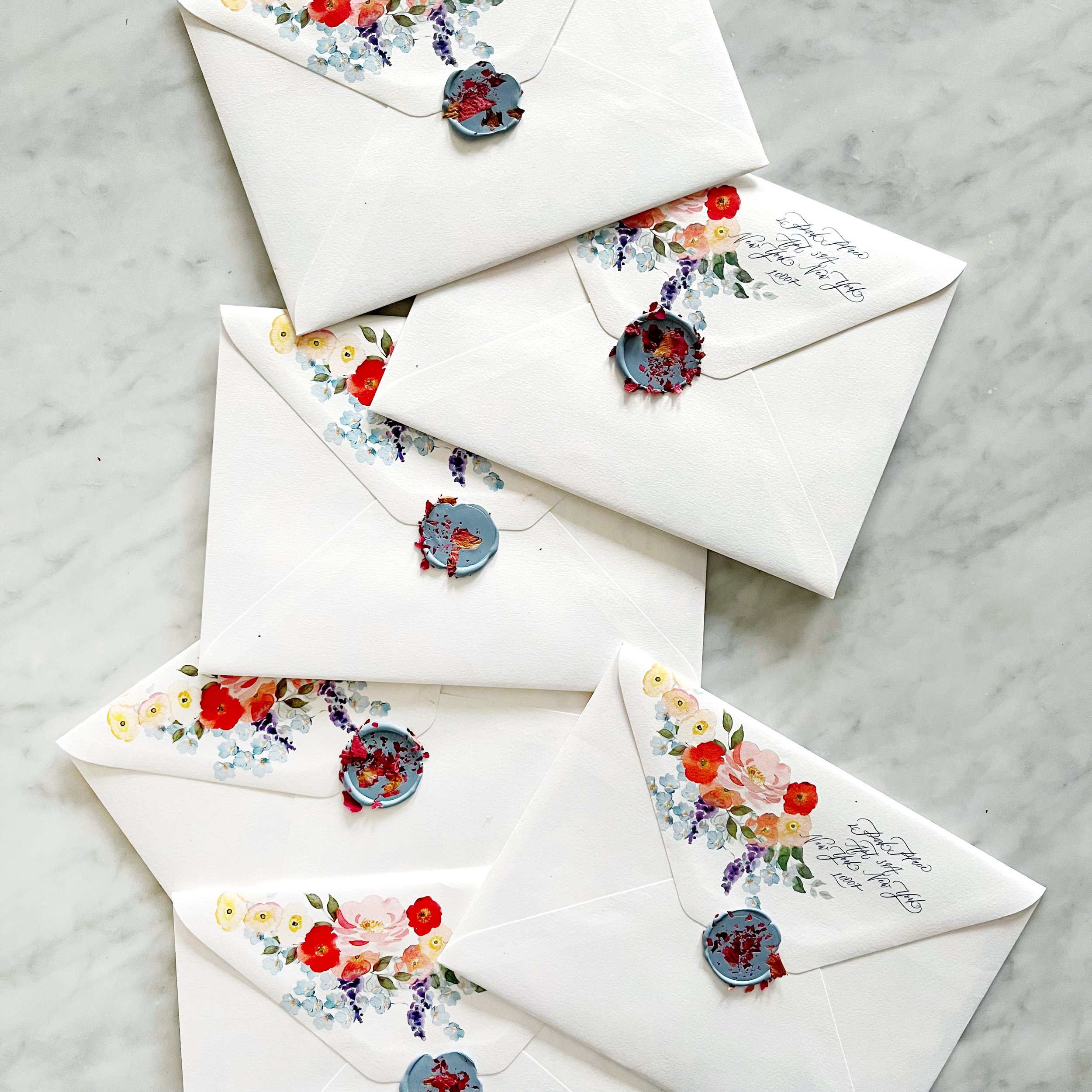
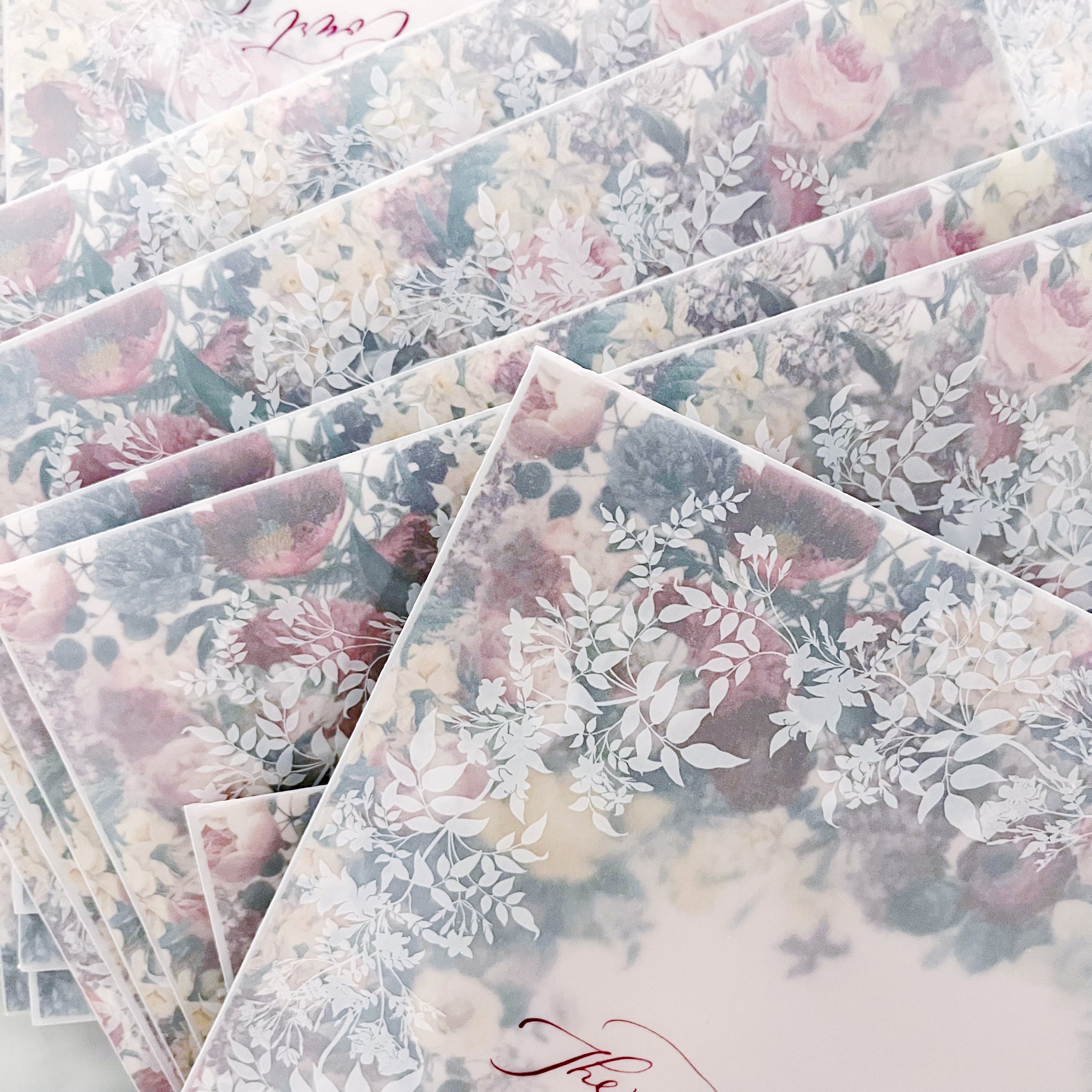
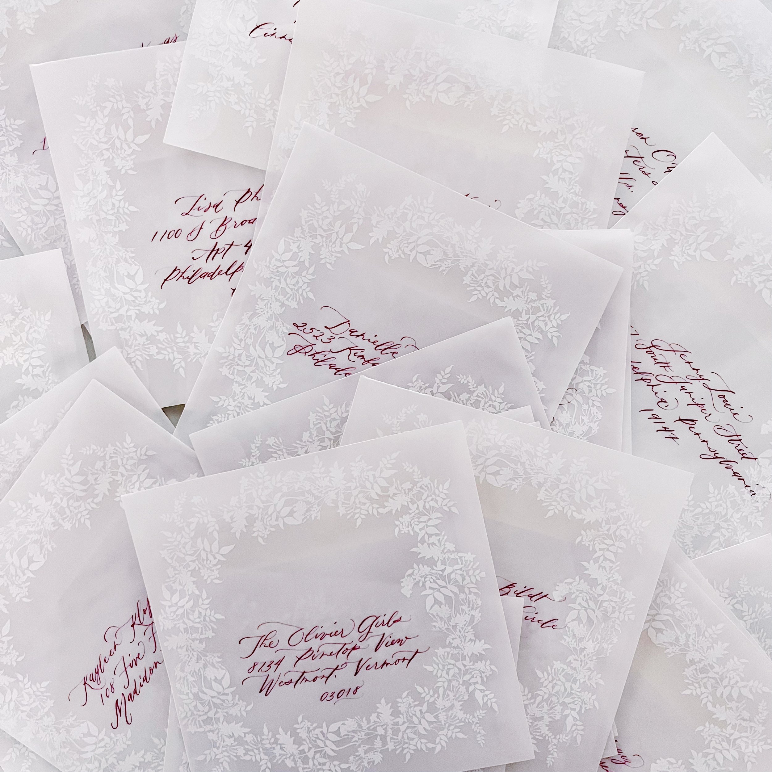
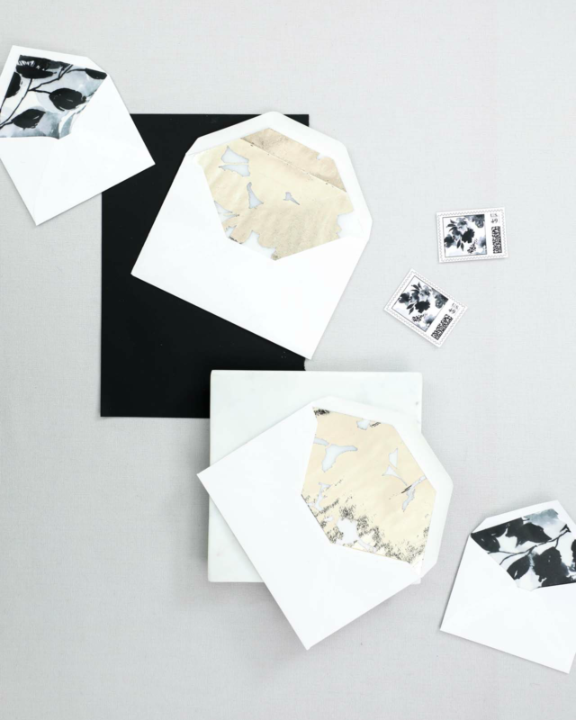
A Custom Toile for a Historic DC wedding
Washington, D.C.
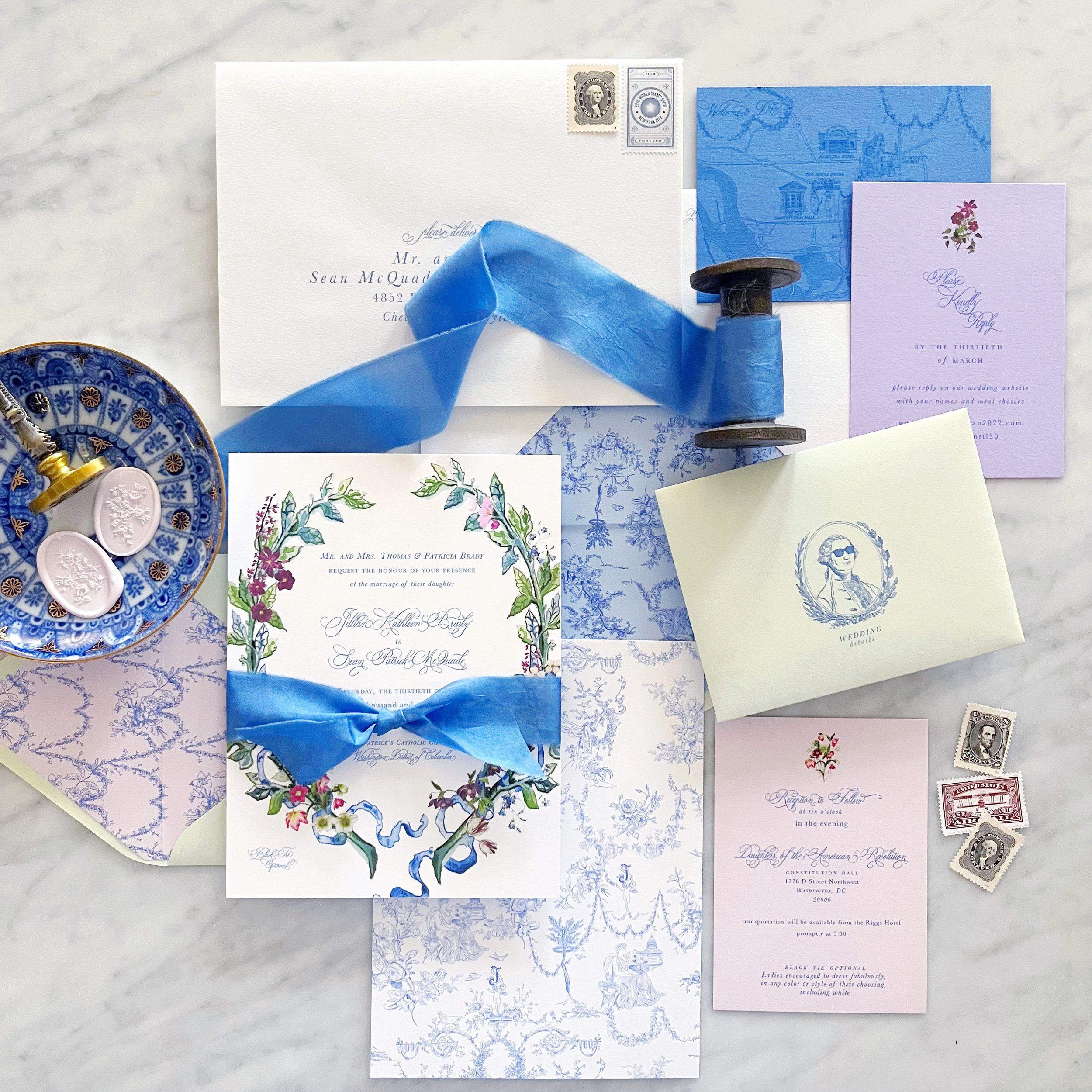
When I created the toile, I also created individual pieces that could be used in a variety of placements throughout her design. The envelope liner was created from floral festoons from the overall pattern, and we highlighted George Washington in his sunglasses on the front of the enclosure envelopes.
We opted for a colored version of her laurel for the invitation itself, and repeated the same style for her placecards. Vintage style postage was a must and we did a custom dye for her silk ribbon to perfectly match her blue.
Each envelope was sealed with a pale pink wax seal with a bouquet from her toile pattern.
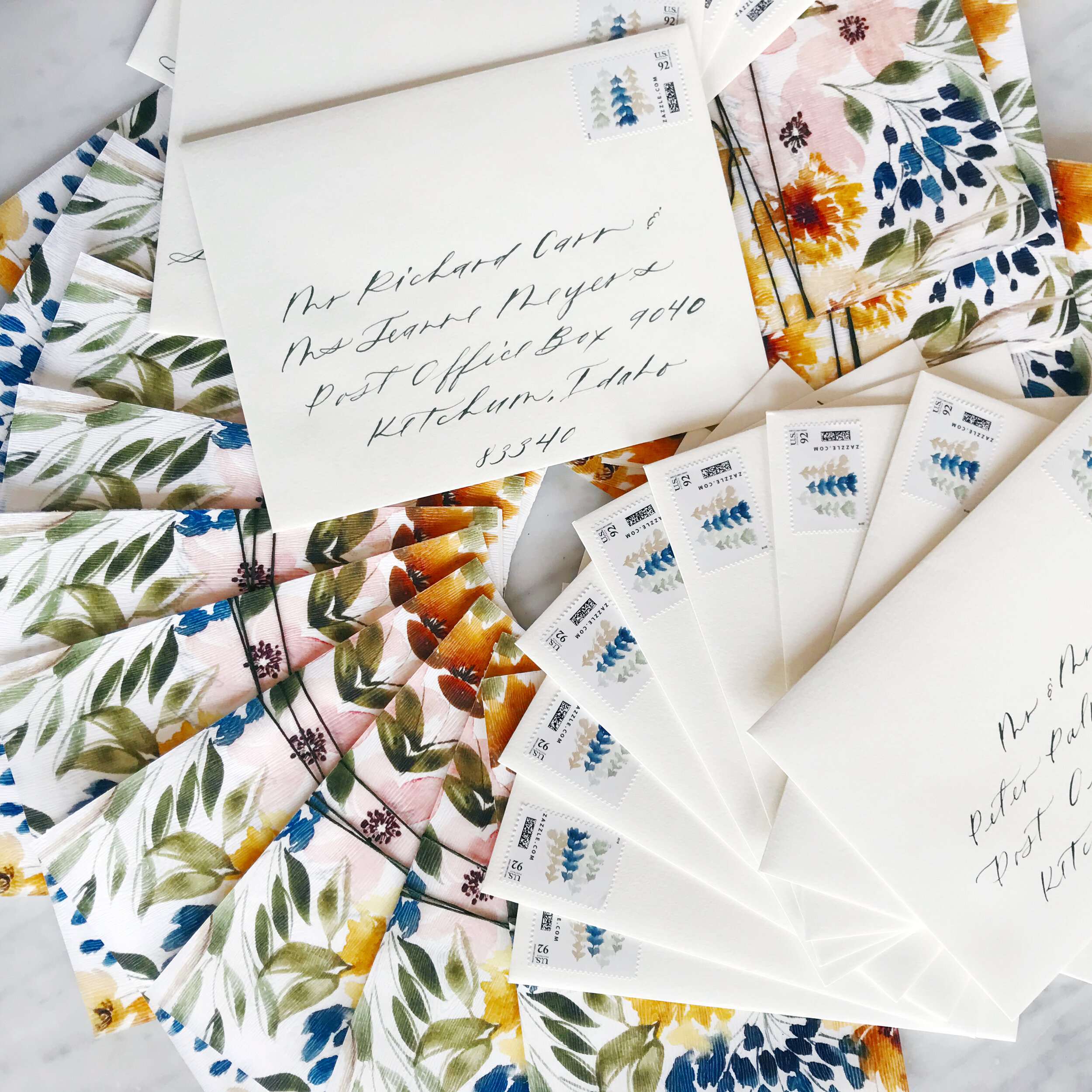
Bright and Summery Bridal Shower Invitations
The vibrancy of this suite is just perfection - with custom envelope liners, full floral invitations with patterned backers, modern calligraphy, and the perfect wax seal.


Bright and Summer Bridal Shower Envelopes
How gorgeous are these envelopes!
We used modern calligraphy in a dark blue to match the invitation. Each envelope was printed with original artwork in a tumble down the front of the envelope. The florals wrapped over the top and continue down the back flap to the return address!


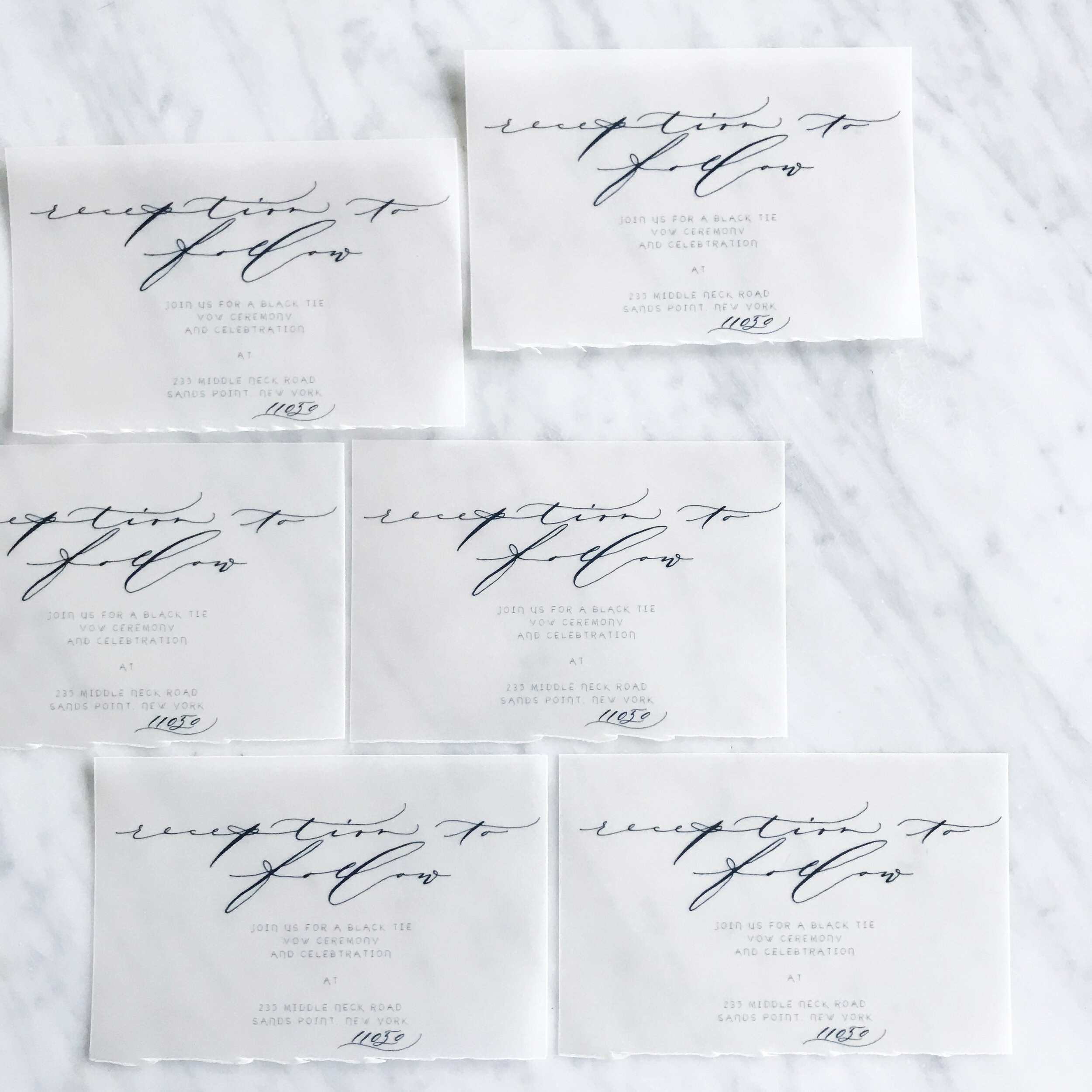
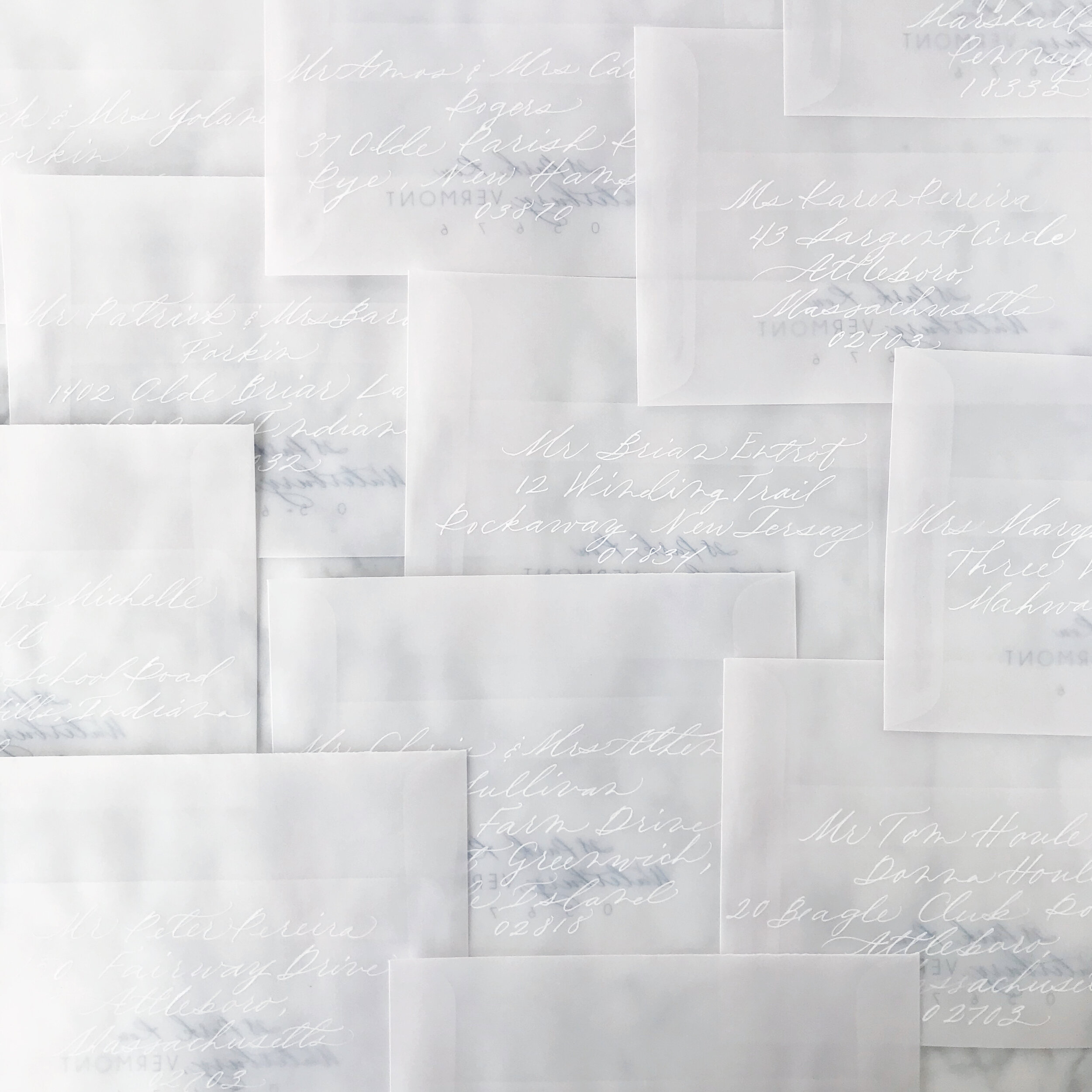
Botanical Baby Shower Invitations - The Envelopes
I’ve worked with vellum envelopes before, obviously, but this project was a little bit different. Vellum is a beautiful material to work with and I love how nicely it juxtaposes as a complimentary texture to so many other materials. Since I knew we would be using the woodgrain paper for both the invitation and insert, I loved the semi-transparency of the vellum to contrast against that. But here’s the thing…you can see through the vellum. So the question always is how do you protect the privacy of the invitation as it goes through the post? Whatever material is chosen, it also needs to support the guest addresses, meaning that it either needs to be dark enough to support a light address or the other way around.
Examples of how to circumvent this would be to do a vellum wrap in a pattern or a custom tissue paper - I typically like to use custom printed tissue paper with a complimentary pattern that we’ve designed to match the suite. For this project, we didn’t have the turnaround time for custom tissue, so that option was out. A vellum wrap was also out because the envelopes I selected were Marques size - 7.25 square - which means a vellum wrap would need to be at least 15” to wrap all the way around. Vellum prints on a laser printer (yes, I know you can get inkjet vellum, but I have a strong preference for how the ink sits on top using a laser) and my printer maxes out at 12”…so that option was also not available.
So what’s left?
Using the back of the invite and the envelope liner! The envelope liner obviously shows when the guest opens the envelope, but there’s nothing saying that I can’t print both sides so one shows through the envelope and shows when the envelope is opened, so that’s what we did. I matched the heavy pattern for the backs of the invitations and the back of the envelope liner so it created a consistent and cohesive pattern front to back, which I LOVED.
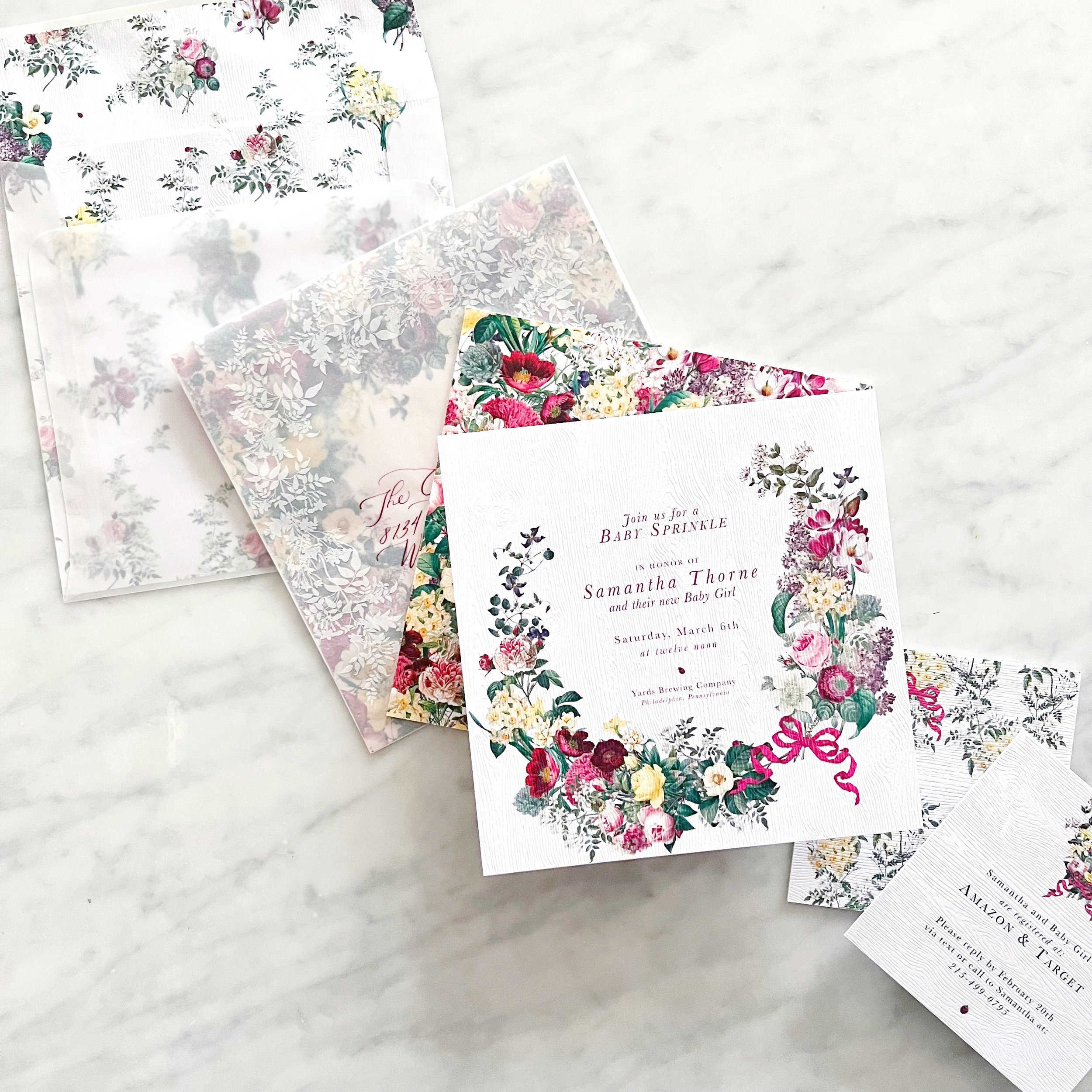
OI course, I didn’t stop there - I also wanted artwork on the outside of the envelope to overlap with what showed through from the envelope liner.


Calligraphy in a deep burgundy and modern style topped them off!
I specifically designed the envelope liner to have a negative space to frame the calligraphy, making it not only the focal point, but also easier to read.
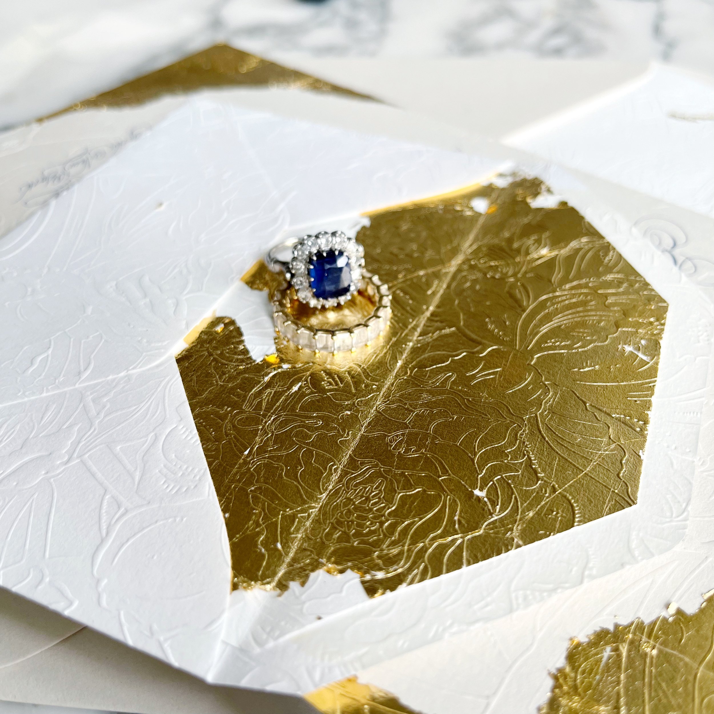
Gold Gilded & Embossed Invitation
elegant | regal | Gold | old-world | dramatic
an invitation suite for a wedding at:
the beekman hotel | new york, new york


We used so many details of the Beekman Hotel as we played with design ideas for Yara. She knew she wanted bits of gold and embossing, and we wanted to pull color inspiration from her beautiful sapphire engagement ring. We also wanted to echo some of the overall textures and feelings of the hotel, like the dark moody lighting and all the velvet upholstery.
We also selected not to go with all white paper, instead, we selected a warm white and a taupe.
Our bride was looking for old-world drama, and I think we delivered!
She had seen so many examples of “old-world” invitations that were pale and beautiful, but hardly any that were dark and moody, like the hotel that was hosting their nuptials.


Each piece of the suite had gold gilding applied by hand. The invitation had the most dramatic gilding, followed by the reception card. Our additional insert card just had touches of gold around the edges.
We always want each piece to feel unique and not like a cookie-cutter of the other pieces in the suite. but have their own personality!
The taupe mailing envelopes also had gilded detail rounding the return address, as well as gilded details on the deep sapphire blue wax seals.

Another high-impact moment is the reply envelope. Fully embossed and lined with gold gilding, it’s a dramatic piece with so much texture and wow factor! The fronts of each reply envelope also featured a bit of old-world magic with tiny pieces of gilding.

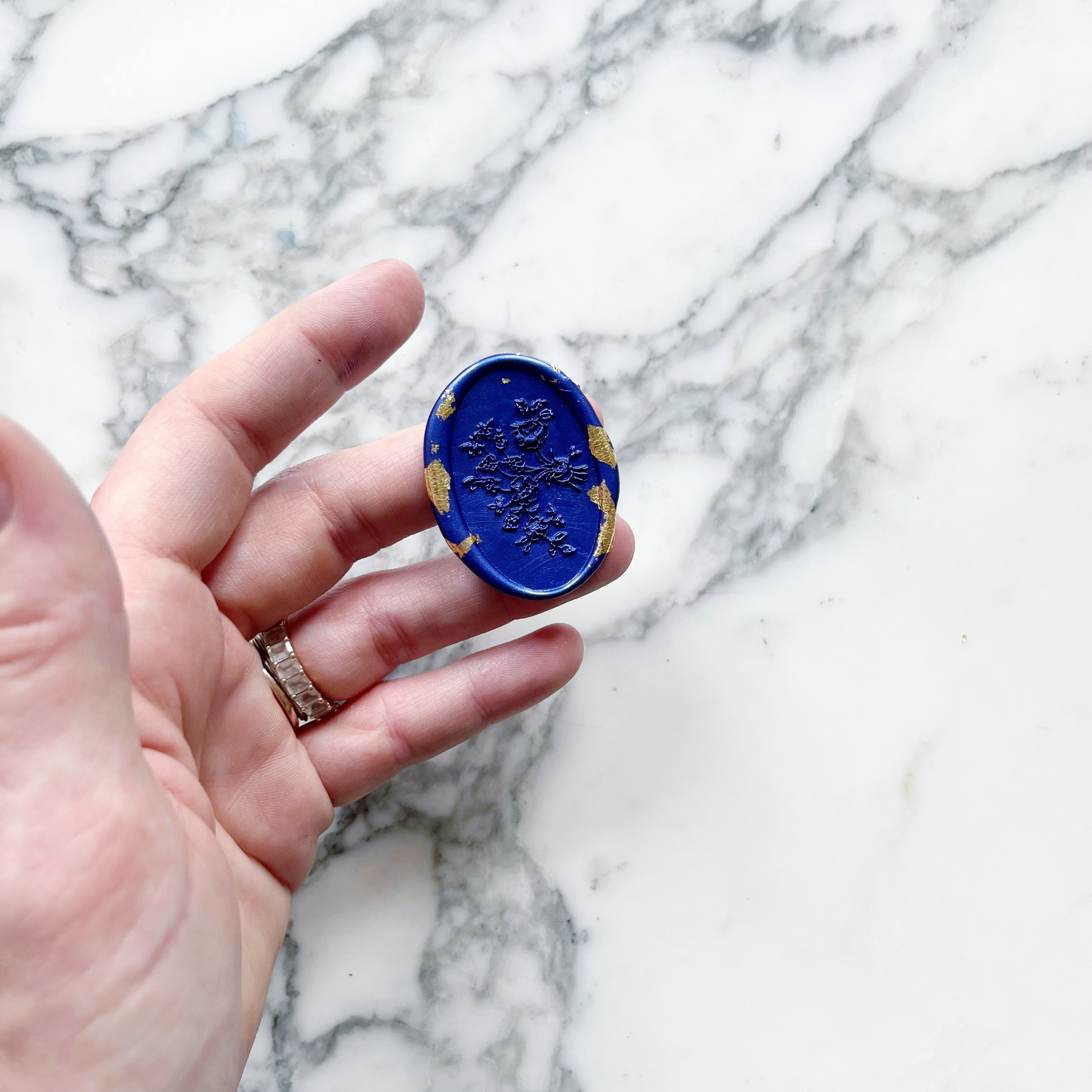
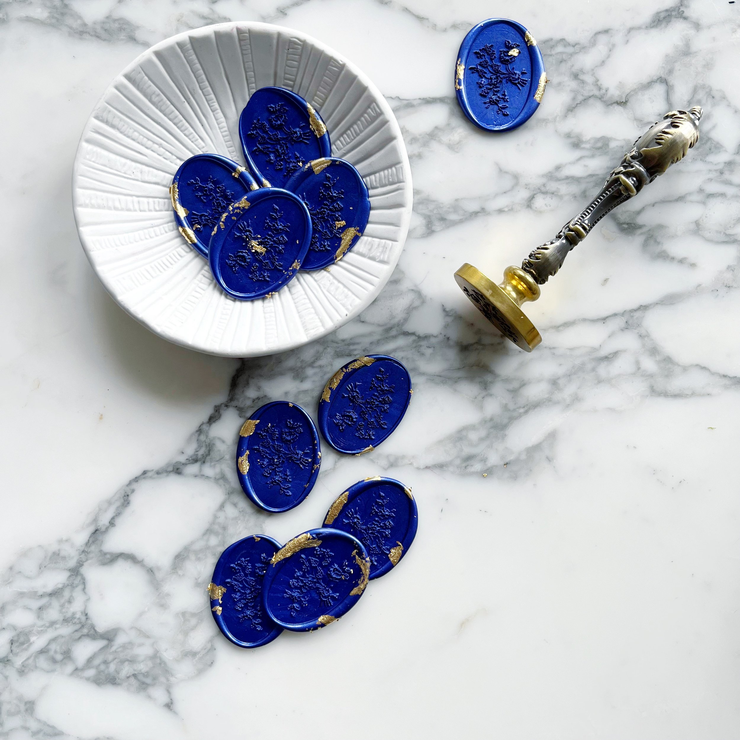
The oval floral wax seals we designed for Yara’s suite also had bits and pieces of gilding in the sapphire blue wax. We used the wax seals to hold closed our taupe mailing envelopes.


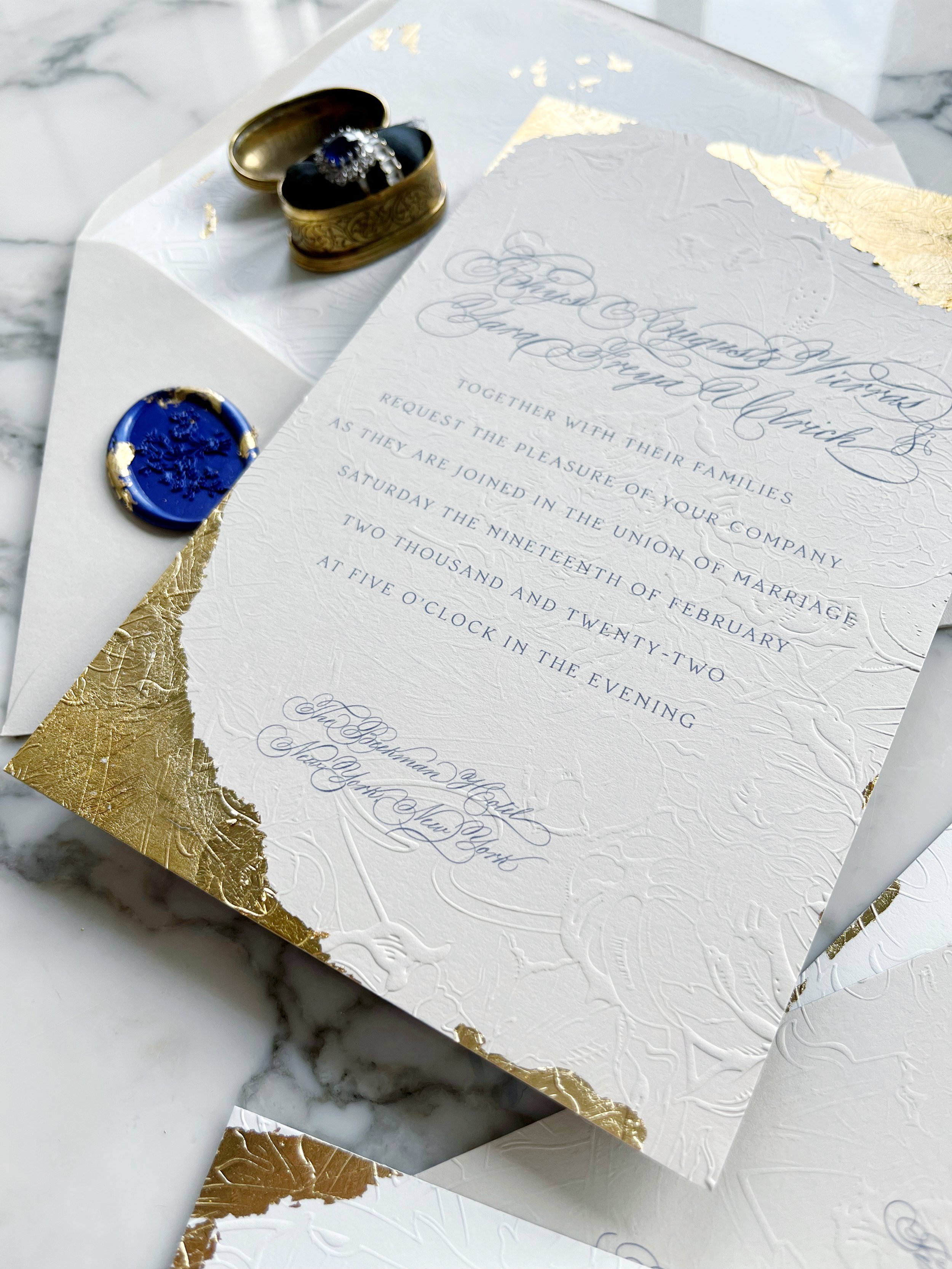
The embossing is definitely the highlight of the suite with the embossed pattern covering several of the pieces. The tactile experience and visual beauty are like nothing else! These invitations were designed to truly set the mood for Yara and Rhys’ wedding!
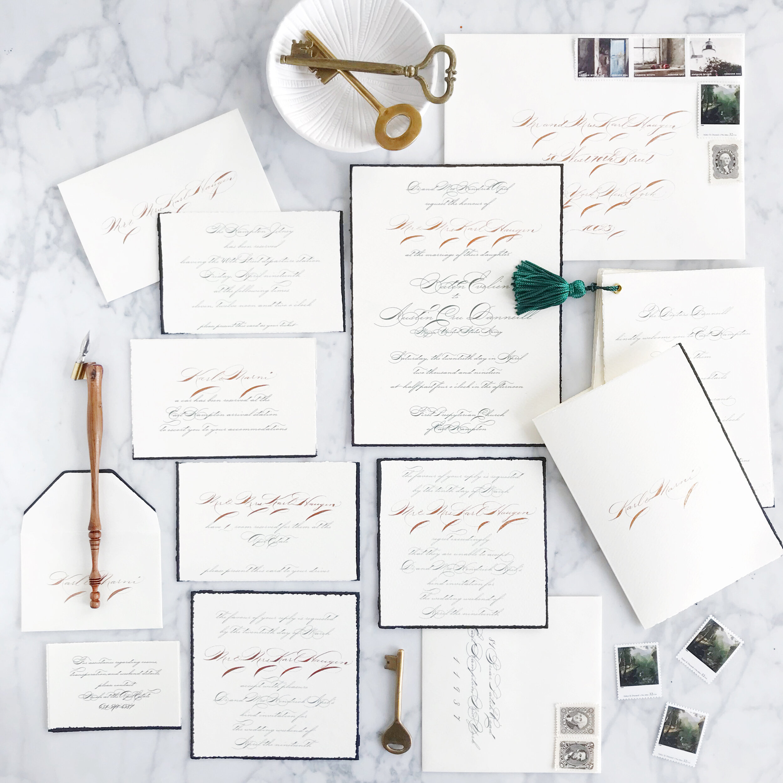
A Formal Wedding in the Hamptons
Formal | Calligraphy | 1920’s | White Tie | Train Rides
Private Estate | Hamptons, New York


Saying that our bride, Katen, has a passion for the 1920’s would be an understatement. Working in the antiques and historical field with a specialty in the time period, we knew it had to be the focus of her invitations.
One of first conversations we had with her shared her annoyance at how we now portray the 1920’s with little to no historical accuracy and attend it like a costume party. Being all about historical accuracy ourselves, we were all about this. We worked with her and did a ton of research on invitations and etiquette of the period, looked up calling cards and their usage, and travel styling of the day. We brought all of this new information into her invitation design.
We had a few different elements that we knew we wanted to integrate:
Each invitation would be personalized for each guest, and we don’t mean the envelopes. Each invitation, reply card, reception card, travel card, and accommodations cards were all personalized for each guest.
She loved traveling by train from New York City up to their family home in the Hamptons, and booked all the travel for her guests. All travel was arranged by the bride and groom, including cars to transport guests from the station to their accommodations.
All the guest accommodations were also arranged and taken care of by the bride and groom.
The bride enlisted a staff member of their Hampton’s household to act as a concierge to arrange anything additional or answer any questions for their guests.
The idea was that the guests wouldn’t have to lift a finger. For anything.

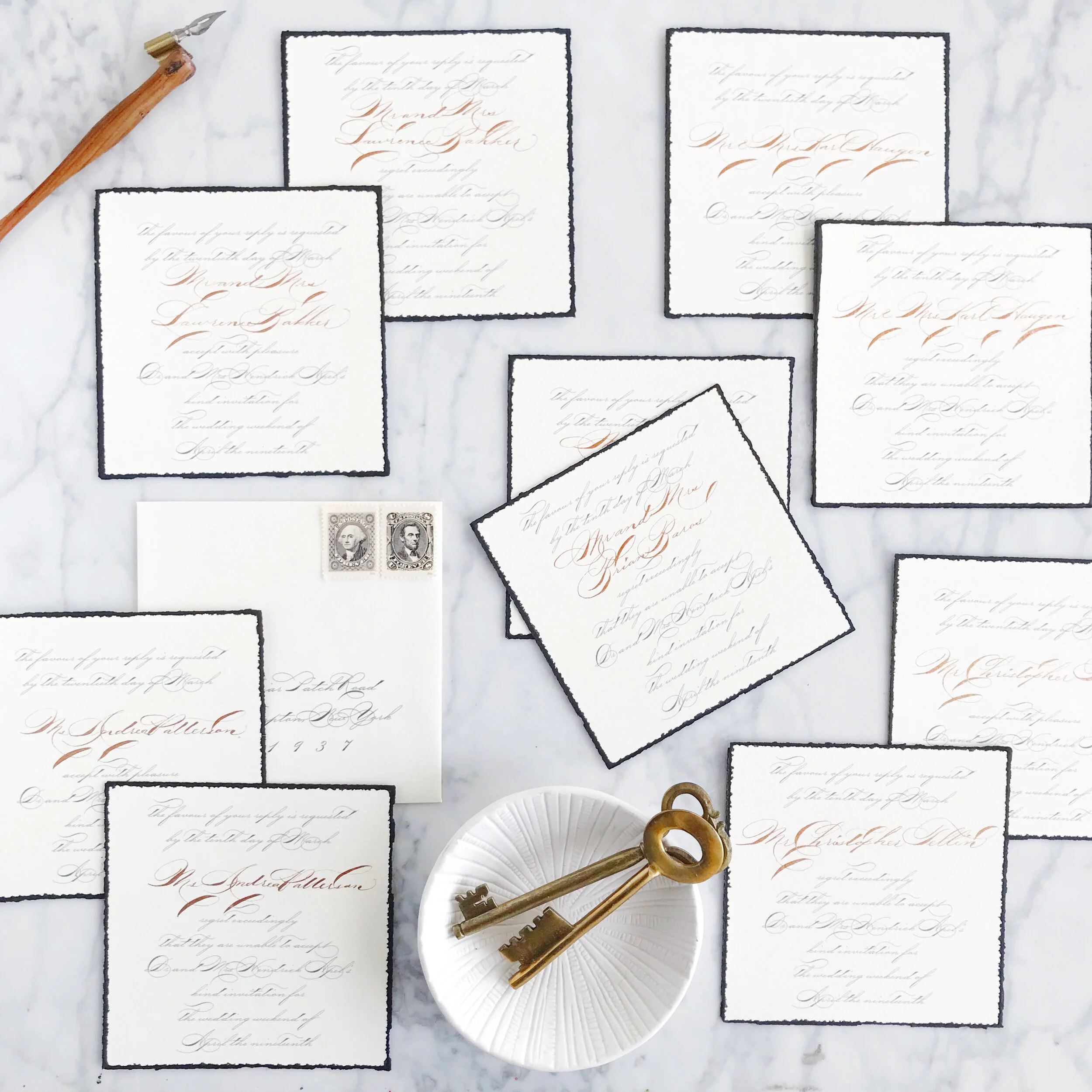
Our invitations on stiff cream handmade paper were edged in black. Each invitation bore the name of each guest and was worded to address and invite the guests by name.


Our reply card were similarly personalized for each guest, but formatted differently than what we see in our contemporary wedding invitations. Each guest was provided with two cards, one for a response to attend, and one to decline. Each card was worded again to integrate the guest’s names into the pieces.

A petite envelope holding three small cards told each guest where they were booked to stay for the weekend, that a car would pick them up from the train station, and a card that stood in as a train ticket for the guests ride up from the city.


Several pages, bound with a tassel, detailed out all the events for the guest’s four-day stay including transportation details, dress codes, and other event details.


Each envelope continued our theme with formal copper calligraphy. A collection of vintage postage completed suite.


Sneak Peek - Formal Wedding in the Hamptons
Formal | Calligraphy | Dramatic | Personalized | 1920’s
Inspired by the invitations of years past, elegant train travel, and a level of formality that we don’t see very often anymore.
Sneak Peek - Art Nouveau Wedding Invitations
Romantic, pale, textured, unexpected, handmade paper, tactile, art nouveau
an invitation suite for a wedding at:
Glen Foerd Mansion | Philadelphia, Pennsylvania
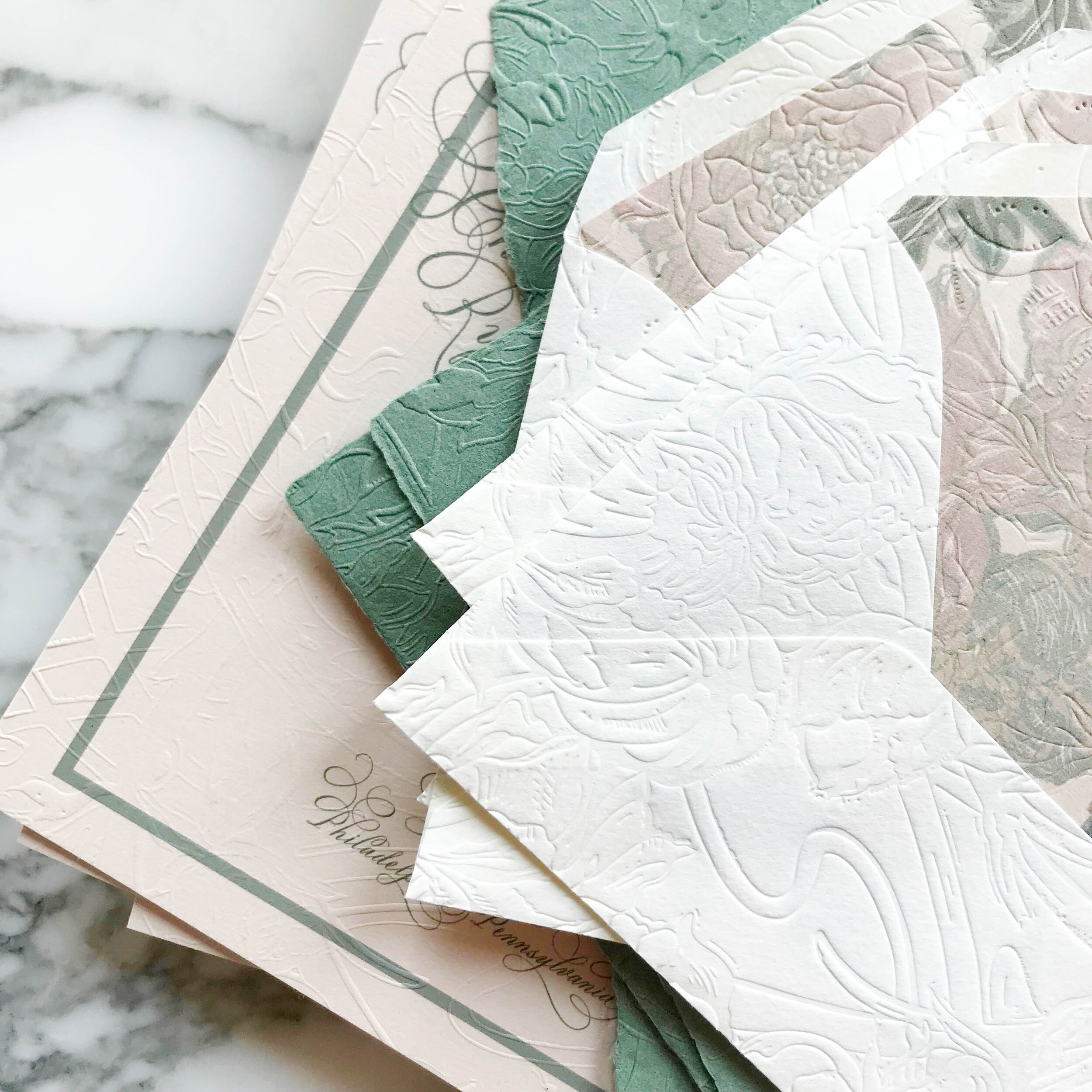
pale shades of nude and sage, with classic art nouveau texture and artwork, saturated with heavy texture emobossed onto pillowy soft papers.
Calligraphy | The Process
We begin each of our projects very much the same, all of which includes selecting a calligraphy style. Rather than having a set number of scripts that we offer to every client, we create new ones based on what our bride is looking for. I watch my calligraphy styles evolve and change so rapidly, that even if I had a set number of styles I offered, that set would only be relevant for a matter of months before it evolves into something new and better.

I also love that we present our brides with what their names will look like in calligraphy, which certainly changes the way they view each style.
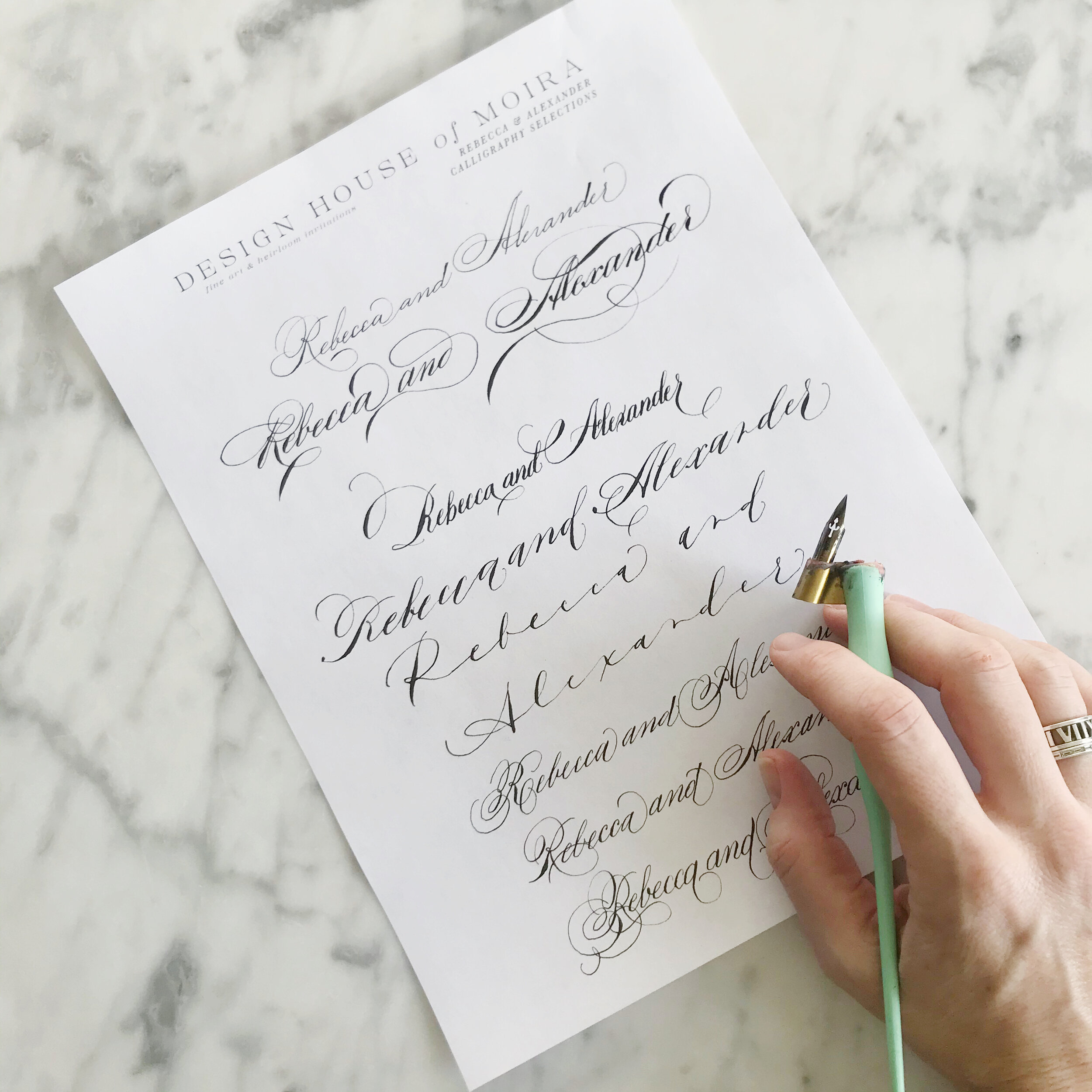
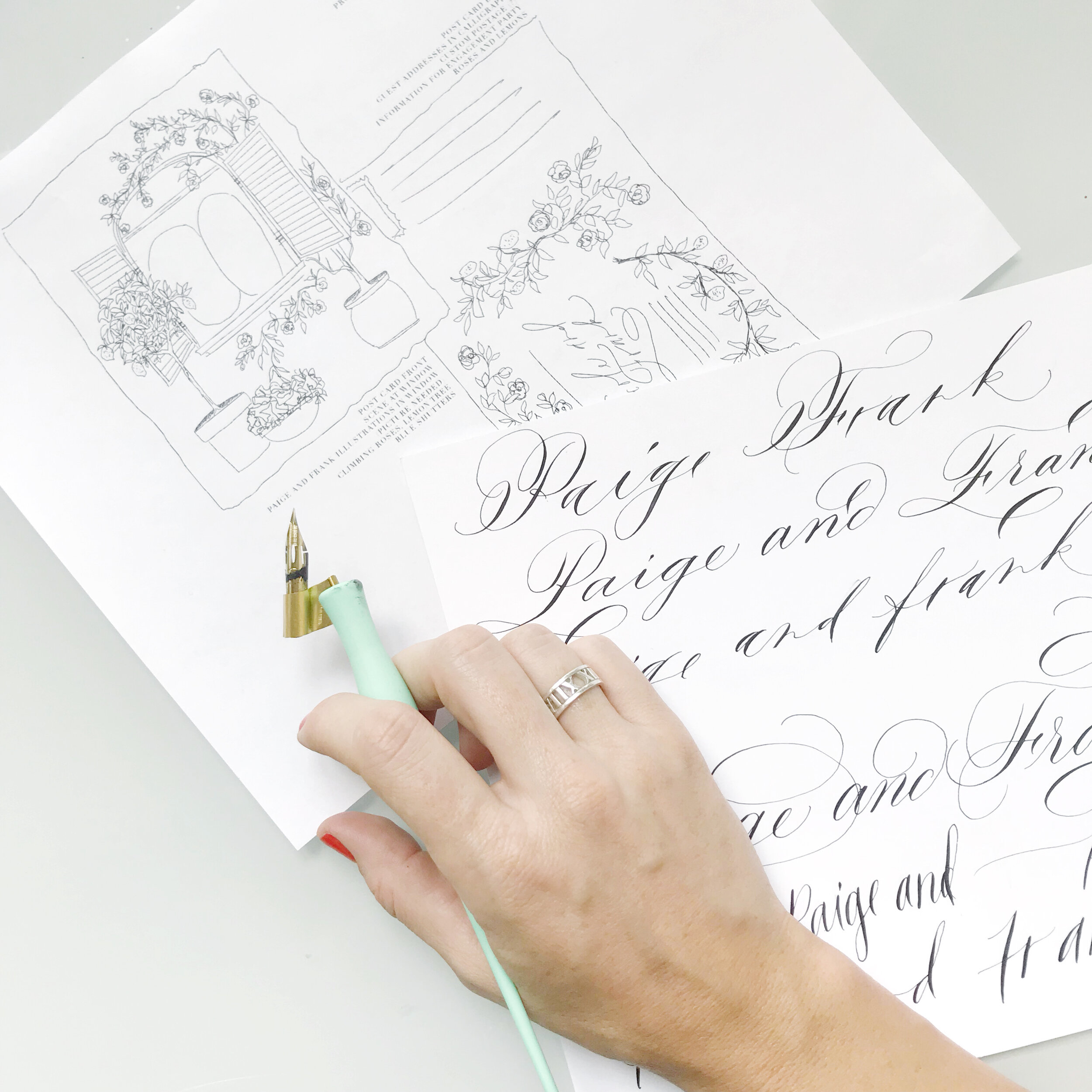
This is how we always begin our creative process! We sketch out your suite and preset you with calligraphy options to jump start our design process.
How to Combine Classic & Modern
How do you combine two totally opposing design ideas? We’ll show you…

classic | elegant | gold | clean lines | monochromatic | bold
an invitation suite for a wedding at:
New York Public Library | New York, New York
For a wedding at the New York Public Library, our bride wanted to figure out how to combine super traditional, flourished calligraphy (her favorite!) but with more modern lines and a bit of gold.


We started with our paper selection.
We went with a bold, bright white cotton, a silky smooth black, and thick vellum with deckled edges. The bold white gave us a modern feel while balancing out the over-the-top calligraphy.
We also selected an oversized wax seal in black, again, aiming to combine the traditional and modern.
We used a combination of printing methods, including digital printing for our bold monochromatic patterns, and foil for the invitation, reply card envelope liners, and mini insert cards.
We placed the bold black and white floral pattern on both the backs of our insert cards as well as the envelope liners on our mini bright white envelopes.
Calligraphy | The Modern Side
Calligraphy has had a massive comeback in the last decade. When I first began my personal calligraphy journey in 2009, I couldn’t find a calligraphy class to save my life. I figured it out on my own, trial and error style.
These days it’s hard to ignore calligraphy in the world around us. It has been integrated into weddings, top to bottom, but also in logos, menu design, home decor, pillows, mugs, etc. (Home Goods, I’m looking at you for those last few).
The calligraphy we see ubiquitously throughout our world generally falls into to major categories (no, I’m not being technical here): modern and traditional. There are a whole handful of styles out there, but we’re talking about Copperplate here formed with a pointed pen and dip ink.

It took me a long time to learn how modern calligraphy moved and its characteristics. Traditional, flourished, formal calligraphy came most naturally to me, while I found the modern styling something I really had to learn.
I love how calligraphy can change the entire look and feel of an invitation. You can take an otherwise formal and traditional invitation and completely shake it up by adding a bold and modern script, or take a super clean and modern style and add in some traditional calligraphy to bring off the edge a bit.
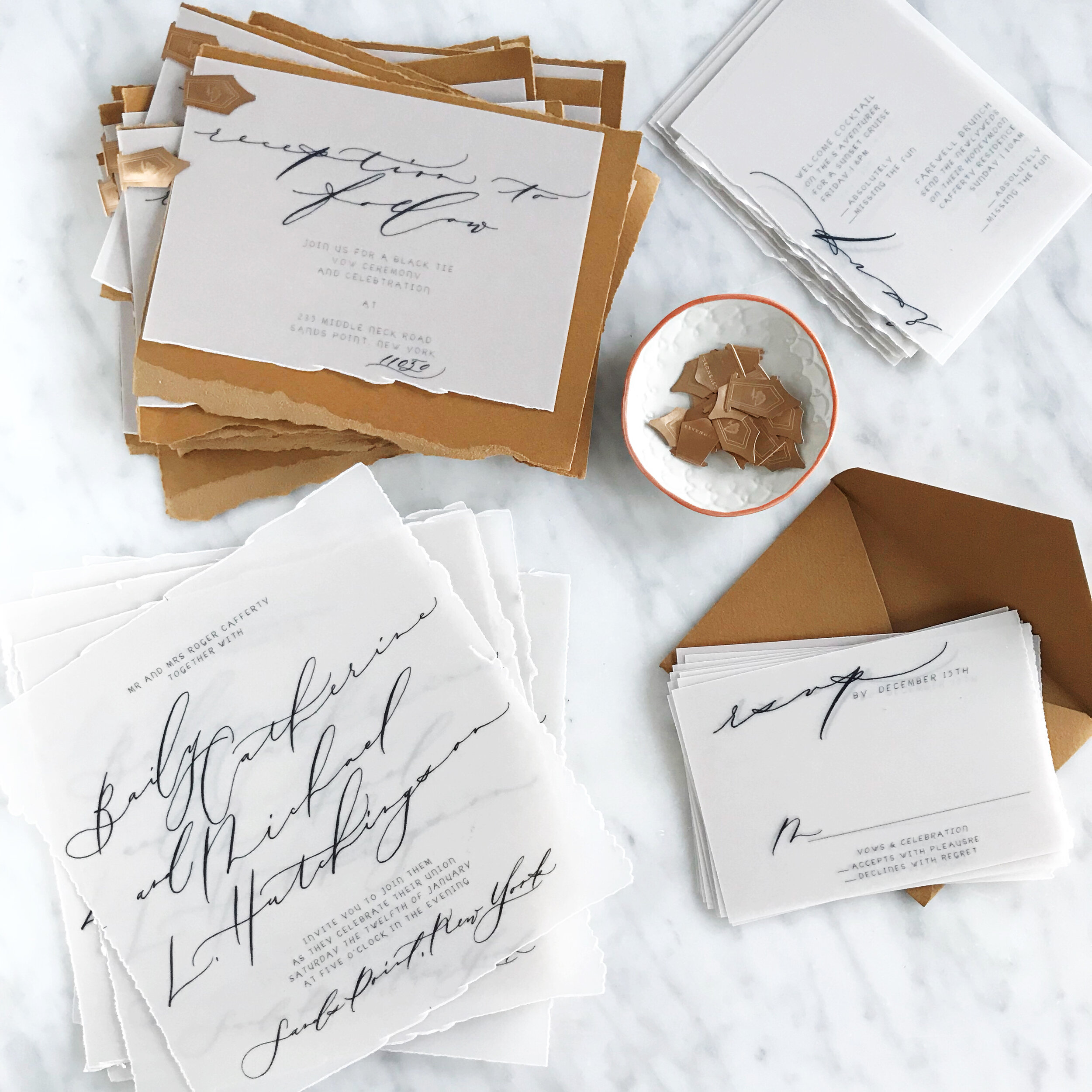
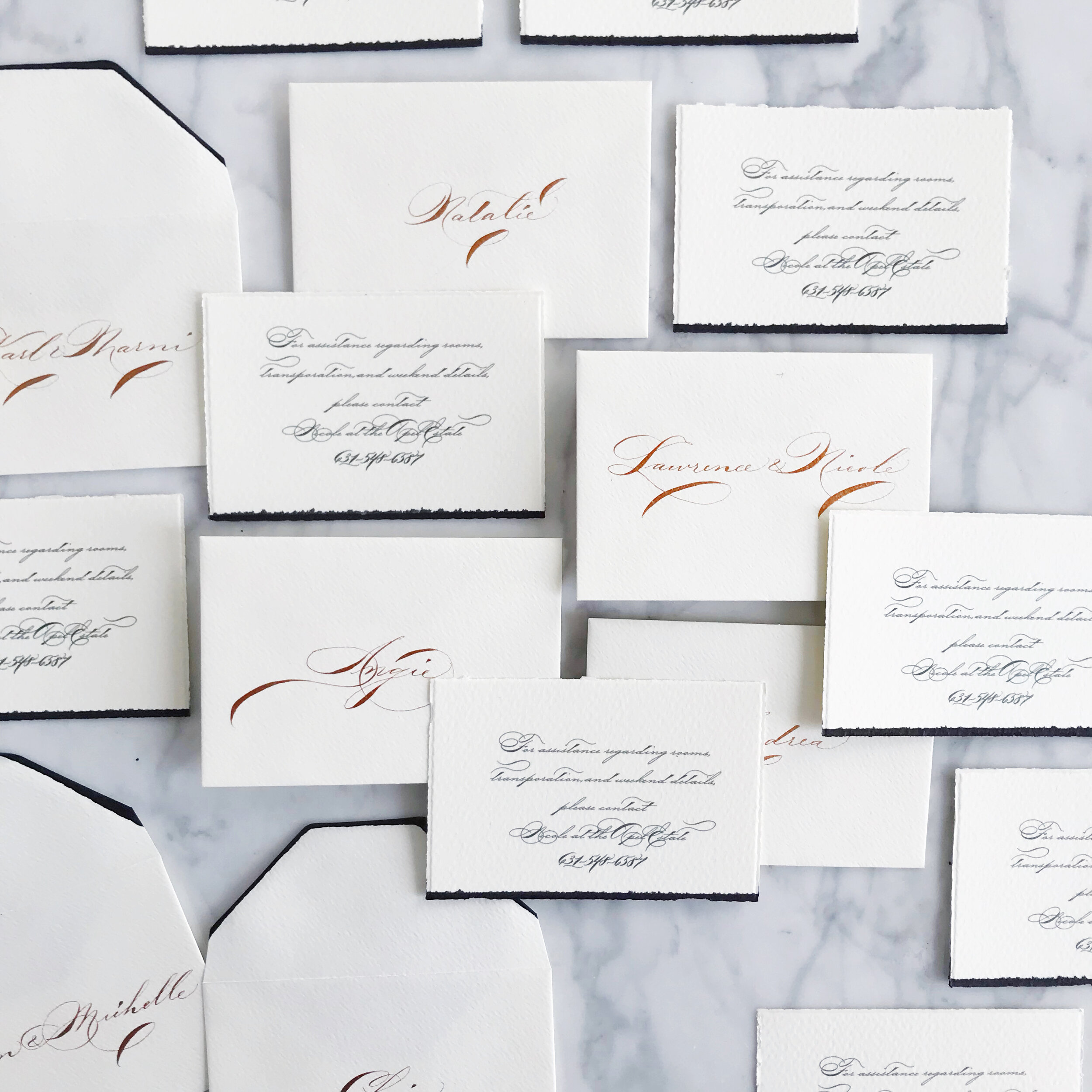
What is "Spot Calligraphy"
What is this thing you speak of….
this “spot calligraphy”?

Spot Calligraphy refers to a specific selection of calligraphed words in your wedding invitation suite. You could think of them as the titles of each of your invitation pieces…thinks like:
bride and groom’s names
“please reply”
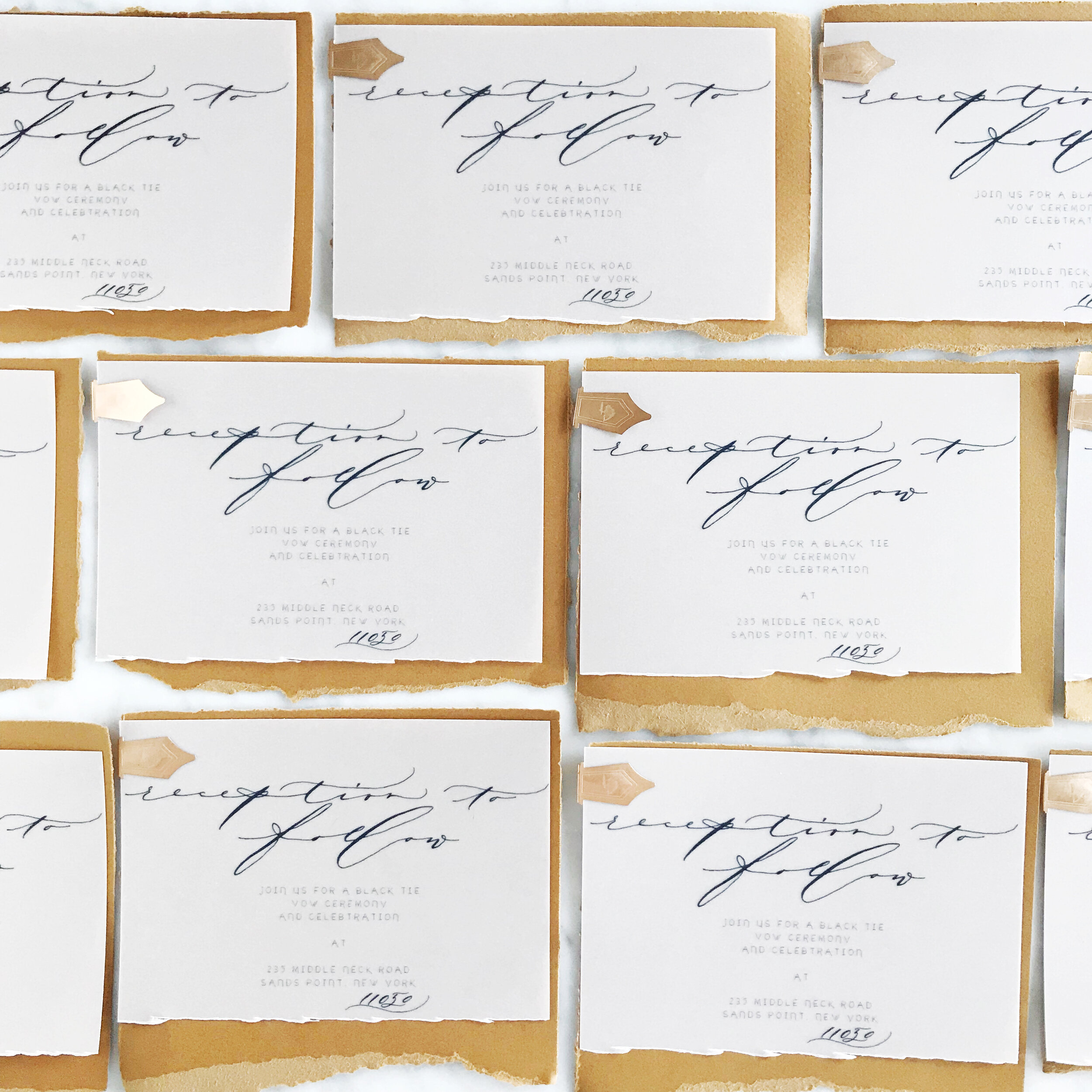
“reception to follow”
your venue name
city and state of your return address
“dinner and dancing”
“please join us”
etc.
When working with an invitation designer or calligrapher, you can have them create “spot calligraphy” for your invitation suite and provide you with the title lettering to be used throughout your suite.
If you’re interested in having us do spot calligraphy for your suite, shop it below!
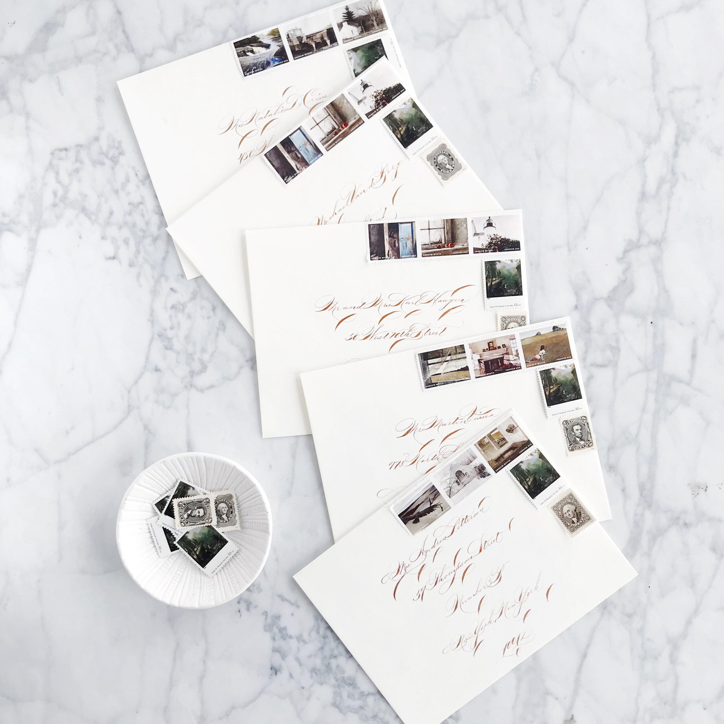
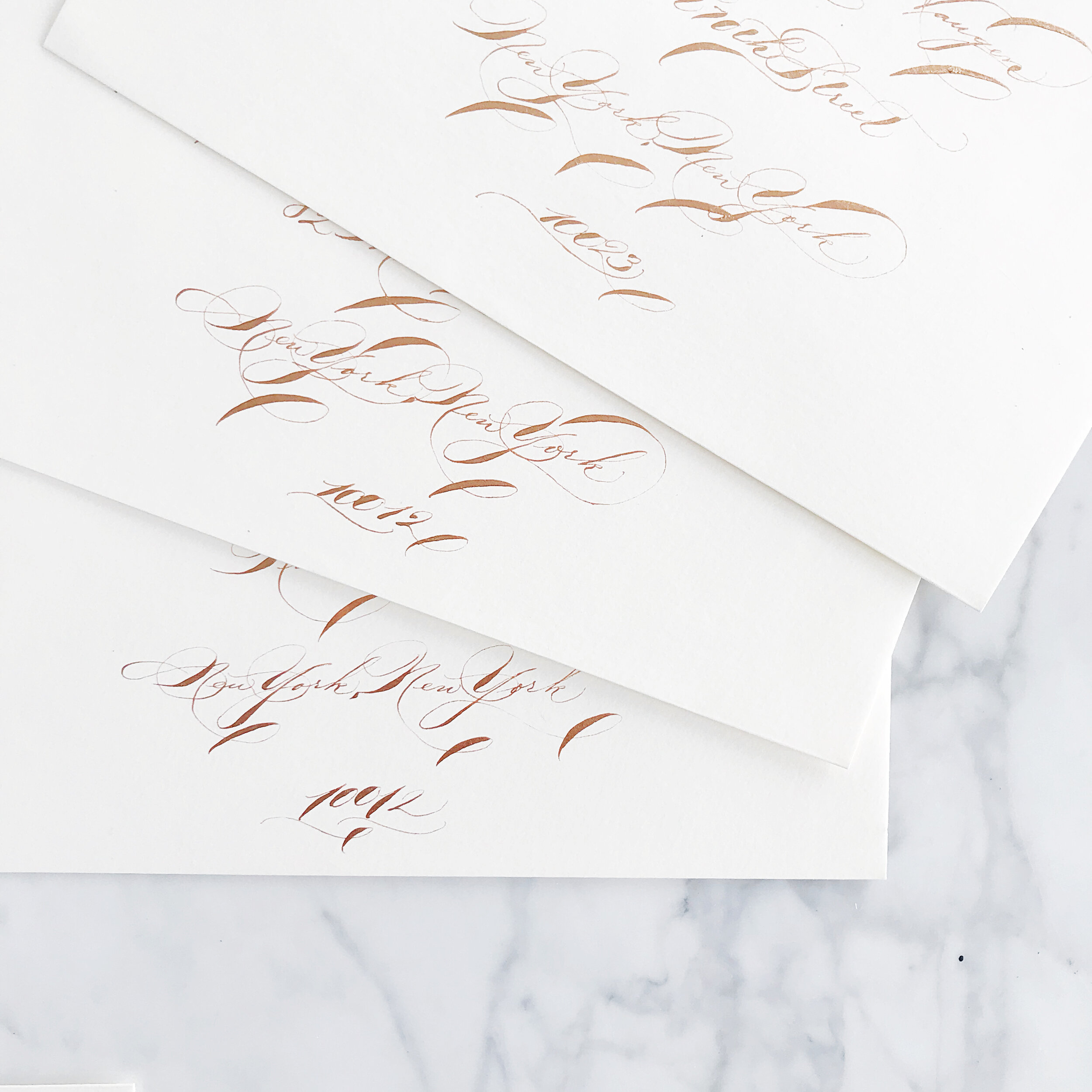
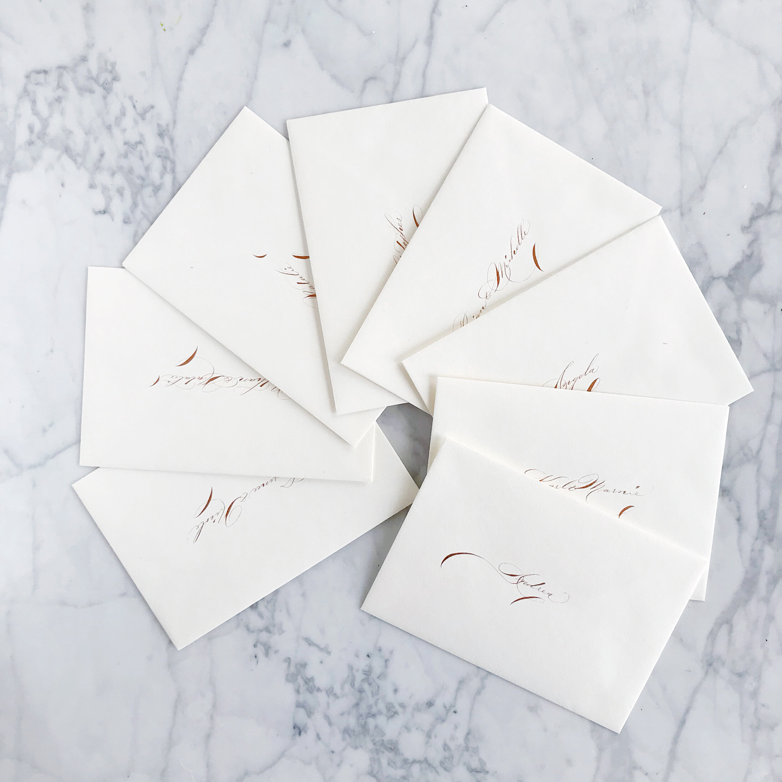
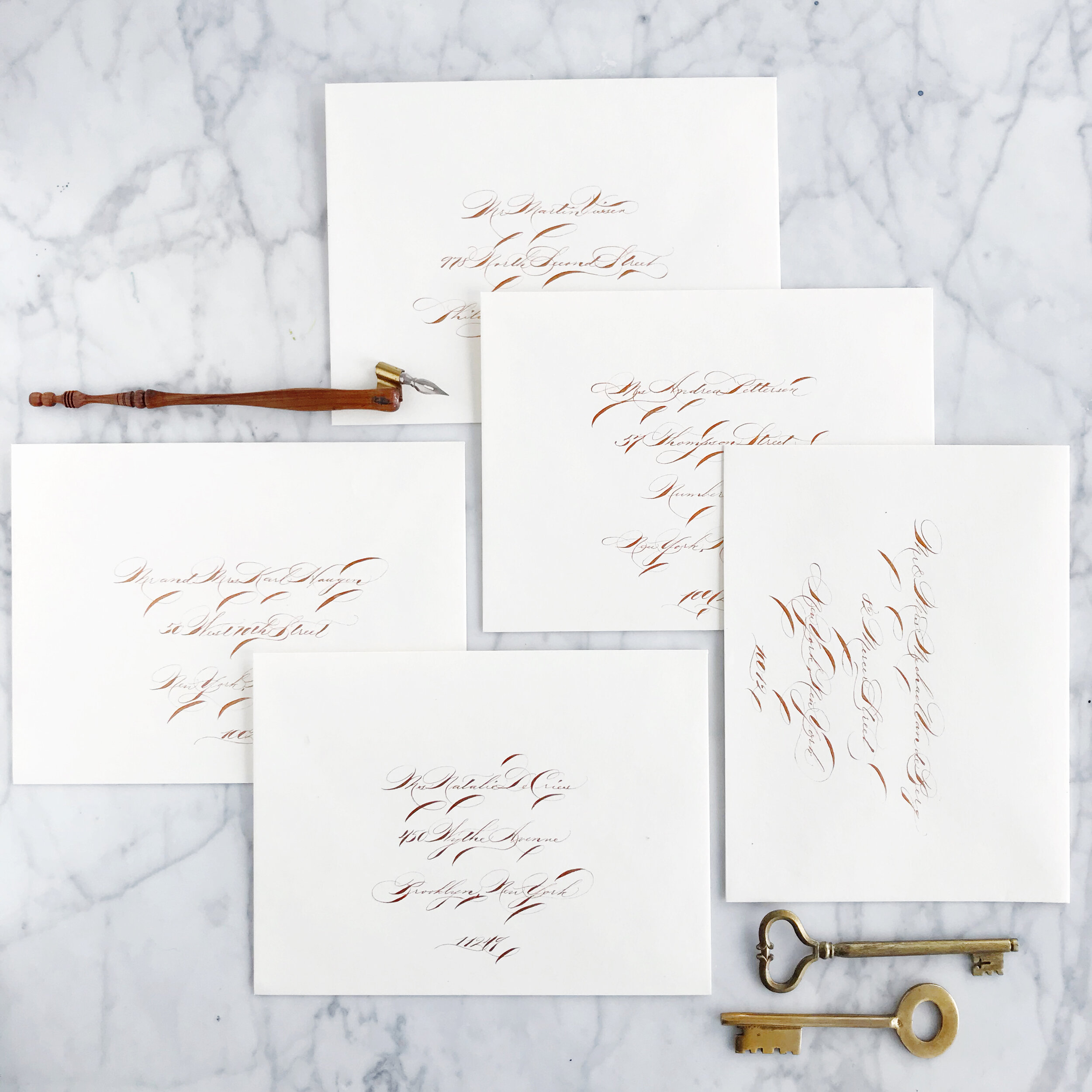
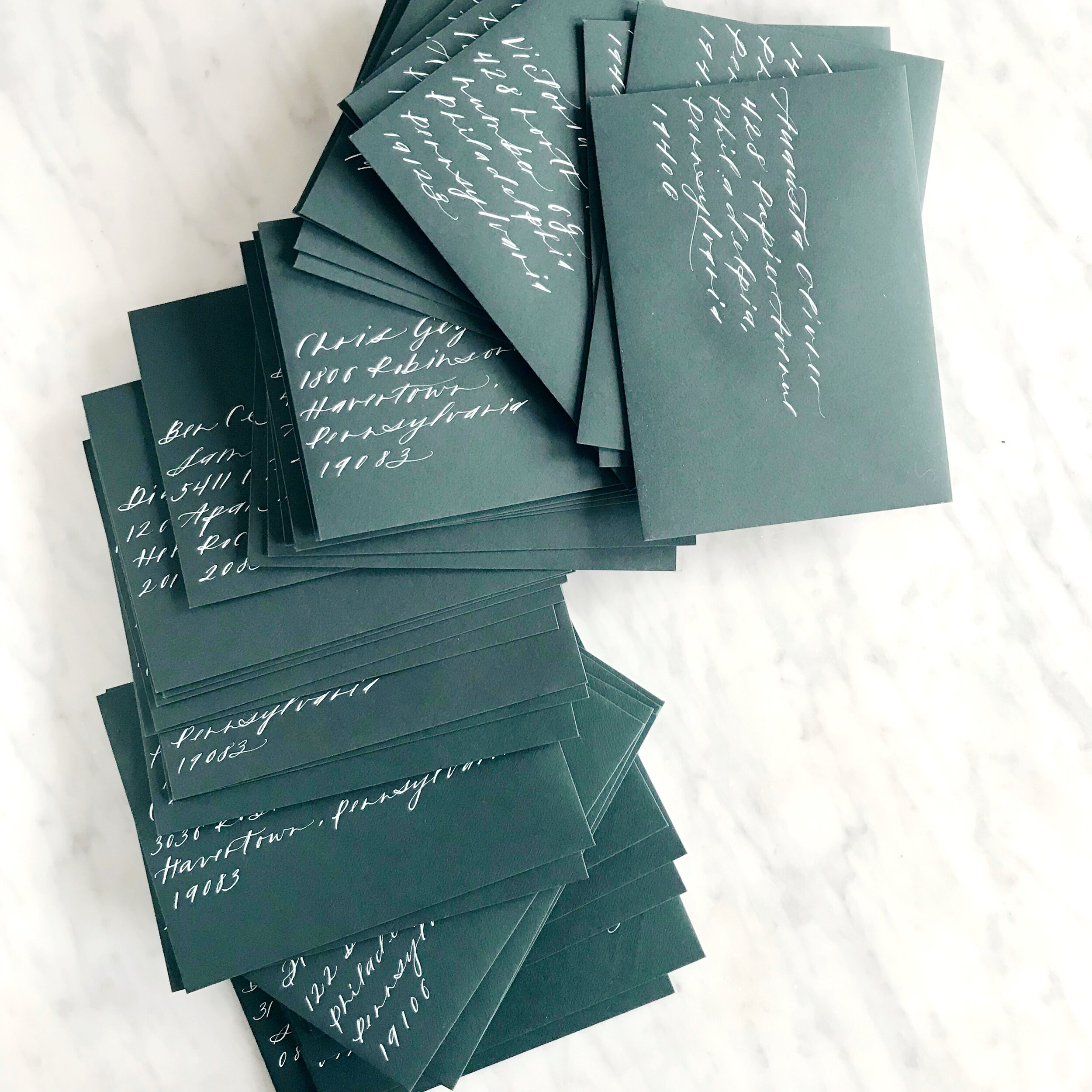
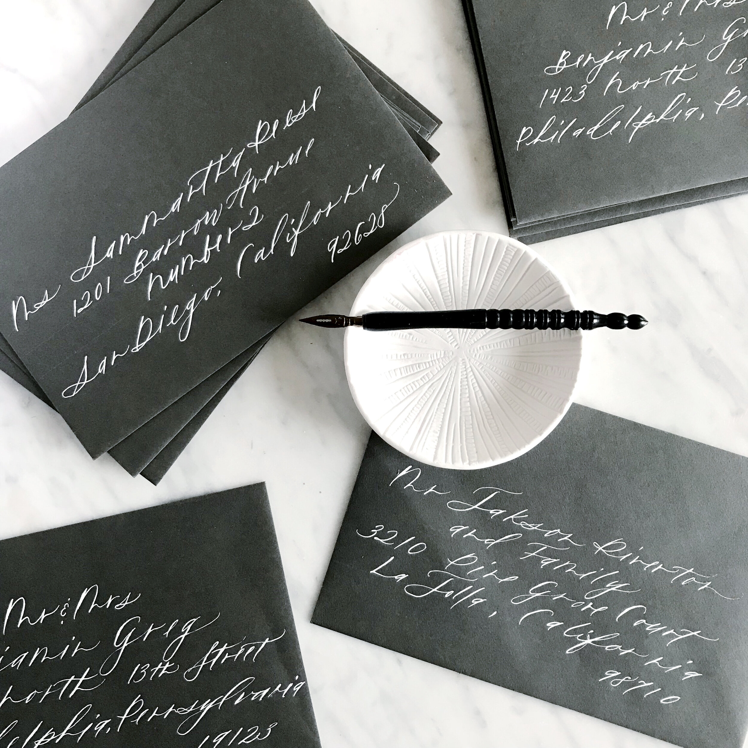
Wedding Invitation Envelope Calligraphy
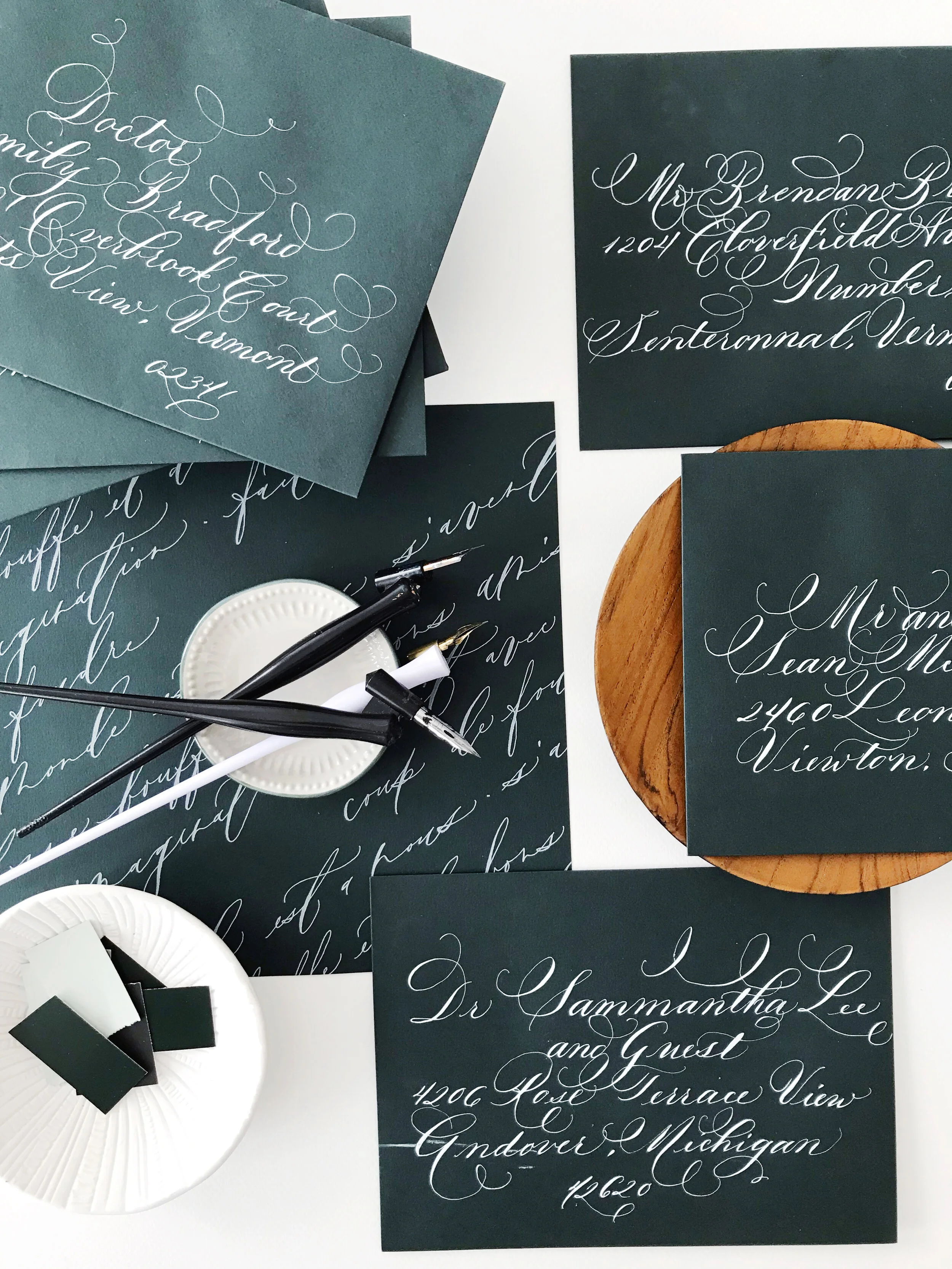
Formal calligraphy in white ink on dark green envelopes
Envelope calligraphy is one of those details that just takes an invitation suite to the next level. Adding playfulness with a modern calligraphy style, or formality with a classic, your guest’s name and address on their envelope is the first preview they’ll have of your wedding style.
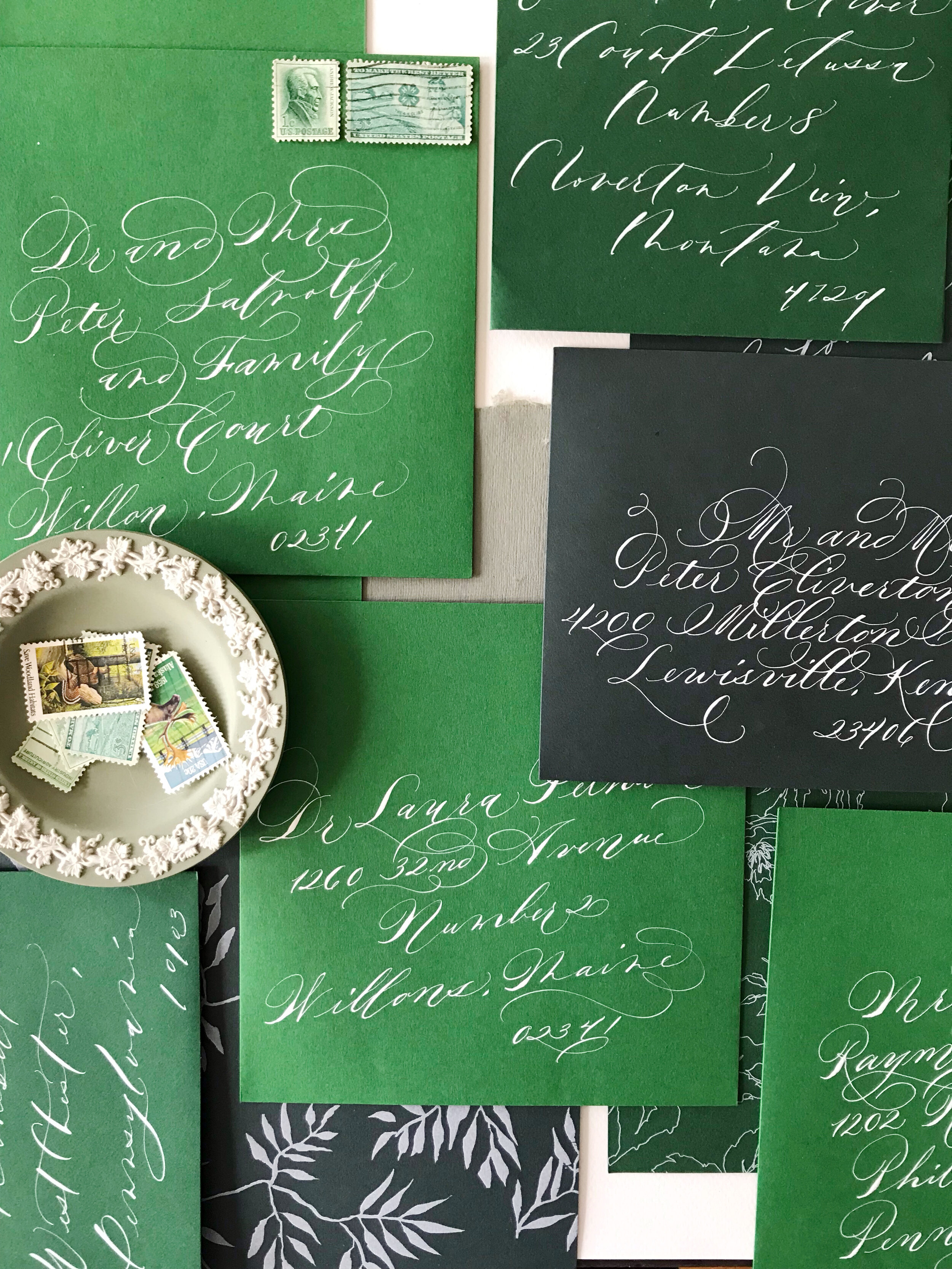

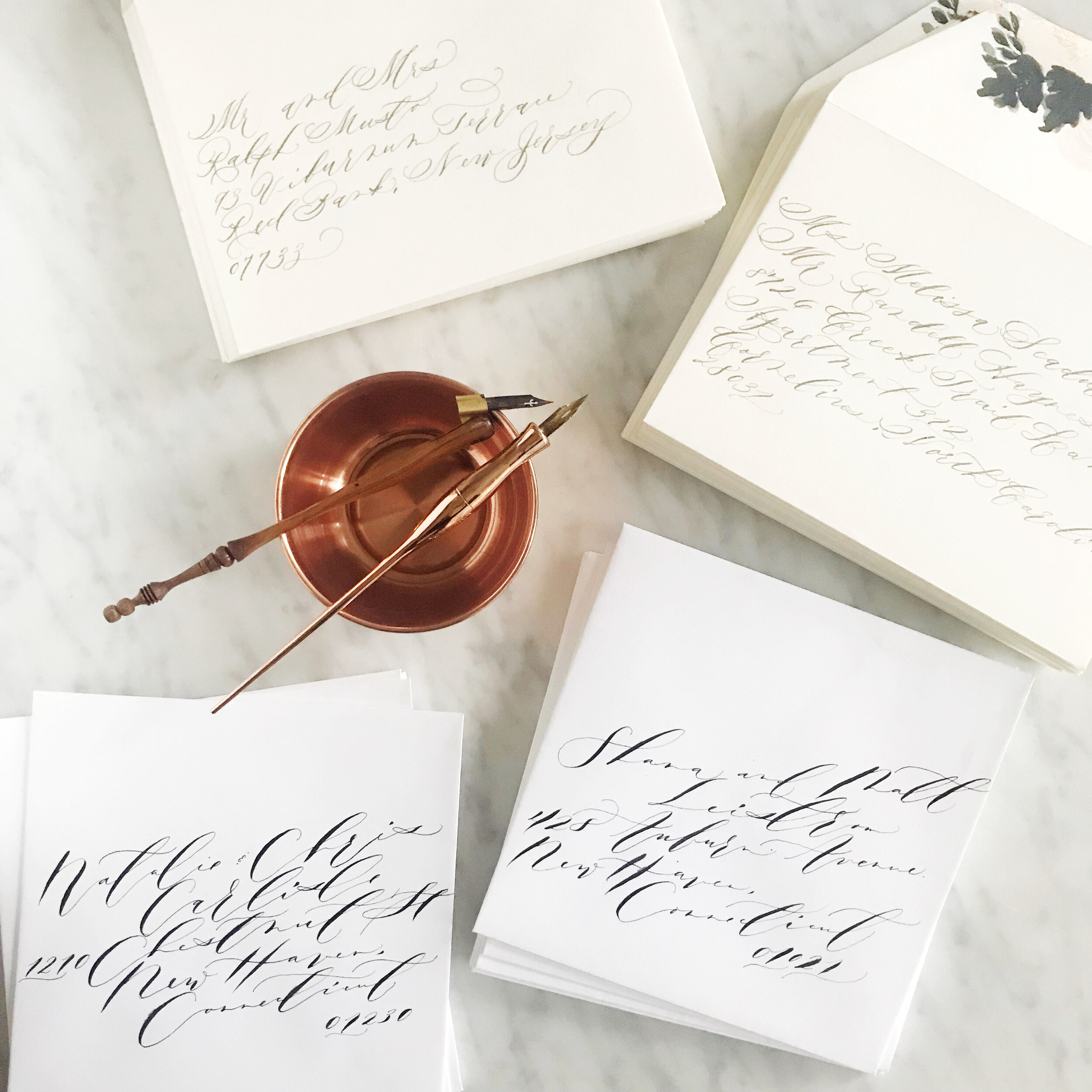

Calligraphy can go in so many different directions, and we’d love to help you select the perfect style for you!
With every bride, we begin by looking at their overall aesthetic and invitation design and curate a calligraphy style collection specifically for them to select from. We know that no two brides are alike, so we would never ask you to choose from a limited set of styles.
When working with us, we ask that you give us at least two weeks to complete your envelopes, but if you need them faster, we can make that happen!
Let us know if you’re interested in having us add the detail of calligraphy to your wedding suite! You can book us online, nice and simple!
We are currently accepting calligraphy projects either locally to us in Philadelphia, or shipped to us from anywhere in the U.S.
