

Fall Wedding Invitations for a California Wedding
moody | bold | unexpected | texture | fall
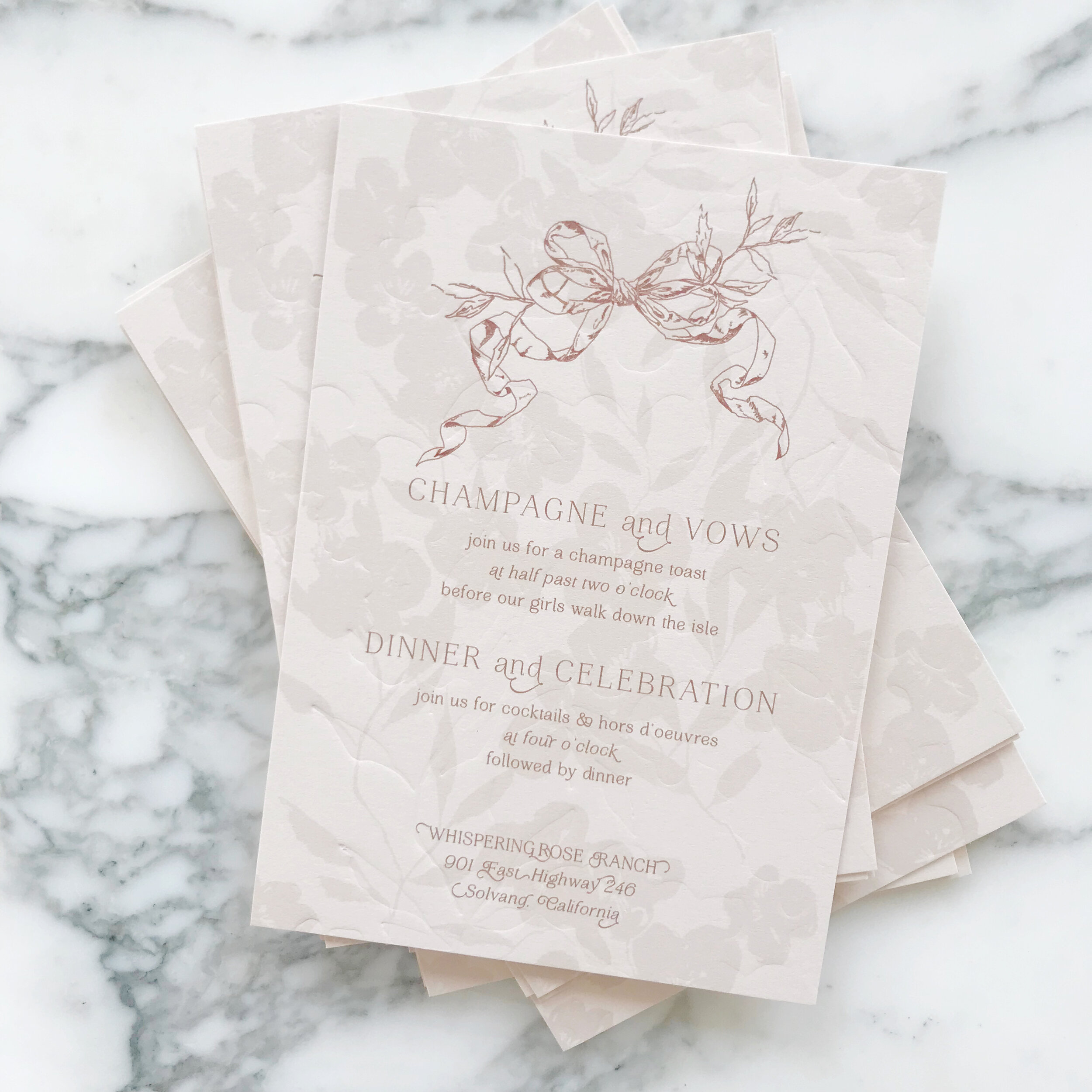
an invitation suite for a wedding at:
Whispering Rose Ranch | Solvang California
The Colors
When our brides first approached us, they had a pretty good idea of what they were looking for. They wanted unexpected texture, deep rose colors, a pop of green, and shades of neutrals.
We selected two shades of greens, two shades of rose, and three shades of pale neutrals, including a sage and chartreuse green, a deep rose and a more violet blush, and a range of pale taupes and creams.
We loved the idea of unexpected textures! We have two pieces that were blind pressed (debossed) layered with digital printing on both the reply card envelope and reception card with a pillowy texture. I also really loved pitching the idea of layering cane into the invitation itself, adding an additional pale color as well as some awesome texture.


The Design
We love the artwork suite for this design. We included two pieces of watercolor artwork, as well as some solid artwork for our tone-on-tone design, and line artwork design of two different vintage style bows.
We see the bow design topping the invitations, reception cards, and reply envelopes. We see them again sneaking in on the back of the rehearsal cards and flaps of the reply envelopes.
We loved the variances of heavy and light design work throughout all the cards, like the minimal design on the reply card, to let the green pop and stand out. Meanwhile, we have the brunch card and its heavy floral tone-on-tone border, which I just love.


Our mailing envelopes were also pretty amazing with artwork on the fronts and back. We also see our second piece of artwork on the mailing envelope liner.


