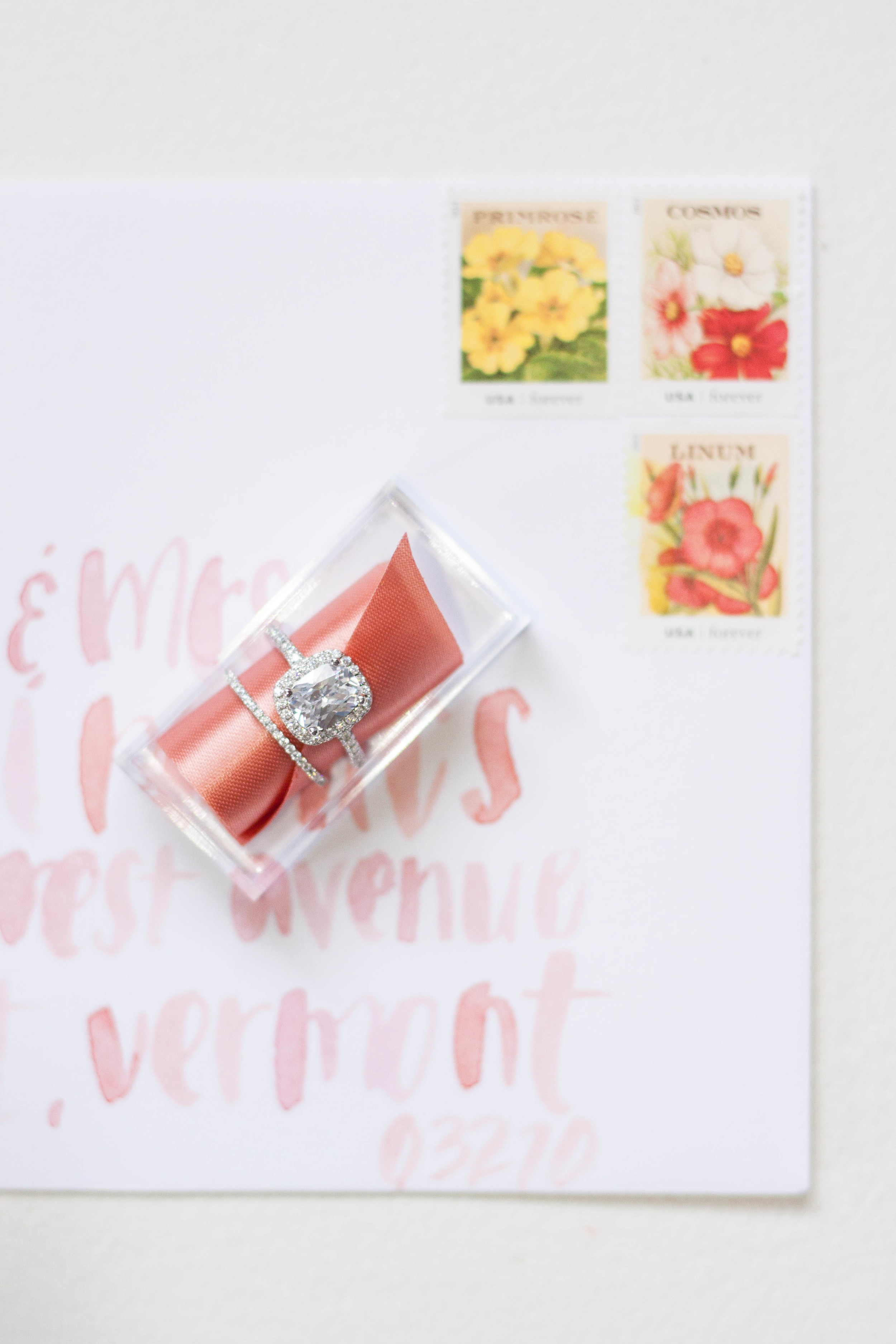
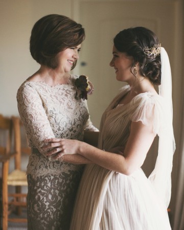
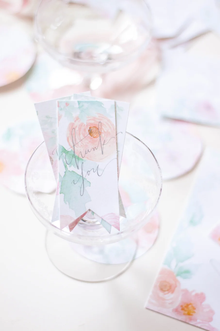
Personalized Perfume Bottles
This past month has held a few perfume bottle projects, which just warms my heart! They’re such an interesting and unique gift!
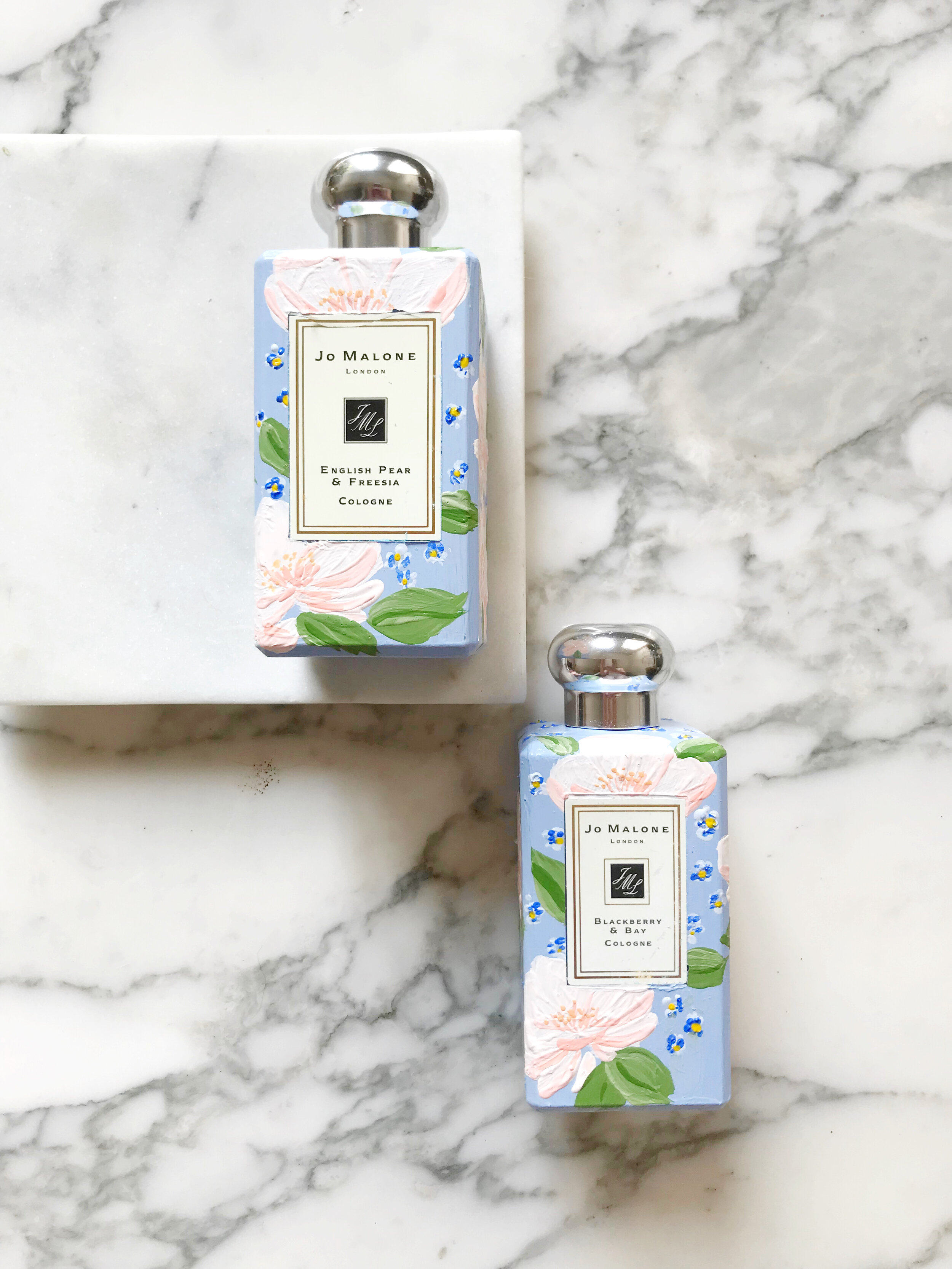
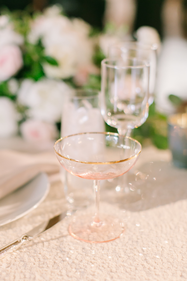
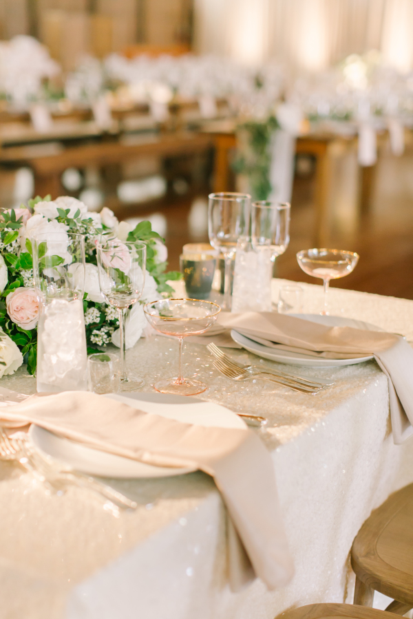
This particular set was designed to match the bride’s wedding invitations and was a gift from the mother of the bride to her daughter on her wedding day. (If you don’t know, Jo Malone is designed to layer and pair scents, so these two are the two the bride selected to wear on her special day!)


The bride’s invitations may look familiar to you, we posted the pictures a while back. Her perfume bottles pair beautifully with her blush and blue invitation suite.


Sneak Peek - Art Nouveau Wedding Invitations
Romantic, pale, textured, unexpected, handmade paper, tactile, art nouveau
an invitation suite for a wedding at:
Glen Foerd Mansion | Philadelphia, Pennsylvania
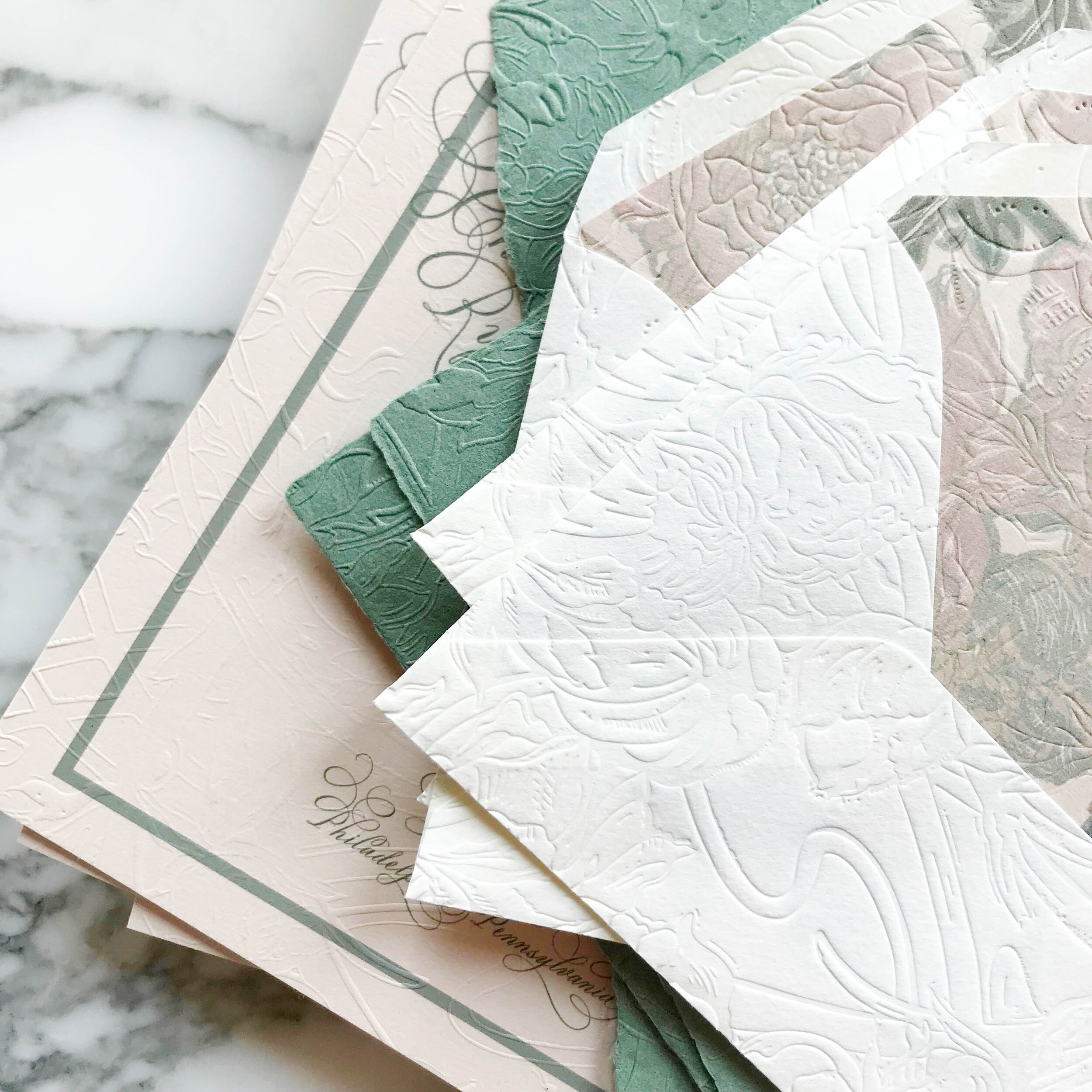
pale shades of nude and sage, with classic art nouveau texture and artwork, saturated with heavy texture emobossed onto pillowy soft papers.
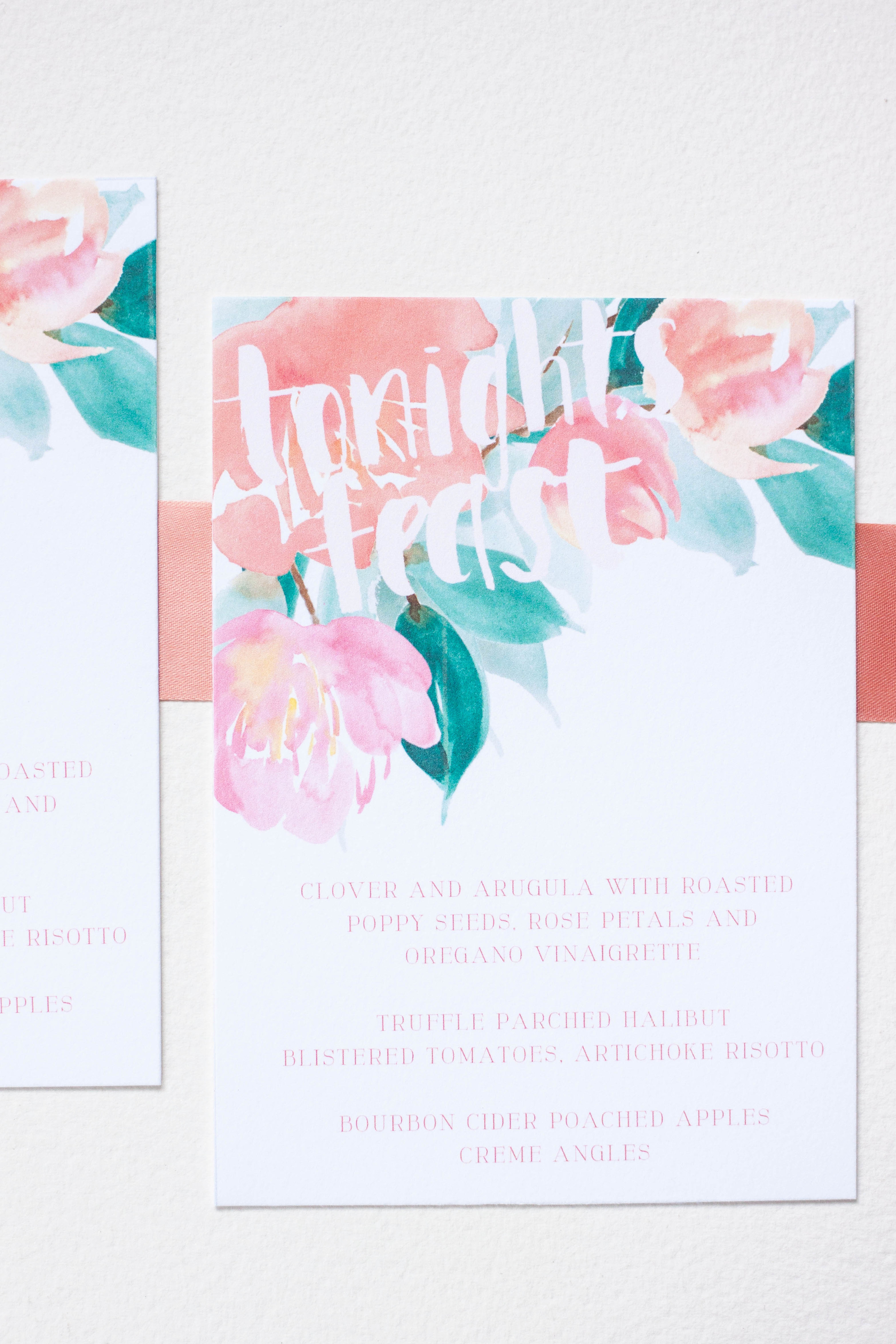
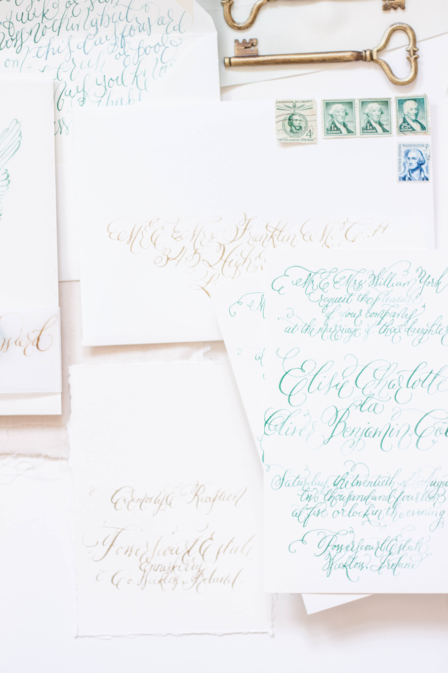
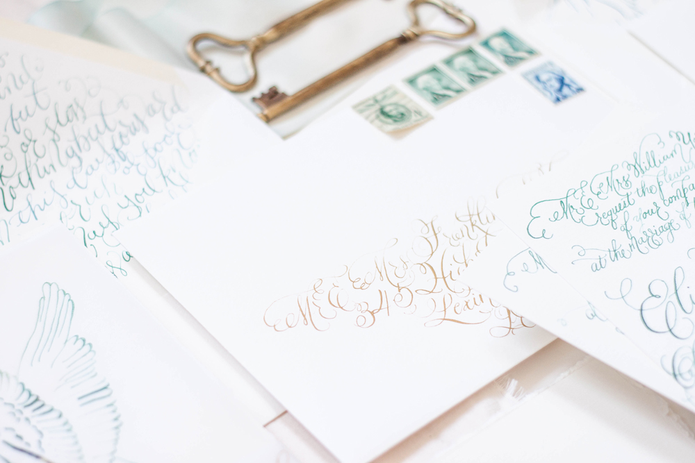
Fall Wedding Invitations for a California Wedding
moody | bold | unexpected | texture | fall
an invitation suite for a wedding at:
Whispering Rose Ranch | Solvang California
The Colors
When our brides first approached us, they had a pretty good idea of what they were looking for. They wanted unexpected texture, deep rose colors, a pop of green, and shades of neutrals.
We selected two shades of greens, two shades of rose, and three shades of pale neutrals, including a sage and chartreuse green, a deep rose and a more violet blush, and a range of pale taupes and creams.
We loved the idea of unexpected textures! We have two pieces that were blind pressed (debossed) layered with digital printing on both the reply card envelope and reception card with a pillowy texture. I also really loved pitching the idea of layering cane into the invitation itself, adding an additional pale color as well as some awesome texture.
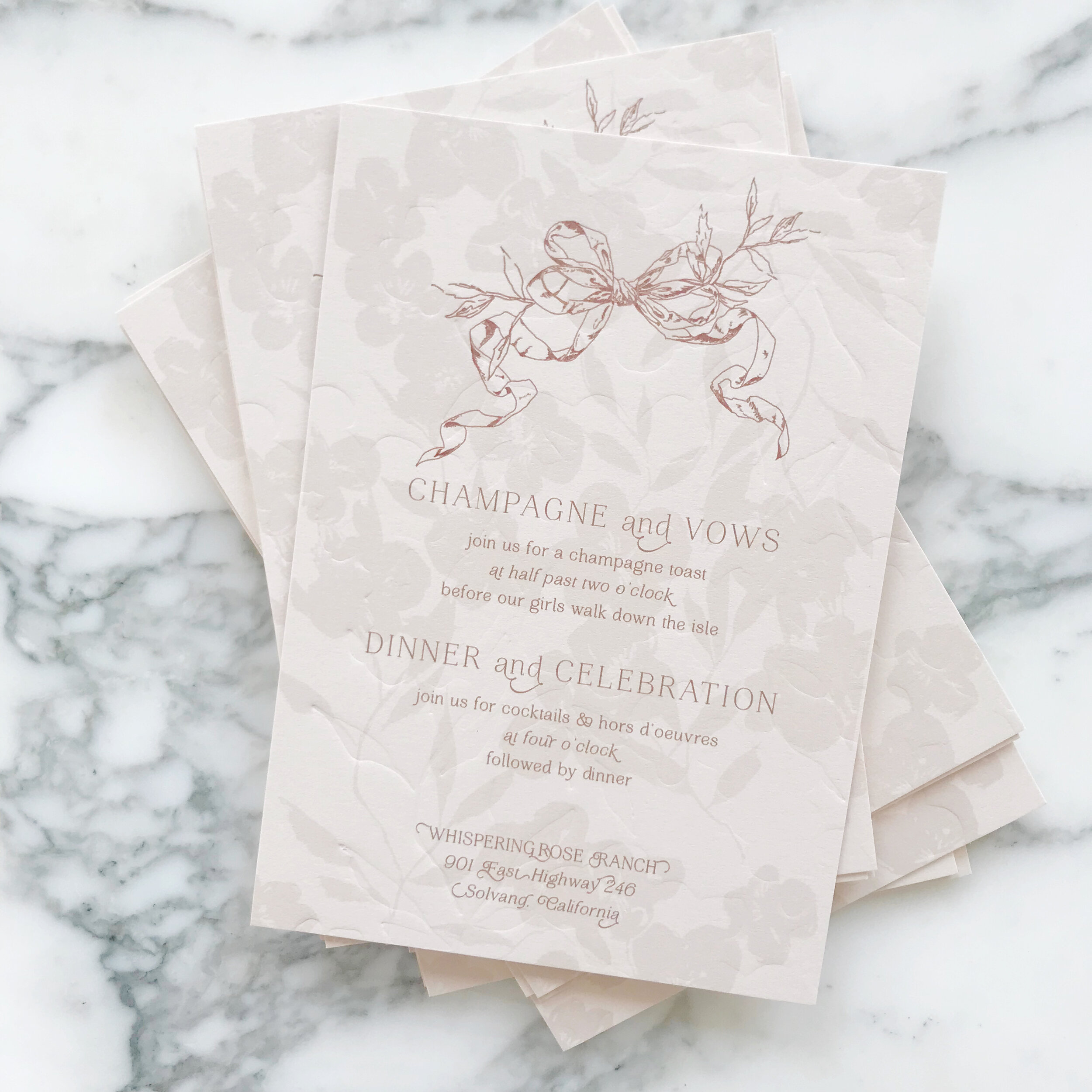


The Design
We love the artwork suite for this design. We included two pieces of watercolor artwork, as well as some solid artwork for our tone-on-tone design, and line artwork design of two different vintage style bows.
We see the bow design topping the invitations, reception cards, and reply envelopes. We see them again sneaking in on the back of the rehearsal cards and flaps of the reply envelopes.
We loved the variances of heavy and light design work throughout all the cards, like the minimal design on the reply card, to let the green pop and stand out. Meanwhile, we have the brunch card and its heavy floral tone-on-tone border, which I just love.


Our mailing envelopes were also pretty amazing with artwork on the fronts and back. We also see our second piece of artwork on the mailing envelope liner.


Featured | Style Me Pretty
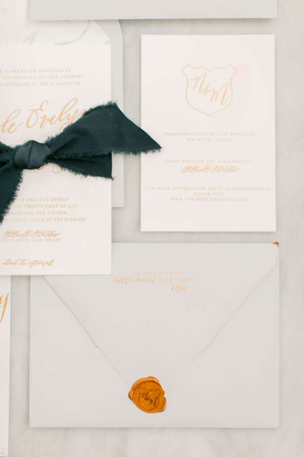
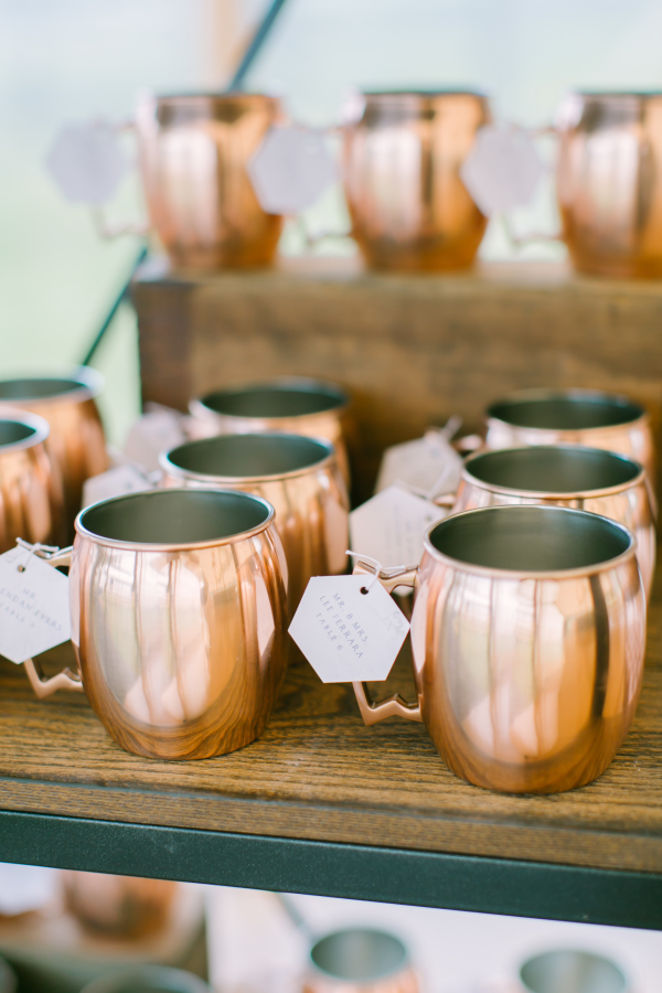
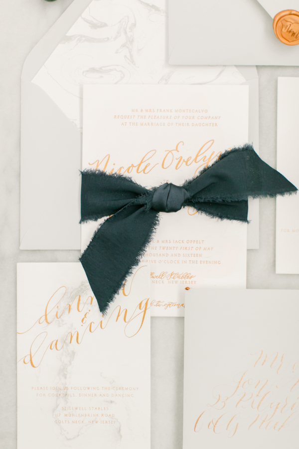
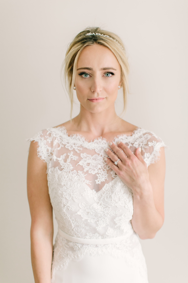
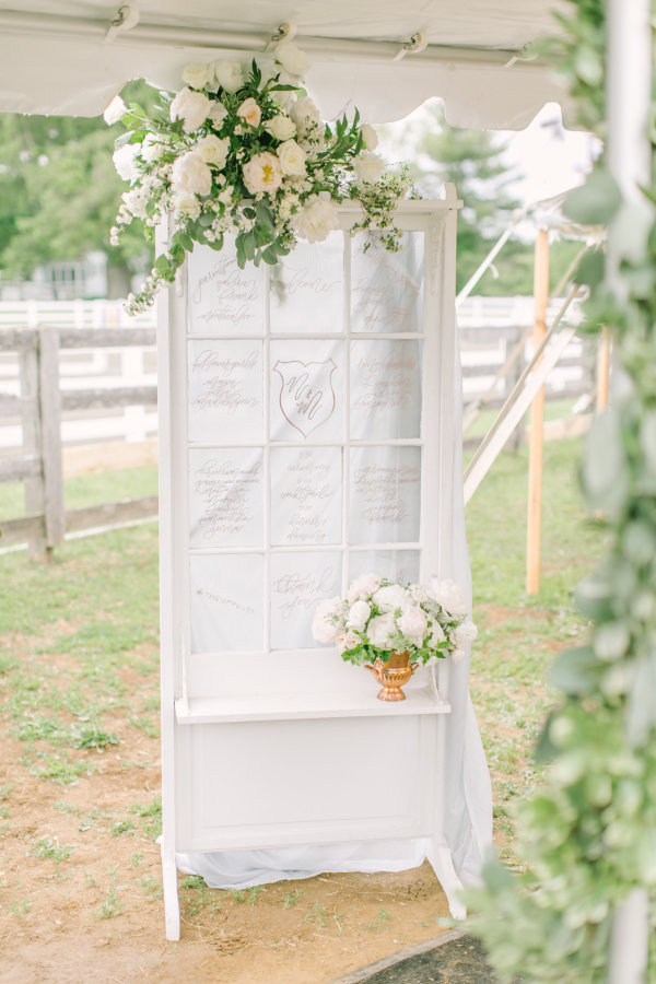
Here are some more lovely shots from Nicole and Matt's gorgeous stable wedding! See the whole feature on Style Me Pretty here!
Nicoles invitations and save the dates were all hand marbled on thick cotton paper then printed in copper foil. Her invitation had both marbled details as well as the pales of blush washes. Each invitation suite was tied together with hand frayed navy silk ribbon, tucked inside a marble lined pale grey envelope and sealed with a custom wax seal. All her menus featured the same pale blush wash and their wax seal at the top of each menu. Each guests' place card was a hexagon on the same hand marbled paper, daintily tied onto a copper mug. The rest of the reception details featured lots of carrera marble, such as the marble hexagon table numbers with copper lettering.


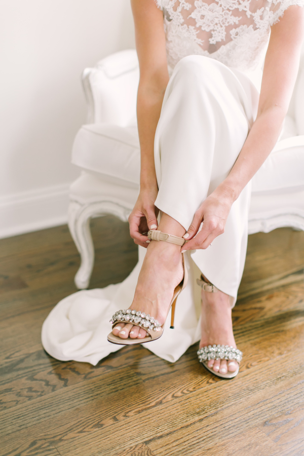
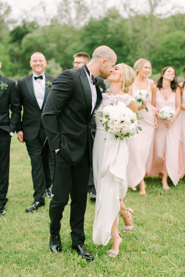


Photography: Love & Light Photographs | Cinematography: Between Sleep and Awake | Event Planning + Design: Gilded Lily Events | Floral Design: Blade Floral and Event Designs | Wedding Dress: Reem Acra | Cake: The Vintage Cake | Shoes: Givenchy | Jewelry: Leonardo Jewellers | Bridesmaids' Dresses: Joanna August | Catering: Brennans | Makeup: Make Me Up Eva | Hair: Beautiful Hair by Heather Turner | Band: Hank Lane Music | Groom's Attire: The Black Tux | Venue: Chandelier Grove | Bar + Linen Rentals: Paul David Partywares | Bridal Boutique: Gabriella New York Bridal Salon | Bride's Makeup: Sara Talias | Draping: Drape Kings | Paper + Calligraphy: Design House of Moira | Photo Booth: Premier Event Rentals | Rentals: Party Rental LTD | Rolls Royce Rental: Concorde Worldwide | Tents, Flooring + Lighting: Sperry Tents | The Color Condition Cocktail Hour Swag: Patina | Vintage + Specialty Rentals: Dovetail Vintage Rentals | Welcome Boxes: That's Darlin'
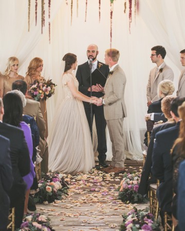
Real Wedding | Jess & Robert
For her programs, we bound white cotton paper with embroidery string in a perfect shade of French blue. Her escort cards bore her large, 2" custom wax seal on pale blue paper, with her guest names in pale gold.


Photography: Love & Light Photographs | Cinematography: Endless Wave Studios | Event Design: Gilded Lily Events | Floral Design: Reynolds | Wedding Dress: Mark Zunino | Cake: Carlo's Bakery | Stationery: Design House Of Moira | Jewelry: Jenny Packham | Bridesmaids' Dresses: Monique Lhuillier | Makeup: Make Me Up Eva | Hair: Up & Out | Band: Almost Easy Band | Groom's Attire: Calvin Klein | Groomsmen's Attire: Calvin Klein | Officiant: Reverend Donald Gebhard | Ceremony Music: Shrewsbury String Quartet | Transportation: ShooBoo Shuttle | Venue: Mallard Island Yacht Club | Bridal Boutique: Kleinfeld Bridal | Bridesmaid's Accessories: Olive + Piper | Bridesmaids' Robes: Cloud Hunter | Cake Topper: Table Setting is My Life | Candleabra Rental: Two of a Kind | Ceremony Lighting: Ocean Tents | Custom Hair Accessories: Foolish Ginger | MOB + MOG Robes: POSY | Maid of Honor Dress: Adrianna Pappell | Rentals: Dovetail Vintage Rentals | Ring Bearer Pillow: JfyBride | Signage: Design House Of Moira | Veil: Mark Zunino | Vintage Hat Box: Trousseau & Co | Welcome Gifts: That's Darlin'
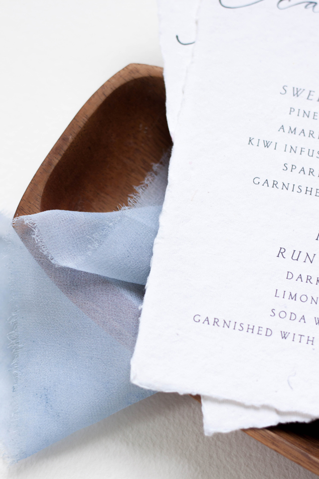
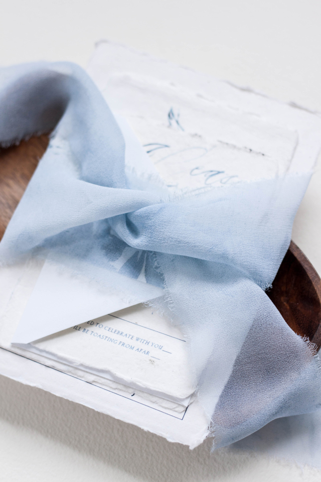
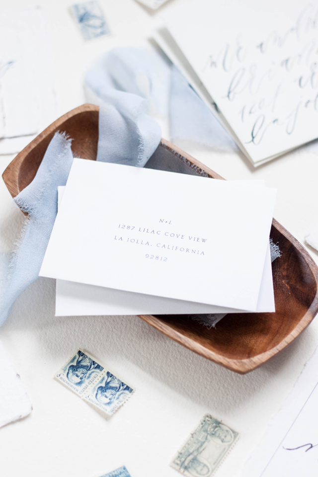
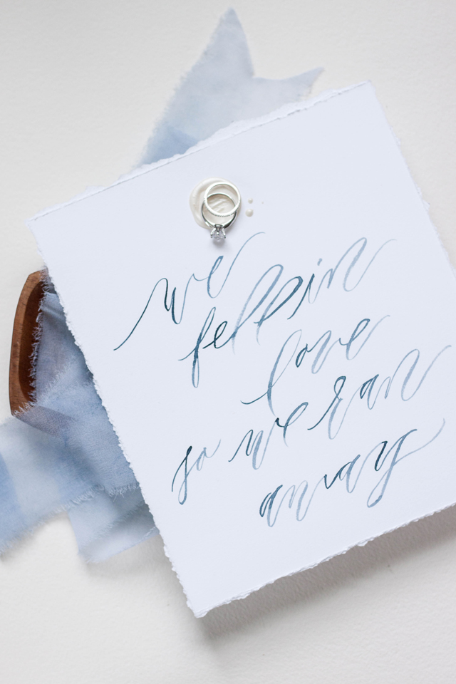
Featured | Oh So Beautiful Paper
It's Monday morning and I'm greeted by a featured post of my work on Oh So Beautiful Paper! That's a perfect way to start a week! You can view the featured post here!


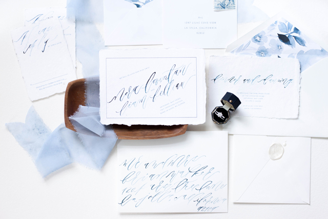
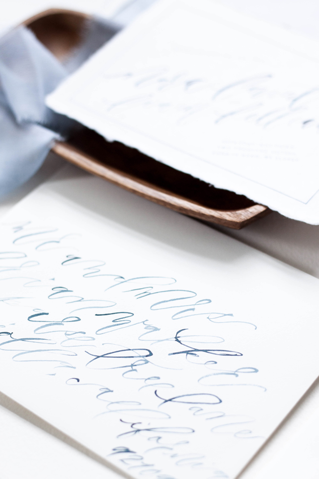
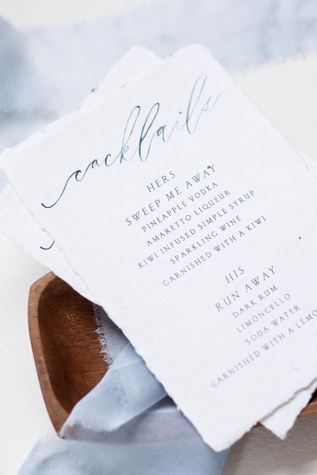
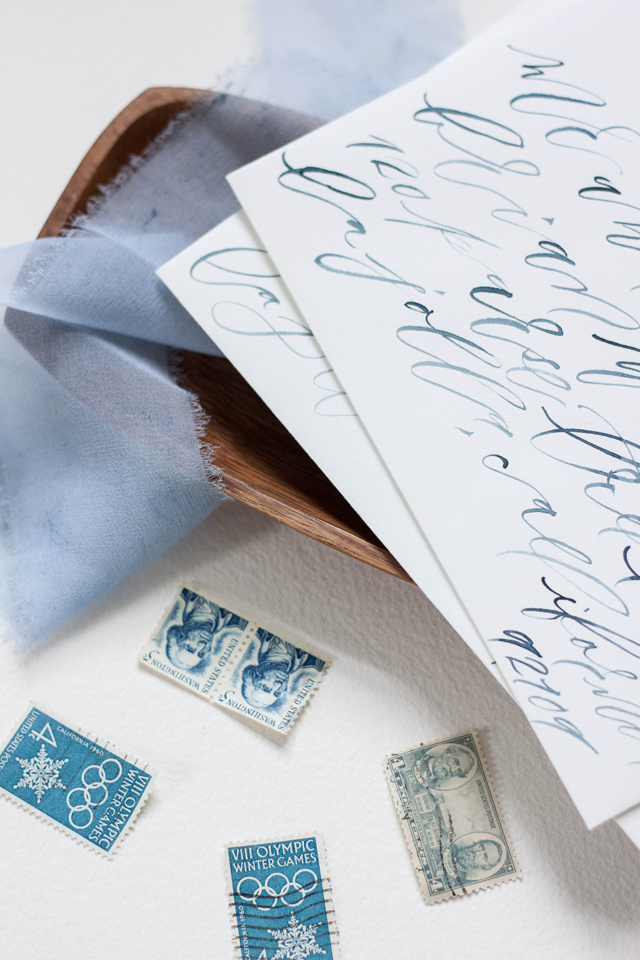
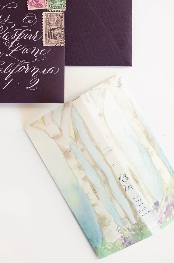
Working with Marina from Bustle Events, we designed this suite for an elopement celebration, using the phrase “we fell in love, so we ran away” as the theme. We really wanted to embrace the destination aspect of the celebration, tying in natural edges and shades of blue. The invitation itself announces their elopement and invites guests to join them at the bride’s parents home upon their return home. We really loved the idea of using paper with a raw edge and choose to go with handmade 100% cotton rag paper from Fabulous Fancy Pants. We paired the handmade paper with slooping brush lettering, and paired it with a formal serif font.
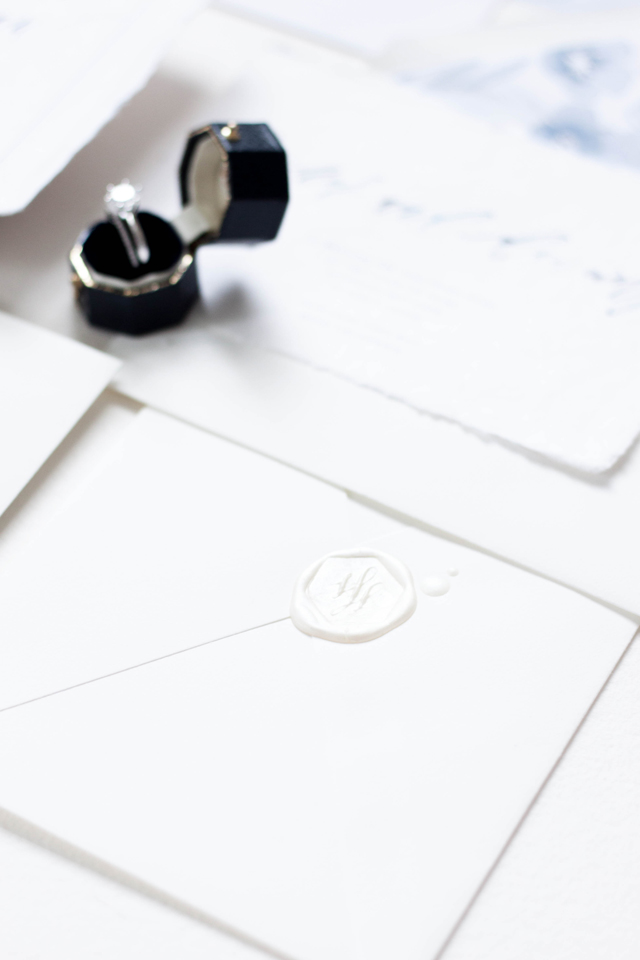
I also hand painted a large piece of artwork for the bride in monochromatic blues, and used that artwork to be printed as their envelope liners. Each invitation suite was wrapped in hand dyed, hand frayed silk ribbon and tucked into a crisp white cotton envelope. The cocktail menus were printed on the same 100% cotton rag paper and featured a “his & hers” signature cocktail. We also created a larger scale artwork piece of the quote we used in the suite featuring the couple’s wax seal.

Design, printing and production: Design House of Moira
Ring box: Lang Antiques
Paper: Fabulous Fancy Pants
Photography: Design House of Moira
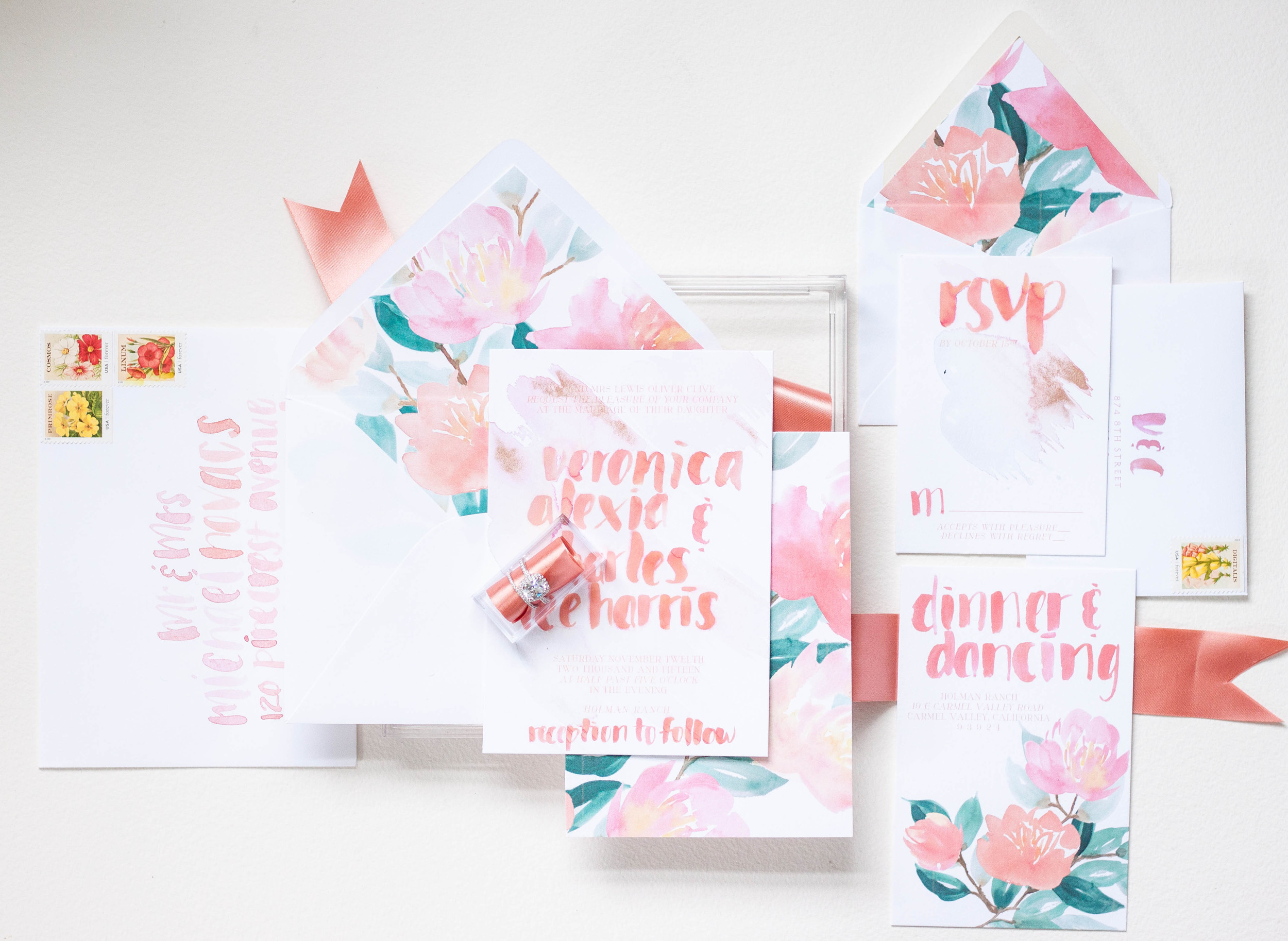
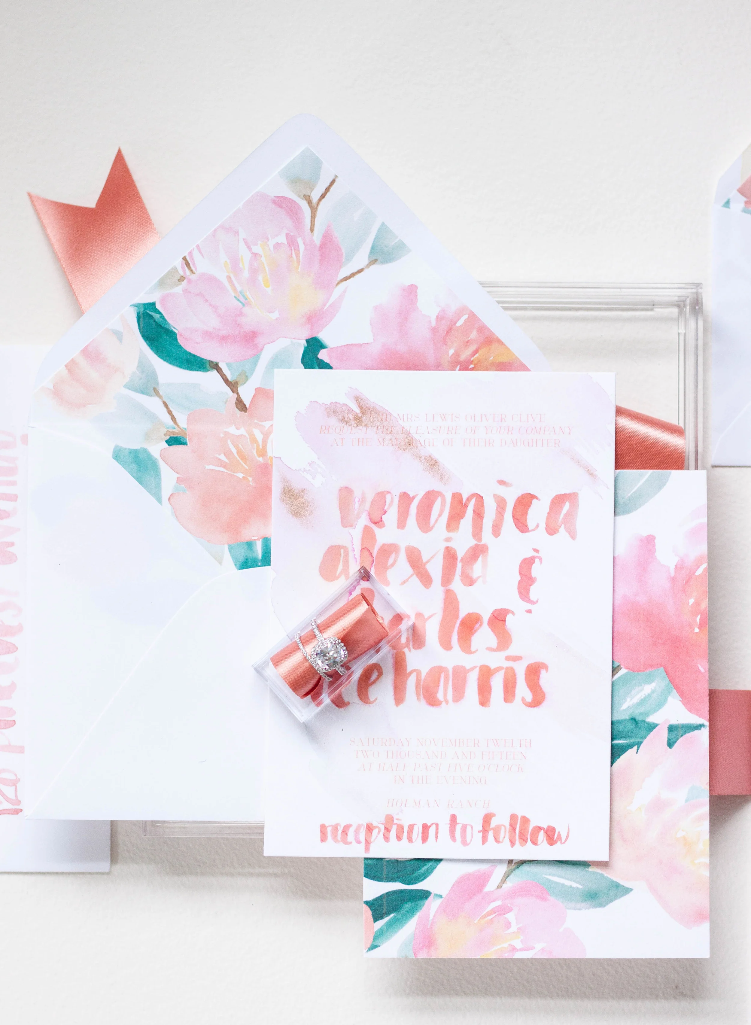
Bespoke | Veronica & Charles

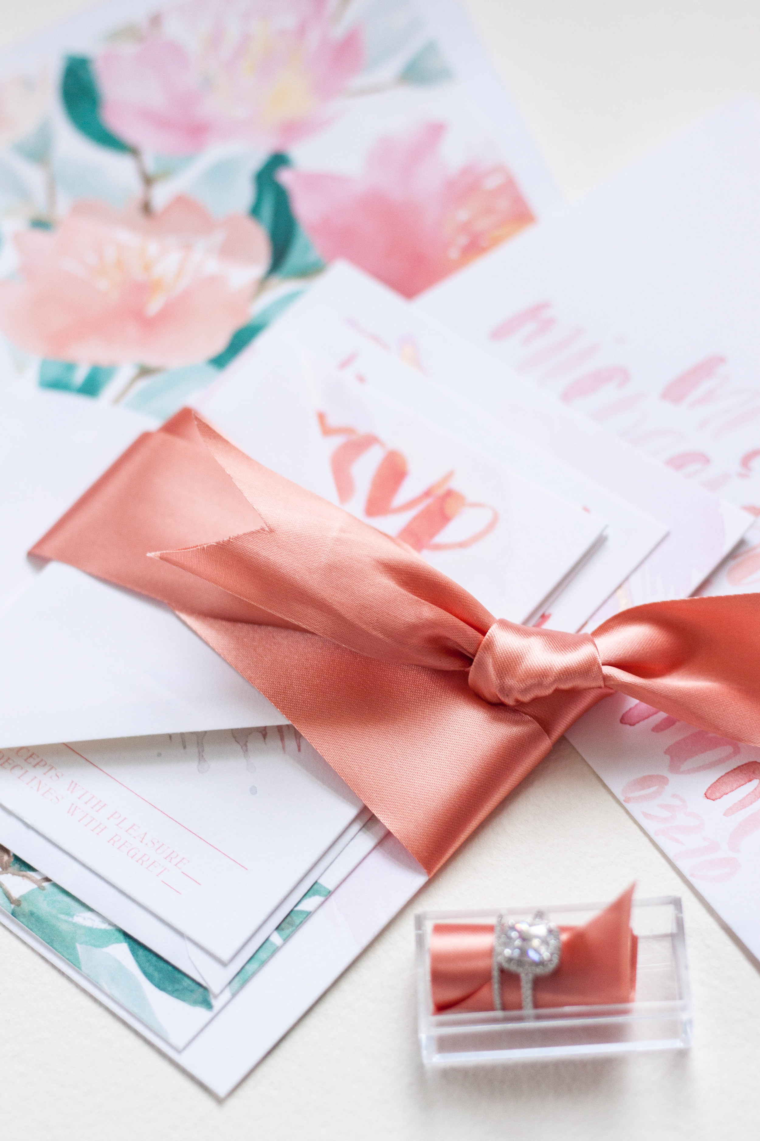
These invitations were created for the Oh So Inspired Retreat held in Sonoma, California last fall. We wanted to create something fun, bright, bold and playful with touches of rose gold and shades of peaches and pinks.
The invitations were kept on the simple side, with bold lettering gracing the front. Behind the lettering, I did a pale watercolor wash of pale pink and dropped in just a touch of rose gold. The backs of the invitations were printed in the bold pattern, adding interest and color to the simple invitation design.
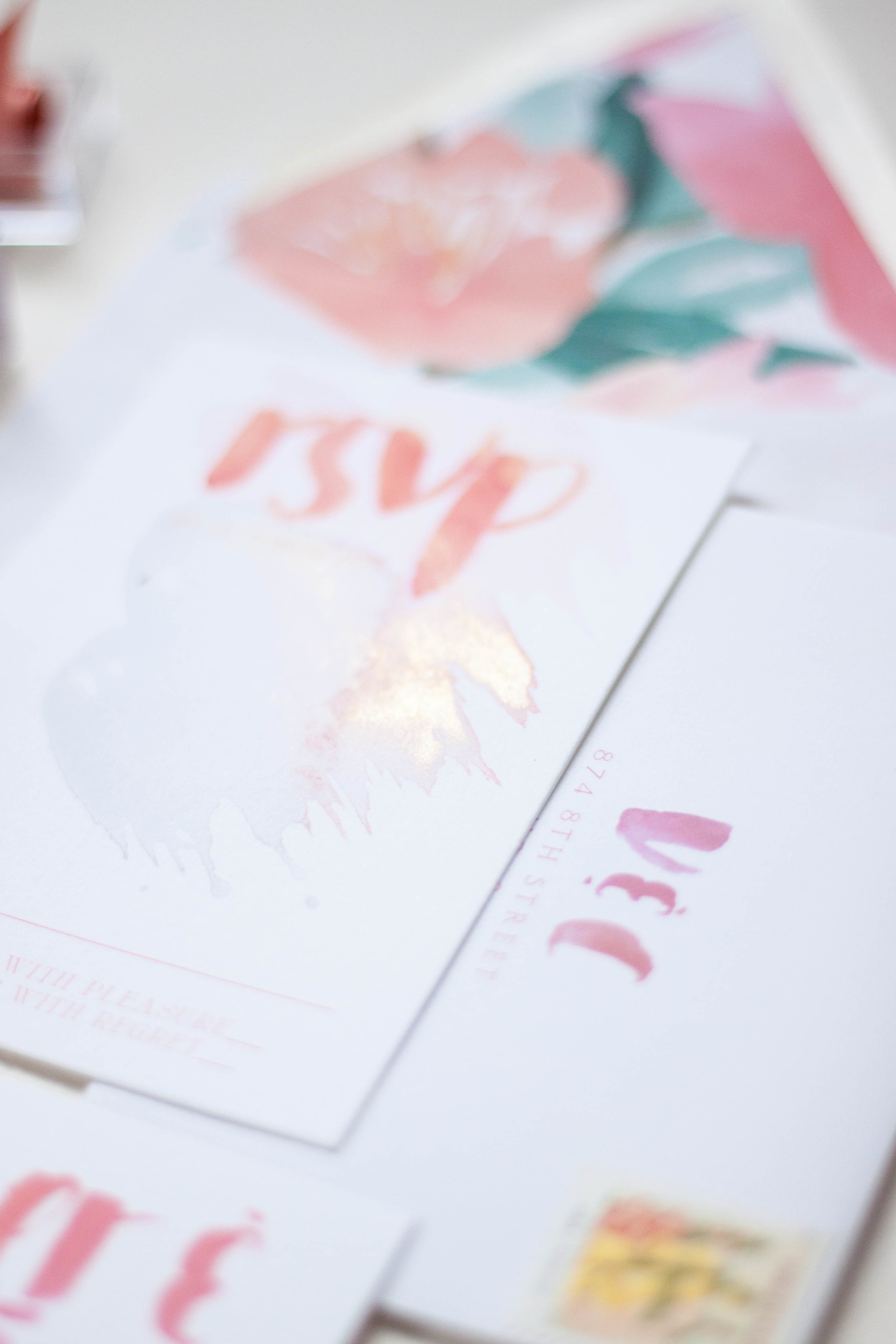
I completely love the envelope design with the envelopes lined in the bold print. Each envelope was addressed in the same bold, heavy brush lettering. The carefully selected stamps are reprints of vintage seed packets and the colors were perfect! The small reply card was printed with the couple's address with their initials in the same bold brush style.


Paper Talk | Why choose custom

Working with a bride and groom to create something this unique and reflective of their wedding day is such a pleasure. Being able to bring in that fine art aspect as well as hand lettering and calligraphy just brings a look and feel so different from anything you can find in the pre-designed realm.
Working with a designer on a custom piece is like watching a dream come to life. Around here, we begin with a sketch to show our ideas of how the artwork with work and play from one piece to another and to help our clients see our vision. I keep every sketch I've ever done - I love being able to flip back trough them! We work together selecting the printing method, paper, assembly detail, calligraphy style and artwork that go into each design, all based on the couple's person story and their style.
One of my main goals is to make this process as painless as possible! All of our clients also have access to our full stamping and stuffing services - meaning, we assemble, stuff, stamp, address, and seal your invitations, so all you need to do is mail them! That's just one of the perks of working with a custom designer. You will also get a bit more guidance on all the little details - like what printing is good for you (how would you know, you've never done this before!) how much your final pieces will weigh for postage, or what wording etiquette should you use - we'll take care of all those details for you and take as much off your plate as we can.

Why choose custom, you ask? Let's talk about it! There are so many options out there for your wedding initiations; they come in all shapes, sized and price points. So how do you decide? Should you print at home? Order a pre-fab design from a reputable website? Go with something you aren't so thrilled about? Take the leap and go for something you love? Dig yourself into the DIY hole? Go crazy and pull out all your hair just trying to decide?
Custom is a really fun option, but it isn't always for everyone. Trust me, you're talking to the queen of DIY - it's how I got into this business in the first place..."puh, this whole graphic design thing cant be that hard, I can totally do this!" I would ALWAYS rather do it myself and figure out the process than have someone else do it, so if you're a DIYer, I feel ya! However, DIY or pre-fab isn't for everyone either.
A few years ago, I had the epiphany that I wanted to limit myself to custom only designs, and I wanted to restrict myself and not offer the "I have something for absolutely everyone" mentality. I had done the graphics approach for about 3 years at that point, and I just wasn't loving it. I wanted to offer something totally unique to myself and my company, so I began offering artwork based designs only. You do see this approach more frequently now, but when I first started playing with the idea about four and a half years ago, there really wasn't anything like it in the market (except Julie Song, who's work makes me swoon!)

A couple who chooes a custom deign usually has a few things about them: They know exactly what they like! They're usually confident in themselves and know that they wants the details of their wedding to totally reflect their personal style. They may be looking for flexibility or something a bit more fun than the invitations they've seen in the past, or wish to have original artwork of their venue created for them. Sometimes it may be that they've never seen something they just love, but know the work of the artist and are confident in building something together.
Give us a shout if you're interested in finding out more about creating a custom design for your wedding!
Featured | Martha Stewart Weddings
Michelle Leo of Michelle Leo Events is one of the amazing leaders in our industry, so when she approached me to create a suite for her bride, Sara, I was honored! The suite we created is one of my all time favorites (I know I say that a lot, but how could I possibly pick a true favorite?!).
We wanted to keep the suite classic, elegant, and interesting with some texture and gold. The suite was printed in gold foil on 220lb stock in a pale ivory and a textured aubergine. The main invitation was adorned with antique lace appliqued in the corners, each hand cut from a larger lace piece (on the plus side, it didn't take nearly as long as I thought it would!). The envelopes were both lined with pale fall leaves and the suite was tied up with thin velvet ribbon. The aubergine envelopes were then addressed in flourished gold, and into the post they went!
The overall wedding was simply spectacular and it was such a joy to work with such an amazing team!


For the menus, we kept with the moody aubergine stock - we loved the way the color stood out against the taupe linens. The main lettering was all done by hand in calligraphy, then mixed with a classic and clean block type. The place cards continued the moody color scheme with each guests name in flourished gold ink.


Photography: Alixann Loosle Photography
Location: High Star Ranch
Event Planning: Michelle Leo Events
Catering: Culinary Crafts
Flowers: Urban Chateau Floral
Videography: Chris McClain
Officiant: Rev. Kamrin Carver
Stationery and Calligraphy: Moira Designs
Cake: One Sweet Slice
Music: Joe Muscolino Band
Rentals: Diamond Rental
Hair and Makeup: Studio Enizio
Bespoke | luica
florals | maidenhair fern | opal | rose gold | lace | modern calligraphy | romantic | blush | peach


Coming soon | loeb boathouse suite
a suite created to reflect the spring view from the Loeb Boathouse in Central Park of the city beyond.

Bespoke | Elisie
private estate | angelic sculpture | calligraphy | pale | elegant | black tie | silk | deckled edge | gold


Coming Soon | estate & sculpture
...a suite inspired by an angelic sculpture and a private estate coming to the blog soon!

Instagram Weekly
This week on Instagram...this is such a gorgeous suite that I have the pleasure of creating. It included a watercolor pattern of gorgeous blown open roses and buds and it was mixed with a pale watercolor stripe. The suite itself was all hand lettered on deckled edge paper, tied up with thread and assembled with a wax monogram seal. More to come!

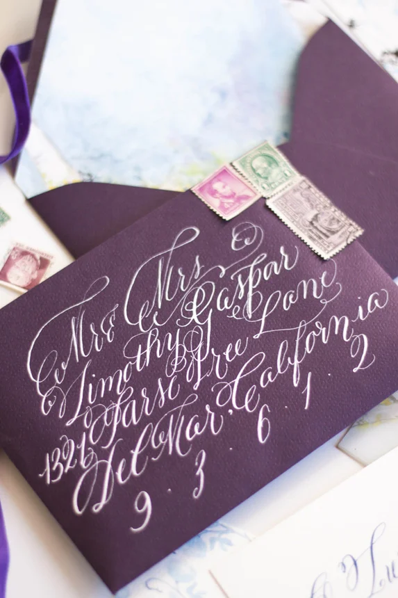
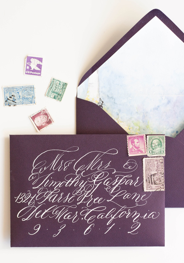
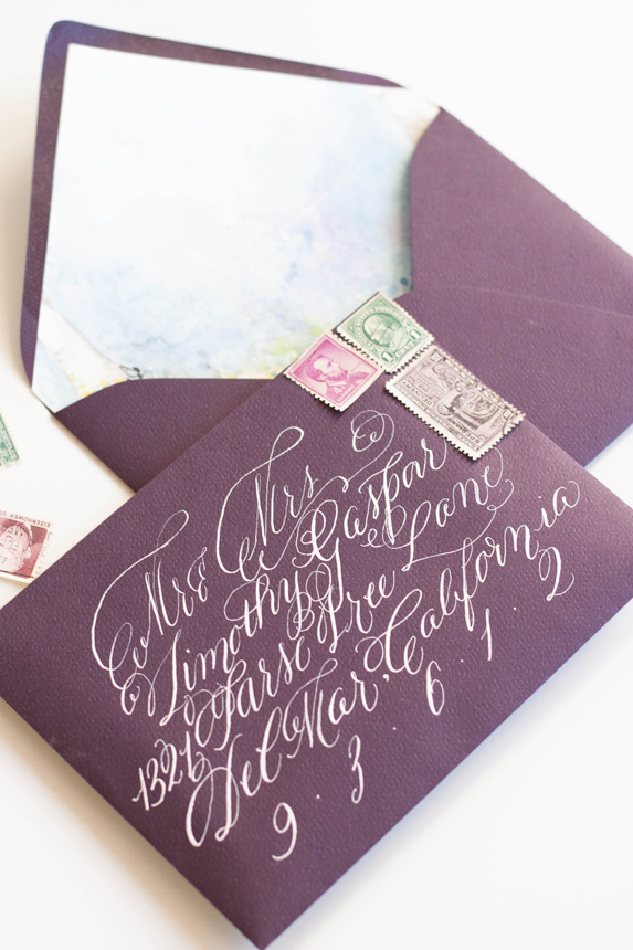
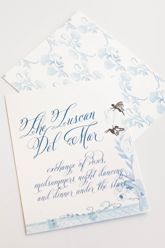
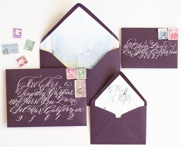
Bespoke - midsummers night dream

Our last post told the story of the process and artwork behind a wedding invitation suite inspirited by A Midsummer's Night Dream. The final suite was a gorgeous combination of shades of blue, violet and purples with black details.
I really did enjoy working on this suite even though I went through a period of discouragement with the artwork and color palate.
The most colorful and my personal favorite part of the suite was the watercolor painting of a fairy hollow. I created a little vignette of trees spanning a space with colorful flowers and lots of blues. I used the artwork on a thin velum that wrapped the entire suite and held all the pieces together as well as the envelope liner and the back of some of the pieces.


The invitations featured a calligraphy monogram, banner and watercolor flourish. I wanted to keep the main portion of the invitation free of heavy artwork and focus on the calligraphy elements. I knew that the other pieces and the backs would hold enough color and artwork to balance the suite as a whole.
The back of the invitation suite was the artwork that took me the longest, as one could imagine, especially given that I redid the entire thing from color to shades of blue (see previous post for further background). I kept the artwork on the response card and reception similarly simple, but added some of the silhouettes as details.


As always, the calligraphy on the aubergine envelopes was a perfect match to the suite in opaque white ink. I lined the envelopes with the matching fairy hollow, with the reply card with matching calligraphy on its liner. I choose some vintage stamps to round out the design.


I LOVED creating the programs! They folded with the artwork contenting front and back. When opened, the bridal party was depicted by silhouettes with the bride and groom in the middle.