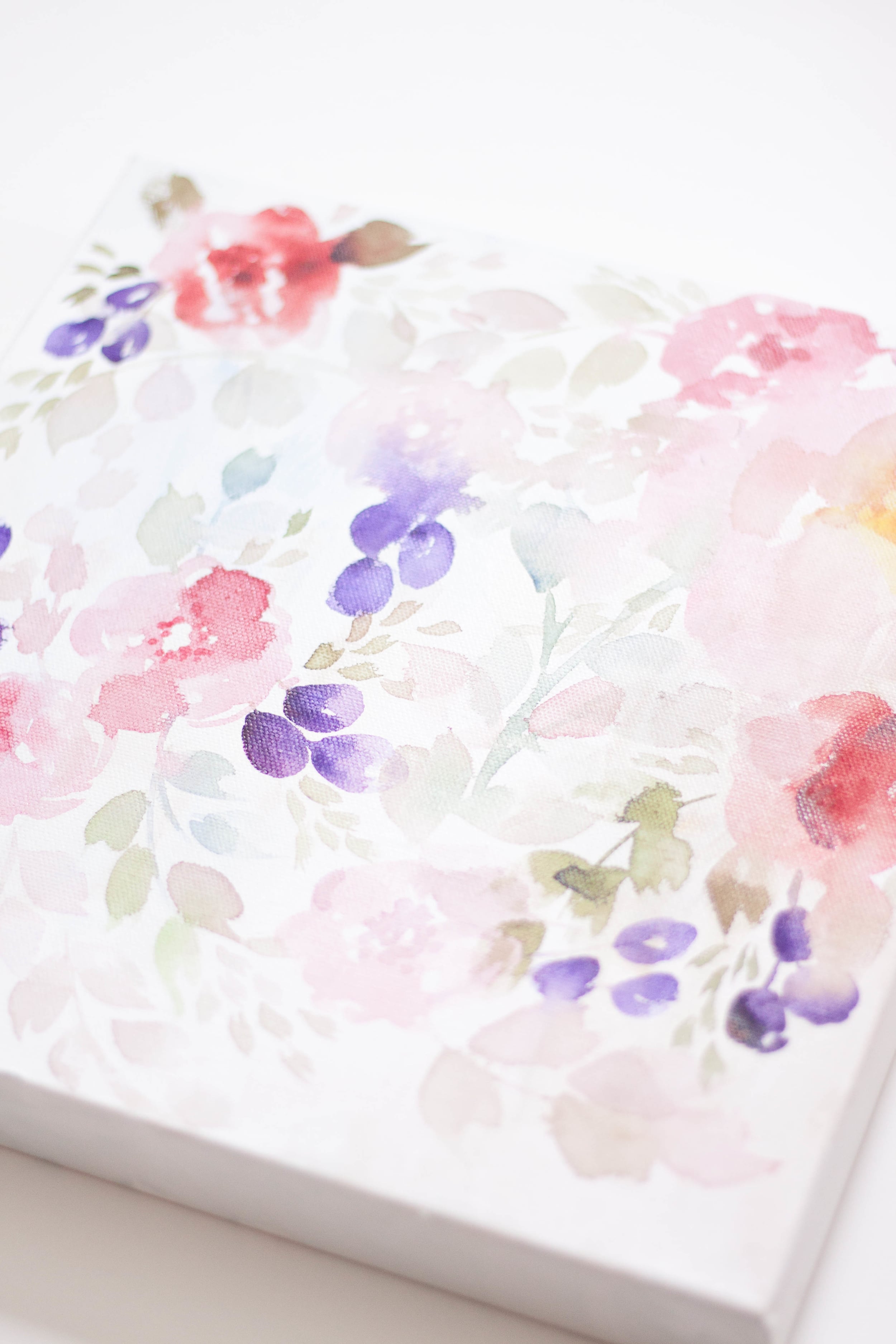
Bright and Summery Bridal Shower Invitations
The vibrancy of this suite is just perfection - with custom envelope liners, full floral invitations with patterned backers, modern calligraphy, and the perfect wax seal.


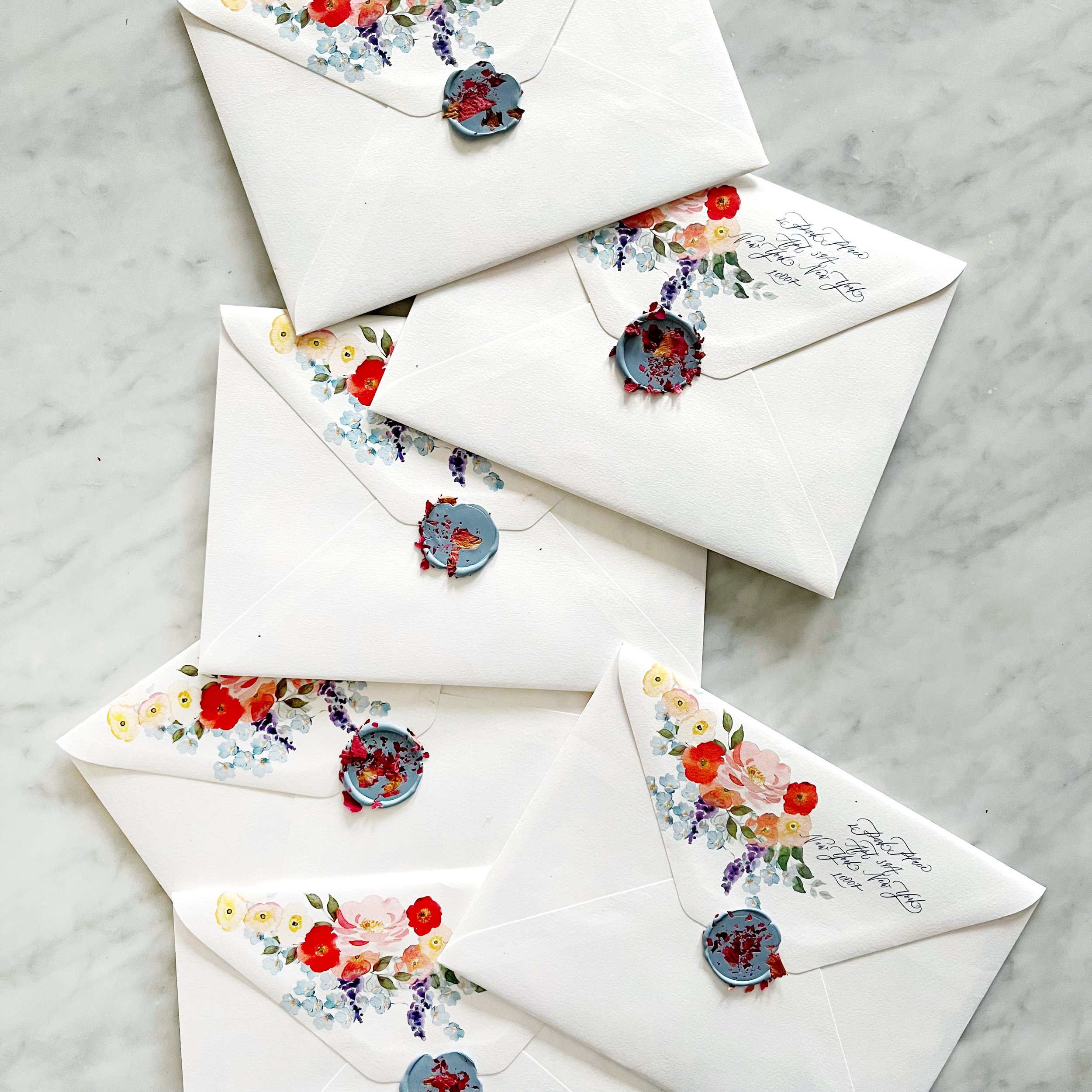


Bright and Summery Bridal Shower Invitations - The Wax Seal
I love the wax seal details of this design!
I selected a pale blue to complement the more subtle colors of this design. As an added detail, we added some dried rose petals and a saturated pink to the wax.

Bright and Summery Bridal Shower Invitations
So vibrant and colorful! This custom bridal shower invitation is perfect for a summer garden party!
I can’t wait to show you the details!

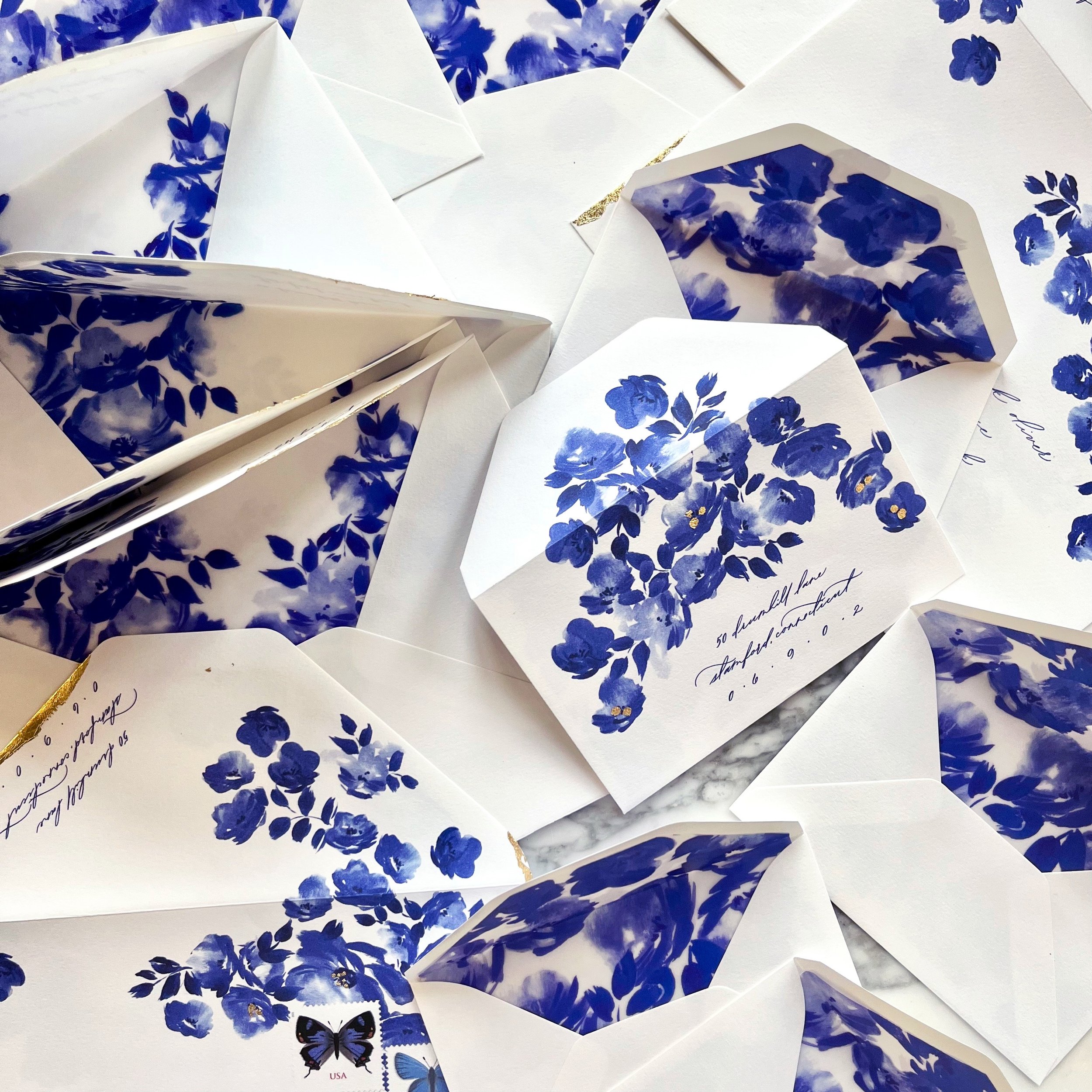
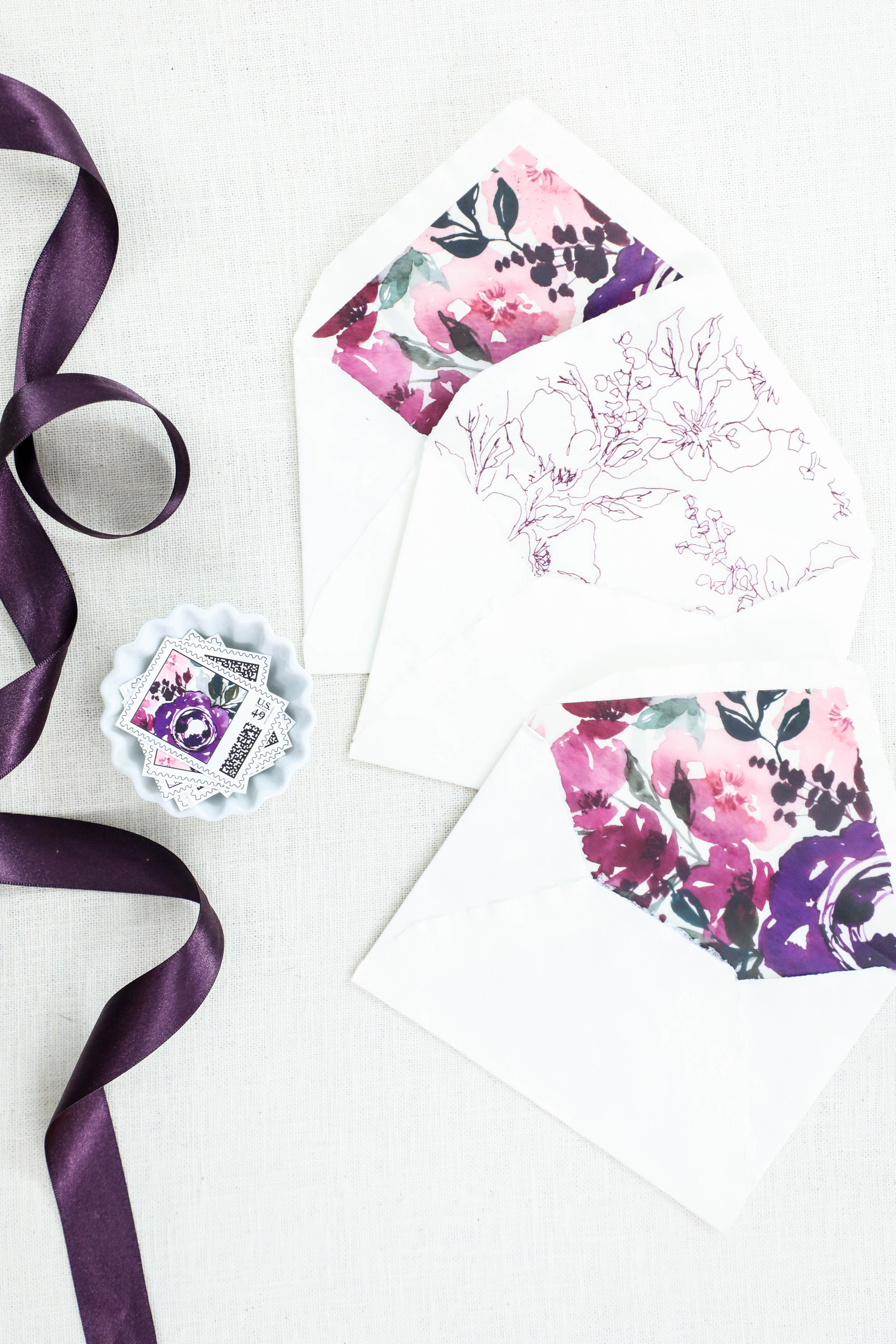
Chinoiserie Blue Wedding Invitations - Envelopes
Envelopes…always my favorite part of an invitation suite. A commonly neglected and always unexpected design element….

This suite featured two different pieces of artwork on the envelope liners, as well as artwork printed on both the reply envelope as well as the mailing envelope. Naturally, we selected blue postage to compliment the overall aesthetic.


Personalized Perfume Bottles
This past month has held a few perfume bottle projects, which just warms my heart! They’re such an interesting and unique gift!
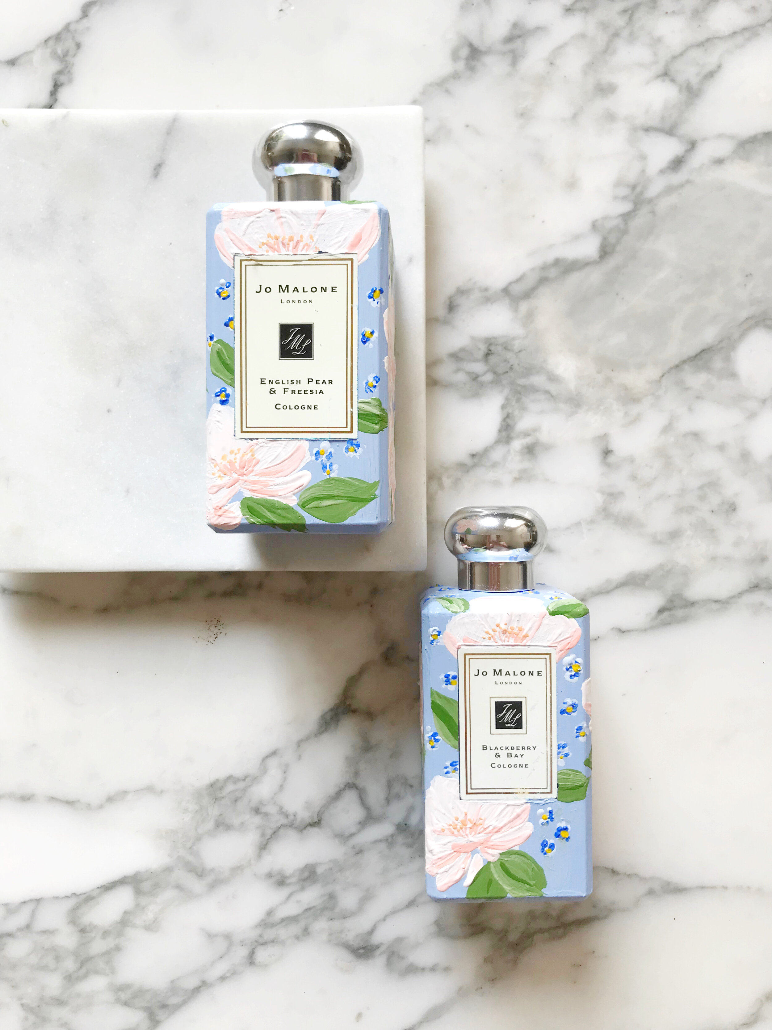
This particular set was designed to match the bride’s wedding invitations and was a gift from the mother of the bride to her daughter on her wedding day. (If you don’t know, Jo Malone is designed to layer and pair scents, so these two are the two the bride selected to wear on her special day!)


The bride’s invitations may look familiar to you, we posted the pictures a while back. Her perfume bottles pair beautifully with her blush and blue invitation suite.


Fall Wedding Invitations for a California Wedding
moody | bold | unexpected | texture | fall
an invitation suite for a wedding at:
Whispering Rose Ranch | Solvang California
The Colors
When our brides first approached us, they had a pretty good idea of what they were looking for. They wanted unexpected texture, deep rose colors, a pop of green, and shades of neutrals.
We selected two shades of greens, two shades of rose, and three shades of pale neutrals, including a sage and chartreuse green, a deep rose and a more violet blush, and a range of pale taupes and creams.
We loved the idea of unexpected textures! We have two pieces that were blind pressed (debossed) layered with digital printing on both the reply card envelope and reception card with a pillowy texture. I also really loved pitching the idea of layering cane into the invitation itself, adding an additional pale color as well as some awesome texture.
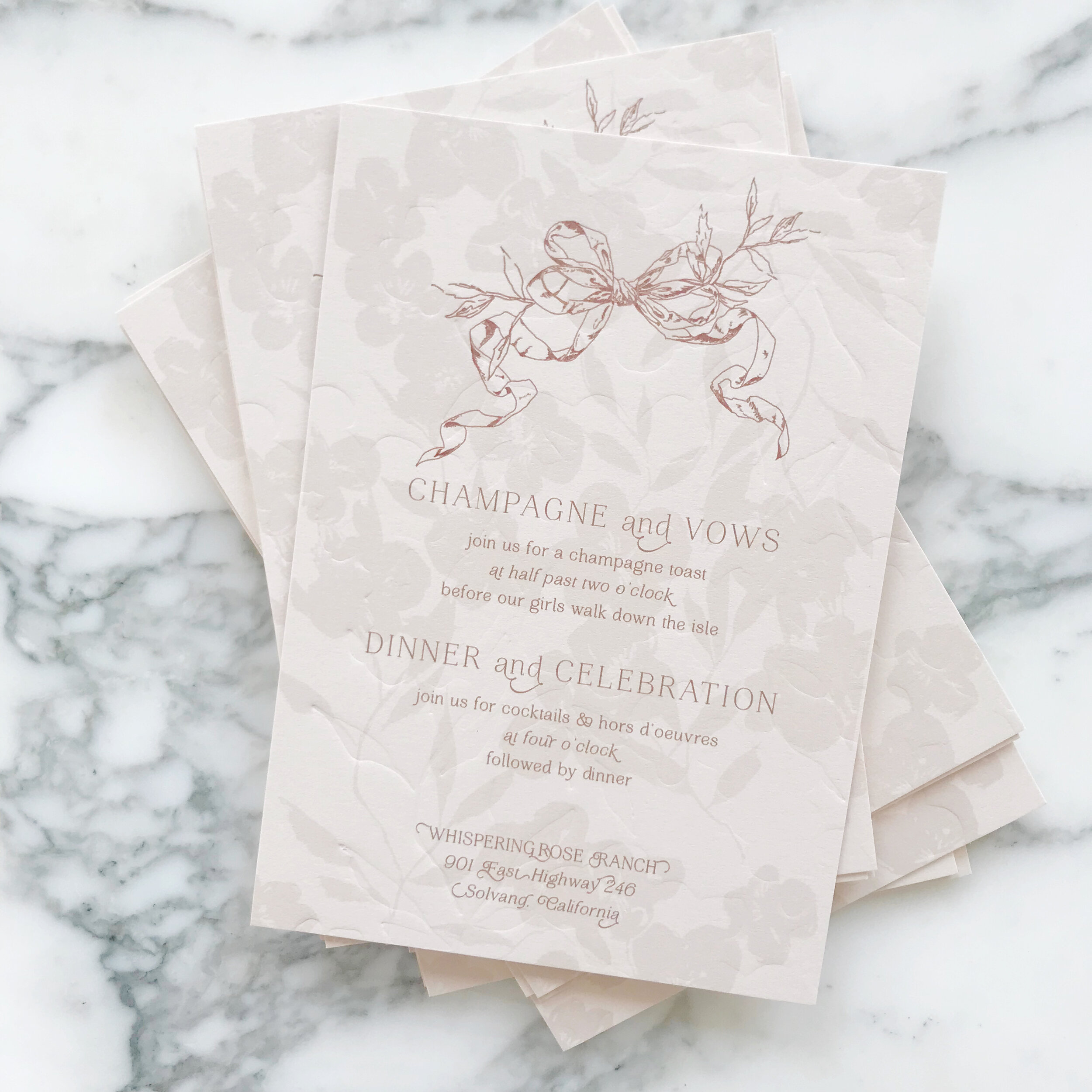


The Design
We love the artwork suite for this design. We included two pieces of watercolor artwork, as well as some solid artwork for our tone-on-tone design, and line artwork design of two different vintage style bows.
We see the bow design topping the invitations, reception cards, and reply envelopes. We see them again sneaking in on the back of the rehearsal cards and flaps of the reply envelopes.
We loved the variances of heavy and light design work throughout all the cards, like the minimal design on the reply card, to let the green pop and stand out. Meanwhile, we have the brunch card and its heavy floral tone-on-tone border, which I just love.


Our mailing envelopes were also pretty amazing with artwork on the fronts and back. We also see our second piece of artwork on the mailing envelope liner.


Spring Rose Garden Invitation Suite Reveal
See our spring rose garden wedding invitation suite in action as we unveil it on our YouTube Channel!
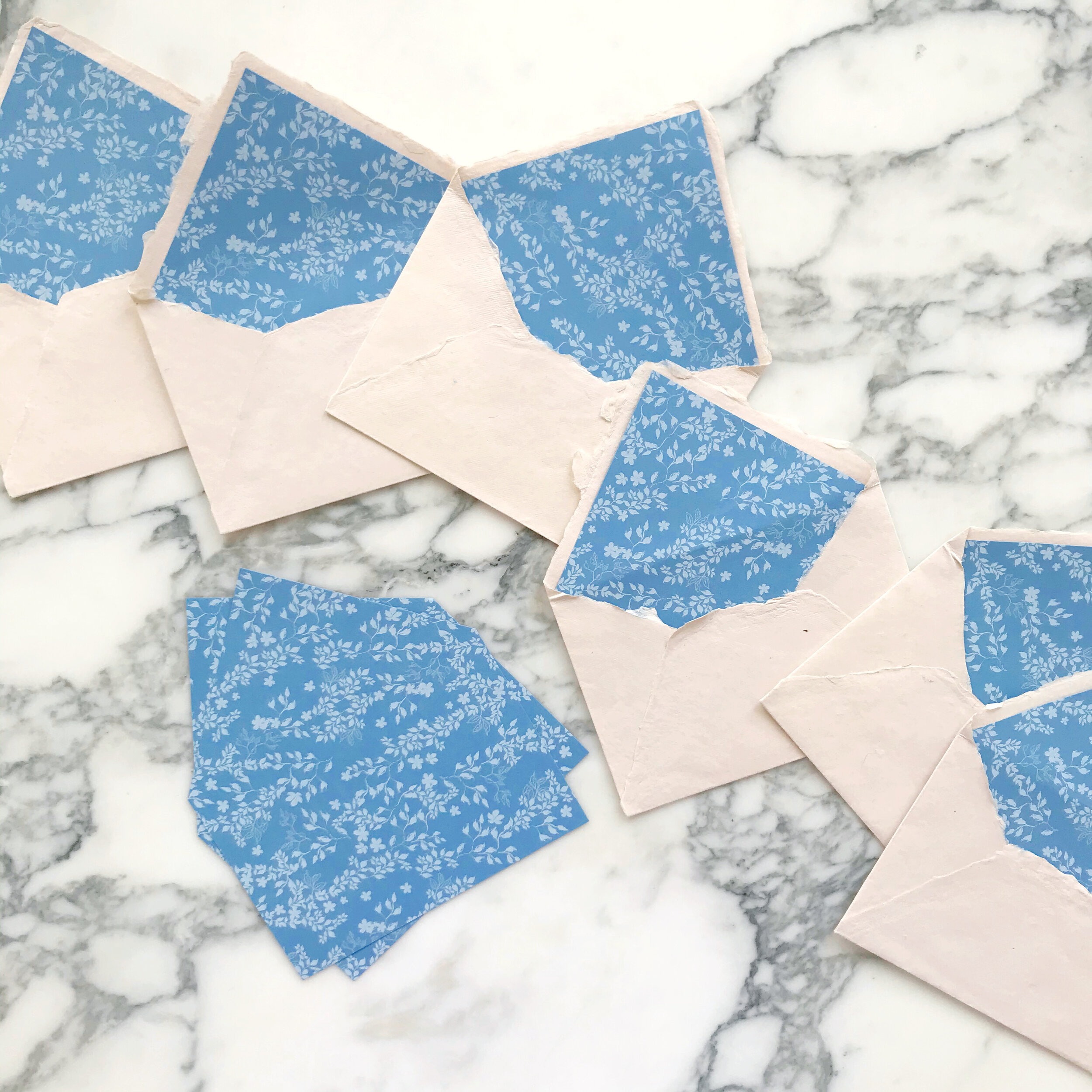
Roses and forget-me-nots were the focal point for this spring wedding invitation suite. I loved the pairing of white ink on blue pops of some more modern interest.

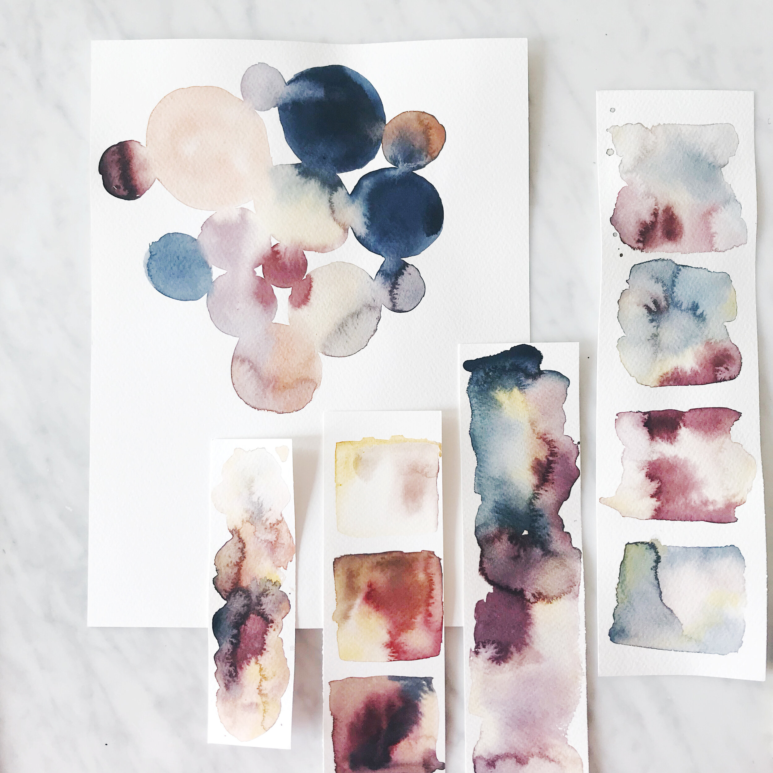
Watercolor and Masking Fluid
I’ve been playing around with watercolor and masking fluid lately, trying to find a good combination of product and paper.
After many trials and errors, I think I have found a combo that I like! See it in action in the time-lapse I posted on our YouTube!

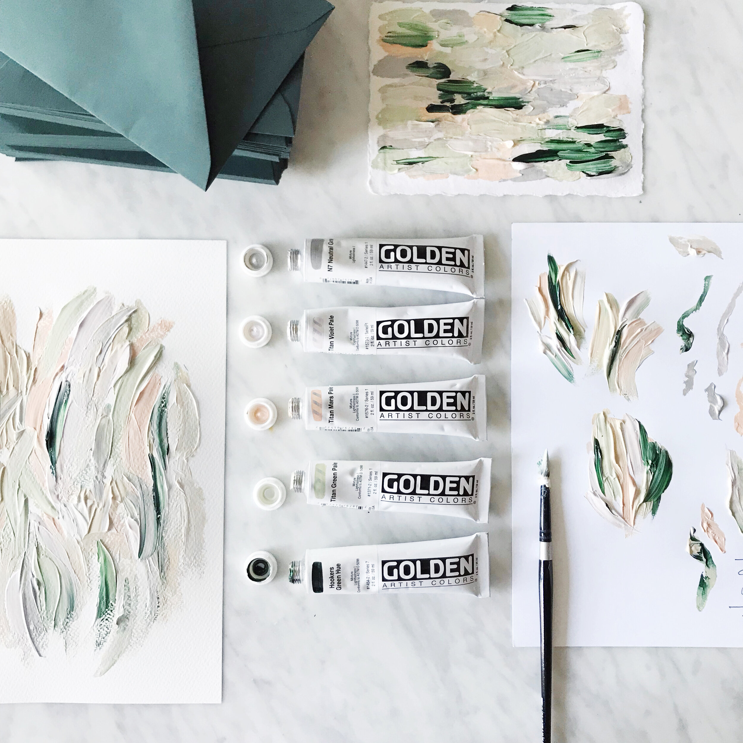
Watercolor White Peonies

We have a new painting up on our YouTube this week! Watercolor and white flowers are always a challenge, so I’ve been practicing with this perfect specimen of a white tree peony. Who wants a gorgeous white peony invitation suite??
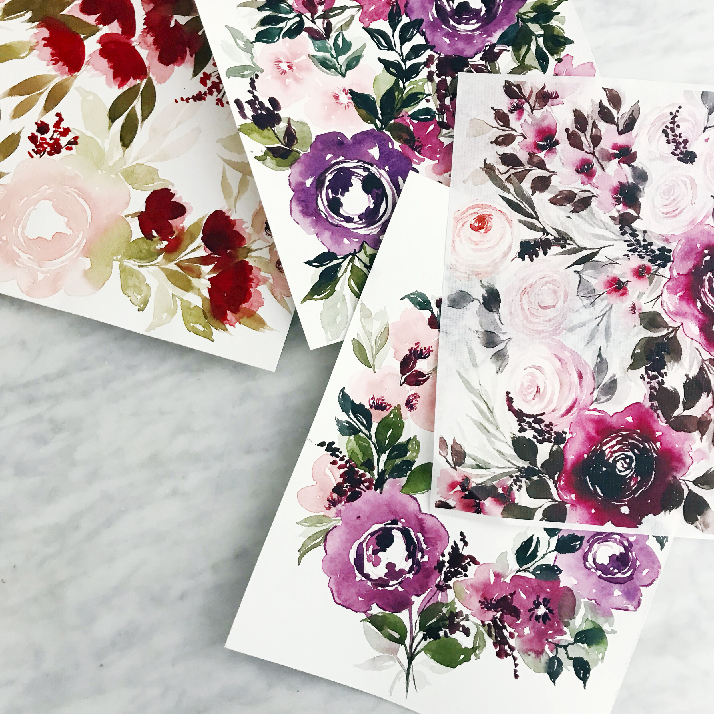
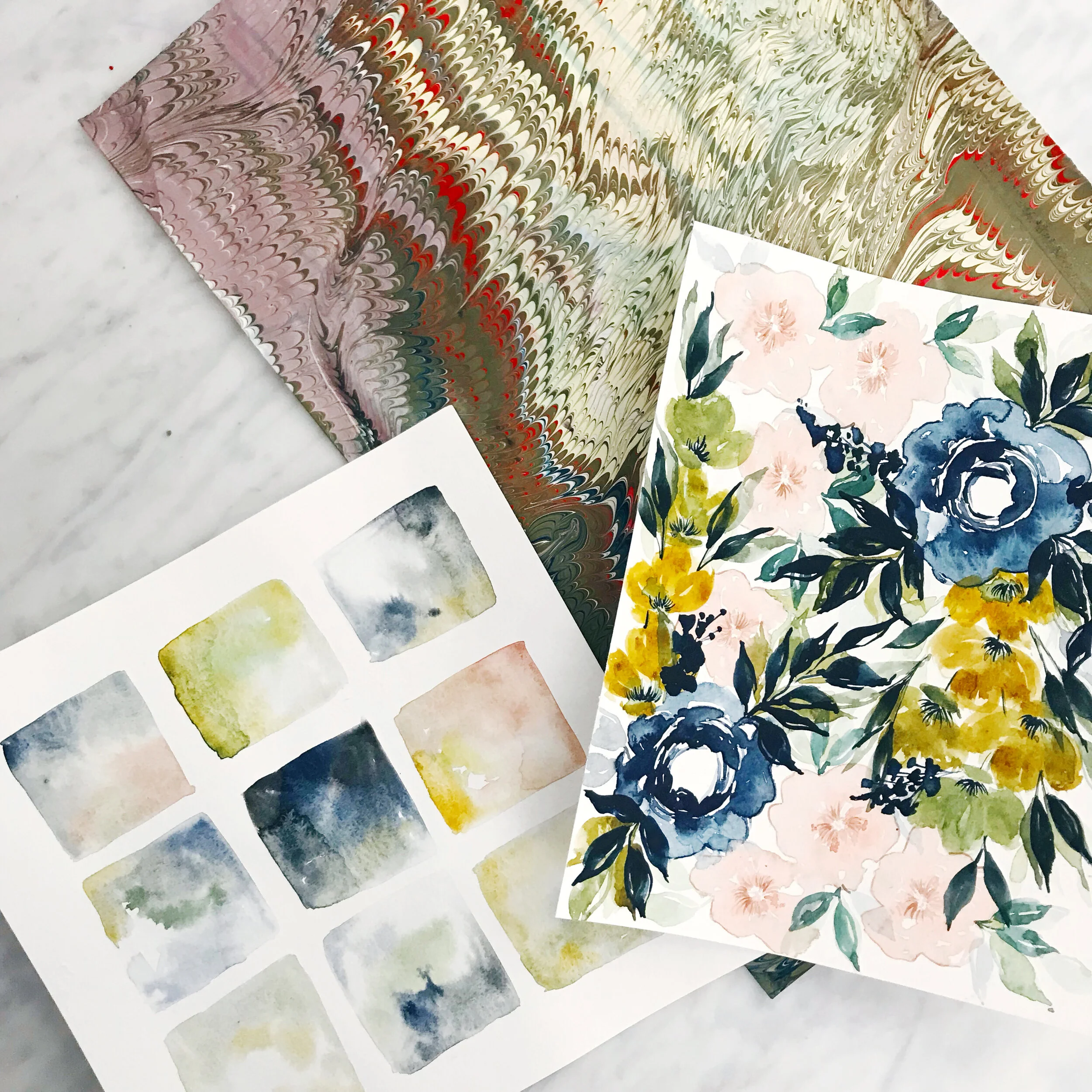
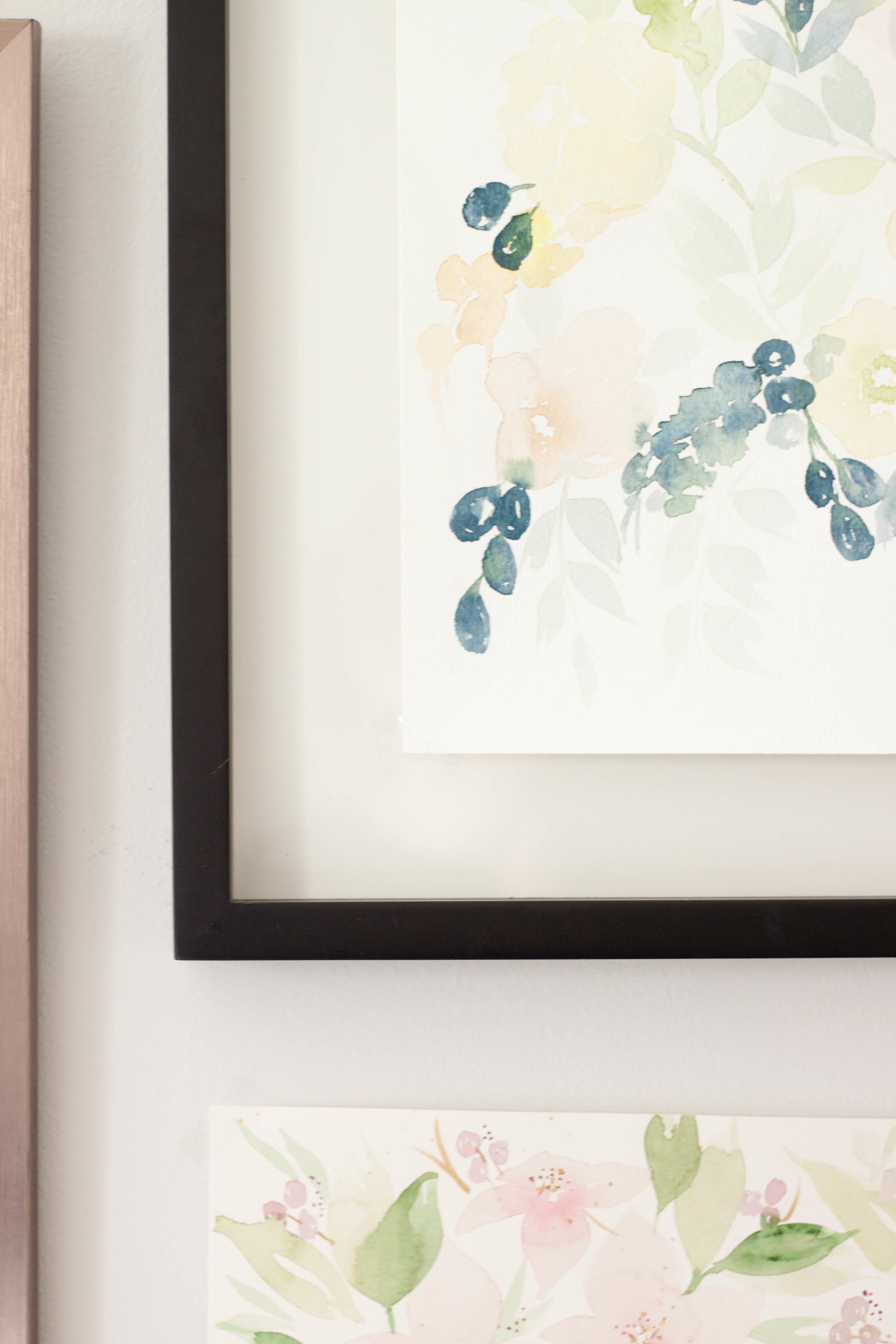
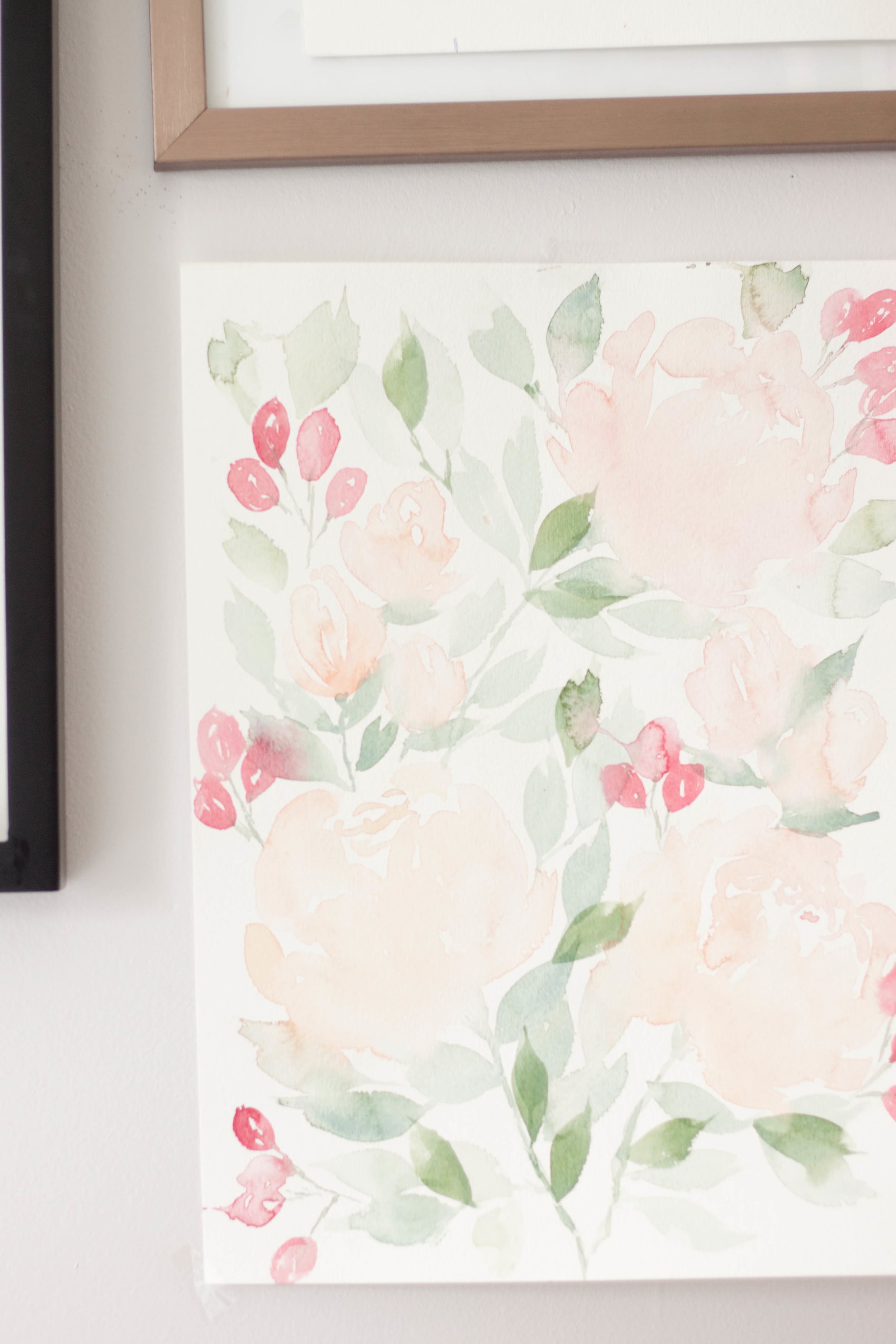
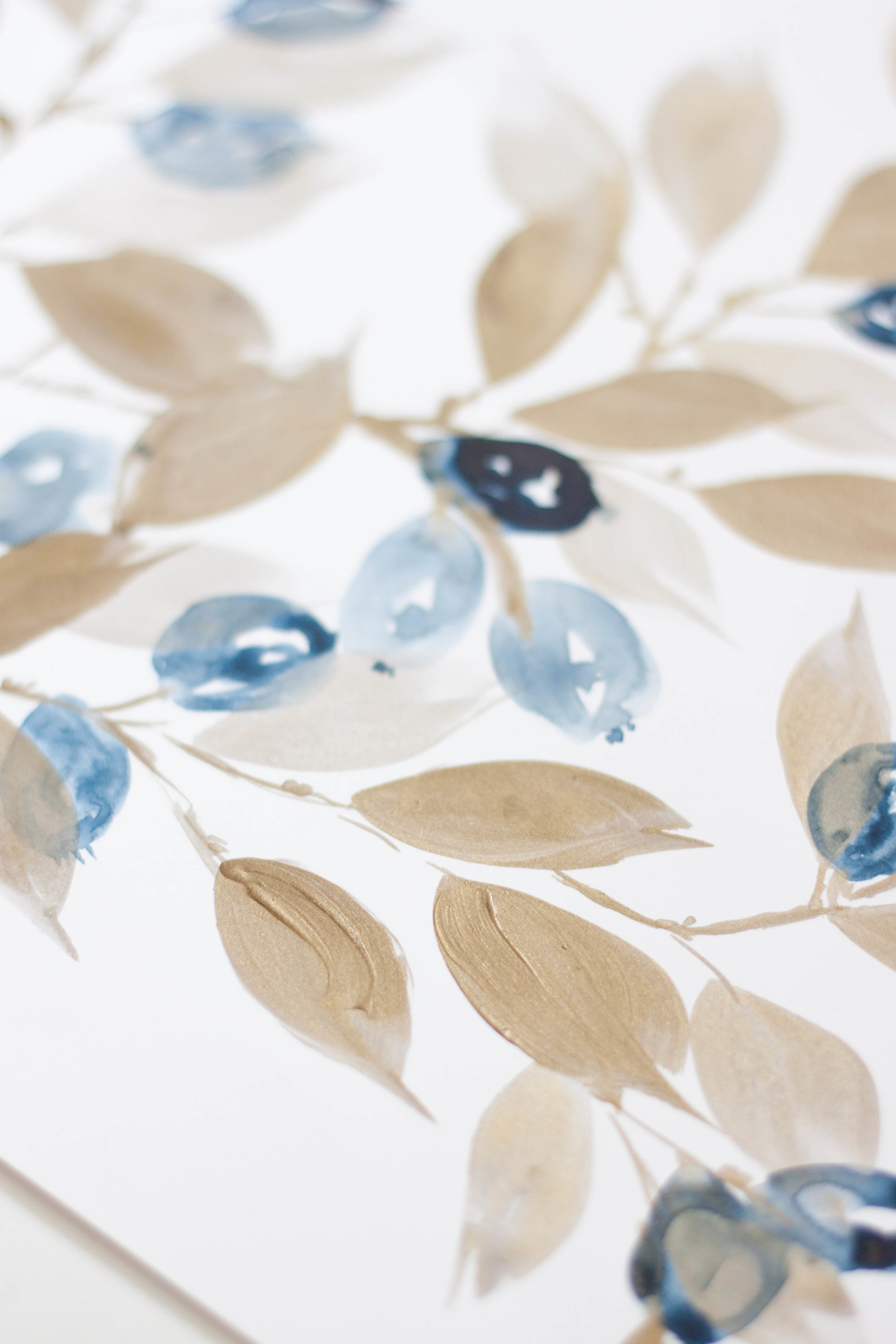
Invitations Featuring Custom Artwork
There are several different routes you can go aesthetically when it comes to your wedding invitations. Around here, we typically lean towards the artwork heavy side of things, specifically watercolor.

Watercolor wedding invitations still seem to be in the forefront and limelight of design these days, and I’m loving it! From simple watercolor washes to colorful florals and patterns, we love it all - granted, around here, we tend to lean towards the more complex side and avoid the simple washes (I personally find them a little dull).
Watercolors are perfect for all seasons and aesthetics, from spring pastels to deep jewel tones of fall and winter.

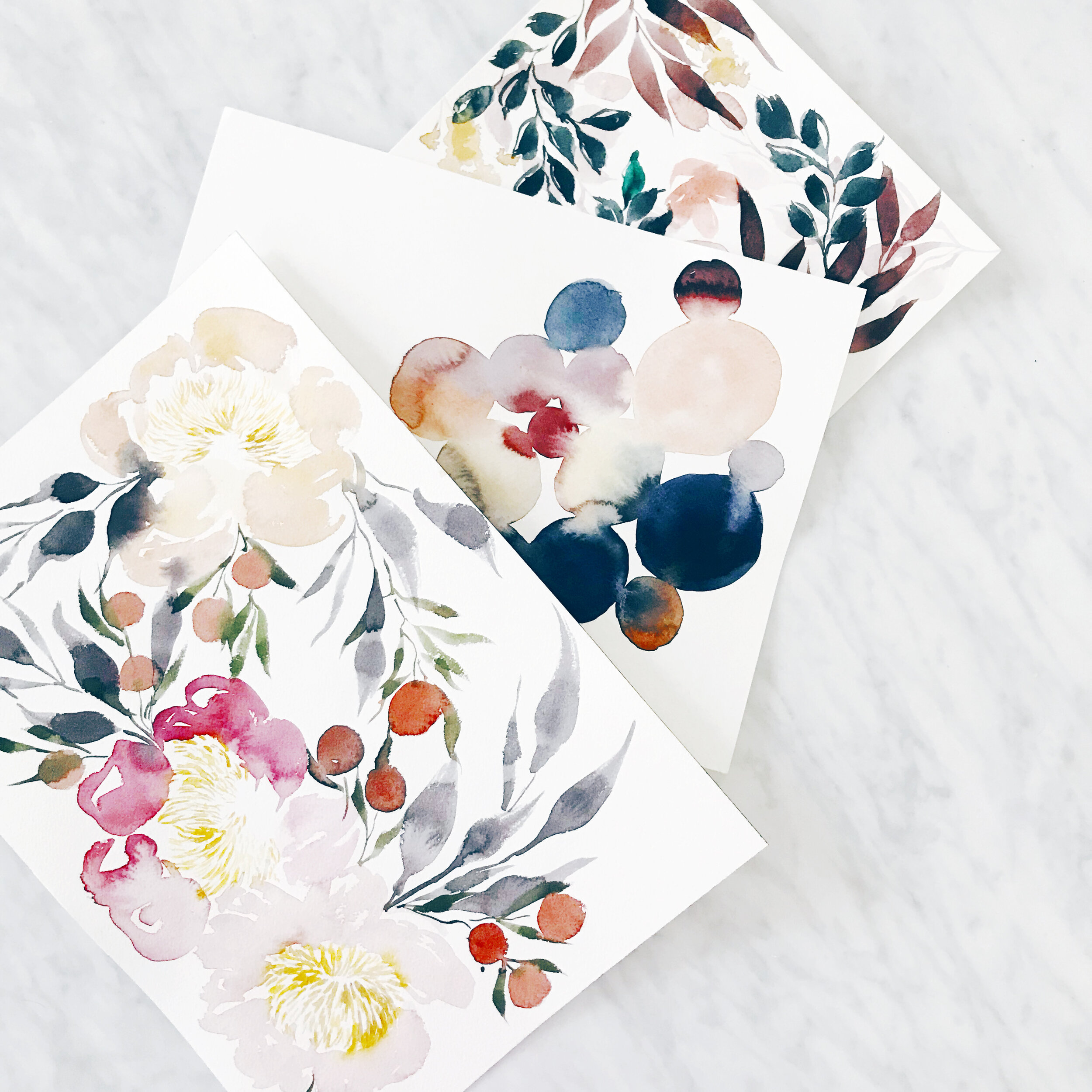
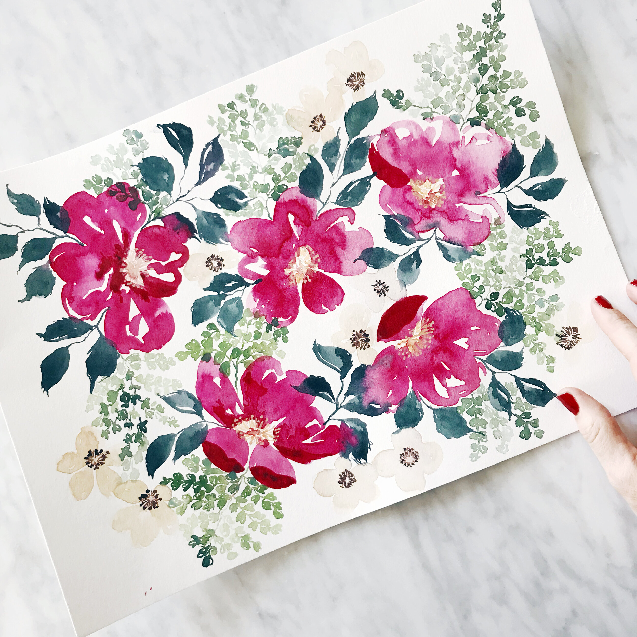
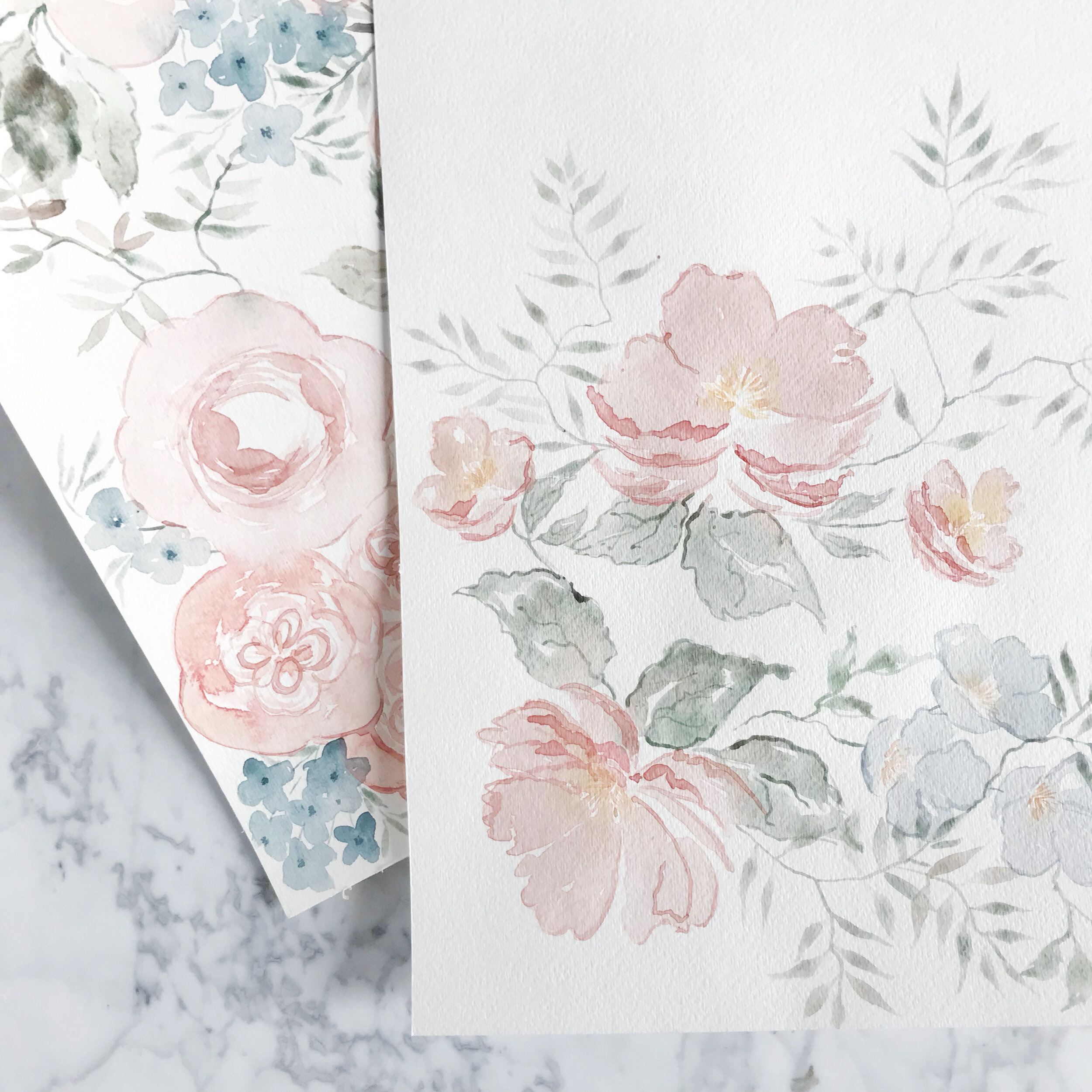
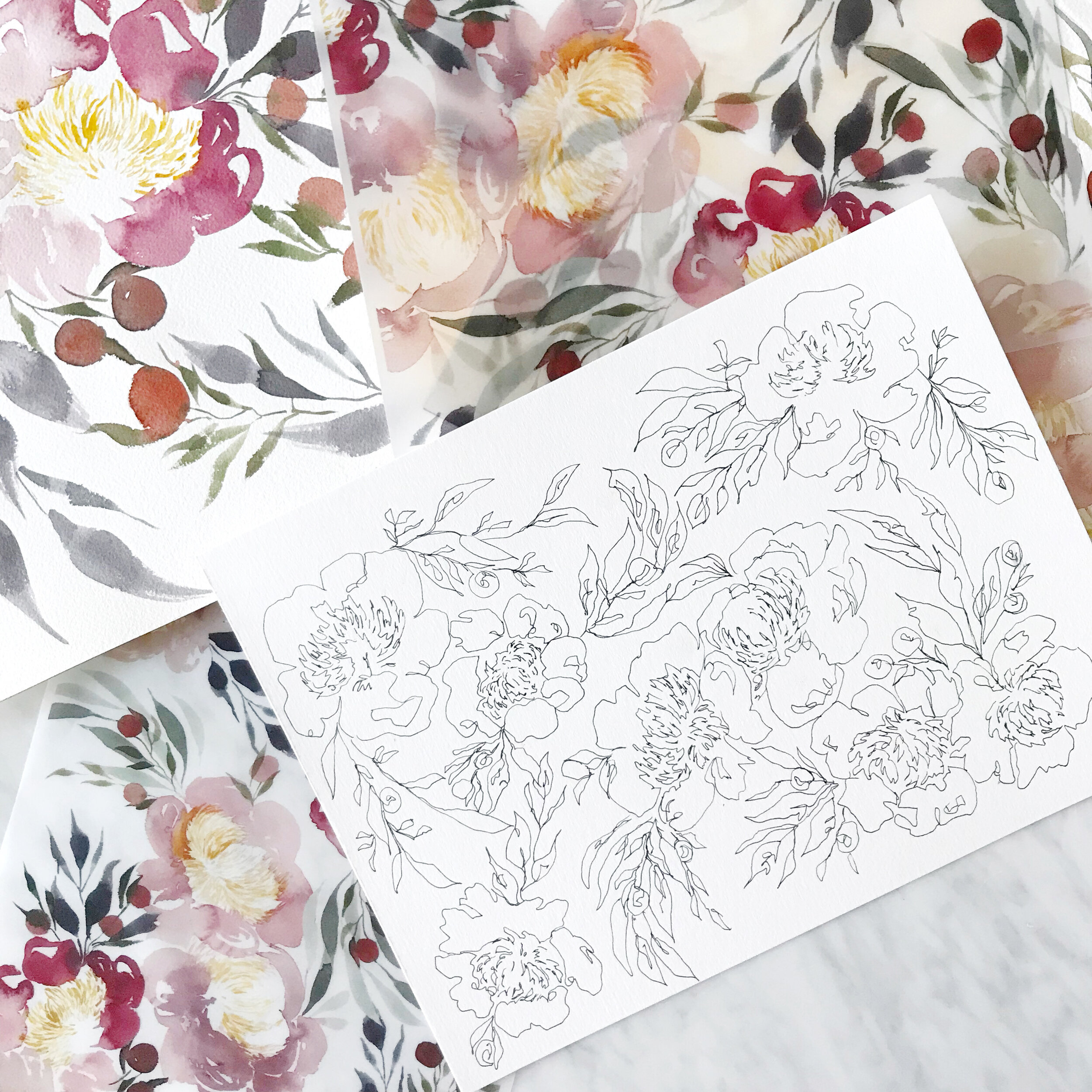
Each suite of artwork is unique to each client, reflecting their personal style and wedding locale. I love bringing in bits of the season and venue, tying all of their details together.
My best advice when working with an artist for your wedding invitations:
Find an artist whose entire portfolio you love. If you start with a designer that you hope can capture the look you’re going for, it’s like cramming a square peg into a round hole. This also requires you as the bride to be able to perfectly articulate what you’re looking for, which sometimes is not all that easy. You know the vibe you’re going for, and can point to pictures you love, but when it comes down to it, you will be in charge of driving the creative direction of your wedding invitations and having the vocabulary to communicate that to your stationer. This leads to frustration on both sides, with the designer not understanding what about their work just doesn’t feel right to you, and you not having the vocabulary to communicate why it doesn’t feel like what you’re looking for.
In contrast, if you find a designer whose entire vibe you dig, you can trust them to create something for you that naturally fits within the aesthetic you’re looking for without requiring you to be in the driver’s seat. A good designer has a distinctive look and feel, which takes so much of the design burden and stress off of you, allowing you to enjoy the process rather than wanting to pull your hair out.
A good stationer isn’t just a designer - they’ll also have knowledge and experience with resources, materials, printing methods, and assembly tricks that we would never expect you to know. Find someone whose work you love, and trust them to guide you through a process you can then enjoy!

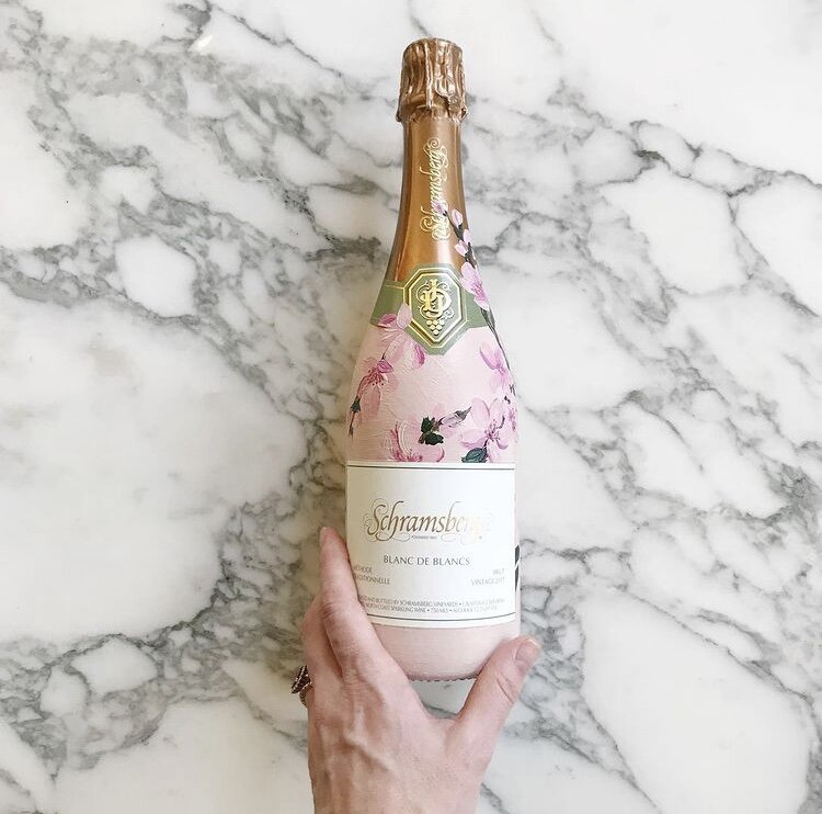
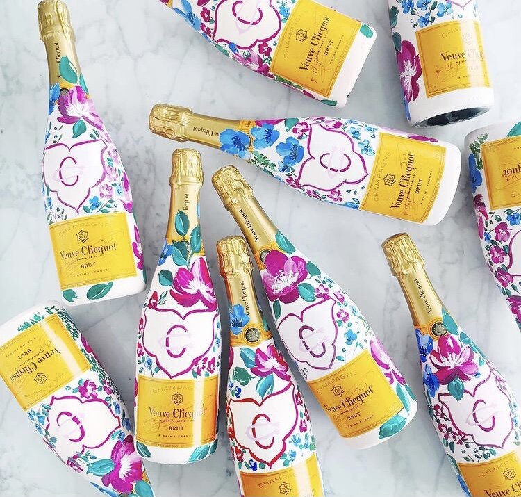
Hand Painted Custom Champagne Bottles
Hand-painted champagne bottles are the perfect custom touch for a gift for your bridal party or adorn your bar for an eye catching detail for your guests.
For these particular projects, each bottle was hand-painted to match the bride’s invitation suites with bright fuchsia blooms and cherry blossoms or pale blues and blushes.
Join me on YouTube channel for a brief video featuring some of our painted work.
If you’re interested in commissioning bottles from us, let us know!

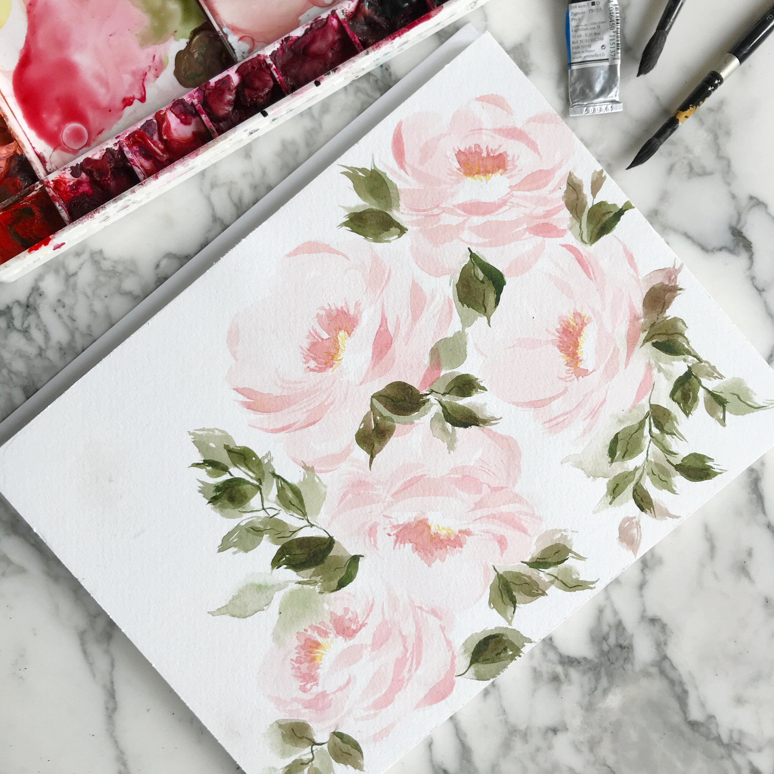
Painting White Peonies in Watercolor
Painting white flowers without using white paint
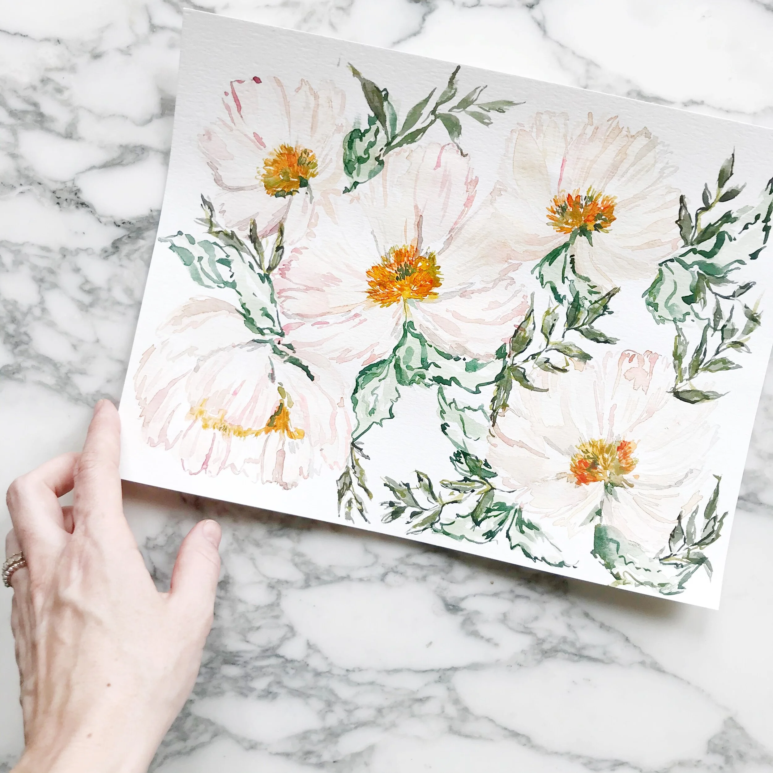
Painting White Peonies in Watercolor
I've been working on a new flower form (new for me, at least) and working a lot with white peonies.
There are two essential ways to paint white flowers - using tiny bits of grey for the flower details and adding a dark background to designate where the flower falls, or using shades of greys and pale neutrals to create the optic of white flowers (because white flowers aren't 100% white).
I'll be using the latter technique to create white peonies with watercolor. I hope these tips for watercolor painting as well as showing you a small example of what's it's like being a working artist and will be useful to you. If you enjoy my artwork and crave more glimpses behind the scenes, please subscribe to my channel and hit the like button.
Also, please leave a comment on the video with questions and requests.
Design House of Moira on the Web:
Instagram - www.instagram.com/designhouseofmoira
Websites - www.designhouseofmoira.com | www.designhouseprepschool.com
Running a Creative Business & Watercolor Painting - Video
I'm playing around with some more five-petal flowers today in some moody spring flowers (doesn't that sound like an oxymoron??).
In this video, I'll talk through a little about my painting process, but we'll also chat openly about creating a unique style and how to compete in a saturated market on value rather than price.
I hope these tips for watercolor painting as well as showing you a small example of what's it's like being a working artist and will be useful to you. If you enjoy my artwork and crave more glimpses behind the scenes, please subscribe to my channel and hit the like button.
Also, please leave a comment on the video with questions and requests. Design House of Moira on the Web:
Instagram - www.instagram.com/designhouseofmoira
Websites - www.designhouseofmoira.com | www.designhouseprepschool.com
price.
Bespoke | Laura

Laura & Ellis
shades of indigo, velvet, monochromatic, elegant, fall wedding

the tri-fold save the date folded into a thin, velum envelope so the artwork could be seen inside. custom postage completed the save the date envelopes.

the invitation suite was kept simple on the fronts of the pieces with indigo monochromatic artwork gracing the reverse of each piece. The suite included a save the date, invitation, reply card, reception card and dress code card. The reply envelope and save the date envelopes were both a thin, transparent velum.


We paired the suite with a thin piece of velum, printed with the moody artwork suite to bring in the dark, winter reds and berries.


Custom postage and artwork printed envelope liners completed the suite. We created the postage from the two artwork suites we used throughout the design.
Bespoke | Kiersten & Matt

Kiersten & Matthew
dark and moody, with elegance and romance - a perfect combination for a snowy winter wedding.


original artwork beside finished printed pieces

We kept the invitation fairly simple with a line botanical laurel and a modern calligraphy style.


The additional inserts included the reply card and reception card, both of which we kept very simple and minimal. They both featured the same modern calligraphy and small blooms from the line botanical artwork suite

We paired the suite with a thin piece of velum, printed with the moody artwork suite to bring in the dark, winter reds and berries.


Custom postage and artwork printed envelope liners completed the suite. We created the postage from the two artwork suites we used throughout the design. The three envelope liners (save the date, mailing envelope, reply card envelope) featured the two main artwork suites as well as a contemporary landscape scene created to reflect the bride's childhood home.
Real Wedding | Jess & Robert
One of my favorite projects last year was creating these gorgeous French blue invitations for Jess and Roberts wedding. We incorporated the same pale shade of blue throughout her wedding stationery. Her invitations were large in size, using a marquis envelope in 7x7 square. Each invitation was hand watercolored with foil printing in pale gold and paired with white cotton cards with French blue printing. Each suite was tucked into it's envelope and sealed shut with a large seal bearing the couples artwork and crest.
View the entire wedding gallery here, featured on Style Me Pretty.


Photography: Love & Light Photographs | Cinematography: Endless Wave Studios | Event Design: Gilded Lily Events | Floral Design: Reynolds | Wedding Dress: Mark Zunino | Cake: Carlo's Bakery | Stationery: Design House Of Moira | Jewelry: Jenny Packham | Bridesmaids' Dresses: Monique Lhuillier | Makeup: Make Me Up Eva | Hair: Up & Out | Band: Almost Easy Band | Groom's Attire: Calvin Klein | Groomsmen's Attire: Calvin Klein | Officiant: Reverend Donald Gebhard | Ceremony Music: Shrewsbury String Quartet | Transportation: ShooBoo Shuttle | Venue: Mallard Island Yacht Club | Bridal Boutique: Kleinfeld Bridal | Bridesmaid's Accessories: Olive + Piper | Bridesmaids' Robes: Cloud Hunter | Cake Topper: Table Setting is My Life | Candleabra Rental: Two of a Kind | Ceremony Lighting: Ocean Tents | Custom Hair Accessories: Foolish Ginger | MOB + MOG Robes: POSY | Maid of Honor Dress: Adrianna Pappell | Rentals: Dovetail Vintage Rentals | Ring Bearer Pillow: JfyBride | Signage: Design House Of Moira | Veil: Mark Zunino | Vintage Hat Box: Trousseau & Co | Welcome Gifts: That's Darlin'
Prep School - Creative: Watercolor I
Creative: Watercolor I
In our first watercolor course, we will explore color theory, basic color mixing, supplies, and basic applications (we'll be painting fruit!) using several techniques. The watercolor courses, like the business and pricing courses, are meant to build on one another semester to semester.
Announcement | Original Artwork
About a month or two ago, I started doing something that may seem pretty straight forward, but I had never thought of before (it was a bit of a 'duh' moment). I started creating artwork for no other reason than creation and practice. As an artist, it's actually a bit of a conundrum. I personally know that I have a hard time sitting down and just creating something without any guidelines or parameters. I never know what to paint - or to paint at all. I could sketch, but what would I sketch??
So a began letting color be my parameters and not worrying too much about what I actually painted. I also started letting the watercolor behave as watercolor should, and not worrying so much about it being "perfect". I allowed the paints to bleed together, the reds play into the greens and the blush into blue.
A funny thing happened - the more I practiced, the better I saw my work getting. Shocking, right? Who knew that practice improved one's skills!
Another unexpected thing happened - when I started posting my latest work on social media, I received much higher praise/likes/accolades than normal! My most liked post on instagram EVER was a bronze gouache leaf painting! I was somewhat (totally. I was totally) blown away!
So every other day or so I sit down to create something for the fun of it, but now I have a whole pile of gorgeous watercolor artwork. What will I do with all this artwork?
Well, after several requests, I've decided to sell it! They're my babies, but my walls are full and they need to go to good homes.

So as we welcome 2016, I have launched the first round of artwork for sale. Each piece is unique and original, so if there's a piece you love, snap it up before someone else does! And don't forget to check back for new pieces to be added!
To celebrate the launch, I've also added a free printable to celebrate 2016! Find it in the shop, download and don't forget to share how you use it with #moiraart

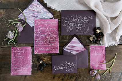
Featured | 100 layer cake - dutch masters
A bit earlier this year, a project I collaborated was featured on 100 Layer Cake! It was a pleasure to collaborate with Emily Wren on this moody project.
The invitations were a gorgeous, deep aubergine, watercolor washed plum and featured coordinating hand marbled paper as the envelope liners. The over the top flourished calligraphy was printed in white foil and then addressed in matching calligraphy.


Photographer: Emily Wren Photography / Location: Power Plant Productions / Event Design: Confetti & Co. / Floral Design: Kate Farley Design / Hair & Makeup: True Beauty Marks / Calligraphy: Design House of Moira / Desserts: Cake Life Bake Shop / Catering: Birchtree Catering / Rentals: Maggpie Vintage Rentals / Dress: Carol Hannah from Lovely Bride Philadelphia / Jewelry: Egan Day / Models: Gina (owner of True Beauty Marks) & Mike
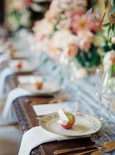
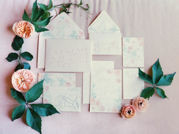
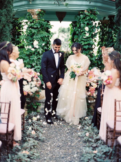
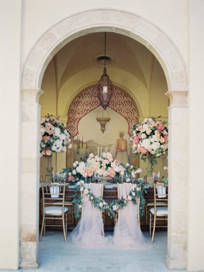
Featured | Style me Pretty
I had the pleasure of working with Luica and David, along with Joseba Sandoval of Sandoval Studio Photography and Romance Weddings to create this luscious and romantic wedding held at a private villa in Spain. I was approached by Joseba to meet with his bride who was looking for something lush, organic, blush and peach, and intimate. The villa created a private retreat for their small wedding and their over the top florals were perfectly framed by the architecture of the space.
For their stationery (which will have more details posting this week), I created a pattern based on the Spanish tile that was featured through out the villa. I paired that with the fluffy garden roses and ranunculus used throughout their florals. We choose to keep the calligraphy contemporary to reflect the couples style, and wrapped the suite in antique lace. I added touches of rose gold by hand to each invitation suite, and I still swoon over the final pieces. The brides pale peach gown was just to die for!
Photography: Sandoval Studios Photography | Wedding Gown: Chaviano Couture | Wedding Cake:Sweet Things By Fi | Belt Gown: Carlee Sizemore | Bride Shoes: Chinese Laundry | Candy Bar: Dulce Serendipia | Catering : El Gastor | Chairs And Linen: Pedro Navarro | Cheesecake Design And Cheesecake Table Decor: Reviva Weddings | Creative Direction And Overall Styling: Mar Sandoval From Romance Weddings | Flowers And Ceremony Decor: Pedro Navarro | Groom Suite: Hugo Boss | Stationery Design And Escort Cards: Design House Of Moira | Venue: Villa | Wedding Favors And Drink Stirres: Mar Sandoval From Romance Weddings | Wedding Planning And Coordination: Reviva Weddings | Wedding Rings: Lujan Jewelry